• Home
  • Tools dropdown img
    • Spreadsheet Charts

      • ChartExpo for Google Sheets
      • ChartExpo for Microsoft Excel
    • Power BI Charts

      • Power BI Custom Visuals by ChartExpo
    • Word Cloud

  • Charts dropdown img
    • Chart Category

      • Bar Charts
      • Circle Graphs
      • Column Charts
      • Combo Charts
      • Comparison Charts
      • Line Graphs
      • PPC Charts
      • Sentiment Analysis Charts
      • Survey Charts
    • Chart Type

      • Box and Whisker Plot
      • Clustered Bar Chart
      • Clustered Column Chart
      • Comparison Bar Chart
      • Control Chart
      • CSAT Survey Bar Chart
      • CSAT Survey Chart
      • Dot Plot Chart
      • Double Bar Graph
      • Funnel Chart
      • Gauge Chart
      • Likert Scale Chart
      • Matrix Chart
      • Multi Axis Line Chart
      • Overlapping Bar Chart
      • Pareto Chart
      • Radar Chart
      • Radial Bar Chart
      • Sankey Diagram
      • Scatter Plot Chart
      • Slope Chart
      • Sunburst Chart
      • Tornado Chart
      • Waterfall Chart
      • Word Cloud
    • Google Sheets
      Microsoft Excel
  • Services
  • Pricing
  • Contact us
  • Blog
  • Support dropdown img
      • Gallery
      • Videos
      • Contact us
      • FAQs
      • Resources
    • Please feel free to contact us

      atsupport@chartexpo.com

Categories
All Data Visualizations Data Analytics Surveys
Add-ons/
  • Google Sheets
  • Microsoft Excel
  • Power BI
All Data Visualizations Data Analytics Surveys
Add-ons
  • Google Sheets
  • Microsoft Excel
  • Power BI

We use cookies

This website uses cookies to provide better user experience and user's session management.
By continuing visiting this website you consent the use of these cookies.

Ok

ChartExpo Survey


Home > Blog > Power BI

Uncover Hidden Insights With Power BI Advanced Analytics

Data is the new gold, and Power BI is the alchemist’s tool that transforms it into actionable knowledge.

power bi advanced

Think of Power BI as your trusty sidekick, armed with a toolkit of advanced analytics superpowers. Power BI advanced analytics empowers you to dig deeper, unearthing valuable patterns, trends, and correlations hidden beneath.

It’s like having a secret weapon in your data arsenal.

Join us as we embark on an adventure into the enchanting world of Power BI advanced analytics. We will explore the powerful tools and techniques to take your data analysis to the next level.

From predictive modeling to data clustering, this adventure will leave no data stone unturned and no insight uncovered.

But that’s not all.

Power BI also offers cutting-edge visualization capabilities to bring your data to life. Say goodbye to boring charts and hello to stunning visualizations that make your insights memorable.

No longer will your data remain a mysterious labyrinth.

Table of Content:

  1. What is Power BI?
  2. Advanced Features in Power BI
  3. How to Perform Advanced Analytics in Power BI?
  4. How to Create Advanced Power BI Dashboards?
  5. Wrap Up

Let’s get started.

What is Power BI?

Power BI, an innovative creation from Microsoft, empowers businesses to unleash the true potential of data. This analytics tool has an intuitive interface that helps you transform raw information into meaningful insights effortlessly.

When considering Looker vs Power BI, it’s important to note that while both platforms offer robust data analytics capabilities, Power BI stands out with its comprehensive suite of features for connecting, preparing, and analyzing data from diverse sources.

Advanced Features in Power BI

Do you want to become the maestro of analytics? Look no further than these Power BI magical capabilities. These features transform your data from a jumbled mess into a beautifully orchestrated symphony of insights.

  • Advanced analytics: PBI allows you to tap into an arsenal of cutting-edge analytics tools, including predictive modeling and clustering. Consequently, unlock a treasure trove of profound insights, unravel intricate patterns, and unleash the power of data-driven predictions.
  • Custom data connectors: Power BI allows the creation of custom data connectors to connect to data sources like web services. This feature seamlessly integrates data from diverse sources into Power BI reports and dashboards.
  • Advanced data modeling: Power BI provides robust data modeling techniques. You can create relationships between tables, define hierarchies, and implement row-level security for fine-grained access control. Consequently, it enables you to create sophisticated data models that accurately represent your data and support in-depth analysis.
  • Advanced calculations: DAX (Data Analysis Expressions) empowers you to create intricate calculations, craft clever measures, and conjure calculated columns. All in a flexible and mighty fashion to extract profound insights from the depths of data.
  • Advanced visualizations: Power BI offers a variety of advanced visualizations, including custom visuals developed by the Power BI community. These visualizations go beyond standard charts and graphs, enabling you to present data innovatively. Ultimately, deliver impactful visual storytelling.

How to Perform Advanced Analytics in Power BI?

Performing advanced Power BI analytics involves several key steps:

  1. Define objectives: Clearly define the end goal of your analysis, such as identifying trends, making predictions, or uncovering patterns. This guides the entire analysis process.
  2. Data preparation: Clean, transform, and shape your data to ensure it is in a suitable format for analysis. Utilize Power Query to perform data cleansing and transformation tasks.
  3. Advanced analytics techniques: Apply advanced analytics techniques such as forecasting, clustering, regression, or sentiment analysis. Moreover, leverage Power BI’s integration with Azure Machine Learning or other advanced analytics tools for complex analysis.
  4. Visualization and reporting: Create visualizations and reports that effectively communicate the results of your analysis. Use the advanced Power BI dashboards and other visualization options to present insights compellingly.
  5. Iterative analysis: Continuously iterate and refine your analysis based on feedback and new insights. Explore different visualizations, calculations, or models to gain deeper insights from your data.
  6. Data refresh and automation: Set up data refresh schedules to ensure your analysis remains up-to-date. Automate data refresh using Power BI’s data refresh options or connect to live data sources for real-time analysis.
  7. Sharing and collaboration: Transform your data insights into shared experiences within your organization by leveraging Power BI’s collaborative features. This allows seamless collaboration, feedback exchange, and knowledge dissemination among colleagues.

How to Create Advanced Power BI Dashboards?

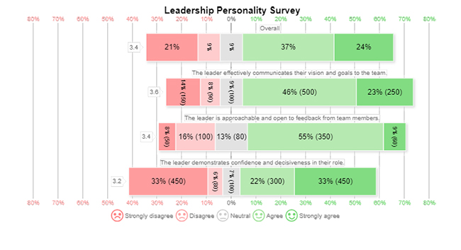
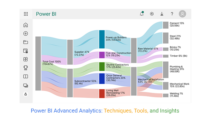
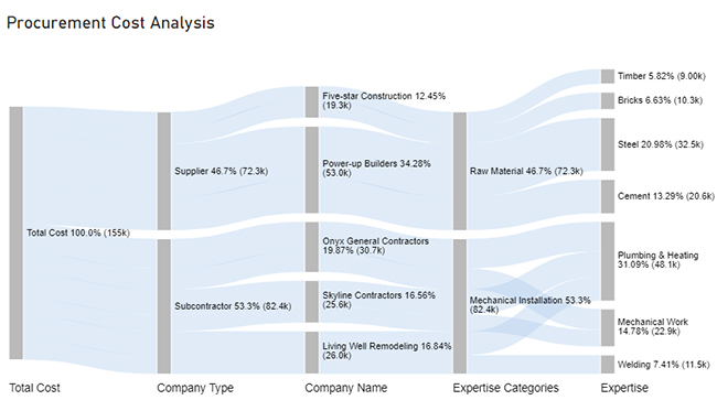
Now, let’s explore the steps of creating advanced Power BI dashboards.

Stage 1: Logging in to Power BI

  • Log in to Power BI.
  • Enter your email. Click the “Submit” button.
Enter email to login to Power BI
  • You are redirected to your Microsoft account.
  • Enter your password and click “Sign in”.
Enter Password to login to Power BI
  • Choose whether to stay signed in.
Click on stay signed in
  • Once done, the Power BI home screen will open.

Stage 2: Creating a Data Set and Selecting the Data Set to Use in Your Sankey Chart

  • Click on the “Create” option on the left-side menu.
  • Select ”Paste or manually enter data“.
select Paste or manually enter data in Power BI
  • We’ll use the following cash flow data for this example.
Total Cost Company Type Company Name Expertise Categories Expertise Cost
Total Cost Subcontractor Skyline Contractors Mechanical Installation Plumbing & Heating 15456
Total Cost Subcontractor Skyline Contractors Mechanical Installation Mechanical Work 10159
Total Cost Subcontractor Onyx General Contractors Mechanical Installation Plumbing & Heating 18045
Total Cost Subcontractor Onyx General Contractors Mechanical Installation Mechanical Work 12695
Total Cost Subcontractor Living Well Remodeling Mechanical Installation Plumbing & Heating 14589
Total Cost Subcontractor Living Well Remodeling Mechanical Installation Welding 11456
Total Cost Supplier Power-up Builders Raw Material Cement 20561
Total Cost Supplier Power-up Builders Raw Material Steel 32456
Total Cost Supplier Five-star Construction Raw Material Bricks 10253
Total Cost Supplier Five-star Construction Raw Material Timber 9000
  • Paste the above data table into the “Power Query” window.
  • Select the “Create a dataset only” option.
Create Dataset in Power BI ce341
  • Click on the “Data Hub” option on the left-side menu.
  • Power BI populates the data set list. (If you have not created a data set, refer to the Error! Reference source not found section.)
Click on Data Hub
  • Choose the data set you want to use to create your Sankey diagram.
  • Power BI populates the screen as shown below:
Workspace in Power BI
  • The data set and its fields are shown on the right side. The middle area shows report and data set options.
  • Click on the “Create a report” dropdown.
  • Select “Start from scratch“.
  • You should see the Report Canvas screen as shown below:
Create Report and start from scratch

Stage 3: Adding the Power BI Sankey Diagram Extension by ChartExpo

  • Creating the Sankey Diagram requires us to use an add-in or Power BI visual from AppSource.
  • Navigate to the right side of the Power BI dashboard.
  • Open the Power BI Visualizations panel.
  • Click the ellipsis symbol (…) as highlighted in the diagram below. This will import the Power BI Sankey Diagram extension by ChartExpo.
Report Canvas screen in Power BI
  • The following menu opens:
  • Select the “Get more visuals” option.
  • The following window opens:
click on to get more visuals
  • Enter “Sankey Diagram for Power BI by ChartExpo” in the highlighted search box.
  • You should see the “Sankey Diagram for Power BI by ChartExpo” as shown in the image below.
Sankey Diagram for Power BI by ChartExpo
  • Click the highlighted “Add” button.
Click the Add button
  • Power BI will add the “Sankey Diagram for Power BI by ChartExpo” icon in the visualization panel.
Click on Sankey Diagram Icon

Stage 4: Drawing a Sankey Diagram with ChartExpo’s Power BI extension

  • Select the “Sankey Diagram for Power BI by ChartExpo” icon in the visualization panel.
  • The following window opens in the report section of your dashboard:
Report Section in Dashboard
  • You can resize the visual as needed.
  • Navigate to the right side of your Power BI dashboard.
  • You should see “Fields” next to “Visualizations.”
Fields next to visualizations
  • You’ll select the fields to use in your Sankey chart here.
  • The ChartExpo visual needs to be selected, though. Select the fields in the following sequence:
    • Total Cost
    • Company Type
    • Company Name
    • Expertise Categories
    • Expertise
    • Cost
Select fields for Sankey diagram
  • You’ll be asked for a ChartExpo license key or email address.
enter email for ChartExpo license

Stage 5: Activate your ChartExpo Trial or Apply a Subscription Key

  • Select the ChartExpo visual. You should see three icons below “Build Visual” in the Visualizations panel.
Build visual panel in Power BI
  • Select the middle icon, “Format visual.”
  • The visual properties will be populated as shown below.
visual properties in Power BI
  • If you are a new user,
    • Type in your email under the section titled “Trial Mode”.
    • This should be the email address that you used to subscribe to the ChartExpo add-in. It is where your ChartExpo license key will be sent.
    • Ensure that your email address is valid.
    • Click “Enable Trial“. You’ll get a 7-day trial.
enter email id
  • You should receive a welcome email from ChartExpo.
  • The Sankey Diagram you create under the 7-day trial contains the ChartExpo watermark (see below).
power bi advanced ce341 1
  • If you have obtained a license key:
    • Enter your license key in the “ChartExpo License Key” textbox in the “License Settings” section (see below).
    • Slide the toggle switch next to “Enable License” to “On“.
enter license key
  • Your Sankey diagram should now be ready (see below). Note that it does not have a watermark.
power bi advanced ce341 2
  • Let’s add a Prefix (such as a $ sign) with the numeric values in the chart.
  • Expand the “Stats” properties and include the Prefix value.
power bi advanced ce341 3
  • Let’s add colors to each node. Expand the “Level Colors” properties and select the colors.
coloring Sankey diagram
  • Automatically all changes will be saved.
final power bi advanced

Insights

  • The total cost of procurement at Level 1 is $155K.
  • At Level 2, out of the $155K cost, $72.3K was spent on suppliers (46.7%), and $82.4K was spent on subcontractors (53.3%).
  • At Level 3;
    • Out of the $72.3K supplier cost;
      • $53.0K was spent on Power-up Builder.
      • $19.3K was spent on Five-star construction.
    • From the $82.4K subcontractor price;
      • $25.6K was spent on Skyline Contactors.
      • $30.7K was spent on Onyx General Contractors.
      • $26.0K was spent on Living Well Remodeling.
    • At Level 4, the suppliers’ companies provided raw materials for procurement, which cost $72.3K. The companies providing Mechanical Installations cost around $82.4K.
    • Out of the $72.3K raw material cost;
      • $20.6K was spent on cement.
      • $32.5K was spent on steel.
      • $10.3K was spent on bricks.
      • $9K was spent on timber.
    • From the $82.4K mechanical installation cost;
      • $48.1K was spent on Plumbing and Heating.
      • $22.9K was spent on Mechanical Work.
      • $11.5K was spent on Welding.

FAQs:

What is advanced analytics in Power BI?

Power BI advanced analytics refers to the advanced analytical features and capabilities within the Power BI platform. These features enable you to go beyond basic data visualization and uncover hidden insights in your data.

What is the most powerful feature of Power BI?

The most powerful PBI feature is its ability to seamlessly connect and integrate data from various sources. This enables consolidation, transformation, and analysis in a unified, interactive environment for comprehensive insights and reporting.

How can Power BI advanced analytics help businesses?

Power BI advanced analytics provide businesses with deeper insights into their data. This enables the identification of trends, patterns, and correlations that drive better decision-making. It empowers businesses to perform forecasting, predictive analytics, and complex data modeling. Consequently, optimize operations and gain a competitive edge.

Wrap Up

Power BI advanced analytics revolutionizes how businesses uncover hidden insights within their data. Going beyond basic reporting allows you to delve deeper to identify complex patterns, trends, and correlations.

This deeper understanding leads to more informed decision-making and strategic planning, ultimately driving business growth.

Power BI provides seamless integration and consolidation of data from multiple sources. As a result, it provides a comprehensive view of the business landscape.

Power BI advanced analytics also offers iterative analysis capabilities. This enables you to refine your analysis based on feedback and new insights continuously. Moreover, it fosters a culture of continuous improvement, driving you to extract the most valuable insights.

Furthermore, the visualizations and reporting capabilities enable you to present your findings compellingly and understandably. Interactive dashboards, charts, and reports facilitate data-driven storytelling. Consequently, allowing the stakeholders to gain a clear understanding of the insights derived from the data.

Conclusively, leveraging the power of advanced analytics and ChartExpo informs decisions that drive success.

Do not hesitate the adventure awaits.

How much did you enjoy this article?

PBIAd2
Start Free Trial!
127266

Related articles

next previous
Power BI12 min read

Power BI Group By Guide for Effective Data Insights

Learn how Power BI Group By helps you aggregate data, clarify trends, and create reports by grouping values to make large datasets manageable & insightful.

Power BI12 min read

How to Create Sankey Diagram in Microsoft Power BI?

Learn How to Create Sankey Diagram in Microsoft Power BI using Desktop & Web Service. What they are and how to use them effectively.

Power BI8 min read

Power BI Artificial Intelligence: Insights Using Visuals

Discover all there is to know about the Power BI artificial intelligence. You'll also discover how AI is used in Power BI, and how to use it for analysis and more.

Power BI9 min read

Budgeting in Healthcare: Use Visuals to Spot Budget Gaps

This guide helps you discover what budgeting in healthcare is. You'll also discover the factors that affect hospital budgets and types of budgeting in healthcare.

Power BI9 min read

Predictive Analytics in Power BI for Making Insightful Visuals

This guide shows you everything you need to know about Predictive Analytics in Power BI. It also shows you how it works, and how to interpret the results.

ChartExpo logo

Turn Data into Visual
Stories

CHARTEXPO

  • Home
  • Gallery
  • Videos
  • Services
  • Pricing
  • Contact us
  • FAQs
  • Privacy policy
  • Terms of Service
  • Sitemap

TOOLS

  • ChartExpo for Google Sheets
  • ChartExpo for Microsoft Excel
  • Power BI Custom Visuals by ChartExpo
  • Word Cloud

CATEGORIES

  • Bar Charts
  • Circle Graphs
  • Column Charts
  • Combo Charts
  • Comparison Charts
  • Line Graphs
  • PPC Charts
  • Sentiment Analysis Charts
  • Survey Charts

TOP CHARTS

  • Sankey Diagram
  • Likert Scale Chart
  • Comparison Bar Chart
  • Pareto Chart
  • Funnel Chart
  • Gauge Chart
  • Radar Chart
  • Radial Bar Chart
  • Sunburst Chart
  • see more
  • Scatter Plot Chart
  • CSAT Survey Bar Chart
  • CSAT Survey Chart
  • Dot Plot Chart
  • Double Bar Graph
  • Matrix Chart
  • Multi Axis Line Chart
  • Overlapping Bar Chart
  • Control Chart
  • Slope Chart
  • Clustered Bar Chart
  • Clustered Column Chart
  • Box and Whisker Plot
  • Tornado Chart
  • Waterfall Chart
  • Word Cloud
  • see less

RESOURCES

  • Blog
  • Resources
  • YouTube
SIGN UP FOR UPDATES

We wouldn't dream of spamming you or selling your info.

© 2025 ChartExpo, all rights reserved.