Categories
What is an airline customer dashboard?
Imagine this: You fly often and recently made reservations for your next journey. You’re enthusiastic, yet there’s still that ongoing uncertainty will your flight go smoothly? Or will you encounter unexpected turbulence?


Picture all your flight details, from checking in to reaching your destination, neatly arranged in one user-friendly interface. This is the purpose of the airline customer dashboard. It is more than just a luxurious instrument; it is your gateway to efficient aviation.
78% of air travelers favor using digital platforms for self-service features, such as accessing flight details and resolving problems.
But what makes an airline customer dashboard truly effective? It’s not only about impressive visuals or extra features. It’s all about providing genuine value to you, the traveler. This dashboard acts as a dependable co-pilot, providing seamless itinerary management and immediate gate change updates for a stress-free journey.
This blog post will explore the essential elements that transform an airline customer dashboard into a game-changer.
Fasten your seatbelt let’s explore airline customer dashboards.
First…
Definition: An airline customer dashboard is a digital platform or interface. It provides airline passengers with real-time information and services related to their travel experience. It allows passengers to manage various aspects of their journey conveniently.
These dashboards typically offer features such as flight booking, check-in, seat selection, and baggage tracking. Passengers can access their flight itinerary, including departure and arrival times, gate information, and any updates. Or changes to their flight status.
Additionally, airline customer dashboards may provide services like in-flight entertainment options, onboard amenities, and meal preferences.
Overall, an airline customer dashboard aims to enhance the passenger experience. How? By providing easy access to essential travel information and services, ensuring a smoother and more enjoyable journey.
An airline customer dashboard is essential for enhancing the overall passenger experience and optimizing airline operations. Several key reasons underscore the importance of having such a dashboard.
This convenience enhances the overall travel experience, leading to greater satisfaction among passengers.
An effective airline consumer dashboard is characterized by several key features that cater to the diverse needs of passengers. These features streamline the travel process, provide essential information, and offer personalized services.
Creating an aviation customer service dashboard requires careful planning and consideration to meet the diverse needs of passengers. Following a structured approach ensures the dashboard for airline travelers effectively enhances the overall customer experience.
Monitoring key performance indicators (KPIs) is essential for assessing the effectiveness and efficiency of an airline dashboard. These KPIs provide valuable insights into various airline operations and aspects of passenger experience.
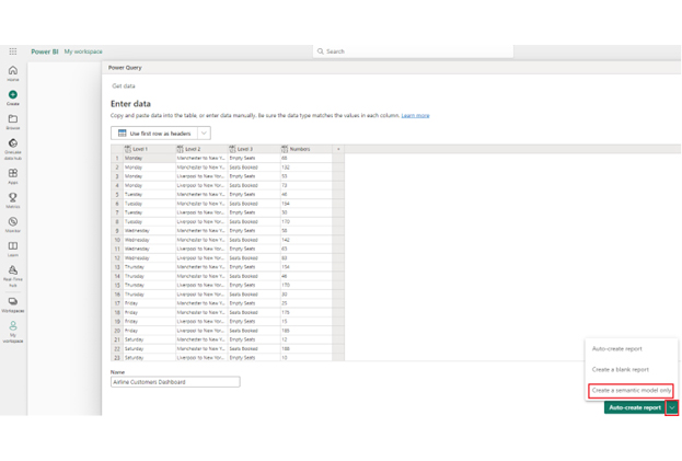
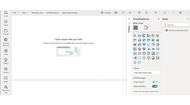
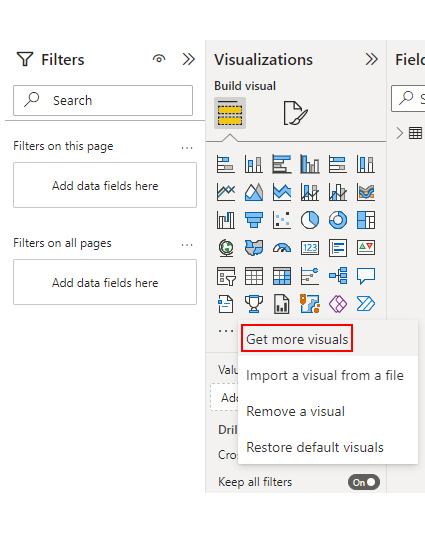
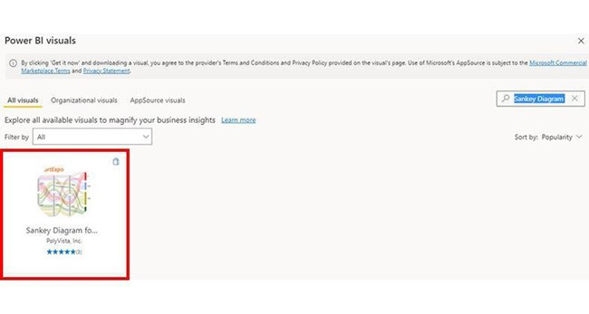
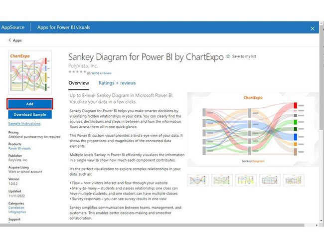
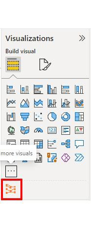
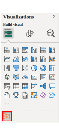
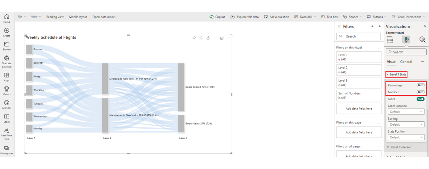
Follow these steps to harness the robust features of Power BI visualization, including the Sankey diagram in Power BI, for effective data analysis.


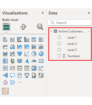
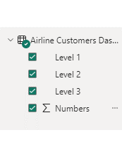
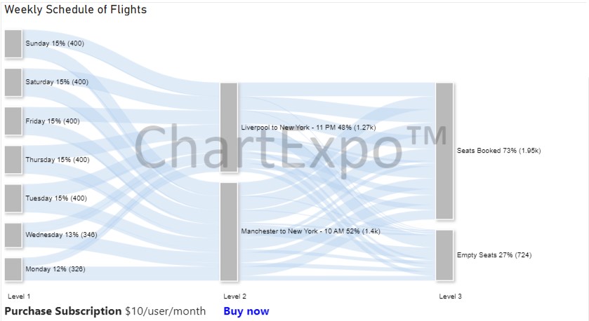
| Level 1 | Level 2 | Level 3 | Numbers |
| Monday | Manchester to New York – 10 AM | Empty Seats | 68 |
| Monday | Manchester to New York – 10 AM | Seats Booked | 132 |
| Monday | Liverpool to New York – 11 PM | Empty Seats | 53 |
| Monday | Liverpool to New York – 11 PM | Seats Booked | 73 |
| Tuesday | Manchester to New York – 10 AM | Empty Seats | 46 |
| Tuesday | Manchester to New York – 10 AM | Seats Booked | 154 |
| Tuesday | Liverpool to New York – 11 PM | Empty Seats | 30 |
| Tuesday | Liverpool to New York – 11 PM | Seats Booked | 170 |
| Wednesday | Manchester to New York – 10 AM | Empty Seats | 58 |
| Wednesday | Manchester to New York – 10 AM | Seats Booked | 142 |
| Wednesday | Liverpool to New York – 11 PM | Empty Seats | 63 |
| Wednesday | Liverpool to New York – 11 PM | Seats Booked | 83 |
| Thursday | Manchester to New York – 10 AM | Empty Seats | 154 |
| Thursday | Manchester to New York – 10 AM | Seats Booked | 46 |
| Thursday | Liverpool to New York – 11 PM | Empty Seats | 170 |
| Thursday | Liverpool to New York – 11 PM | Seats Booked | 30 |
| Friday | Manchester to New York – 10 AM | Empty Seats | 25 |
| Friday | Manchester to New York – 10 AM | Seats Booked | 175 |
| Friday | Liverpool to New York – 11 PM | Empty Seats | 15 |
| Friday | Liverpool to New York – 11 PM | Seats Booked | 185 |
| Saturday | Manchester to New York – 10 AM | Empty Seats | 12 |
| Saturday | Manchester to New York – 10 AM | Seats Booked | 188 |
| Saturday | Liverpool to New York – 11 PM | Empty Seats | 10 |
| Saturday | Liverpool to New York – 11 PM | Seats Booked | 190 |
| Sunday | Manchester to New York – 10 AM | Empty Seats | 15 |
| Sunday | Manchester to New York – 10 AM | Seats Booked | 185 |
| Sunday | Liverpool to New York – 11 PM | Empty Seats | 5 |
| Sunday | Liverpool to New York – 11 PM | Seats Booked | 195 |
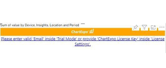
To begin using ChartExpo as a new user;
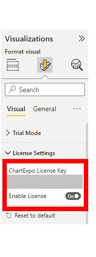
If you have obtained a license key:
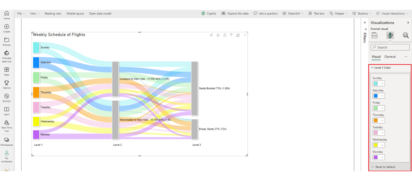
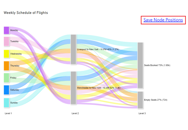
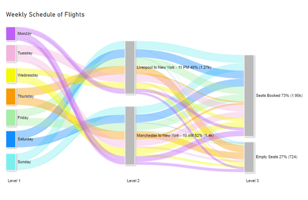
The Sankey Diagram shows information on flights from Manchester and Liverpool to New York at specific times throughout the week, detailing the number of empty seats and booked seats. Here are some insights from the data using a Sankey diagram generator:
The key features of an effective airline customer dashboard are essential to providing passengers with a seamless and convenient travel experience. These features cater to various needs and preferences, ensuring that passengers can easily access critical information and services.
Booking and reservation management functionality allows passengers to search for flights, compare prices, and make bookings. This streamlines the booking process and enhances convenience for travelers.
Flight status and updates provide passengers with real-time information on flight schedules, delays, gate changes, and other important updates. This helps passengers stay informed and prepared throughout their journey.
Check-in and boarding pass features enable passengers to check in online and access electronic boarding passes. This reduces waiting times at the airport and enhances efficiency for both passengers and airline staff.
Baggage information features offer clear information on baggage allowances, restrictions, and tracking capabilities. Passengers can easily manage their luggage and track their belongings throughout their journey.
Travel documents and itinerary features allow passengers to access important travel documents such as e-tickets, boarding passes, and itinerary details. This ensures passengers have all the necessary information at their fingertips for a smooth and hassle-free travel experience.
In conclusion, an effective airline customer dashboard plays a crucial role in enhancing passengers’ overall travel experience. The features help streamline the travel process and improve customer satisfaction.
How much did you enjoy this article?


Discover diverse and high-quality Power BI report examples for inspiration and insights. Elevate your reporting with strategic visualization techniques.

A Customer Relationship Management Dashboard centralizes data, tracks key metrics, and drives smarter business decisions. Discover now!

Explore Healthcare Dashboard Examples and learn how to turn complex healthcare data into clear, actionable insights for better decision-making.


