Categories
Can data tell a story? Can it captivate an audience and convey a powerful message? The answer lies in the art of Power BI dashboard design. Power BI offers a powerful platform for data visualization, turning raw data into meaningful stories.


The art of storytelling with Power BI dashboard design goes beyond mere data representation. It involves crafting a narrative that engages and informs stakeholders.
Think of Power BI dashboards as your canvas and the data as your paint. With a stroke of creativity and an eye for detail, you can transform raw numbers into captivating stories.
But, like any art form, there’s a delicate balance between aesthetics and functionality. It’s about finding that sweet spot where design elements enhance comprehension without overwhelming the message.
Get ready to dazzle, inspire, and amaze as you reveal the hidden stories waiting to be told. This guide shows you how to compose narratives that captivate your audience, leaving them yearning for more.
Definition: Power BI dashboard design refers to creating appealing and informative data visualizations using Microsoft’s Power BI platform. It involves selecting the correct data, organizing it effectively, and designing visualizations to present insights clearly and engagingly. The goal is to make complex data easy to understand and enable users to gain valuable insights quickly.
A beautiful Power BI dashboard design holds immense importance in data analytics and business intelligence. Here are some key reasons why investing time and effort into crafting visually appealing dashboards is crucial:
Visualizations, like diagrams, charts, and KPI cards, are crucial parts. These tiles convey bits of knowledge in an outwardly engaging and straightforward way, giving a depiction of key measurements, often reflected in healthcare dashboard examples where clear and quick insights are critical for decision-making.
Filters allow users to interact with the data dynamically. Consolidating slicers, date pickers, or other channel choices empowers clients to alter the view, zeroing in on unambiguous information subsets or periods.
KPIs give a compact synopsis of key metrics and performance indicators. These can be represented through scorecards or cards, offering at-a-glance insights into the health of the business. Using a KPI visual in Power BI makes these insights even clearer and easier to track.
Effective navigation features and drill-down capabilities enhance the user experience. Users should be able to explore deeper levels of detail or move between different sections of the dashboard seamlessly.
A visually appealing design with consistent branding elements contributes to a professional and engaging dashboard. Logos, color schemes, and well-chosen themes ensure a cohesive look aligned with organizational identity.
Made for chiefs, the Executive dashboard design configuration offers a complete outline of hierarchical execution. It presents key measurements, monetary synopses, and basic KPIs in a natural and outwardly engaging way, empowering leaders to make informed choices initially.

Made for bosses, the Marketing Agency dashboard design offers a total blueprint of various levels of execution. It presents key estimations, financial summaries, and essential KPIs in a characteristic and ostensibly captivating manner, enabling trailblazers to initially seek informed decisions.

Equipped towards Client Relationship The board (CRM), CRM Dashboard design configuration fits client information, deals pipelines, and backing collaborations. It reinforces associations with bits of knowledge into client procurement and fulfillment, cultivating a concentrated perspective on client-related data.
Empowering sales teams, this sales dashboard design provides comprehensive insights into sales performance. It tracks sales by region, product performance, and real-time sales tracking, guiding teams to achieve and exceed sales targets.
Taking special care of monetary experts, the Finance dashboard design configuration offers a smooth point of interaction to easily explore complex monetary information. Picture spending plan designations, track consumptions, and gain real-time insights into financial performance through interactive charts, graphs, and a comprehensive 3-statement financial model.

These Power BI dashboard design plans are decisively created to meet the particular requirements of their individual spaces, giving significant experiences and encouraging information-driven independent direction.
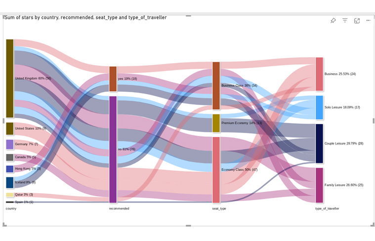
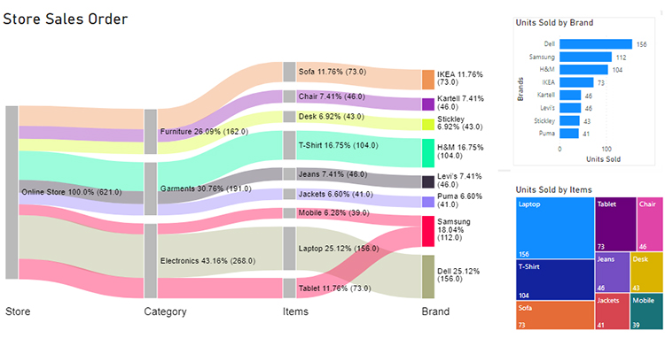
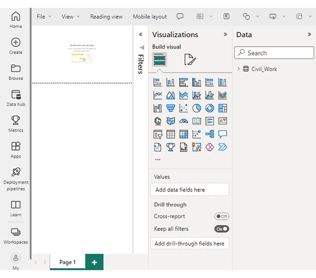
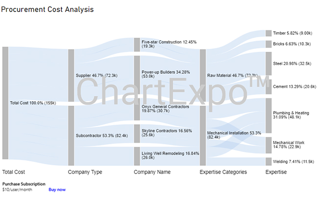
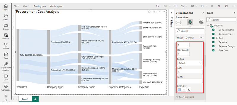
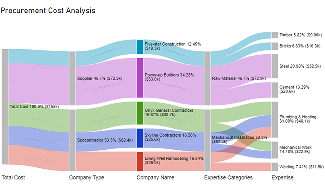
You can enhance your Power BI dashboard design by adding a Sankey chart to clearly visualize the flow of data between categories.


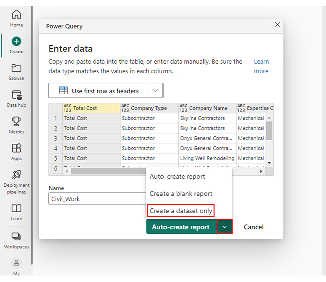
| Total Cost | Company Type | Company Name | Expertise Categories | Expertise | Cost |
| Total Cost | Subcontractor | Skyline Contractors | Mechanical Installation | Plumbing & Heating | 15456 |
| Total Cost | Subcontractor | Skyline Contractors | Mechanical Installation | Mechanical Work | 10159 |
| Total Cost | Subcontractor | Onyx General Contractors | Mechanical Installation | Plumbing & Heating | 18045 |
| Total Cost | Subcontractor | Onyx General Contractors | Mechanical Installation | Mechanical Work | 12695 |
| Total Cost | Subcontractor | Living Well Remodeling | Mechanical Installation | Plumbing & Heating | 14589 |
| Total Cost | Subcontractor | Living Well Remodeling | Mechanical Installation | Welding | 11456 |
| Total Cost | Supplier | Power-up Builders | Raw Material | Cement | 20561 |
| Total Cost | Supplier | Power-up Builders | Raw Material | Steel | 32456 |
| Total Cost | Supplier | Five-star Construction | Raw Material | Bricks | 10253 |
| Total Cost | Supplier | Five-star Construction | Raw Material | Timber | 9000 |


Clearly define the purpose and objectives of your Power BI dashboard design. Understand the specific insights users are seeking to ensure the dashboard meets their needs.
Focus on key performance indicators (KPIs) dashboard and prioritize essential metrics. Avoid clutter by emphasizing the most critical information for quick and efficient decision-making.
Establish a clear visual hierarchy to guide users’ attention. Maintain consistency in colors, fonts, and design elements to create a cohesive and professional look.
Choose visualizations that effectively represent the data and support the narrative. Select the right chart types to enhance understanding and interpretation of information, such as those that illustrate cost of living comparisons by city.
Implement interactive elements such as slicers, filters, and drill-throughs to engage users. Allow them to explore and analyze data dynamically for a more personalized experience.
Ensure your Power BI dashboard design is responsive, adapting to various screen sizes and devices. This enhances accessibility and usability for a diverse user base.
Regularly review and update your PBI dashboard design to reflect changing business requirements. Address issues, update data sources, including the Power BI connector, and incorporate user feedback for continuous improvement.
These best practices will help you create PBI dashboards that are user-friendly, visually compelling, and provide meaningful insights for effective decision-making, especially when comparing Looker vs Power BI.
The number of visuals on a Power BI dashboard can vary based on data complexity and objectives. However, keeping the number of visuals between 6 to 12 is generally recommended to avoid overwhelming users.
To make your Power BI dashboard look good:
A good Power BI dashboard design should be easy to use, with a logical flow and clear navigation.
It should also have clear section headings, labels, and descriptions. In addition, displays accurate and up-to-date data with automated data refreshes.
Overall, a good Power BI dashboard design should prioritize functionality and user experience to ensure maximum impact and value.
There are common pitfalls when designing Power BI dashboards. They include
Power BI dashboard design is more than assembling charts and graphs; it’s the art of storytelling through data.
Adhering to the principles of clear objectives, simplicity, and visual hierarchy helps you transform data into captivating narratives. Each chart, graph, or table should contribute to the overall narrative. Guiding the viewer through the data and highlighting key insights.
A beautifully designed BI dashboard engages users, conveys complex insights effectively, and fosters data-driven cultures within organizations. Like artists carefully craft each brushstroke, a well-crafted dashboard requires thoughtful consideration of data, audience, and design elements.
The digital era continues to embrace data as its greatest asset. Therefore, mastering the art of Power BI dashboard design becomes an indispensable skill. Embrace this art; you will wield the power to enlighten, inform, and inspire with data stories.
Let ChartExpo be the brush that paints a story that captivates and informs like never before.
How much did you enjoy this article?


Discover diverse and high-quality Power BI report examples for inspiration and insights. Elevate your reporting with strategic visualization techniques.

A Customer Relationship Management Dashboard centralizes data, tracks key metrics, and drives smarter business decisions. Discover now!

Explore Healthcare Dashboard Examples and learn how to turn complex healthcare data into clear, actionable insights for better decision-making.


