Categories
Businesses that thrive today consistently do so by understanding their customers at every stage of the relationship.
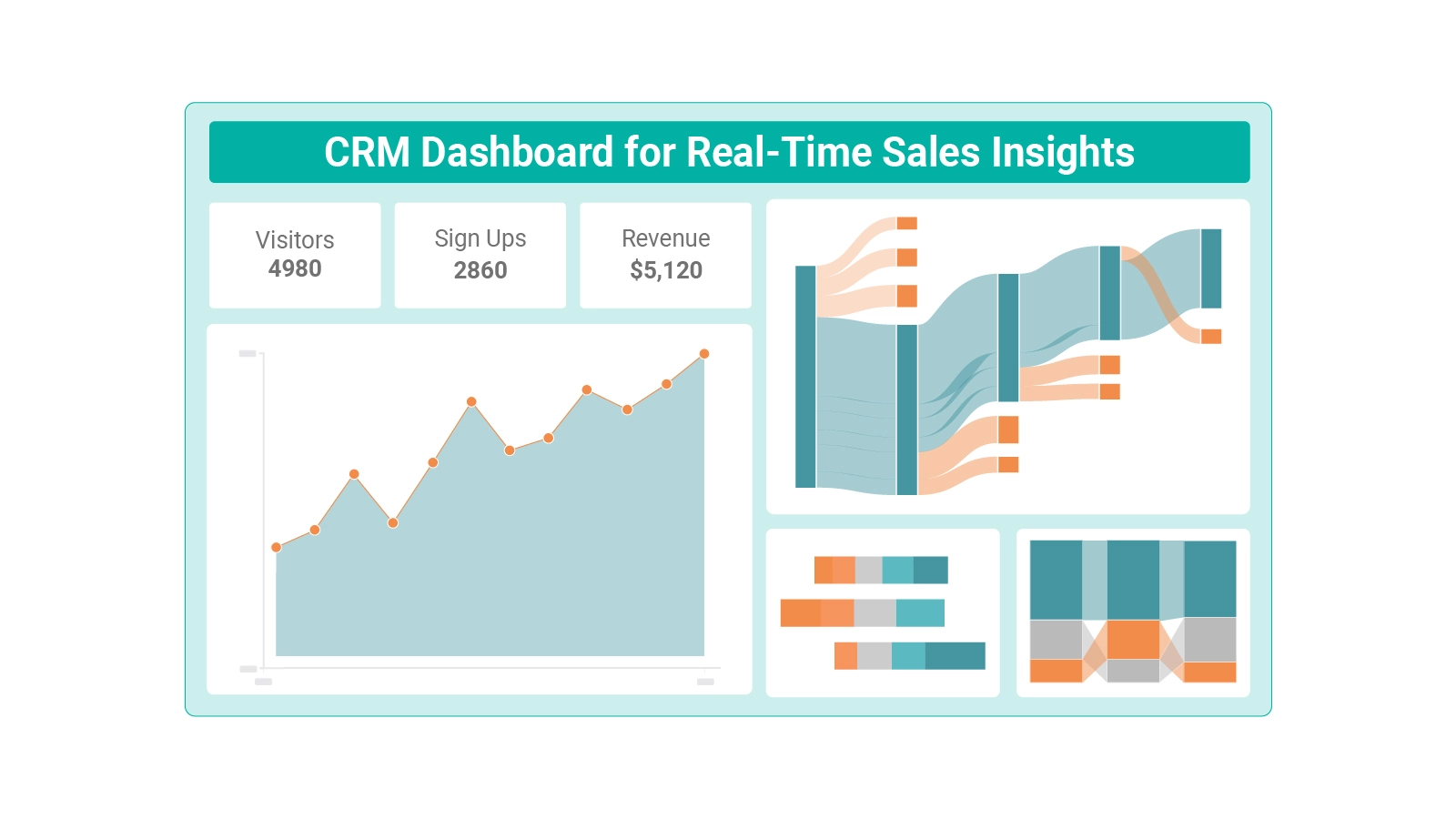
A Customer Relationship Management Dashboard puts that understanding at your fingertips, consolidating sales data, customer interactions, and performance metrics into a single, actionable view.
This blog covers what a Customer Relationship Management Dashboard does, the key metrics it should track, how it works in practice, and a step-by-step approach to analyzing one in Power BI.
Whether you are building your first dashboard or improving an existing setup, you will find clear, practical guidance to sharpen decisions and strengthen customer outcomes across every stage.
Definition: A Customer Relationship Management Dashboard is a centralized visual platform that brings together customer data, sales performance figures, and business activity records in one interface. Teams use it to monitor trends, evaluate KPI progress, and act on real-time signals.
When teams adopt a Customer Relationship Management Dashboard, raw data becomes a structured picture of customer behavior, pipeline health, and revenue trajectory.
From managing incoming leads to analyzing long-term engagement patterns, this tool converts complex information into clear, strategic guidance that teams can act on immediately.
Its value extends beyond simple data storage. A well-built system transforms scattered information into structured insights that guide every team toward better performance and faster responses.
Comparing these insights against a customer experience dashboard gives businesses a richer understanding of satisfaction trends alongside their core CRM data.
A well-designed customer relationship management dashboard includes several foundational elements that give teams a complete picture of business activity and customer behavior.
These same elements appear across the business dashboard, where multiple performance indicators are layered together for a broad operational view.
Selecting the right metrics for your customer relationship dashboard determines whether it delivers genuine intelligence or just surface-level numbers.
Many organizations pair these metrics with data from an accounts dashboard to draw a direct line between customer performance and financial results.
A customer relationship dashboard operates through a continuous cycle of data gathering, processing, and visual output that keeps teams informed in real time.
In advanced configurations, CRM data connects with systems such as an inventory dashboard, so customer demand patterns align directly with stock availability.
Different versions of a customer relationship dashboard are built to serve specific business functions, from daily operations to long-term planning.
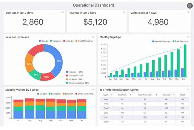
Operational dashboards surface real-time data on daily business activities, including sign-ups, revenue flow, customer interactions, and support volume. Teams use them to stay responsive and keep operations on track as conditions shift.
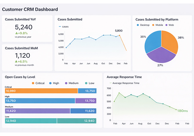
Analytical dashboards present historical case data, platform usage distribution, and response performance over time. They reveal behavioral patterns that support data-driven decisions across sales and service teams.
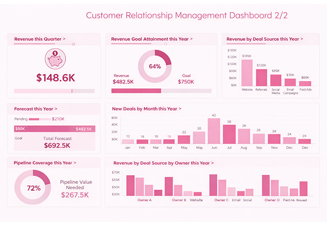
Strategic dashboards display revenue targets, deal origin breakdowns, and pipeline coverage metrics at a high level. Executives rely on them to guide long-term planning and assess overall business trajectory.
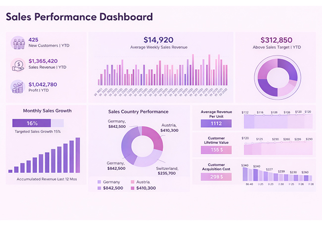
Sales performance dashboards aggregate revenue figures, growth rates, customer acquisition data, and regional breakdowns in a single view. They give sales leaders the visibility needed to fine-tune strategy and measure progress toward targets.
Leadership teams frequently layer these insights alongside the executive dashboard to inform strategic direction and high-level planning.
Reviewing real-world CRM Dashboard Examples shows how organizations apply dashboards to specific business challenges.
A sales pipeline dashboard maps how revenue, geographic regions, acquisition channels, and deal stages interact across the sales process.
It shows the path opportunities travel from initial contact to closed deals, with visibility into where conversions stall. For teams using a Power BI sales dashboard, this same pipeline view enables real-time tracking of deals and revenue performance.
Example Insight: Highlights conversion flow bottlenecks and performance gaps so sales teams can adjust strategy and improve deal closure rates.
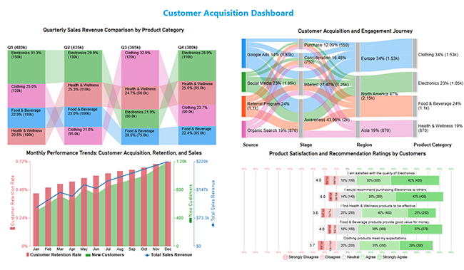
A customer acquisition dashboard illustrates how different channels, journey stages, and product categories connect to drive new customer conversions. It maps the full acquisition path and highlights where drop-offs occur.
Example Insight: Reveals conversion gaps and surfaces customer feedback patterns to sharpen both acquisition targeting and retention approaches.
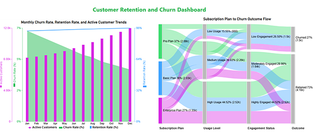
A customer retention dashboard tracks how subscription plans, usage frequency, and engagement levels affect churn and retention rates over time. It presents a longitudinal view of loyalty trends and at-risk segments.
Example Insight: Pinpoints churn drivers and engagement gaps so teams can take targeted action to strengthen customer retention strategies.
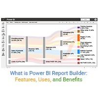
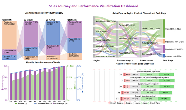
The following guide walks through how to analyze a CRM Dashboard in Power BI using Sankey Charts, Multi-Axis Line Charts, Comparison Bar Charts, and Likert Charts.
Structure your dataset with relevant CRM fields such as customer sources, sales revenue, time (monthly/quarterly), product categories, and customer feedback scores.
Tip: Ensure data is clean, consistent, and free from missing values to avoid incorrect insights.
Use a Sankey chart to understand how customers move through stages.
This helps identify which channels generate the most conversions and where customer drop-offs occur in the funnel.
Use a multi-axis line chart to track monthly performance trends.
This visualization helps compare growth patterns and understand how customer acquisition impacts revenue over time.
Use a comparison bar chart to analyze quarterly sales across product categories.
This allows you to identify top-performing categories and seasonal variations in sales.
Use a Likert chart to analyze customer feedback and sentiment.
This helps evaluate customer perception and identify areas for product or service improvement.
Analyze all visuals together to get a complete view of:
This integrated analysis helps businesses make data-driven decisions and improve overall strategy.
Applying solid Power BI dashboard design principles throughout this process keeps your dashboard clear, interactive, and straightforward to interpret. For advanced visuals such as Sankey and Likert Charts, third-party tools can extend Power BI’s built-in capabilities and improve analytical depth.

Adopting a Customer Relationship Management Dashboard delivers measurable advantages that lift both business performance and the quality of customer engagement.
Organizations frequently connect CRM insights with data from a fleet management dashboard to align operational efficiency with customer-facing performance.
Building an effective customer relationship dashboard starts with intentional design decisions that keep the tool focused and actionable.
Applying these principles produces a dashboard that stays useful as the business grows, consistent with the usability standards seen in a human resource dashboard, where clear design is a core requirement.
Start by defining your goals and selecting the KPIs that reflect them. Gather and clean your CRM data, then use a visualization tool to build charts and indicators that surface actionable insights. Keep the layout straightforward so users can interpret results quickly.
Yes, Power BI supports CRM-style dashboard builds by pulling data from multiple connected sources. While it does not replace a dedicated CRM platform, it excels at visualization, trend analysis, and performance reporting.
Yes, a customer relationship dashboard can be adapted to suit your specific needs. You can modify the layout, apply filters, and design visuals around the metrics that matter most to your team.
A Customer Relationship Management Dashboard is no longer an optional tool for data-driven teams. It is a core operational asset that turns scattered customer and sales information into clear, visual guidance everyone can act on.
When built with purpose and maintained consistently, it reduces guesswork, sharpens team alignment, and keeps focus on the customers who drive growth.
Success comes down to commitment: relevant KPIs, timely data refreshes, and a layout that people actually open and use every day. Teams that sustain this discipline gain a durable advantage in understanding their customers and outpacing competitors who still rely on instinct alone.
How much did you enjoy this article?


Discover diverse and high-quality Power BI report examples for inspiration and insights. Elevate your reporting with strategic visualization techniques.

Explore Healthcare Dashboard Examples and learn how to turn complex healthcare data into clear, actionable insights for better decision-making.

Power BI Copilot converts natural language into instant reports, dashboards, and data insights for teams at every level. Read on to learn more!