• Home
  • Tools dropdown img
    • Spreadsheet Charts

      • ChartExpo for Google Sheets
      • ChartExpo for Microsoft Excel
    • Power BI Charts

      • Power BI Custom Visuals by ChartExpo
    • Word Cloud

  • Charts dropdown img
    • Chart Category

      • Bar Charts
      • Circle Graphs
      • Column Charts
      • Combo Charts
      • Comparison Charts
      • Line Graphs
      • PPC Charts
      • Sentiment Analysis Charts
      • Survey Charts
    • Chart Type

      • Box and Whisker Plot
      • Clustered Bar Chart
      • Clustered Column Chart
      • Comparison Bar Chart
      • Control Chart
      • CSAT Survey Bar Chart
      • CSAT Survey Chart
      • Dot Plot Chart
      • Double Bar Graph
      • Funnel Chart
      • Gauge Chart
      • Likert Scale Chart
      • Matrix Chart
      • Multi Axis Line Chart
      • Overlapping Bar Chart
      • Pareto Chart
      • Radar Chart
      • Radial Bar Chart
      • Sankey Diagram
      • Scatter Plot Chart
      • Slope Chart
      • Sunburst Chart
      • Tornado Chart
      • Waterfall Chart
      • Word Cloud
    • Google Sheets
      Microsoft Excel
  • Services
  • Pricing
  • Contact us
  • Blog
  • Support dropdown img
      • Gallery
      • Videos
      • Contact us
      • FAQs
      • Resources
    • Please feel free to contact us

      atsupport@chartexpo.com

Categories
All Data Visualizations Data Analytics Surveys
Add-ons/
  • Google Sheets
  • Microsoft Excel
  • Power BI
All Data Visualizations Data Analytics Surveys
Add-ons
  • Google Sheets
  • Microsoft Excel
  • Power BI

We use cookies

This website uses cookies to provide better user experience and user's session management.
By continuing visiting this website you consent the use of these cookies.

Ok

ChartExpo Survey


Home > Blog > Power BI

Conditional Formatting in Power BI for Advanced Analytics

Conditional formatting in Power BI is a feature that allows users to highlight and draw attention to important data trends in their visualizations. By applying color-coded formatting to specific criteria, users (and other stakeholders) can quickly and easily identify patterns and outliers in their data sets.

Conditional Formatting in Power BI

In this guide, you’ll discover the benefits of the Power BI conditional formatting function and how to apply a conditional format in a Power BI matrix/table.

Table of Content:

  1. What is Conditional Formatting in Power BI?
  2. Why Use Power BI Conditional Formatting?
  3. Conditional Formatting Power BI: Common Types
  4. How to Apply Conditional Formatting in Power BI Matrix/Table?
    • Power BI Conditional Formatting Based on Field Value
    • Power BI Conditional Formatting Based on Measure
    • Conditional Formatting in Power BI Using DAX
  5. How to Use Conditional Formatting in Power BI?
  6. How to Interpret Conditional Formatting in Power BI?
  7. How to Remove Power BI Conditional Formatting?
  8. Benefits of Using Power BI Conditional Formatting Function
  9. Top 5 Conditional Formatting Mistakes in Power BI
  10. Tips for Advanced Conditional Formatting in Power BI
  11. Conditional Formatting in Power BI – FAQs
  12. Wrap Up

First…

What is Conditional Formatting in Power BI?

Definition: Conditional formatting in Power BI is a feature that automatically changes the appearance of data—such as background color, font color, icons, or data bars—based on specific rules or conditions. It helps users highlight important values, identify trends, and make reports easier to read and interpret by visually emphasizing key insights.

Why Use Power BI Conditional Formatting?

Power BI conditional formatting makes your reports clearer and more insightful by highlighting key data automatically.

It helps you:

  • Spot trends and outliers quickly using colors, icons, or data bars.
  • Make reports easier to read so users can understand insights at a glance.
  • Support better decisions by drawing attention to important values.
  • Enhance visual appeal and engagement across dashboards.

Conditional Formatting Power BI: Common Types

Power BI provides several types of conditional formatting top 5 are as follows:

  • Background Color

This option changes the background color of cells based on specific values or ranges. It’s useful for showing intensity, such as higher values in darker shades and lower ones in lighter tones.

  • Font Color

Font color formatting changes the text color according to data values. It’s a simple way to emphasize differences without altering the background—perfect for quick comparisons.

  • Data Bars

Data bars display horizontal bars within cells to visually compare numbers. Longer bars represent higher values, making it easy to spot performance levels at a glance.

  • Icons

Icon sets use symbols like arrows, check marks, or warning signs to represent performance or status trends. They help users quickly identify positive or negative results.

  • Web URL Formatting

This feature turns cell values into clickable links that direct users to external reports, dashboards, or related resources, adding interactivity to your visuals.

How to Apply Conditional Formatting in Power BI Matrix/Table?

Here are easy steps to help you apply conditional formatting in Power BI for a matrix (or table):

  • Open the report in Power BI Desktop
  • Create a Table (or Matrix)
  • Select the Column or Data Cell
  • Access the Formatting options
  • Apply Conditional Formatting
  • Choose a Formatting Rule
  • Configure the Rule
  • Define Rules
  • Preview and Apply
  • Repeat for Additional Formatting
  • Save and Publish.

Example

Step-by-Step Guide to adding conditional formatting in Power BI to evaluate data, a Color by Rules:

Select “Rules” in the Format by field of the Background color (or Font color dialogue box to format the cell background (or font color) according to the rules. In the “Based on field” section, select the field on which the formatting is based. The “Summarization” displays the field’s aggregate type.

Enter one or more value ranges and colors for each under Rules. There’s the “If” value condition, a value condition, and a color for each value range. Each value range’s cell backgrounds or fonts are colored with the specified color. Look out for the three rules in the example below:

Percent Column in Affordability Column for Doing Conditional Formatting in Power BI

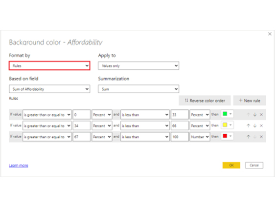
If you choose Percent from the options, the rule boundaries will be specified as a percentage of the whole range of values from lowest to maximum. If the lowest data point was 100 and the highest was 400, the preceding rules would color anything under 200 green, anything between 200 and 300 yellow, and anything over 300 red.

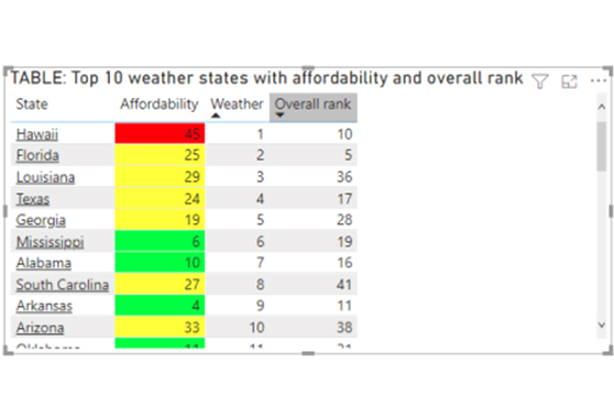
The illustration table below has rules-based background color formatting dependent on the Percent column in the Affordability column:

Look Out for Three Rules in Example Below for Doing Conditional Formatting in Power BI

Power BI Conditional Formatting Based on Field Value

  1. Select your table or matrix visual in Power BI.
  2. In the Values section, click the down arrow next to the field you want to format.
  3. Choose Conditional formatting, then pick a format type (e.g., Background color, Font color, Icons).
  4. Under Format style, select Field value.
  5. Pick the field or measure that contains your color or icon values.
  6. Click OK or Apply to confirm.

Power BI Conditional Formatting Based on Measure

  1. Select your table or matrix visual in Power BI.
  2. In the Values section, click the down arrow next to the field you want to format.
  3. Choose Conditional formatting, then select a format type (like Background color, Font color, or Icons).
  4. Under Format style, pick Field value.
  5. From the dropdown, select the measure that returns a numeric or color value.
  6. Click OK or Apply to see your table update.

Conditional Formatting in Power BI Using DAX

Steps for DAX conditional formatting in Power BI:

  • Create a new measure in Power BI using DAX.
    Example: SalesColor = IF(SUM(Sales[Revenue]) > 50000, “#00FF00”, “#FF0000”)

This formula returns green for values above 50,000 and red for lower ones.
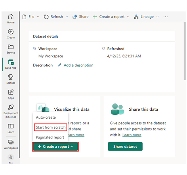
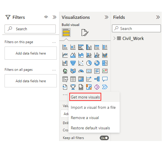
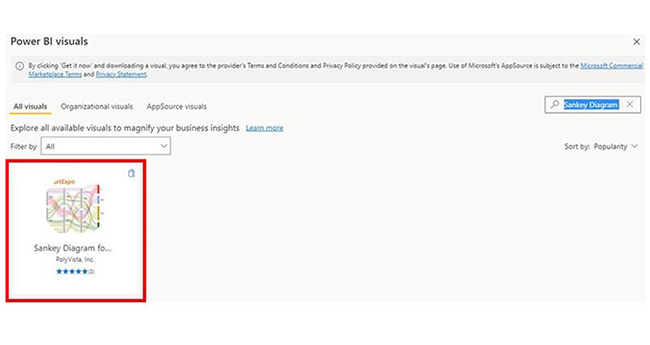
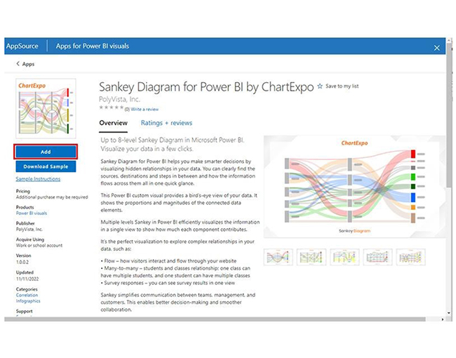
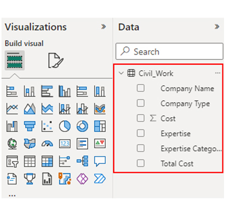
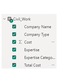
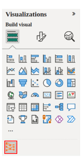
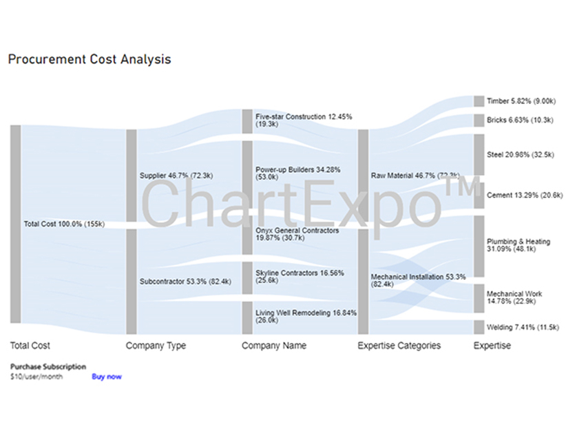
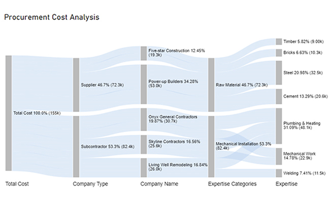
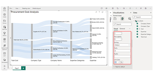
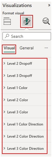
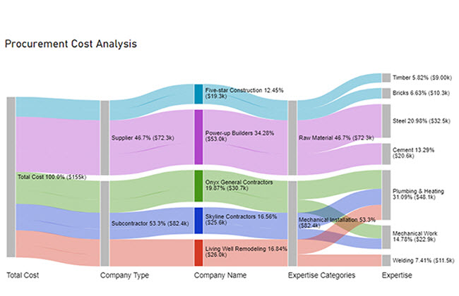
  • Add the measure to your model: It should output a color code or numeric result you’ll use for formatting.
  • Open your table or matrix visual: Click the down arrow beside the field to format.
  • Go to Conditional formatting → Background color (or Font color).
  • Under Format style, choose Field value and select the DAX measure you created.
  • Click OK to apply the rule.

How to Use Conditional Formatting in Power BI?

  1. Select your visual: Choose the table or matrix visual where you want to apply conditional formatting.
  2. Choose a field: In the Visualizations pane, go to the Values section and locate the field you want to format.
  3. Open formatting options: Click the down arrow next to the field name and select Conditional formatting from the menu.
  4. Pick a format type: Choose a formatting style such as Background color, Font color, Data bars, Icons, or Web URL.
  5. Set your formatting logic: Decide whether to format by Color scale, Rules, or Field value, and define your color or value conditions.
  6. Apply changes: Click OK or Apply to confirm and review the results in your visual.

How to Interpret Conditional Formatting in Power BI?

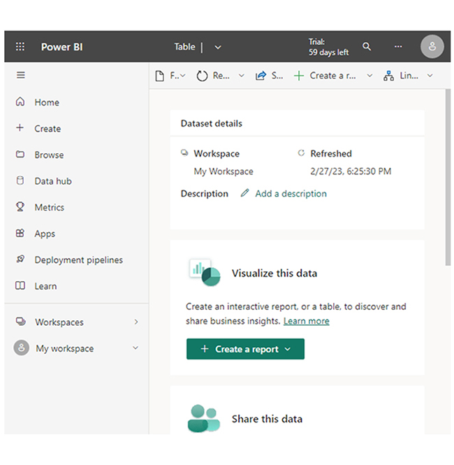
Stage 1: Logging in to Power BI

  • Log in to Power BI.
  • Enter your email address and click the “Submit” button.
Enter email to login to Power BI
  • You are redirected to your Microsoft account.
  • Enter your password and click “Sign in“.
Enter Password to login to Power BI
  • You can choose whether to stay signed in.
Click on stay signed in
  • Once done, the Power BI home screen will open.

Stage 2: Creating a Data Set and Selecting the Data Set to Use in Your Chart

  • Go to the left-side menu and click the “Create” button.
  • Select “Paste or manually enter data“.
select Paste or manually enter data in Power BI ce487
  • We’ll use the sample data below for this example.
Total Cost Company Type Company Name Expertise Categories Expertise Cost
Total Cost Subcontractor Skyline Contractors Mechanical Installation Plumbing & Heating 15456
Total Cost Subcontractor Skyline Contractors Mechanical Installation Mechanical Work 10159
Total Cost Subcontractor Onyx General Contractors Mechanical Installation Plumbing & Heating 18045
Total Cost Subcontractor Onyx General Contractors Mechanical Installation Mechanical Work 12695
Total Cost Subcontractor Living Well Remodeling Mechanical Installation Plumbing & Heating 14589
Total Cost Subcontractor Living Well Remodeling Mechanical Installation Welding 11456
Total Cost Supplier Power-up Builders Raw Material Cement 20561
Total Cost Supplier Power-up Builders Raw Material Steel 32456
Total Cost Supplier Five-star Construction Raw Material Bricks 10253
Total Cost Supplier Five-star Construction Raw Material Timber 9000
  • Paste the data table above into the “Power Query” window. After that, select the “Create a dataset only” option.
Select Create a Dataset Only After Doing Conditional Formatting in Power BI
  • Navigate to the left-side menu, and click on the “Data Hub” option. Power BI will populate the data set list. If no data set has been created, you’ll get an error message.
Click on Data Hub After Doing Conditional Formatting in Power BI
  • Choose the preferred data set to be used in creating the Sankey chart. After that, Power BI will populate the screen as shown below:
Choose Preferred Data Set in Creating Sankey Diagram After Doing Conditional Formatting in Power BI
  • Click on the “Create a report” dropdown, and select “Start from scratch.”
Click Create a Report After Doing Conditional Formatting in Power BI
  • A Report Canvas similar to the one below appears on your screen.
Report Canvas to One Below Appears on Screen After Doing Conditional Formatting in Power BI

Stage 3: Adding the Power BI Sankey Diagram Extension by ChartExpo

  • To create the Sankey Diagram, you’ll need an add-in or Power BI visual from AppSource. Navigate to the right side of the Power BI dashboard and open the Power BI Visualizations panel. Click the ellipsis symbol (…) to import the Power BI Sankey Diagram extension by ChartExpo.
Open Power BI Visualizations Panel After Doing Conditional Formatting in Power BI
  • Select the “Get more visuals” option from the menu that opens.
Select Get More Visuals After Doing Conditional Formatting in Power BI
  • Enter “Sankey Diagram for Power BI by ChartExpo” in the highlighted search box. You’ll see the “Sankey Diagram for Power BI by ChartExpo” as shown in the image below.
Enter Sankey Diagram for Power BI After Doing Conditional Formatting in Power BI
  • Click on the highlighted “Add” button.
Click Add Button After Doing Conditional Formatting in Power BI
  • Power BI will add the “Sankey Diagram for Power BI by ChartExpo” icon in the visualization panel.
Sankey Diagram Icon in Visualization Panel After Doing Conditional Formatting in Power BI

Stage 4: Drawing a Sankey Diagram with ChartExpo’s Power BI extension.

  • Select the “Sankey Diagram for Power BI by ChartExpo” icon in the visualization panel. A window similar to the one below will open in the report section of your dashboard.
Open in Report Section of Dashboard After Doing Conditional Formatting in Power BI
  • You can resize the visual as needed. Next, navigate to the right side of the Power BI dashboard. You’ll see “Fields’ next to “Visualizations.”
You will See Fields Next to Visualizations After Doing Conditional Formatting in Power BI
  • At this point, you’ll have to select the fields to use in the Sankey chart. To select the fields, follow the sequence below:
    • Total Cost
    • Company Type
    • Company Name
    • Expertise Categories
    • Expertise
    • Cost
Select Fields Follow Sequence After Doing Conditional Formatting in Power BI
  • You’ll have to provide your email address or a ChartExpo license key.
Enter License Key After Doing Conditional Formatting in Power BI

Stage 5: Activate the ChartExpo Trial or Apply a Subscription Key

  • Select the ChartExpo visual. You’ll see three icons below “Build Visual” in the Visualization panel.
See Build Visual in Visualization Panel After Doing Conditional Formatting in Power BI
  • Select the middle icon, “Format visual.” The visual properties will be populated as shown below.
Select Format Visual After Doing Conditional Formatting in Power BI
  • To use the ChartExpo as a new user, you’ll have to enter your email address in the textbox under the “Trial Mode” section. The License key will be sent to your email address. To activate your 7-day trial, toggle “Enable Trial.”
Enable Trial Mode After Doing Conditional Formatting in Power BI
  • You’ll receive a welcome email from ChartExpo. The Sankey Diagram you create using the 7-day trial comes with the ChartExpo watermark.
You See Sankey Diagram with ChartExpo Watermark After Doing Conditional Formatting in Power BI
  • If you have a license key, enter it in the “ChartExpo License Key” textbox in the “License Settings” section. Slide the toggle switch next to “Enable License” to “On.”
Enable License Key After Doing Conditional Formatting in Power BI
  • You’ll notice that the Sankey diagram doesn’t come with a watermark.
You See Sankey Diagram without ChartExpo Watermark After Doing Conditional Formatting in Power BI
  • Here’s how to add a Prefix (like the $ sign) with the numeric values in the chart. Expand the “Stats” properties and include the Prefix value.
Add Prefix with Numeric Values in Chart After Doing Conditional Formatting in Power BI
  • To add colors to each node, expand the “Level Colors” properties and select the colors.
Add Level Colors and Select Colors After Doing Conditional Formatting in Power BI
  • All changes will be automatically saved.
Final Conditional Formatting in Power BI


Insights

  • At Level 1 (Total Cost), the procurement cost is $155K.
  • At Level 2 (Company Type), out of the $155K cost, $82.4K (53.3%) was spent on subcontractors, while $72.3K (46.7%) was allocated to the supplier.
  • At Level 3 (Company Name), the supplier cost of $72.3K was divided between two companies: Five-star Construction and Power-up Builder, with charges of $19.3K and $53.0K, respectively.
  • The subcontractor cost of $82.4K was distributed among three companies: Onyx General Contractors, Skyline Contractors, and Living Well Remodeling. They charged $30.7K, $25.6K, and $26.0K, respectively, for their services..

How to Remove Power BI Conditional Formatting?

  1. Select your visual: Click the table or matrix visual that contains conditional formatting.
  2. Open formatting options: In the Visualizations pane, go to the Values section and locate the formatted field.
  3. Access the Conditional formatting menu: Click the down arrow next to the field name and hover over Conditional formatting.
  4. Remove the formatting: Select the formatting type you want to clear, such as Remove background color, Remove font color, or Remove icons.
  5. Review your visual: Check the table or matrix to confirm that the conditional formatting has been successfully removed.

Benefits of Using Power BI Conditional Formatting Function

  1. Improved Data Interpretation: Makes it easier to understand complex data by visually emphasizing important values, patterns, and relationships in your reports.
  2. Enhanced Decision-Making: Enables users and stakeholders to quickly spot trends and variances, leading to faster and more confident business decisions.
  3. Visual Clarity: Adds visual cues such as color scales, icons, and data bars to make data more engaging and easier to read at a glance.
  4. Spotting Trends and Outliers: Automatically highlights patterns, anomalies, and significant data points that might otherwise go unnoticed in large datasets.
  5. Highlighting Key Metrics: Draws attention to critical KPIs—like performance against targets—using color coding (for example, green for success and red for underperformance).

Top 5 Conditional Formatting Mistakes in Power BI (and How to Fix Them)

  • Using Too Many Colors: Overloading visuals with colors can confuse viewers instead of guiding them.

Fix: Stick to 2–3 main colors and use them consistently (for example, green for growth, red for decline).

  • Ignoring Data Context: Applying one rule to all data types can lead to misleading results.

Fix: Adjust your rules based on what each dataset represents and its value range.

  • Relying Only on Color: Not everyone perceives colors the same way, especially color-blind users.

Fix: Combine color with icons, data bars, or labels for better accessibility.

  • Skipping Dynamic Logic: Static rules don’t reflect changes in your data.

Fix: Use DAX measures or field values to make your formatting update automatically.

  • Overcomplicating Rules: Too many conditions can slow performance and make visuals messy.

Fix: Keep your formatting simple and focus on highlighting what truly matters.

Tips for Advanced Conditional Formatting in Power BI

  1. Use DAX Measures for Dynamic Formatting: Create a DAX measure to control colors or styles based on complex logic. This allows your visuals to update automatically as data changes.
  2. Format Based on Another Column: Use values from a different field to drive conditional formatting. For example, base your sales color scale on profit margin rather than total revenue.
  3. Add Dynamic Titles: Add conditional formatting in Power BI to visual titles so they display information like the selected date range, product category, or performance summary.
  4. Customize Cell Elements: In tables and matrices, format specific cell elements—such as background color, font color, data bars, or icons—to highlight key insights.
  5. Combine Multiple Formatting Types: Mix background color, icons, and data bars together for richer visuals that show more context in a single view.

Conditional Formatting in Power BI – FAQs

How do you add conditional formatting in Power BI measure?

To add conditional formatting in Power BI to a measure, select the measure, go to the “Format” pane, navigate to “Conditional formatting,” and configure rules for visual representation based on values.

How to do conditional formatting in DAX?

In DAX (Data Analysis Expressions), use the FORMAT function to add conditional formatting in Power BI. Within the function, define logical conditions to format measure outputs based on specified rules or criteria.

Wrap Up

Conditional formatting in Power BI allows users to visually enhance data representation by applying formatting rules based on values. It is crucial for highlighting patterns, anomalies, and trends. It also makes data interpretation more intuitive and facilitates informed decision-making.

In Power BI, conditional formatting can be applied in color scales, data bars, icon sets, and rules-based formatting. Color scales can be used to assign different colors to data points based on their values. Data bars are horizontal bars that are added to a field to represent its value visually.

Icon sets allow you to display icons (like flags, arrows, or traffic lights) next to the data points. Finally, rules-based formatting helps in defining custom rules to format data based on certain criteria.

By following the steps outlined in this guide, you’ll be able to create compelling visualizations while incorporating conditional formatting into the entire data analysis process.

How much did you enjoy this article?

PBIAd1
Start Free Trial!
143376

Related articles

next previous
Power BI10 min read

Power BI Tooltips: A Step-by-Step Walkthrough

This guide delves into what the Power BI Tooltip is and how it works. You'll also discover why it is useful, and how to create multiple tooltips in Power BI.

Power BI7 min read

Power BI Data Sources: Connecting for Better Insights

The guide explains what Power BI Data Sources are and the various types of Power BI Data Sources. You'll discover how to visualize source data in Power BI.

Power BI7 min read

Time Intelligence in Power BI to build Insightful Reports

Discover all you need to know about Time Intelligence in Power BI. This guide explores the benefits of Time Intelligence and tips for using Time Intelligence.

Power BI12 min read

How to Use Power BI for Clear Insights with Charts

Discover how to use Power BI to analyze data, create interactive reports, and make smarter business decisions with ease.

Power BI12 min read

Power BI Field Parameter: A Guide for Smarter Reporting

Discover how Power BI Field Parameters simplify visualization. Explore advanced techniques, use cases, and step-by-step guidance to create dynamic reports.

ChartExpo logo

Turn Data into Visual
Stories

CHARTEXPO

  • Home
  • Gallery
  • Videos
  • Services
  • Pricing
  • Contact us
  • FAQs
  • Privacy policy
  • Terms of Service
  • Sitemap

TOOLS

  • ChartExpo for Google Sheets
  • ChartExpo for Microsoft Excel
  • Power BI Custom Visuals by ChartExpo
  • Word Cloud

CATEGORIES

  • Bar Charts
  • Circle Graphs
  • Column Charts
  • Combo Charts
  • Comparison Charts
  • Line Graphs
  • PPC Charts
  • Sentiment Analysis Charts
  • Survey Charts

TOP CHARTS

  • Sankey Diagram
  • Likert Scale Chart
  • Comparison Bar Chart
  • Pareto Chart
  • Funnel Chart
  • Gauge Chart
  • Radar Chart
  • Radial Bar Chart
  • Sunburst Chart
  • see more
  • Scatter Plot Chart
  • CSAT Survey Bar Chart
  • CSAT Survey Chart
  • Dot Plot Chart
  • Double Bar Graph
  • Matrix Chart
  • Multi Axis Line Chart
  • Overlapping Bar Chart
  • Control Chart
  • Slope Chart
  • Clustered Bar Chart
  • Clustered Column Chart
  • Box and Whisker Plot
  • Tornado Chart
  • Waterfall Chart
  • Word Cloud
  • see less

RESOURCES

  • Blog
  • Resources
  • YouTube
SIGN UP FOR UPDATES

We wouldn't dream of spamming you or selling your info.

© 2025 ChartExpo, all rights reserved.