• Home
  • Tools dropdown img
    • Spreadsheet Charts

      • ChartExpo for Google Sheets
      • ChartExpo for Microsoft Excel
    • Power BI Charts

      • Power BI Custom Visuals by ChartExpo
    • Word Cloud

  • Charts dropdown img
    • Chart Category

      • Bar Charts
      • Circle Graphs
      • Column Charts
      • Combo Charts
      • Comparison Charts
      • Line Graphs
      • PPC Charts
      • Sentiment Analysis Charts
      • Survey Charts
    • Chart Type

      • Box and Whisker Plot
      • Clustered Bar Chart
      • Clustered Column Chart
      • Comparison Bar Chart
      • Control Chart
      • CSAT Survey Bar Chart
      • CSAT Survey Chart
      • Dot Plot Chart
      • Double Bar Graph
      • Funnel Chart
      • Gauge Chart
      • Likert Scale Chart
      • Matrix Chart
      • Multi Axis Line Chart
      • Overlapping Bar Chart
      • Pareto Chart
      • Radar Chart
      • Radial Bar Chart
      • Sankey Diagram
      • Scatter Plot Chart
      • Slope Chart
      • Sunburst Chart
      • Tornado Chart
      • Waterfall Chart
      • Word Cloud
    • Google Sheets
      Microsoft Excel
  • Services
  • Pricing
  • Contact us
  • Blog
  • Support dropdown img
      • Gallery
      • Videos
      • Contact us
      • FAQs
      • Resources
    • Please feel free to contact us

      atsupport@chartexpo.com

Categories
All Data Visualizations Data Analytics Surveys
Add-ons/
  • Google Sheets
  • Microsoft Excel
  • Power BI
All Data Visualizations Data Analytics Surveys
Add-ons
  • Google Sheets
  • Microsoft Excel
  • Power BI

We use cookies

This website uses cookies to provide better user experience and user's session management.
By continuing visiting this website you consent the use of these cookies.

Ok

ChartExpo Survey


Home > Blog > Power BI

Crafting a Comprehensive Marketing Agency Client Dashboard

Marketing agencies deal with large amounts of data from various sources. For example, social media data, email, and paid campaign data, and even website traffic data

In addition, they use many tools for scheduling, data analytics, SEO, and even reporting. They also have several clients who all need their marketing KPIs tracked and reported.

Marketing agency client dashboard

Platforms like Google Analytics provide insights that can give you an overview of your KPIs and reports.

Social media platforms also have insights and analytics that can be put on a dashboard.

Marketing agency client dashboards can make reporting easier as they can collect data from various platforms.

They can also be used as templates for different clients that the agency is serving.

In this article, we explore marketing agency client dashboards. We begin by defining them and their importance.

We then look at the key benefits of using a marketing agency client dashboard. We’ll also learn the essential elements of a marketing agency client dashboard.

We’ll also discuss how to create a marketing agency client dashboard in Power BI.

Table of Contents:

  1. What is a Marketing Agency Client Dashboard?
  2. Importance
  3. Key Benefits
  4. Essential Elements
  5. Marketing Agency Client Dashboard in Power BI
  6. Wrap Up

What is a Marketing Agency Client Dashboard?

A marketing agency client dashboard can be defined as a marketing data and insights platform.

A marketing dashboard presents a comprehensive summary of marketing key metrics, Key performance indicators, and analytics.

This data is gathered from multiple sources, such as social media, email marketing campaigns, and Google Analytics.

A marketing agency client dashboard serves as a communication and reporting tool. This allows clients to track and assess the effectiveness of the marketing strategies implemented by the agency.

Why are Marketing Agency Client Dashboards Important?

A marketing agency client dashboard acts as a communication channel between marketing agencies and their clients, providing essential insights into marketing analytics.

Below are the reasons why marketing agency client dashboards are important:

  • Progress Tracking

Dashboards allow both clients and agencies to monitor progress over time. Campaign milestones and goals can be set and tracked through the dashboard.

  • Provides Insights

A client marketing dashboard provides customized reports that are relevant to the client’s specific needs and preferences.

This streamlines reporting, ensuring that clients have access to insights that align with their business objectives.

Client dashboards also provide insights into customer segments, behavior patterns, and demographics. They also help clients better understand their target audiences.

  • Accountability

Marketing agencies use dashboards to showcase their performance, achievements, and the value they bring to the client’s business.

With analytics for agencies, the visibility provided by the dashboard allows clients to simultaneously hold agencies accountable for achieving predetermined goals and objectives.

  • They Help Identify Optimization Opportunities

By closely tracking performance data, dashboards can reveal areas that need further optimization.

These include underperforming ads, landing pages with high bounce rates, or poor-converting keywords.

  • They Help with Campaign Planning

The insights, reporting, and analytics within dashboards aid clients in planning effective future campaigns that build on what works.

Key Benefits of Using a Marketing Agency Client Dashboard

Below are the key benefits of using a marketing agency client dashboard:

  • It Aids in Data-driven Decision-making

By providing clients with real-time data, they can extract valuable insights for making informed decisions.

This ability facilitates quick responses to market changes, shifts in user behavior, or variations in campaign performance.

  • It Can Contribute to Customer Holding

The dashboard aids in reducing customer turnover by providing clients with tools to analyze and comprehend churn.

This understanding can help you improve customer loyalty and long-term customer lifetime value (CLV).

  • Client Empowerment

The dashboard equips clients with the tools necessary to actively participate in shaping their marketing strategies.

Clients can also better understand the determinants of successful marketing campaigns.

  • It’s Easy to Identify Trends and Campaign Performance

You can easily spot trends in website traffic, engagement, conversions, and other key metrics. In addition, audit campaign performance and track ROI on marketing spending.

  • Cross-Channel Integration

You can integrate data from various marketing channels (social media, email, and PPC) into a single dashboard.

Clients can also assess the holistic impact of their multi-channel marketing efforts.

Essential Elements of a Marketing Agency Client Dashboard

Here are some essential elements for creating an effective marketing agency client dashboard.

  • Campaign overview
  • Conversion metrics
  • Social media metrics
  • Lead generation and sales funnel
  • Website analytics
  • Return On Investment (ROI)
  • Conversion metrics
  • Ad spend and budget allocation
  • Email marketing metrics
  • Feedback and communication hub

By integrating these elements, the marketing agency dashboard offers a user-friendly interface for clients. They can actively monitor, analyze, and contribute to their campaign success.

How to Create a Marketing Agency Client Dashboard in Power BI?

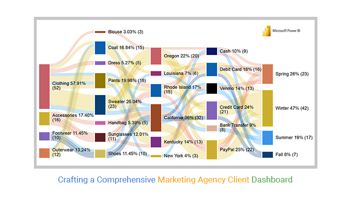
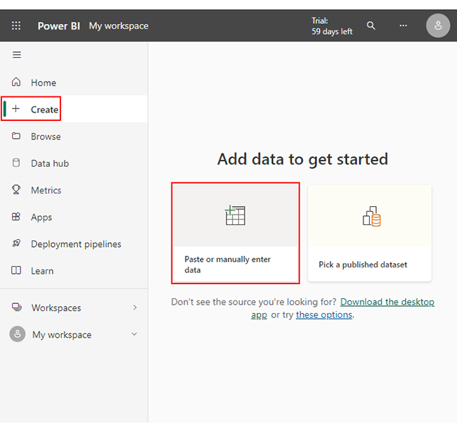
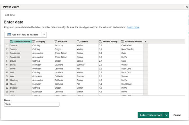
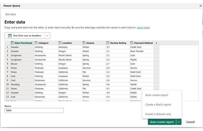
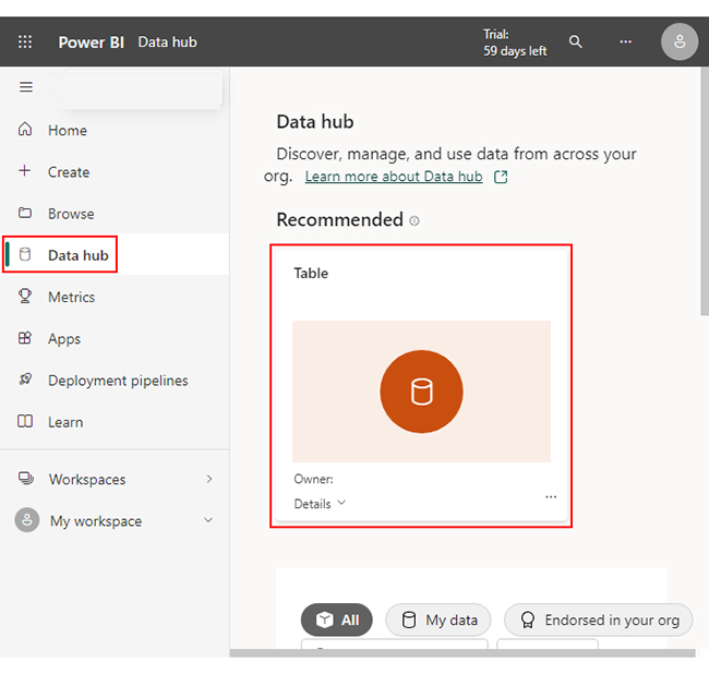
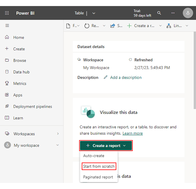
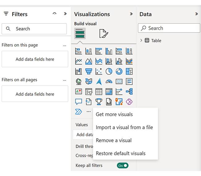
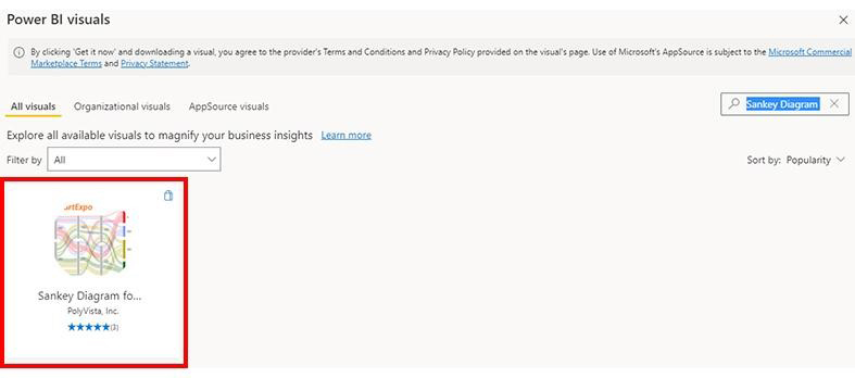
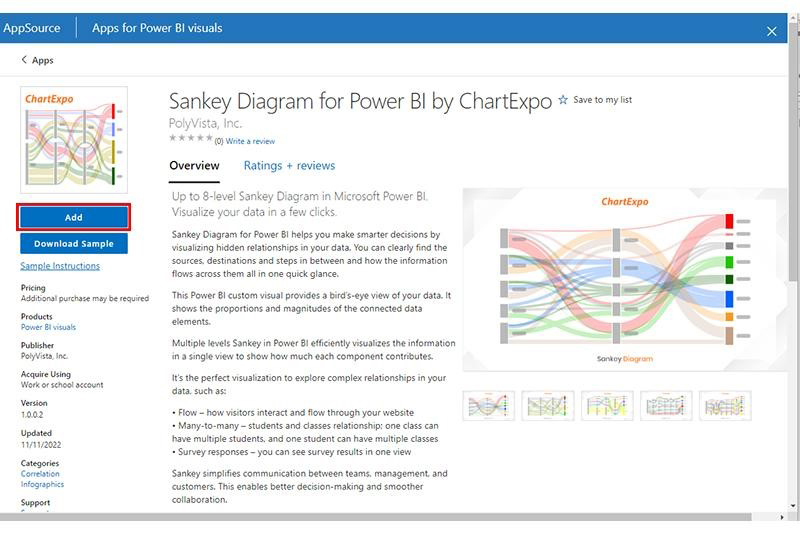
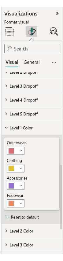
In this section, we learn how to create a marketing agency client dashboard in Power BI. We’ll use the Sankey Diagram as a Power BI business dashboard example.

Stage 1: Logging in to Power BI

  • Log in to Power BI.
  • Enter your email. Click the “Submit” button.
Enter email to login to Power BI
  • You are redirected to your Microsoft account.
  • Enter your password and click “Sign in”.
Enter Password to login to Power BI
  • You can choose whether to stay signed in.
Click on stay signed in
  • Once done, the Power BI home screen will open.

Stage 2: Creating a Data Set and Selecting the Data Set to Use in Your Sankey Chart

  • Go to the left-side menu and click the “Create” button.
  • Select “Paste or manually enter data“.
select Paste or manually enter data in Power BI ce446
  • We’ll use the following consumer behavior and shopping habits dataset.
Item Purchased Category Location Season Review Rating Payment Method
Sweater Clothing Kentucky Winter 3.1 Credit Card
Sweater Clothing Oregon Winter 3.1 Bank Transfer
Sunglasses Accessories Rhode Island Spring 3.1 Cash
Sunglasses Accessories Rhode Island Spring 3.5 PayPal
Blouse Clothing Oregon Spring 2.7 Cash
Shoes Footwear Louisiana Summer 2.9 Venmo
Shoes Footwear California Fall 3.2 Debit Card
Coat Clothing Louisiana Winter 3.2 Debit Card
Coat Outerwear California Summer 2.6 Venmo
Handbag Accessories California Spring 4.8 PayPal
Shoes Footwear California Fall 4.1 Credit Card
Sweater Clothing Oregon Winter 4.9 PayPal
Coat Outerwear California Winter 4.5 PayPal
Dress Clothing Rhode Island Spring 4.7 Debit Card
Coat Outerwear California Winter 4.7 PayPal
Sweater Clothing Kentucky Winter 2.8 Credit Card
Sunglasses Accessories Kentucky Spring 4.1 Venmo
Sweater Clothing Oregon Winter 4.7 Debit Card
Sweater Clothing California Summer 4.6 Bank Transfer
Pants Clothing California Summer 3.3 Venmo
Pants Clothing Kentucky Winter 2.8 Credit Card
Pants Clothing Rhode Island Winter 4.1 Credit Card
Pants Clothing New York Summer 3.2 Cash
Pants Clothing Oregon Winter 4.4 Credit Card
  • Paste the above data table in the Power Query Window.
Create Dataset in Query ce446
  • Select the “Create a dataset only” option.
Create Dataset in Power BI ce446
  • Click on the “Data Hub” option on the left-side menu.
  • Power BI populates the data set list. (If you have not created a data set, refer to the Error! Reference source not found section.)
  • The data details are shown below:
Click on Data Hub ce446
  • Click on the “Create a report” dropdown, as shown below.
  • Select “Start from scratch.”
Create Report and start from scratch ce446
  • A Report Canvas screen appears as below:
Report Canvas screen in Power BI ce446

Stage 3: Adding the Power BI Sankey Diagram Extension by ChartExpo

  • To finish creating our Sankey Diagram, we’ll use an add-in or Power BI visual from AppSource.
  • Navigate to the Power BI Visualizations panel.
  • Click the ellipsis (…) highlighted above to import the Power BI Sankey Diagram extension by ChartExpo.
click on to get more visuals ce446
  • The following menu opens:
  • Select the “Get more visuals” option.
  • The following window opens:
get more visuals in Power BI ce446
  • Enter “Sankey Diagram for Power BI by ChartExpo” in the highlighted search box.
  • You should see the “Sankey Diagram for Power BI by ChartExpo”, as shown in the image below.
Sankey Diagram for Power BI by ChartExpo ce446
  • Click the highlighted “Add” button.
Click the Add button ce446
  • Power BI will add the “Sankey Diagram for Power BI by ChartExpo” icon in the visualization panel.
Click on Sankey Diagram Icon

Stage 4: Drawing a Sankey Diagram with ChartExpo’s Power BI extension

  • Select the “Sankey Diagram for Power BI by ChartExpo” icon in the visualization panel.
  • The following window opens in the report section of your dashboard:
Report Section in Dashboard ce446
  • You can resize the visual as needed.
  • Go to the right-hand side of your Power BI dashboard.
Fields next to visualizations ce446
  • You’ll select the fields to use in your Sankey chart here.
  • The ChartExpo visual needs to be selected, though.
  • Select the fields in the following sequence:
    • Category
    • Item purchased
    • Location
    • Payment method
    • Review rating
    • Season
Select fields for Sankey diagram ce446
  • You’ll be asked for a ChartExpo license key or email address.
enter email for ChartExpo license ce430

Stage 5: Activate your ChartExpo Trial or Apply a Subscription Key

  • Select the ChartExpo visual.
  • You should see three icons below “Build Visual” in the Visualizations panel.
Build visual panel in Power BI
  • Select the middle icon, “Format visual“. The visual properties will be populated as shown below.
visual properties in Power BI
  • If you are a new user,
    • Type in your email under the section titled “Trial Mode”.
    • This should be the email address that you used to subscribe to the ChartExpo add-in. It is where your ChartExpo license key will be sent.
    • Ensure that your email address is valid.
    • Click “Enable Trial.” You’ll get a 7-day trial.
enter email id
  • You should receive a welcome email from ChartExpo.
  • The Sankey Diagram you create under the 7-day trial contains the ChartExpo watermark (see below).
Marketing agency client dashboard 1
  • If you have obtained a license key:
    • Enter your license key in the “ChartExpo License Key” textbox in the “License Settings” section (see below).
    • Slide the toggle switch next to “Enable License” to “On“.
enter license key
  • To add colors, expand the “Level Colors” properties and select a color.
Coloring Sankey Diagram ce446
  • Do this to change the color of each node.
  • All changes are automatically saved.
Chnages Colors In All Nodes ce446
  • Your final chart should look like the one below. If you get a license, the Sankey Chart will not have a watermark.
Final Marketing agency client dashboard

Insights

  • At level 1, Category, clothes were the most purchased item (57.91%). Accessories came in second with 17.40% of the total items. Footwear had the least number of purchases (11.47%).
  • At level 2, Item Purchased, sweaters were the most purchased item (26.04%). Pants were the second most purchased item (19.98%). Blouses were the least purchased item (3.03%).
  • At level 3, Location, most of these purchases were made in California (36%). Oregon came in second (22%). New York had the least number of purchases (4%).
  • At level 4, Payment Method, Paypal was the most preferred payment method (25%). 24% of the customers preferred to pay using credit cards. 9% of the customers preferred to use bank transfers.
  • At level 5, Season, most of the purchases were made during winter (47%). The spring season had the second-highest number of purchases (26%). The fall season had the least number of purchases (8%).

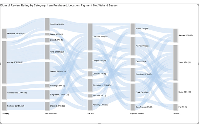
The provided data illustrates customer behavior regarding the timing and method of their purchases.

It reveals the specific types of items bought, top purchasing states, and favored payment methods in those regions. It also shows the correlation between purchases and different seasons.

FAQs

How Do I Create a Marketing Dashboard?

When creating a marketing dashboard, you should ensure that it provides key performance indicators and insights effectively.

Here is a guide to creating a marketing dashboard:

    1. Define your goals and objectives.
    2. Identify key metrics that align with your marketing objectives.
    3. Select a suitable dashboard tool tailored to your needs, such as Tableau, Power BI, or Data Studio.
    4. Collect data from various sources, such as CRM analytics systems, social media platforms, and YouTube analytics.
    5. Design the layout by arranging widgets and visuals logically to facilitate easy comprehension.
  • Set up automatic data refreshes to keep your dashboard up to date.
  • Conduct a preliminary test of your dashboard with a small group. Gather feedback and make any necessary adjustments.
  • Train users on how to use and navigate through the dashboard.
  • Consistently review and update your dashboard to incorporate any changes in your marketing strategy or goals.

What Does a Client Dashboard Contain?

A client dashboard features summarized marketing information, including project progress, financial data, and various reports.

It provides real-time data, enabling clients to monitor activities, track performance, and make data-driven decisions.

A client dashboard also offers communication tools, project management features, and access to support services. It fosters improved collaboration between the client and the service provider.

Wrap Up

A marketing agency client dashboard consolidates all your relevant marketing data into a centralized location.

This helps the marketing agency and the client have unified access and shared visibility. It also facilitates efficient collaboration and minimizes communication gaps.

This dashboard for clients simplifies the identification of critical KPIs and metrics. This facilitates the seamless monitoring of marketing initiatives.

It is also tailored to the client’s specific needs, delivering focused insights and relevant analytics.

This dashboard does more than just aggregate data. It serves as an intuitive interface, enabling quick assessments and informed decision-making.

It boosts efficiency, improves planning, and empowers the agency and client to run successful campaigns.

How much did you enjoy this article?

PBIAd1
Start Free Trial!
129888

Related articles

next previous
Power BI12 min read

How to Create Sankey Diagram in Microsoft Power BI?

Learn How to Create Sankey Diagram in Microsoft Power BI using Desktop & Web Service. What they are and how to use them effectively.

Power BI8 min read

Power BI Artificial Intelligence: Insights Using Visuals

Discover all there is to know about the Power BI artificial intelligence. You'll also discover how AI is used in Power BI, and how to use it for analysis and more.

Power BI9 min read

Budgeting in Healthcare: Use Visuals to Spot Budget Gaps

This guide helps you discover what budgeting in healthcare is. You'll also discover the factors that affect hospital budgets and types of budgeting in healthcare.

Power BI9 min read

Predictive Analytics in Power BI for Making Insightful Visuals

This guide shows you everything you need to know about Predictive Analytics in Power BI. It also shows you how it works, and how to interpret the results.

Power BI8 min read

Quarterly Business Review Template for Optimum Reports

Discover what the quarterly business review template is. This guide also shows you the best practices to consider when using the QBR template.

ChartExpo logo

Turn Data into Visual
Stories

CHARTEXPO

  • Home
  • Gallery
  • Videos
  • Services
  • Pricing
  • Contact us
  • FAQs
  • Privacy policy
  • Terms of Service
  • Sitemap

TOOLS

  • ChartExpo for Google Sheets
  • ChartExpo for Microsoft Excel
  • Power BI Custom Visuals by ChartExpo
  • Word Cloud

CATEGORIES

  • Bar Charts
  • Circle Graphs
  • Column Charts
  • Combo Charts
  • Comparison Charts
  • Line Graphs
  • PPC Charts
  • Sentiment Analysis Charts
  • Survey Charts

TOP CHARTS

  • Sankey Diagram
  • Likert Scale Chart
  • Comparison Bar Chart
  • Pareto Chart
  • Funnel Chart
  • Gauge Chart
  • Radar Chart
  • Radial Bar Chart
  • Sunburst Chart
  • see more
  • Scatter Plot Chart
  • CSAT Survey Bar Chart
  • CSAT Survey Chart
  • Dot Plot Chart
  • Double Bar Graph
  • Matrix Chart
  • Multi Axis Line Chart
  • Overlapping Bar Chart
  • Control Chart
  • Slope Chart
  • Clustered Bar Chart
  • Clustered Column Chart
  • Box and Whisker Plot
  • Tornado Chart
  • Waterfall Chart
  • Word Cloud
  • see less

RESOURCES

  • Blog
  • Resources
  • YouTube
SIGN UP FOR UPDATES

We wouldn't dream of spamming you or selling your info.

© 2025 ChartExpo, all rights reserved.