• Home
  • Tools dropdown img
    • Spreadsheet Charts

      • ChartExpo for Google Sheets
      • ChartExpo for Microsoft Excel
    • Power BI Charts

      • Power BI Custom Visuals by ChartExpo
    • Word Cloud

  • Charts dropdown img
    • Chart Category

      • Bar Charts
      • Circle Graphs
      • Column Charts
      • Combo Charts
      • Comparison Charts
      • Line Graphs
      • PPC Charts
      • Sentiment Analysis Charts
      • Survey Charts
    • Chart Type

      • Box and Whisker Plot
      • Clustered Bar Chart
      • Clustered Column Chart
      • Comparison Bar Chart
      • Control Chart
      • CSAT Survey Bar Chart
      • CSAT Survey Chart
      • Dot Plot Chart
      • Double Bar Graph
      • Funnel Chart
      • Gauge Chart
      • Likert Scale Chart
      • Matrix Chart
      • Multi Axis Line Chart
      • Overlapping Bar Chart
      • Pareto Chart
      • Radar Chart
      • Radial Bar Chart
      • Sankey Diagram
      • Scatter Plot Chart
      • Slope Chart
      • Sunburst Chart
      • Tornado Chart
      • Waterfall Chart
      • Word Cloud
    • Google Sheets
      Microsoft Excel
  • Services
  • Pricing
  • Contact us
  • Blog
  • Support dropdown img
      • Gallery
      • Videos
      • Contact us
      • FAQs
      • Resources
    • Please feel free to contact us

      atsupport@chartexpo.com

Categories
All Data Visualizations Data Analytics Surveys
Add-ons/
  • Google Sheets
  • Microsoft Excel
  • Power BI
All Data Visualizations Data Analytics Surveys
Add-ons
  • Google Sheets
  • Microsoft Excel
  • Power BI

We use cookies

This website uses cookies to provide better user experience and user's session management.
By continuing visiting this website you consent the use of these cookies.

Ok

ChartExpo Survey


Home > Blog > Power BI

Dashboard User Interface Design: Best Practices & Examples

Dashboards are a great data visualization tool. They help to showcase a summary of the most important data in an organization, team, or department. This enables quick, data-informed decision-making.

Achieving the balance between a user-friendly interface and telling a great data story is no mean feat. It is, however, completely doable.

Dashboard User Interface Design

The most important part of a dashboard is communicating information in the shortest time possible.

In this article, we learn the art of dashboard user interface design. We are going to begin by defining a dashboard user interface. We’ll then look at why dashboard UI design is important.

Next, we’ll discuss the key principles of dashboard UI design. We’ll also explore the benefits of a well-designed dashboard UI.

Eventually, we’ll learn how to design a dashboard user interface (UI) in Power BI.

Table of Content:

  1. Understand Dashboard User Interface Design
  2. Why is Dashboard UI Design Important?
  3. Key Principles of Dashboard UI Design
  4. Advantages of a Well-designed Dashboard UI
  5. Best Practices For Designing a Dashboard UI 
  6. Dashboard User Interface (UI) Design: Examples
  7. How to Design User Dashboard Interface: Complete Process
  8. Wrap Up

Understand Dashboard User Interface Design

A dashboard user interface design refers to the visual elements of your dashboard. It includes the bars, charts, and aspects like filters that help users interact with your dashboard.

It differs from the user experience of a dashboard.

A user experience (UX) of a dashboard also provides a summary of key metrics and data. However, the data is related to the user experience of a product, website, application, or service.

A dashboard’s UI is designed to help users quickly understand the status of a system or process.

Dashboards are commonly used for business intelligence (BI) and analytics.

Dashboard UIs typically use a variety of data visualizations, such as charts, graphs, and gauges. This helps to present data clearly and concisely.

Dashboards can also include interactive elements, such as filters and drill-down capabilities. This allows users to explore the data in more detail.

Some key characteristics and components of a dashboard UI include:

  • Data visualizations like charts (bar charts, line graphs, and pie charts), graphs, maps, and tables.
  • Widgets and modules that display specific data elements. Widgets can show real-time data, historical data, or predictive analytics.
  • Customization. Many dashboards allow users to customize their view. They can select the data elements to display or rearrange the layout to suit their needs.
  • Real-Time updates. Some dashboards provide real-time or near-real-time data updates. This ensures that users have access to the most current information.
  • Key Metrics. Dashboard UIs focus on key performance indicators dashboard relevant to a particular domain. These can include business metrics, website analytics, or project management.

Why is Dashboard UI Design Important?

Dashboard UI design is important for several reasons:

  • Helps Make Data More Understandable and Actionable

Dashboards are often used to display complex data in a visually comprehensible manner. A well-designed dashboard can use various data visualization techniques, like charts, graphs, and tables. This helps make data more understandable and actionable.

  • Helps Provide a Positive User Experience

A well-designed dashboard UI provides a positive user experience via aspects like an intuitive and user-friendly interface. Users should be able to access and understand the information they need quickly and efficiently.

  • Helps with Accessibility

Good dashboard design ensures accessibility for all users across devices. A good UI is responsive and works well on various devices and screen sizes.

Thinking about how to make your dashboards accessible to people with disabilities is also helpful. You can add screen readers, for example.

  • Helps Effectively Present Data From Several Sources

Dashboards often pull data from various sources and systems. An effective UI design helps to easily present data from multiple data sources.

  • Can Help Improve a Dashboard’s Performance

Careful design can lead to faster dashboard loading times, especially when dealing with large datasets.

Key Principles of Dashboard UI Design

Effective dashboard UI design relies on several key principles to create user-friendly, visually appealing, and functional dashboards.

Here are some of the fundamental principles of dashboard UI design:

  1. Clarity and Simplicity
  2. Effective Hierarchy and Information Organization
  3. Consistency
  4. Data Visualization
  5. Responsiveness
  6. User-Centered Design
  7. Customization
  8. Performance
  9. Accessibility
  10. Feedback and Interactivity

Advantages of a Well-designed Dashboard UI

A well-designed dashboard user interface (UI) offers numerous benefits to both users and organizations. It enhances the user’s experience and helps improve decision-making.

Here are some of the key benefits of a well-designed dashboard UI:

  1. Improved User Experience
  • A clean and intuitive design makes it easier for users to navigate and interact with the dashboard.
  • Users can quickly find the information they need, reducing frustration and the need for extensive training.
  1. Enhanced Decision-Making
  • Dashboards present critical data in a format that supports better decision-making.
  • Users can access real-time or historical data to identify trends, anomalies, and areas that require attention.
  1. Efficiency
  • Users can access relevant data and perform tasks more efficiently. This is because they don’t need to navigate through multiple screens or systems.
  • A well-organized layout and clear labels streamline workflows.
  1. Customization
  • Users can personalize their dashboard by selecting the data and metrics most relevant to their roles or responsibilities.
  • Customization options increase user satisfaction and productivity.

Best Practices For Designing a Dashboard UI

  • User-Centric Design

Shape the dashboard to suit your audience’s needs. Understand what they prefer and put the most relevant information upfront, helping them make decisions effortlessly. Consider how a Power BI dashboard vs. reports can meet their needs differently. A user-centric approach ensures the dashboard serves its purpose effectively.

  • Clarity and Simplicity

Choose a design that’s clear and clutter-free. Keep it simple with a clean layout, skip unnecessary elements, and ensure users enjoy a smooth experience. Clarity in design makes it easier for users to grasp information.

  • Design Prioritization

Lead users through the dashboard with a well-organized visual hierarchy. Arrange information based on importance, making it a breeze for users to find key insights quickly. A clear hierarchy adds to the overall user experience.

  • Consistency in Design Elements

Keep a consistent look across the dashboard. Adhere to similar varieties, text styles, and styles for a clean appearance, upgrading the impressive skill of the UI.

  • Responsive Design

Ensure your dashboard fits different screen sizes and gadgets consistently. A responsive plan guarantees clients can get to the dashboard easily, regardless of the stage, making it open and easy to use.

  • Meaningful Data Visualizations

Pick visualizations that tell compelling data stories. Opt for chart types that are easy to understand, providing users with clear and meaningful insights.

  • Intuitive Navigation

Fabricate a route framework that feels regular and simple for clients. Sensible route improves the general client experience, permitting clients to investigate the dashboard easily and find the data they’re searching for.

Embrace these prescribed procedures, and you’ll plan a dashboard UI interface that takes care of your client’s requirements as well as conveys an appealing and easy-to-understand insight.

Dashboard User Interface (UI) Design: Examples

Sales Dashboard UI Design

Planned in light of deals experts, the Sales Dashboard UI Design carries an outwardly captivating connection point to the screen and dissects deals execution. Easily track key measurements, perceive client patterns, and jump into income experiences utilizing instinctive diagrams and visuals.

Sales Dashboard UI Design

Healthcare Dashboard UI Design

Exceptionally created for the medical care industry, the Healthcare Dashboard UI Design configuration conveys a far-reaching dashboard custom-made for clinical experts. Effectively screen patient information, watch clinical records, and imagine vital well-being pointers, giving a productive and easy-to-use stage for medical care to the board.

Healthcare Dashboard UI Design

Finance Dashboard UI Design

Custom-fitted for monetary experts, Finance Dashboard UI Design presents a smooth point of interaction for exploring complex monetary information easily. Envision spending plan assignments, screen consumptions, and access constant experiences into monetary execution through intuitive diagrams and charts.

Finance Dashboard UI Design

KPI Dashboard UI Design

Based on key execution pointers (KPIs), the KPI Dashboard UI Design configuration offers a smooth and easy-to-understand dashboard for following and dissecting basic measurements. Picture KPI patterns lay out targets, and engage leaders with a reasonable and compact connection point for vital experiences.

KPI Dashboard UI Design

Executive Dashboard Examples UI Design

Taking care of chiefs, this UI plan features an Executive Dashboard UI Design offering a comprehensive perspective on hierarchical exhibition. Highlighting natural visuals and synopses, it empowers pioneers to pursue informed choices quickly by uniting key data in one open connection point.

Executive Dashboard UI Design

How to Design User Dashboard Interface: Complete Process

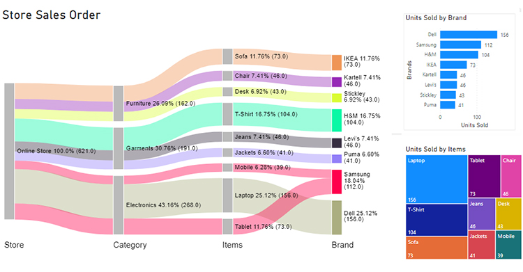
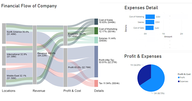
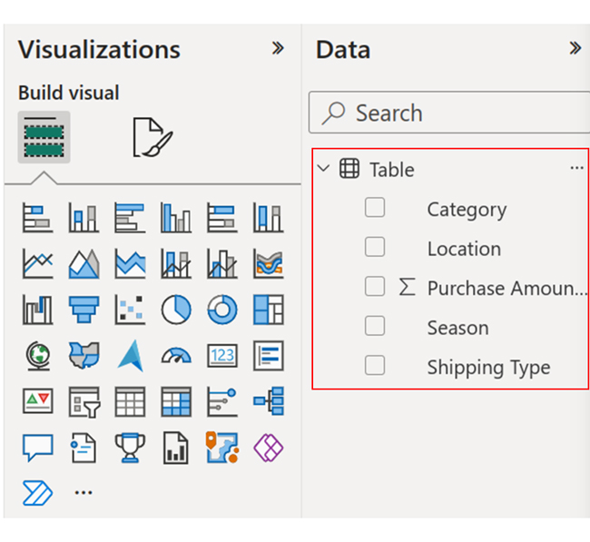
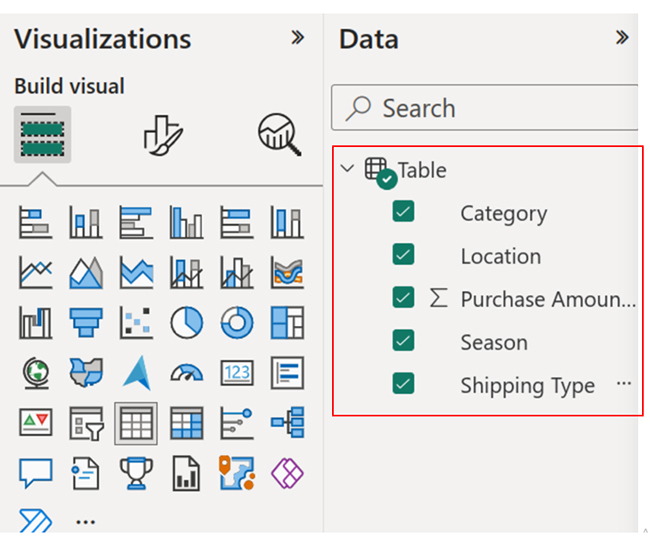
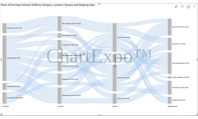
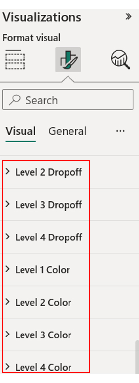
In this section, we learn how to think about dashboard user interface design. We’ll use the Sankey Diagram (Sankey Chart) as an example.
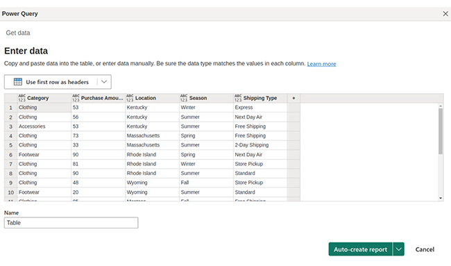
Stage 1: Logging in to Power BI

  • Log in to Power BI.
  • Enter your email. Click the “Submit” button.
Enter email to login to Power BI
  • You are redirected to your Microsoft account.
  • Enter your password and click “Sign in”.
Enter Password to login to Power BI
  • Choose whether to stay signed in.
Click on stay signed in
  • Once done, the Power BI home screen will open.

Stage 2: Creating a Data Set and Selecting the Data Set to Use in Your Sankey Chart

  • Click on the “Create” option on the left-side menu.
  • Select ”Paste or manually enter data“.
select Paste or manually enter data in Power BI ce421
  • We’ll use the following customer shopping preferences dataset
Category Purchase Amount (USD) Location Season Shipping Type
Clothing 53 Kentucky Winter Express
Clothing 56 Kentucky Summer Next Day Air
Accessories 53 Kentucky Summer Free Shipping
Clothing 73 Massachusetts Spring Free Shipping
Clothing 33 Massachusetts Summer 2-Day Shipping
Footwear 90 Rhode Island Spring Next Day Air
Clothing 81 Rhode Island Winter Store Pickup
Clothing 90 Rhode Island Summer Standard
Clothing 48 Wyoming Fall Store Pickup
Footwear 20 Wyoming Summer Standard
Clothing 85 Montana Fall Free Shipping
Clothing 48 Montana Summer Free Shipping
Accessories 54 Montana Winter Free Shipping
Accessories 76 Louisiana Winter Next Day Air
Clothing 51 Louisiana Winter Express
Clothing 34 Louisiana Winter Free Shipping
Outerwear 97 West Virginia Summer Express
Clothing 79 West Virginia Winter Store Pickup
Outerwear 64 West Virginia Summer Store Pickup
  • Paste the above data table into the “Power Query” window.
Paste Data Into Power Query ce430
  • Select the “Create a dataset only” option as shown below.
Create Dataset in Power BI ce430
  • Click on the “Data Hub” option on the left-side menu.
  • Power BI populates the data set list. (If you have not created a data set, refer to the Error! Reference source not found section.)
  • The data details are shown below:
Click on Data Hub ce426
  • Click on the “Create a report” dropdown as shown below.
  • Select “Start from scratch.”
Create Report and start from scratch ce421
  • You should see the Report Canvas screen as shown below:
Report Canvas screen in Power BI ce426

Stage 3: Adding the Power BI Sankey Diagram Extension by ChartExpo

  • To finish creating our Sankey Diagram, we’ll use an add-in or Power BI visual from AppSource.
  • Navigate to the Power BI Visualizations panel.
  • Click the ellipsis (…) highlighted above to import the Power BI Sankey Diagram extension by ChartExpo.
click on to get more visuals ce426
  • The following menu opens:
  • Select the “Get more visuals” option.
  • The following window opens:
get more visuals in Power BI ce426
  • Enter “Sankey Diagram for Power BI by ChartExpo” in the highlighted search box.
  • You should see the “Sankey Diagram for Power BI by ChartExpo”, as shown in the image below.
Sankey Diagram for Power BI by ChartExpo
  • Click the highlighted “Add” button.
Click the Add button
  • Power BI will add the “Sankey Diagram for Power BI by ChartExpo” icon in the visualization panel.
Click on Sankey Diagram Icon

Stage 4: Drawing a Sankey Diagram with ChartExpo’s Power BI extension

  • Select the “Sankey Diagram for Power BI by ChartExpo” icon in the visualization panel.
  • The following window opens in the report section of your dashboard:
Report Section in Dashboard ce421
  • You can resize the visual as needed.
  • Go to the right-hand side of your Power BI dashboard.
Fields next to visualizations ce430
  • You’ll select the fields to use in your Sankey chart here.
  • The ChartExpo visual needs to be selected, though.
  • Select the fields in the following sequence:
    • Category
    • Location
    • Purchase Amount
    • Season
    • Shipping Type
Select fields for Sankey diagram ce430
  • You’ll be asked for a ChartExpo license key or email address.
enter email for ChartExpo license ce430

Stage 5: Activate your ChartExpo Trial or Apply a Subscription Key

  • Select the ChartExpo visual.
  • You should see three icons below “Build Visual” in the Visualizations panel.
Build visual panel in Power BI
  • Select the middle icon, “Format visual.”
  • The visual properties will be populated as shown below.
visual properties in Power BI
  • If you are a new user,
    • Type in your email under the section titled “Trial Mode”.
    • This should be the email address that you used to subscribe to the ChartExpo add-in. It is where your ChartExpo license key will be sent.
    • Ensure that your email address is valid.
    • Click “Enable Trial.” You’ll get a 7-day trial.
enter email id
  • You should receive a welcome email from ChartExpo.
  • The Sankey Diagram you create under the 7-day trial contains the ChartExpo watermark (see below).
Dashboard User Interface Design 1
  • If you have obtained a license key:
    • Enter your license key in the “ChartExpo License Key” textbox in the “License Settings” section (see below).
    • Slide the toggle switch next to “Enable License” to “On“.
enter license key
  • To add colors, expand the “Level Colors” properties and select a color.
  • Do this to change the color of each node.
  • All changes are automatically saved.
Coloring Sankey Diagram ce430
  • Your final chart should look like the one below. If you get a license, the Sankey Chart will not have a watermark.
Final Dashboard User Interface Design

Insights

  • At level 1, Category, clothing was the most sold category (62%). Accessories came in second place (15%). Outerwear came in third (14%).
  • At level 2, Location, most purchases were made in Rhode Island (22.03%). West Virginia (20.25%) came after this. Montana came in third (15.78%).
  • At level 3, Season, summer clothes were the most popular (39%). Winter clothes came in second (36%). Spring clothes came in third.
  • At level 4, Shopping Type, free shipping was the most used shopping type (29%). Store pickup came in second (23%). Next Air came in third (19%).

FAQs: Dashboard User Interface Design

How Do You Design a User-Friendly Dashboard?

Designing a user-friendly dashboard involves a thoughtful approach to information organization, visual clarity, and user experience. Here’s a step-by-step guide to help you create an effective and user-friendly dashboard:

  • Understand your audience
  • Define clear objectives
  • Select relevant data
  • Choose consistent UI elements like color schemes, typography, and visual elements
  • Choose appropriate chart types (e.g., bar graphs, pie charts, line charts) to represent data
  • Implement interactive elements like filters, drill-downs, and tooltips for a dynamic user experience
  • Use whitespace effectively to avoid overcrowding the dashboard
  • Ensure the dashboard adapts to different screen sizes and devices for a seamless user experience
  • Provide easy-to-use navigation menus and links

What Makes a Good Dashboard UI?

A good dashboard user interface (UI) is essential for providing an effective and user-friendly data visualization experience.

Here are key elements and principles that make for a good dashboard UI:

  • Clarity and simplicity
  • Relevant data
  • Utilization of appropriate data visualization techniques (e.g., charts, graphs, and tables)
  • A consistent design and layout throughout the dashboard
  • Provides interactive elements such as filters, sliders, or dropdowns for users to explore data
  • Loads quickly and efficiently to prevent user frustration
  • Optimized for speed and minimal latency in data updates

Wrap Up

We have discussed dashboard user interface design and what makes it effective. UI design is important, but you should also ensure that your dashboard successfully communicates the intended data.

We began by defining UI design and its importance. We also looked at key principles of dashboard UI design, like consistency and accessibility.

We learned the benefits of a well-designed dashboard UI, like improved user experience. Eventually, we looked at how to design a dashboard UI in Power BI. We used ChartExpo’s Sankey Diagram as an example.

We also answered some questions about UI dashboard design.

We hope that this guide serves as a roadmap for great dashboard interface design.

How much did you enjoy this article?

PBIAd2
Start Free Trial!
129297

Related articles

next previous
Power BI12 min read

How to Create Sankey Diagram in Microsoft Power BI?

Learn How to Create Sankey Diagram in Microsoft Power BI using Desktop & Web Service. What they are and how to use them effectively.

Power BI8 min read

Power BI Artificial Intelligence: Insights Using Visuals

Discover all there is to know about the Power BI artificial intelligence. You'll also discover how AI is used in Power BI, and how to use it for analysis and more.

Power BI9 min read

Budgeting in Healthcare: Use Visuals to Spot Budget Gaps

This guide helps you discover what budgeting in healthcare is. You'll also discover the factors that affect hospital budgets and types of budgeting in healthcare.

Power BI9 min read

Predictive Analytics in Power BI for Making Insightful Visuals

This guide shows you everything you need to know about Predictive Analytics in Power BI. It also shows you how it works, and how to interpret the results.

Power BI8 min read

Quarterly Business Review Template for Optimum Reports

Discover what the quarterly business review template is. This guide also shows you the best practices to consider when using the QBR template.

ChartExpo logo

Turn Data into Visual
Stories

CHARTEXPO

  • Home
  • Gallery
  • Videos
  • Services
  • Pricing
  • Contact us
  • FAQs
  • Privacy policy
  • Terms of Service
  • Sitemap

TOOLS

  • ChartExpo for Google Sheets
  • ChartExpo for Microsoft Excel
  • Power BI Custom Visuals by ChartExpo
  • Word Cloud

CATEGORIES

  • Bar Charts
  • Circle Graphs
  • Column Charts
  • Combo Charts
  • Comparison Charts
  • Line Graphs
  • PPC Charts
  • Sentiment Analysis Charts
  • Survey Charts

TOP CHARTS

  • Sankey Diagram
  • Likert Scale Chart
  • Comparison Bar Chart
  • Pareto Chart
  • Funnel Chart
  • Gauge Chart
  • Radar Chart
  • Radial Bar Chart
  • Sunburst Chart
  • see more
  • Scatter Plot Chart
  • CSAT Survey Bar Chart
  • CSAT Survey Chart
  • Dot Plot Chart
  • Double Bar Graph
  • Matrix Chart
  • Multi Axis Line Chart
  • Overlapping Bar Chart
  • Control Chart
  • Slope Chart
  • Clustered Bar Chart
  • Clustered Column Chart
  • Box and Whisker Plot
  • Tornado Chart
  • Waterfall Chart
  • Word Cloud
  • see less

RESOURCES

  • Blog
  • Resources
  • YouTube
SIGN UP FOR UPDATES

We wouldn't dream of spamming you or selling your info.

© 2025 ChartExpo, all rights reserved.