Categories
Are your reports feeling sluggish?
Are your visuals taking forever to load?
Brace yourself – it’s time to optimize and inject some flavor with Power BI data models.
Now, I know what you’re thinking. Data models? Optimization? Isn’t that stuff for the nerds in the IT department?


Well, my friend, you couldn’t be more wrong. Common data model Power BI is the secret sauce that can turn your run-of-the-mill reports into powerhouses of information. They allow you to efficiently organize and structure your data, making it easier to analyze and visualize.
Forget about spending hours waiting for your data to load. With a suitable data model, your insights will be delivered in the blink of an eye. It’s like having a Ferrari for your reports while others are stuck with a rusty old bicycle.
And here’s the best part: you don’t have to be a tech genius to make it happen. We’ll walk you through the steps so you can become a Power BI desktop data modeling maestro in no time.
First!
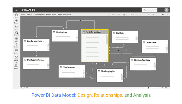
Definition: Power BI data modeling is the process of structuring and connecting data from multiple sources to create a logical foundation for reporting and analysis. It involves organizing data into tables, defining relationships, and using calculations (like DAX) to uncover deeper insights.
A well-designed model, often based on a star schema, ensures accuracy, improves performance, and makes it easier to build interactive dashboards and reports that support better business decisions.
Power BI data models are important because they act as the backbone of reporting and analysis. A strong data model:
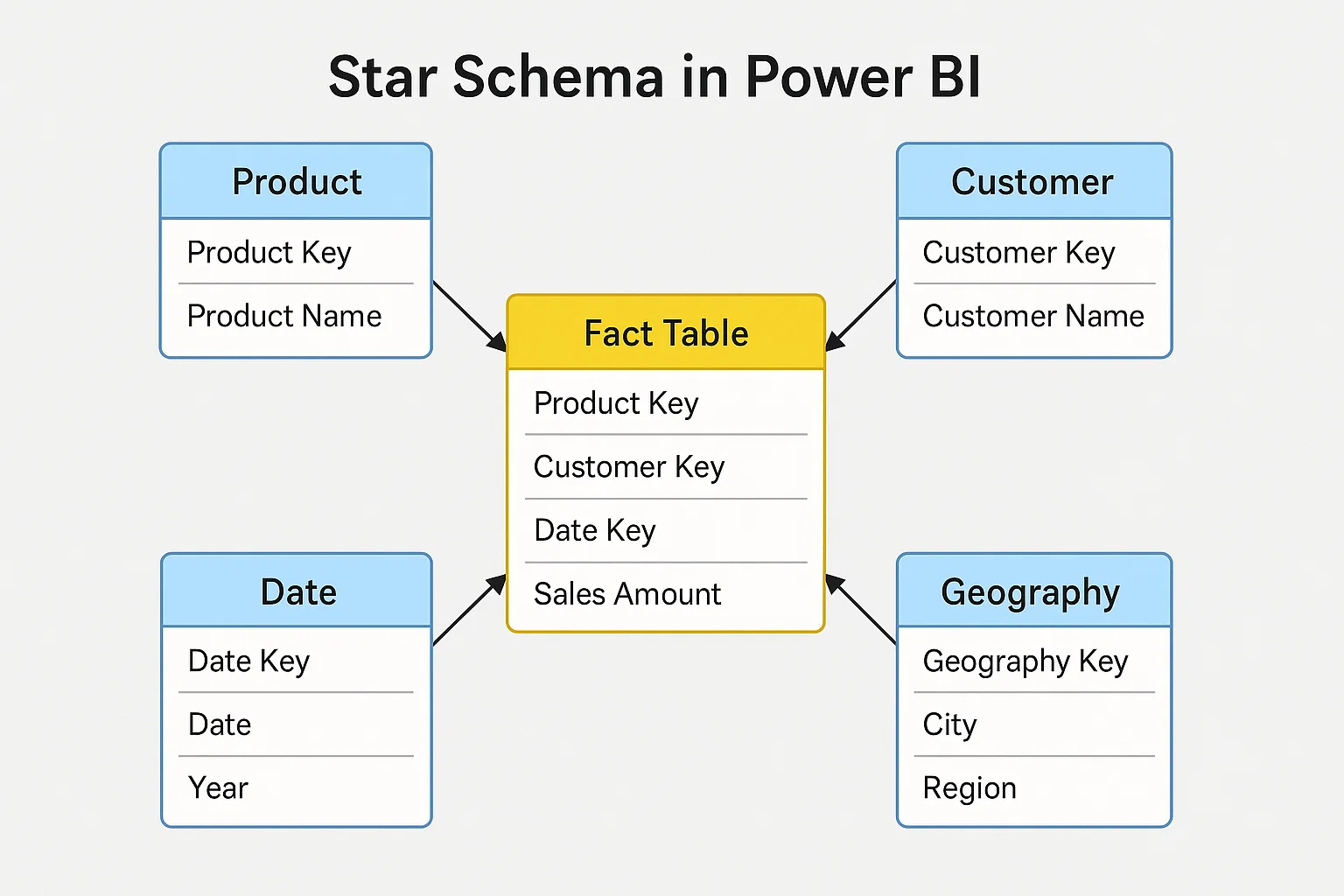
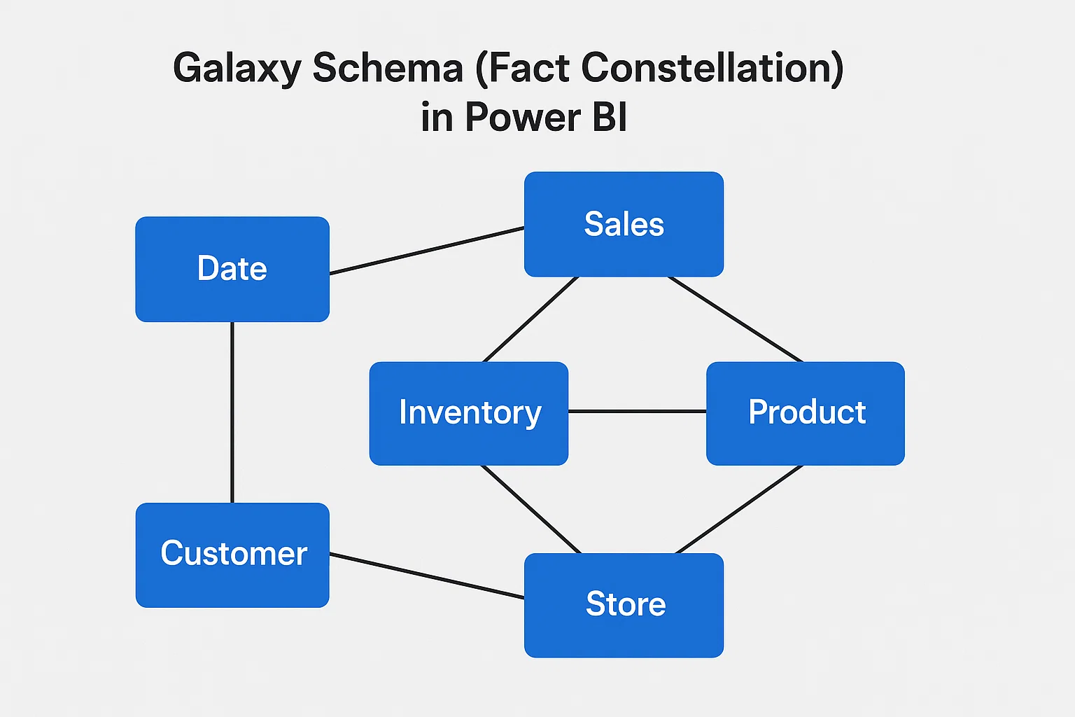
This is the most common and recommended model. It has a central fact table (like sales or revenue) connected to multiple dimension tables (such as products, customers, or dates). It’s simple, efficient, and easy to understand.
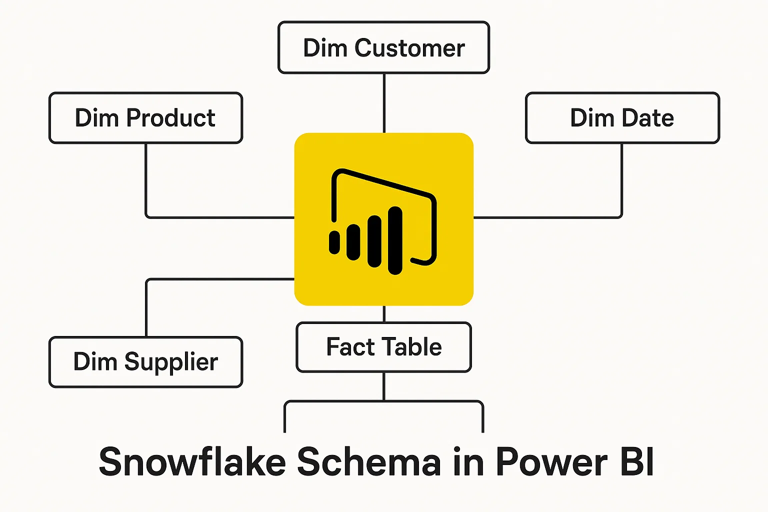
Similar to a star schema, but dimension tables are further broken down into sub-dimensions. This creates a more normalized structure, which can reduce redundancy but may be harder to manage.
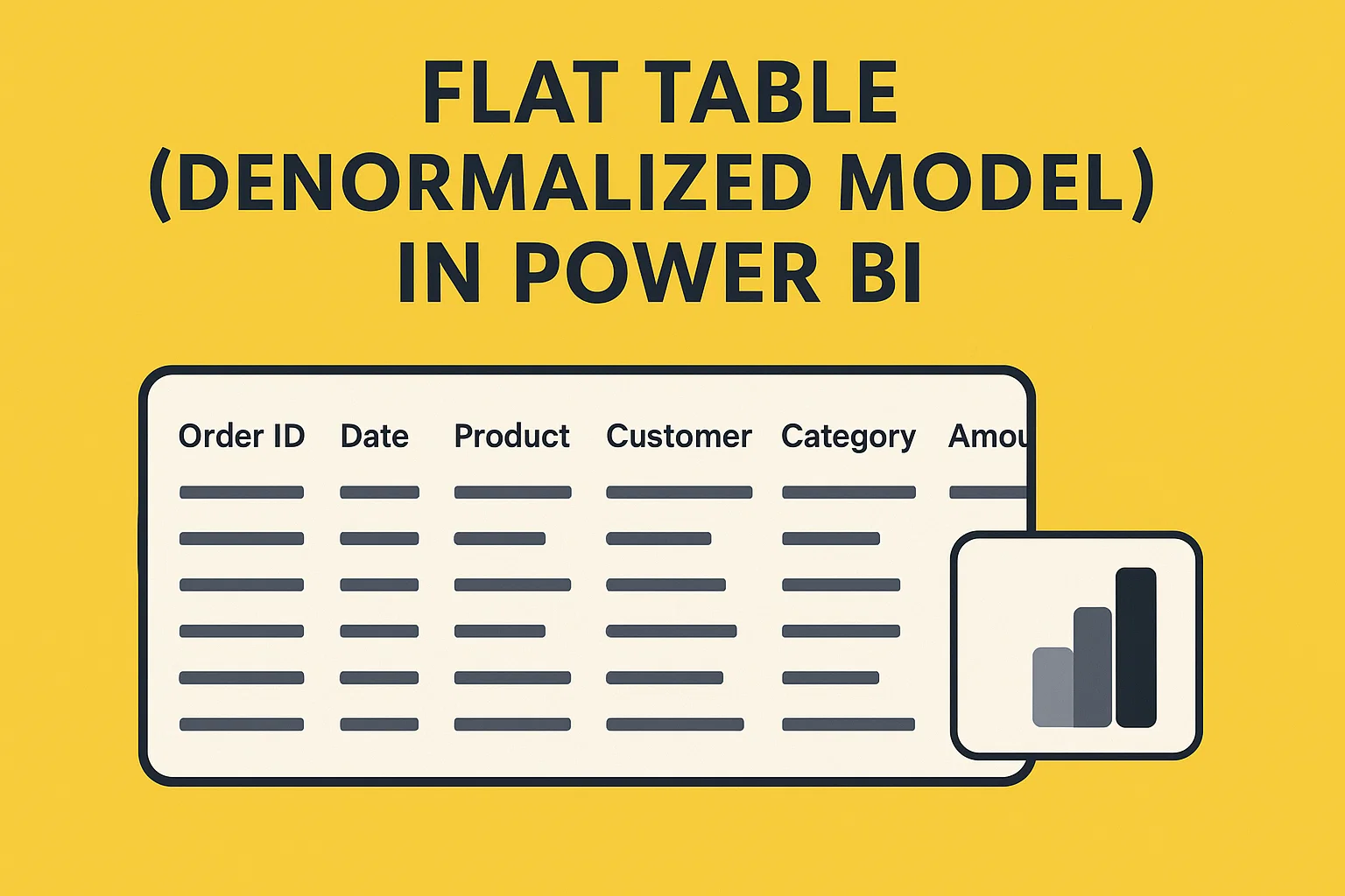
All data is kept in one large table without splitting into facts and dimensions. While it’s easy for very small datasets, it’s not ideal for performance and flexibility when working with large or complex data.
In more complex scenarios, multiple fact tables share dimension tables. This model is useful when you’re analyzing different processes (like sales and inventory) that rely on shared dimensions.
Selecting the best data modeling tool depends on various factors such as your specific requirements, the complexity of your data, and your team’s expertise. For instance, you might consider the differences between Looker and Power BI when evaluating your options. Here are some popular data modeling tools, each with its strengths:
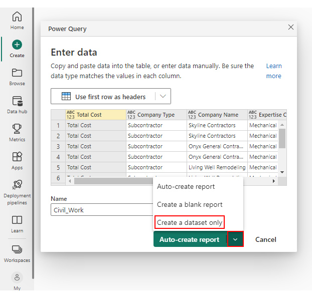
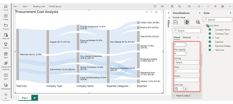
Open Power BI Desktop → click Get Data → load tables from Excel, SQL Server, or other sources.
Use Power Query to clean, format, and prepare your data (rename columns, change data types, remove duplicates).
In Model View, connect tables with relationships using primary and foreign keys. Set the correct relationship type (one-to-many, many-to-one).
Separate data into fact tables (transactions) and dimension tables (descriptions) for a clear star schema.
Use DAX to build custom calculations (e.g., Total Sales = SUM(Sales[Amount])).
Set up drill-down paths such as Year → Quarter → Month to make analysis easier.
Check relationships and measures for accuracy. Confirm results by testing with sample visuals.
Use your completed model to create interactive dashboards and share insights in Power BI.
Check out the Sankey Diagram for Power BI app demo here:
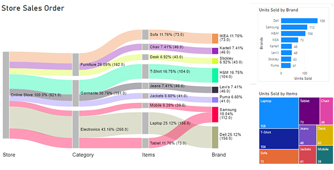
A sales data set in Power BI collects data related to sales activities. It includes information such as sales revenue, quantity sold, customer details, product details, and other relevant metrics. This data set helps to analyze and visualize sales performance, identify trends, and track key performance indicators (KPIs). Consequently, helps to make data-driven decisions to improve sales strategies and outcomes.
Let’s say you have the company sales data table below.
| Store | Category | Items | Brand | Unit Sold |
| Online Store | Electronics | Mobile | Samsung | 39 |
| Online Store | Electronics | Tablet | Samsung | 73 |
| Online Store | Electronics | Laptop | Dell | 156 |
| Online Store | Garments | Jeans | Levi’s | 46 |
| Online Store | Garments | T-Shirt | H&M | 104 |
| Online Store | Garments | Jackets | Puma | 41 |
| Online Store | Furniture | Sofa | IKEA | 73 |
| Online Store | furniture | Chair | Kartell | 46 |
| Online Store | furniture | Desk | Stickley | 43 |
You can appreciate how the report has presented this information, and the Power BI Sankey Diagram makes the gleaning of insights effortless.
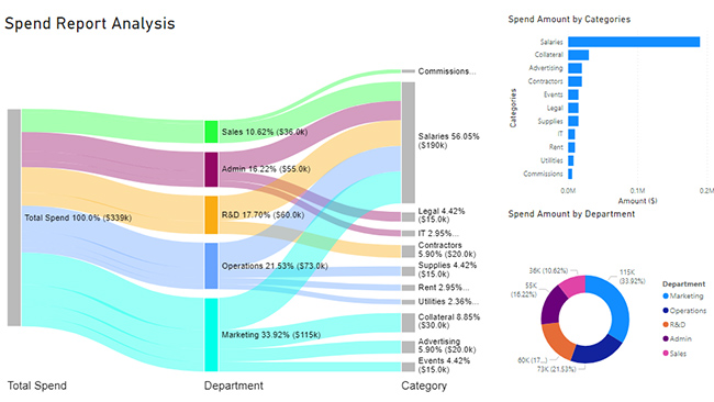
A spending dataset consists of information about an organization’s planned and actual costs.
It helps companies analyze and compare their budgeted and actual expenses. The data set includes details such as cost categories, budget amounts, actual expenditures, and variances. It helps to identify budget deviations, track spending trends, and make informed financial decisions.
Additionally, it can support cost-of-living comparison by city, allowing organizations to evaluate expenses across different locations and plan budgets accordingly.
Suppose you have a company spending data set below.
| Total Spend | Department | Category | Spend Amount ($) |
| Total Spend | Marketing | Advertising | 20,000 |
| Total Spend | Marketing | Events | 15,000 |
| Total Spend | Marketing | Collateral | 30,000 |
| Total Spend | Marketing | Salaries | 50,000 |
| Total Spend | Operations | Rent | 10,000 |
| Total Spend | Operations | Utilities | 8,000 |
| Total Spend | Operations | Supplies | 15,000 |
| Total Spend | Operations | Salaries | 40,000 |
| Total Spend | Sales | Salaries | 30,000 |
| Total Spend | Sales | Commissions | 6,000 |
| Total Spend | R&D | Salaries | 40,000 |
| Total Spend | R&D | Contractors | 20,000 |
| Total Spend | Admin | Salaries | 30,000 |
| Total Spend | Admin | Legal | 15,000 |
| Total Spend | Admin | IT | 10,000 |
You can present it in a Power BI report, as shown below, to make the analysis easy.
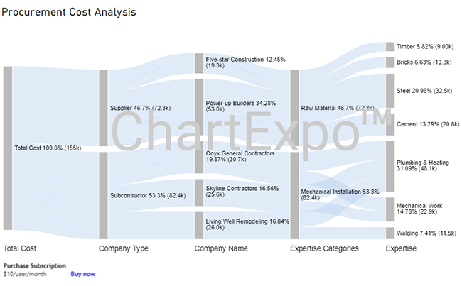
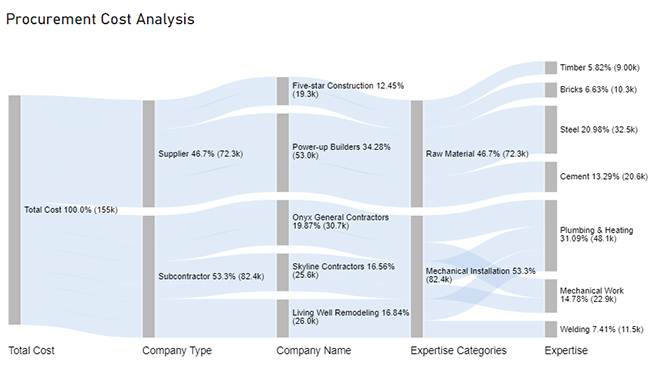
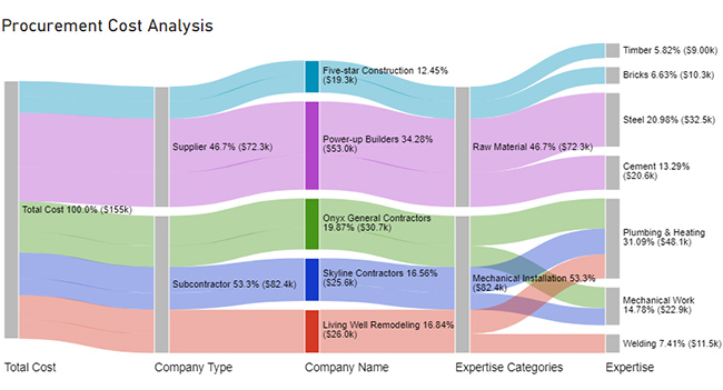
We’ll break down the process into five distinct stages.


| Total Cost | Company Type | Company Name | Expertise Categories | Expertise | Cost |
| Total Cost | Subcontractor | Skyline Contractors | Mechanical Installation | Plumbing & Heating | 15456 |
| Total Cost | Subcontractor | Skyline Contractors | Mechanical Installation | Mechanical Work | 10159 |
| Total Cost | Subcontractor | Onyx General Contractors | Mechanical Installation | Plumbing & Heating | 18045 |
| Total Cost | Subcontractor | Onyx General Contractors | Mechanical Installation | Mechanical Work | 12695 |
| Total Cost | Subcontractor | Living Well Remodeling | Mechanical Installation | Plumbing & Heating | 14589 |
| Total Cost | Subcontractor | Living Well Remodeling | Mechanical Installation | Welding | 11456 |
| Total Cost | Supplier | Power-up Builders | Raw Material | Cement | 20561 |
| Total Cost | Supplier | Power-up Builders | Raw Material | Steel | 32456 |
| Total Cost | Supplier | Five-star Construction | Raw Material | Bricks | 10253 |
| Total Cost | Supplier | Five-star Construction | Raw Material | Timber | 9000 |


BI data modeling structures raw data into fact and dimension tables, making it easier to navigate, analyze, and understand.
With a well-designed model, reports load faster, calculations run efficiently, and insights are more reliable.
Power BI desktop data modeling ensures uniform definitions, calculations, and KPIs across reports, reducing errors and misinterpretation.
By transforming data into meaningful insights, BI data modeling empowers leaders to make informed and strategic decisions.
A strong model adapts as data grows or business needs change, ensuring long-term usability without slowing performance.
Organize your model into fact and dimension tables. Fact tables store transactions or numeric values, while dimension tables hold descriptive details. This structure improves performance and makes analysis more intuitive.
Limit relationships to one-to-many whenever possible. Avoid unnecessary bi-directional filters, as they can create ambiguity and slow performance.
Remove unused columns, choose the most efficient data types (e.g., Whole Number instead of Decimal), and avoid storing unnecessary text fields. This keeps your model lighter and faster.
Where possible, create measures rather than calculated columns. Measures are more efficient, reduce memory usage, and provide flexibility in analysis.
Set up hierarchies (e.g., Year → Quarter → Month or Category → Subcategory → Product) to help users drill down easily and make reports more user-friendly.
Working with massive datasets can slow performance and make models harder to manage if not optimized properly.
Incorrect or missing relationships between tables often lead to inaccurate results and misleading reports.
Writing efficient DAX formulas can be challenging, especially when building advanced calculations or optimizing performance.
Inconsistent data sources or poorly cleaned data can cause discrepancies, making insights less reliable.
A highly flexible model may become too complex, while an overly simplified model might not meet all reporting needs.
The Star Schema is considered the best data model for Power BI. It organizes data into fact tables (numeric values like sales or revenue) and dimension tables (descriptive details like customer, product, or date). This structure improves performance, simplifies relationships, and makes reporting more intuitive.
Launch Power BI, navigate to “File,” and select “Open” to locate and load your .pbix file. The data model, visuals, and settings will be accessible for further editing and analysis.
The Power BI data model is the cornerstone of building insightful and high-performing reports and dashboards. Designing tables, establishing meaningful relationships, and employing calculated measures lay the foundation for extracting profound insights from data. This optimization ensures your reports deliver accurate and relevant information, empowering you to make informed decisions.
A robust data model not only enhances data integrity but also facilitates smoother data transformation processes. Through thoughtful planning, you align your model with business requirements, unraveling intricate patterns and correlations within your data. The result? Clearer visualizations that succinctly convey the story hidden in the numbers.
ChartExpo’s prowess helps you create appealing, interactive visualizations that effectively communicate data patterns and variances. This makes it easier to understand the data and enables you to present your findings clearly and impactfully.
Therefore, leveraging the power of Power BI data models and ChartExpo facilitates data-driven decision-making. Consequently, helps you achieve financial success and gain a competitive edge in today’s fast-paced business landscape.
Start optimizing your reports today and unlock the full potential of your spending data set with Power BI and ChartExpo.
How much did you enjoy this article?


Discover diverse and high-quality Power BI report examples for inspiration and insights. Elevate your reporting with strategic visualization techniques.

A Customer Relationship Management Dashboard centralizes data, tracks key metrics, and drives smarter business decisions. Discover now!

Explore Healthcare Dashboard Examples and learn how to turn complex healthcare data into clear, actionable insights for better decision-making.


