• Home
  • Tools dropdown img
    • Spreadsheet Charts

      • ChartExpo for Google Sheets
      • ChartExpo for Microsoft Excel
    • Power BI Charts

      • Power BI Custom Visuals by ChartExpo
    • Word Cloud

  • Charts dropdown img
    • Chart Category

      • Bar Charts
      • Circle Graphs
      • Column Charts
      • Combo Charts
      • Comparison Charts
      • Line Graphs
      • PPC Charts
      • Sentiment Analysis Charts
      • Survey Charts
    • Chart Type

      • Box and Whisker Plot
      • Clustered Bar Chart
      • Clustered Column Chart
      • Comparison Bar Chart
      • Control Chart
      • CSAT Survey Bar Chart
      • CSAT Survey Chart
      • Dot Plot Chart
      • Double Bar Graph
      • Funnel Chart
      • Gauge Chart
      • Likert Scale Chart
      • Matrix Chart
      • Multi Axis Line Chart
      • Overlapping Bar Chart
      • Pareto Chart
      • Radar Chart
      • Radial Bar Chart
      • Sankey Diagram
      • Scatter Plot Chart
      • Slope Chart
      • Sunburst Chart
      • Tornado Chart
      • Waterfall Chart
      • Word Cloud
    • Google Sheets
      Microsoft Excel
  • Services
  • Pricing
  • Contact us
  • Blog
  • Support dropdown img
      • Gallery
      • Videos
      • Contact us
      • FAQs
      • Resources
    • Please feel free to contact us

      atsupport@chartexpo.com

Categories
All Data Visualizations Data Analytics Surveys
Add-ons/
  • Google Sheets
  • Microsoft Excel
  • Power BI
All Data Visualizations Data Analytics Surveys
Add-ons
  • Google Sheets
  • Microsoft Excel
  • Power BI

We use cookies

This website uses cookies to provide better user experience and user's session management.
By continuing visiting this website you consent the use of these cookies.

Ok

ChartExpo Survey


Home > Blog > Microsoft Excel

Dynamic Tables in Excel Visualizing Data with Ease

What are dynamic tables in Excel, and why do they matter? Excel remains a cornerstone for managing and analyzing information in today’s data-driven age. Dynamic tables are a powerful tool. They make it easier to organize, filter, and analyze data precisely.

Imagine handling a spreadsheet with thousands of rows. Static tables often need to be longer when data changes or expands. This is where dynamic tables shine. They adapt automatically, saving time and reducing errors. Whether tracking sales figures or analyzing trends, these tables ensure your data stays updated without manual intervention.

Dynamic Tables in Excel

Statistics back this up. Studies show that nearly 70% of professionals rely on spreadsheets for decision-making. Yet, many spend hours adjusting their data manually. Dynamic tables in Excel can cut that time significantly, allowing for more focus on insights rather than tedious updates.

Dynamic tables aren’t limited to large-scale projects. Even for smaller tasks, they provide flexibility. Features like structured references and automatic formatting streamline processes. This tool is a game-changer if you’ve ever struggled to keep your formulas accurate as data shifts.

Businesses today need efficiency. Dynamic tables make it possible to handle growing datasets while maintaining accuracy. From financial models to project trackers, they simplify workflows across industries.

It’s clear; Excel’s dynamic capabilities aren’t just helpful but essential for staying ahead. So, let’s explore how dynamic tables can transform how you work with data.

Table of Contents:

  1. What are Dynamic Tables in Excel?
  2. Why Do We Create Dynamic Tables in Excel?
  3. What is an Excel Dynamic Table Range?
  4. How to Create a Dynamic Table in Excel Using a Pivot Table?
  5. How to Create a Dynamic Table in Excel By Using Formulas?
  6. How to Visualize Dynamic Table Data Using Excel with Another Example?
  7. Wrap Up

First…

What are Dynamic Tables in Excel?

Definition: Dynamic tables in Excel are innovative tools for managing data. They automatically adjust as you add or remove entries. Unlike static tables, they grow or shrink to fit your data. With this, you save time and prevent errors.

Features like automatic formatting and structured references make data handling easier. Dynamic tables simplify tasks like sorting, filtering, and creating charts. They’re perfect for professionals working with changing datasets, making Excel more efficient and reliable for business or personal use.

Why Do We Create Dynamic Tables in Excel?

The answer lies in making work easier, faster, and smarter. Dynamic tables are solutions for managing simple lists or analyzing complex datasets. They adapt seamlessly to changes, saving time and boosting accuracy. Let’s explore five reasons why they’re so valuable.

  • Automation and flexibility: Dynamic tables automatically adjust as your data grows or shrinks. Add rows or columns, and the table updates instantly. There is no need to tweak formulas or formats manually. This flexibility keeps everything organized without extra effort.
  • Enhanced data organization: Messy spreadsheets become clean and structured with dynamic tables. Built-in features like sorting and filtering make data easier to navigate. You can focus on what matters without getting lost in clutter.
  • Clarity with structured references: Dynamic tables use structured references that are easy to understand. Instead of “B2:B100”, you see meaningful labels like “Sales[Revenue]”. It’s clear, concise, and perfect for error-free work.
  • Interactive dashboards and reporting: Dynamic tables are a cornerstone of best-designed dashboards, enabling seamless connections to pivot tables and charts. Updates to your table are automatically reflected in reports, ensuring real-time insights and interactivity.
  • Simplifying data validation and analysis: Dynamic tables make data analysis smoother. They support drop-down lists and conditional formatting, making validating entries or spot trends faster and more accurate.

What is an Excel Dynamic Table Range?

Definition: An Excel dynamic table range automatically adjusts to fit your data. It expands or contracts as you add or remove entries. Unlike fixed ranges, dynamic table range eliminates the need for manual updates. It is perfect for managing growing datasets or constantly evolving information.

Dynamic ranges are used in formulas, charts, and reports to ensure accuracy. They’re created using Excel tables or dynamic named ranges. This feature lets your data stay organized and responsive, saving time and reducing errors.

How to Create a Dynamic Table in Excel Using a Pivot Table?

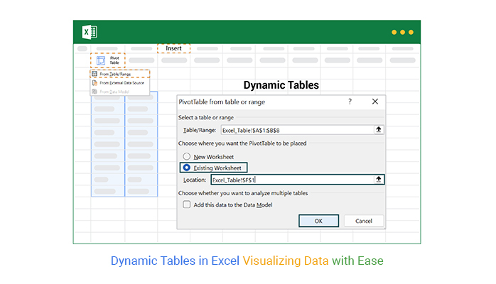
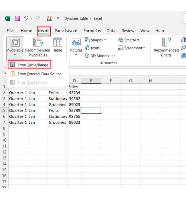
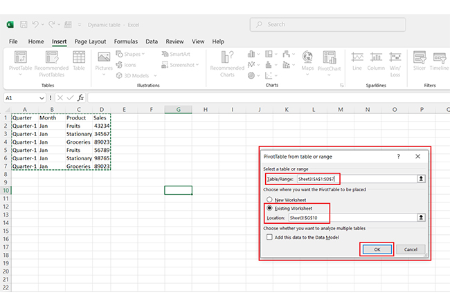
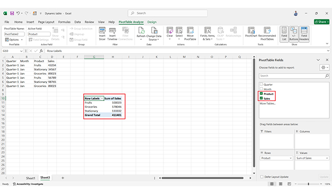
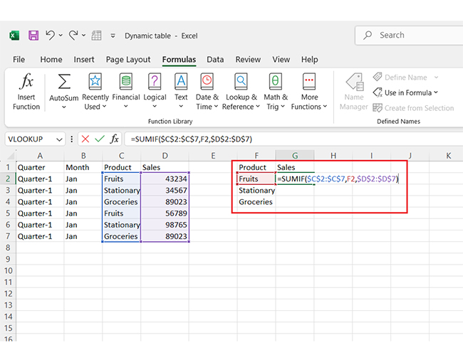
Pivot Tables are a game-changer. They’re powerful, flexible, and easy to set up. Follow these quick steps to create one in Excel:

  1. Start with your data and insert the Pivot Table: Input your dataset into an Excel sheet. Each column should have a header, and there should be no blank rows. Then go to the Insert tab, click PivotTable and select from the table/range.
Go to Insert Tab for Doing Dynamic Tables in Excel
  1. Select data range: Pick the range containing your data. Choose where your PivotTable appears: a new worksheet or the current one.
Select Data Range for Doing Dynamic Tables in Excel
  1. Build your Pivot Table: Check the boxes for the fields you want to include in the PivotTable Fields pane. Drag and drop fields into Rows, Columns, Values, or Filters. Instantly, your dynamic table takes shape!
Include in PivotTable Fields Pane for Doing Dynamic Tables in Excel

How to Create a Dynamic Table in Excel By Using Formulas?

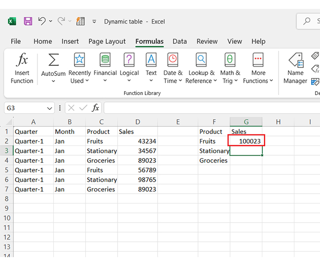
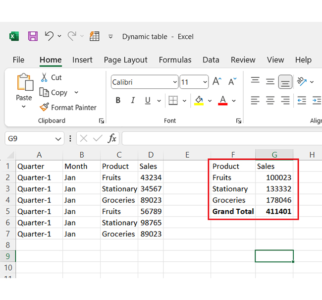
Want to make your data work smarter, not harder? Excel formulas help you create dynamic tables with ease. Here’s how to get started:

  1. Enter your data: Type or paste your dataset into an Excel sheet. Ensure it’s clean and organized using effective data cleansing techniques, with clear column headers for better structure and analysis.
  2. Select your fields: Decide which fields (columns) are relevant to your calculations. Highlight these as your focus areas.
  3. Set up a Pivot Table: Use the selected fields to build a Pivot Table. It’s the foundation for summarizing your data dynamically.
  4. Add your formula: Apply it to the appropriate cell in the Pivot Table. For example, calculate the total sales for your first product by using a formula like =SUM.
Add Your Formula for Doing Dynamic Tables in Excel
  1. The sample below shows how the total for the first product has been calculated.
Show How Total for First Product for Doing Dynamic Tables in Excel
  1. Expand the formula: Drag the formula across or down to apply it to the remaining rows. Voilà! The total for each product is calculated in seconds.
Drag Formula Across to Remaining Rows for Doing Dynamic Tables in Excel

How to Visualize Dynamic Table Data Using Excel with Another Example?

Data analysis is all about turning numbers into stories. But let’s face it—Excel isn’t exactly the life of the party when it comes to visuals. It’s great for crunching numbers, but its charts feel outdated and limited.

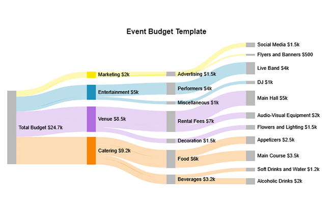
Enter dynamic tables. These tools can help you organize data, but they have limits in creating eye-catching visuals. That’s where ChartExpo steps in. This powerful add-on supercharges Excel with insightful, interactive data visualizations, transforming raw data into clear insights.
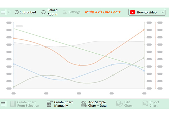
Top 10 Charts Example:

The charts and graphs below were created in Excel using ChartExpo:

Sankey Chart

Sankey Chart After Doing Dynamic Tables in Excel

Likert Scale Chart

Likert Scale Chart After Doing Dynamic Tables in Excel

Comparison Bar Chart

Comparison Bar Chart After Doing Dynamic Tables in Excel

Gauge Chart

Gauge Chart After Doing Dynamic Tables in Excel

Progress Circle Chart

Progress Circle Chart After Doing Dynamic Tables in Excel

Slope Chart

Slope Chart After Doing Dynamic Tables in Excel

Mosaic Plot

Mosaic Plot After Doing Dynamic Tables in Excel

Clustered Stacked Bar Chart

Clustered Stacked Bar Chart After Doing Dynamic Tables in Excel

Waterfall Chart

Waterfall Chart After Doing Dynamic Tables in Excel

Multi Axis Line Chart

Multi Axis Line Chart After Doing Dynamic Tables in Excel

Let’s learn how to install ChartExpo in Excel.

  1. Open your Excel application.
  2. Open the worksheet and click the “Insert” menu.
  3. You’ll see the “My Apps” option.
  4. In the Office Add-ins window, click “Store” and search for ChartExpo on my Apps Store.
  5. Click the “Add” button to install ChartExpo in your Excel.

ChartExpo charts are available both in Google Sheets and Microsoft Excel. Please use the following CTAs to install the tool of your choice and create beautiful visualizations with a few clicks in your favorite tool.

Example

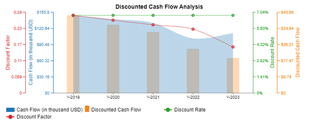
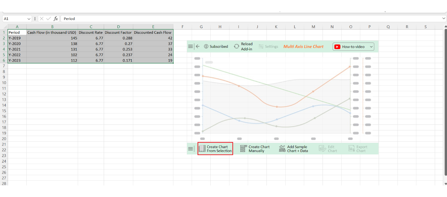
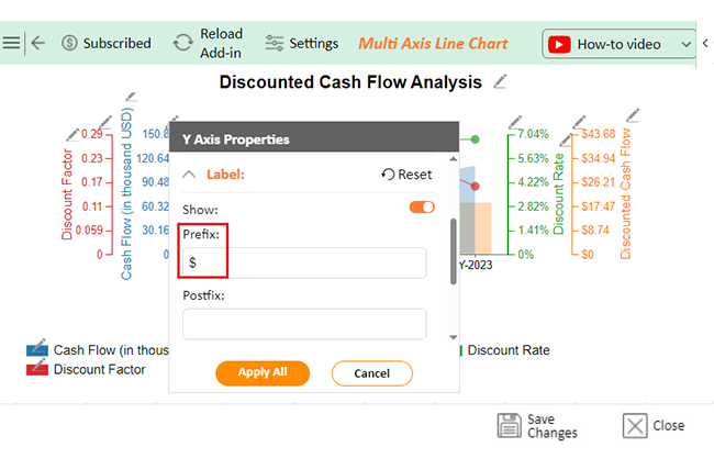
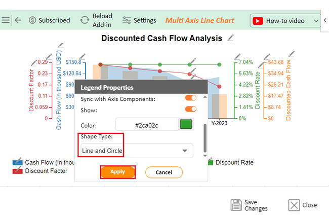
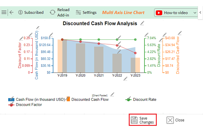
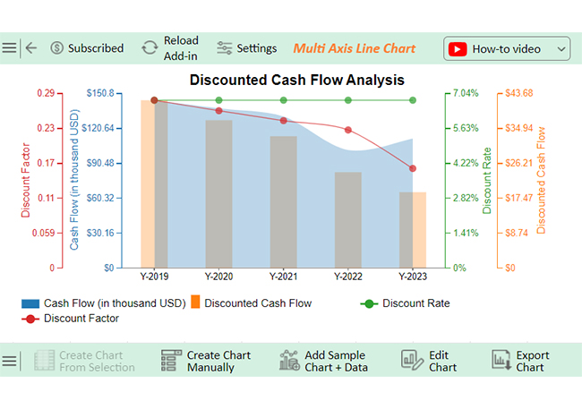
Let’s analyze this sample data in Excel using ChartExpo, a powerful tool for analyzing and interpreting data to uncover actionable insights.

Period Cash Flow (in thousand USD) Discount Rate Discount Factor Discounted Cash Flow
Y-2019 145 6.77 0.288 42
Y-2020 138 6.77 0.27 37
Y-2021 131 6.77 0.253 33
Y-2022 102 6.77 0.237 24
Y-2023 112 6.77 0.171 19
  • To get started with ChartExpo, install ChartExpo in Excel.
  • Now Click on My Apps from the INSERT menu.
insert chartexpo in excel
  • Choose ChartExpo from My Apps, then click Insert.
open chartexpo in excel
  • Once it loads, scroll through the charts list to locate and choose the “Multi Axis Line Chart”.
search multi axis line chart in excel
  • You will see a Multi Axis Line Chart on the screen.
See Multi Axis Line Chart Page After Doing Dynamic Tables in Excel
  • Click the “Create Chart From Selection” button after selecting the data from the sheet, as shown.
Click Create Chart From Selection After Doing Dynamic Tables in Excel
  • ChartExpo will generate the visualization below for you.
Initial Visual After Doing Dynamic Tables in Excel
  • Click on Settings and change the “Data Representation” as follows.
Change Data Representation After Doing Dynamic Tables in Excel
  • If you want to add anything to the chart, click the Edit Chart button:
Click Edit Chart After Doing Dynamic Tables in Excel
  • Click the pencil icon next to the Chart Header to change the title.
  • It will open the properties dialog. Under the Text section, you can add a heading in Line 1 and enable Show.
  • Give the appropriate title of your chart and click the Apply button.
Add Chart Header After Doing Dynamic Tables in Excel
  • You can add the dollar sign with (Sales) value as follows:
Add Prefix Value WIth Sales After Doing Dynamic Tables in Excel
  • First, you can enable the Legend Show button as follows:
Enable Legend Show After Doing Dynamic Tables in Excel
  • Change the Legend shape of “Discounted Cash Flow” to Column and click the “Apply” button.
Change Shape of Discounted Cash Flow After Doing Dynamic Tables in Excel
  • Change the Legend shape of “Discount Factor” into a Line and Circle and click the “Apply” button.
Change Shape of Discount Factor After Doing Dynamic Tables in Excel
  • Click the “Save Changes” button to persist the changes made to the chart.
Click Save Changes After Doing Dynamic Tables in Excel
  • Your final Multi Axis Line Chart will look like the one below.
Final Dynamic Tables in Excel

Insights

  • Cash flows declined from 2019 to 2021.
  • A slight recovery occurred in 2022-2023.
  • Discounted cash flows steadily decreased.
  • A consistent 6.77% discount rate caused time value erosion.

Drive Better Insights with Dynamic Tables in Microsoft Excel for Your Charts:

  1. Open your Excel Application.
  2. Install ChartExpo Add-in for Excel from Microsoft AppSource to create interactive visualizations.
  3. Select the Multi Axis Line Chart from the list of charts.
  4. Select your data
  5. Click on the “Create Chart from Selection” button.
  6. Customize your chart properties to add header, axis, legends, and other required information.

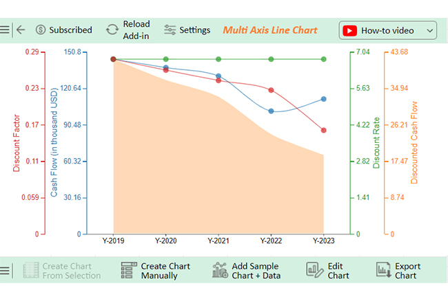
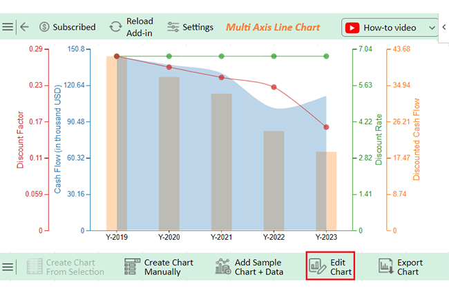
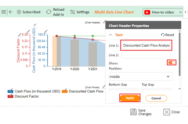
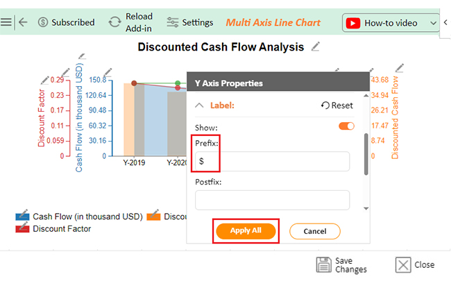
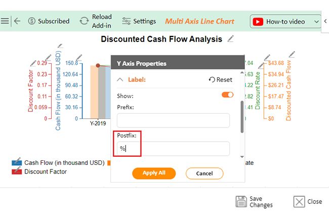
The following video will help you to create a Multi Axis Line Chart in Microsoft Excel.

FAQs

What is a dynamic pivot table in Excel?

A dynamic Pivot Table in Excel updates automatically as your data changes. It helps summarize, analyze, and organize large datasets efficiently. With fields you can drag and drop, it’s a powerful tool for flexible and interactive data analysis.

How do I create a dynamic function in Excel?

To create a dynamic function in Excel, use formulas like INDEX, MATCH, or OFFSET combined with named ranges. Pair them with Table formatting for automatic updates. Dynamic Array functions like FILTER and UNIQUE also enable seamless, flexible calculations.

Wrap Up

Dynamic tables in Excel are powerful tools for managing data. They simplify and streamline the management of large or dynamic datasets, offering adaptability that saves time and effort.

These tables automatically expand or shrink with your data. This eliminates the manual adjustments, ensuring your work remains accurate and organized.

Dynamic tables improve clarity. Features like structured references and automatic formatting make data easier to read and use. It enhances productivity and reduces confusion.

They also enhance reporting. Dynamic tables connect seamlessly with charts and pivot tables. Updates in your data are instantly reflected in reports and dashboards.

Dynamic tables make data analysis and validation simpler and more efficient. Sorting, filtering, and conditional formatting are more efficient. They streamline workflows and help identify trends quickly.

Dynamic tables are essential for modern Excel users. They enhance data management and improve accuracy, making Excel more efficient and user-friendly for simple tasks and complex projects. Start using them today with ChartExpo to improve and revolutionize how you work with data.

How much did you enjoy this article?

ExcelAd2
Start Free Trial!
146155

Related articles

next previous
Microsoft Excel10 min read

Excel Bookkeeping for Small Business: Insights at a Glance

Excel bookkeeping for small businesses helps track income, expenses, and cash flow. Learn about templates and financial analysis to simplify bookkeeping.

Microsoft Excel10 min read

Compound Interest in Excel for Smarter Reporting

Discover compound interest in Excel and how it works. Learn its formulas, calculation tips, and common errors to avoid for more accurate financial analysis.

Microsoft Excel9 min read

KPI Dashboard in Excel: A Complete Guide

A KPI dashboard in Excel helps track key metrics and streamline data visualization. Discover how to create, analyze, and use it with clear guides and examples.

Microsoft Excel11 min read

How to Plot a Speedometer Chart in Excel?

Create a Speedometer Chart in Excel to track KPIs, goals, and performance metrics visually. Explore templates, examples, and step-by-step instructions for better dashboards.

Microsoft Excel13 min read

Excel for Teachers for Insightful Preparation

Excel for teachers simplifies grading, tracks attendance, and organizes data. Find its key features, expert tips, and how ChartExpo enhances data visualization.

ChartExpo logo

Turn Data into Visual
Stories

CHARTEXPO

  • Home
  • Gallery
  • Videos
  • Services
  • Pricing
  • Contact us
  • FAQs
  • Privacy policy
  • Terms of Service
  • Sitemap

TOOLS

  • ChartExpo for Google Sheets
  • ChartExpo for Microsoft Excel
  • Power BI Custom Visuals by ChartExpo
  • Word Cloud

CATEGORIES

  • Bar Charts
  • Circle Graphs
  • Column Charts
  • Combo Charts
  • Comparison Charts
  • Line Graphs
  • PPC Charts
  • Sentiment Analysis Charts
  • Survey Charts

TOP CHARTS

  • Sankey Diagram
  • Likert Scale Chart
  • Comparison Bar Chart
  • Pareto Chart
  • Funnel Chart
  • Gauge Chart
  • Radar Chart
  • Radial Bar Chart
  • Sunburst Chart
  • see more
  • Scatter Plot Chart
  • CSAT Survey Bar Chart
  • CSAT Survey Chart
  • Dot Plot Chart
  • Double Bar Graph
  • Matrix Chart
  • Multi Axis Line Chart
  • Overlapping Bar Chart
  • Control Chart
  • Slope Chart
  • Clustered Bar Chart
  • Clustered Column Chart
  • Box and Whisker Plot
  • Tornado Chart
  • Waterfall Chart
  • Word Cloud
  • see less

RESOURCES

  • Blog
  • Resources
  • YouTube
SIGN UP FOR UPDATES

We wouldn't dream of spamming you or selling your info.

© 2025 ChartExpo, all rights reserved.