• Home
  • Tools dropdown img
    • Spreadsheet Charts

      • ChartExpo for Google Sheets
      • ChartExpo for Microsoft Excel
    • Power BI Charts

      • Power BI Custom Visuals by ChartExpo
    • Word Cloud

  • Charts dropdown img
    • Chart Category

      • Bar Charts
      • Circle Graphs
      • Column Charts
      • Combo Charts
      • Comparison Charts
      • Line Graphs
      • PPC Charts
      • Sentiment Analysis Charts
      • Survey Charts
    • Chart Type

      • Box and Whisker Plot
      • Clustered Bar Chart
      • Clustered Column Chart
      • Comparison Bar Chart
      • Control Chart
      • CSAT Survey Bar Chart
      • CSAT Survey Chart
      • Dot Plot Chart
      • Double Bar Graph
      • Funnel Chart
      • Gauge Chart
      • Likert Scale Chart
      • Matrix Chart
      • Multi Axis Line Chart
      • Overlapping Bar Chart
      • Pareto Chart
      • Radar Chart
      • Radial Bar Chart
      • Sankey Diagram
      • Scatter Plot Chart
      • Slope Chart
      • Sunburst Chart
      • Tornado Chart
      • Waterfall Chart
      • Word Cloud
    • Google Sheets
      Microsoft Excel
  • Services
  • Pricing
  • Contact us
  • Blog
  • Support dropdown img
      • Gallery
      • Videos
      • Contact us
      • FAQs
      • Resources
    • Please feel free to contact us

      atsupport@chartexpo.com

Categories
All Data Visualizations Data Analytics Surveys
Add-ons/
  • Google Sheets
  • Microsoft Excel
  • Power BI
All Data Visualizations Data Analytics Surveys
Add-ons
  • Google Sheets
  • Microsoft Excel
  • Power BI

We use cookies

This website uses cookies to provide better user experience and user's session management.
By continuing visiting this website you consent the use of these cookies.

Ok

ChartExpo Survey


Home > Blog > Power BI

Mastering Data Visualization: Unveiling the Best-Designed Dashboards

In the modern world, data reigns supreme. The best-designed dashboards, therefore, strike a tricky balance between being aesthetically pleasing and actionable.

Dashboards help showcase trends in key performance indicators (KPIs) and business performance. They are also a great way to divulge crucial insights from data.

Best Designed Dashboards

However, for dashboards to be properly designed, the data source(s) have to be clean and reliable. Even if you design the most aesthetically pleasing dashboard based on untrustworthy data, then it’s not helpful.

In this article, we delve into the world of best-designed dashboards. We begin by defining them and learning why they’re important. We’ll then look at the benefits of using a well-designed dashboard.

We’ll explore the elements of a well-designed dashboard and the best practices to follow when designing one.

We’ll also discuss how to design the best dashboard in Power BI. Eventually, respond to questions you might still have about the best-designed dashboards.

Table of Contents:

  1. What is the Best Dashboard?
  2. Why are Best Designed Dashboards Important?
  3. Benefits of Using a Well-Designed Dashboard
  4. Elements of a Best-Designed Dashboard
  5. Best Practices for Designing the Best Dashboard
  6. How to Design the Best Dashboard in Power BI?
  7. Wrap Up

What is the Best Dashboard?

The best dashboard summarizes key insights and trends for the target audience. The summary is done in a user-friendly and easy-to-understand way.

Here are other characteristics of the best dashboard:

  • It has a clearly defined goal.
  • It is meant to serve a specific audience.
  • It uses trustworthy data sources.
  • Contains actionable data.
  • Is suited for your specific business or data context.

Why are Best Designed Dashboards Important?

The best-designed dashboards are a great tool in every business’ arsenal. This is because they:

  • Help answer specific data questions in a business context. For example, what was the revenue growth this quarter compared to the last one?
  • Can easily be integrated into business processes.
  • Can help get everyone on the same page.
  • Can help streamline data management processes within an organization.
  • Can help support decision-making.

Benefits of Using a Well-Designed Dashboard

There are several benefits to using a well-designed dashboard. These include:

  • It can help your team take prompt action. For example, an alert system for a client’s one-month sales follow-up call.
  • Can help monitor and identify issues that should be addressed within an organization. For example, a sudden decrease in revenue. The team can then find the root cause and address it.
  • Can be used to give updates to various stakeholders or even to pitch to potential customers.
  • They are a great way to present data that might be complex to understand.
  • They help highlight business or organization KPIs in a centralized place.

Elements of a Best-Designed Dashboard

The best-designed dashboards share some key elements, including:

  • They’re aesthetically pleasing
  • They’re user-friendly
  • They use a consistent color scheme and style
  • They use plenty of white space around the visuals
  • They make use of borders around the visuals
  • They focus on only a few critical metrics
  • They’re easily scannable (shows the most important data at a glance)

Best Practices for Designing the Best Dashboard

There are a few things to keep in mind when designing the best dashboard. These include:

  • Understanding the Intended Audience

The audience that you are designing the dashboard for will determine crucial aspects. These include the data sources you go with or the metrics or KPIs to focus on.

  • Understanding the Goal the Dashboard Intends to Achieve

The goal a dashboard intends to achieve will help you know how to package your data story. If you want to showcase revenue in real-time, for example, you’ll know what important aspects to highlight.

  • Ensuring Data Integrity

Even the best-designed web analytics dashboards won’t be helpful if you do not have trustworthy data. Always work with reliable data sources. You also need to transform your data before creating your dashboard.

  • Sticking to your organization’s brand

Ensure that you use colors, gradients, fonts, and logos that align with the company’s brand. This helps to keep your dashboard consistent.

  • Allowing for Further Data Exploration

Add features to help your audience further interact with the dashboard. These include slicers, filtering, and drill-through.

  • Streamlining your ETL Processes

All of the datasets you use for your dashboards can use your ETL processes if you streamline them.

  • Limiting the Number of Visuals on a Page

Ensure that your dashboards are not crowded. This allows the audience to focus better on the visualizations.

How to Design the Best Dashboard in Power BI?

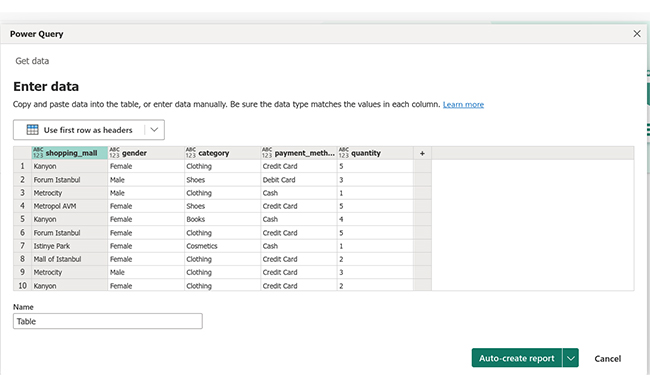
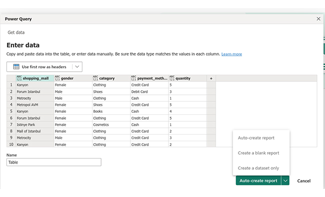
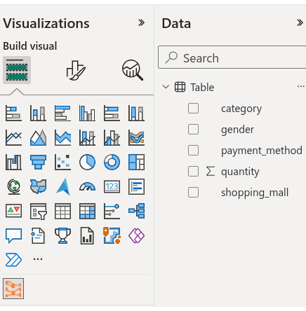
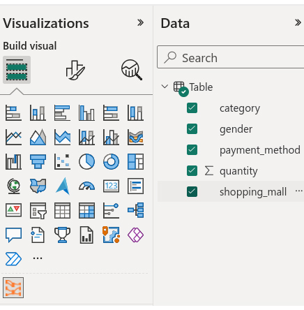
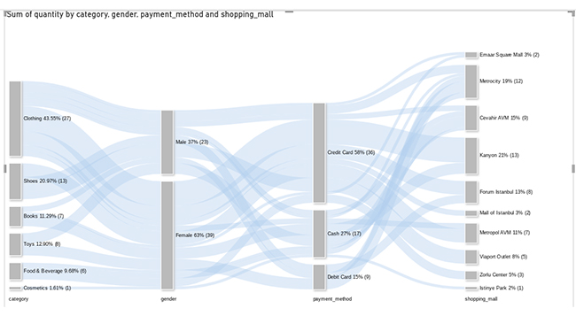
In this section, we learn more about Power BI dashboard design for the best-designed dashboards. We’ll use the Sankey Diagram (Sankey Chart) as a Power BI business dashboard example.

Stage 1: Logging in to Power BI

  • Log in to Power BI.
  • Enter your email. Click the “Submit” button.
Enter email to login to Power BI
  • You are redirected to your Microsoft account.
  • Enter your password and click “Sign in”.
Enter Password to login to Power BI
  • Choose whether to stay signed in.
Click on stay signed in
  • Once done, the Power BI home screen will open.

Stage 2: Creating a Data Set and Selecting the Data Set to Use in Your Sankey Chart

  • Click on the “Create” option on the left-side menu.
  • Select ”Paste or manually enter data“.
select Paste or manually enter data in Power BI ce421
  • We’ll use the following customer shopping dataset.
 Shopping_mall Gender Category Payment method Quantity
Kanyon Female Clothing Credit Card 5
Forum Istanbul Male Shoes Debit Card 3
Metrocity Male Clothing Cash 1
Metropol AVM Female Shoes Credit Card 5
Kanyon Female Books Cash 4
Forum Istanbul Female Clothing Credit Card 5
Istinye Park Female Cosmetics Cash 1
Mall of Istanbul Female Clothing Credit Card 2
Metrocity Male Clothing Credit Card 3
Kanyon Female Clothing Credit Card 2
Metrocity Female Food & Beverage Cash 2
Emaar Square Mall Female Books Credit Card 1
Metrocity Female Toys Debit Card 4
Cevahir AVM Male Clothing Cash 2
Kanyon Female Clothing Credit Card 2
Viaport Outlet Male Shoes Credit Card 5
Metrocity Male Books Debit Card 2
Zorlu Center Female Food & Beverage Credit Card 3
Metropol AVM Female Clothing Cash 2
Cevahir AVM Male Toys Cash 4
Emaar Square Mall Male Clothing Credit Card 1
Cevahir AVM Female Food & Beverage Cash 1
Cevahir AVM Male Clothing Credit Card 2
  • Paste the above data table into the “Power Query” window.
Paste Data Into Power Query ce432
  • Select the “Create a dataset only” option as shown below.
Create Dataset in Power BI ce432
  • Click on the “Data Hub” option on the left-side menu.
  • Power BI populates the data set list. (If you have not created a data set, refer to the Error! Reference source not found section.)
  • The data details are shown below:
Click on Data Hub ce432
  • Click on the “Create a report” dropdown as shown below.
  • Select “Start from scratch.”
Create Report and start from scratch ce421
  • You should see the Report Canvas screen as shown below:
Report Canvas screen in Power BI ce426

Stage 3: Adding the Power BI Sankey Diagram Extension by ChartExpo

  • To finish creating our Sankey Diagram, we’ll use an add-in or Power BI visual from AppSource.
  • Navigate to the Power BI Visualizations panel.
  • Click the ellipsis (…) highlighted above to import the Power BI Sankey Diagram extension by ChartExpo.
click on to get more visuals ce426
  • The following menu opens:
  • Select the “Get more visuals” option.
  • The following window opens:
get more visuals in Power BI ce426
  • Enter “Sankey Diagram for Power BI by ChartExpo” in the highlighted search box.
  • You should see the “Sankey Diagram for Power BI by ChartExpo”, as shown in the image below.
Sankey Diagram for Power BI by ChartExpo
  • Click the highlighted “Add” button.
Click the Add button
  • Power BI will add the “Sankey Diagram for Power BI by ChartExpo” icon in the visualization panel.
Click on Sankey Diagram Icon

Stage 4: Drawing a Sankey Diagram with ChartExpo’s Power BI extension

  • Select the “Sankey Diagram for Power BI by ChartExpo” icon in the visualization panel.
  • The following window opens in the report section of your dashboard:
Report Section in Dashboard ce421
  • You can resize the visual as needed.
  • Go to the right-hand side of your Power BI dashboard.
Fields next to visualizations ce432
  • You’ll select the fields to use in your Sankey chart here.
  • The ChartExpo visual needs to be selected, though.
  • Select the fields in the following sequence:
    • Category
    • Gender
    • Payment method
    • Quantity
    • Shopping_mall
Select fields for Sankey diagram ce432
  • You’ll be asked for a ChartExpo license key or email address.
enter email for ChartExpo license ce430

Stage 5: Activate your ChartExpo Trial or Apply a Subscription Key

  • Select the ChartExpo visual.
  • You should see three icons below “Build Visual” in the Visualizations panel.
Build visual panel in Power BI
  • Select the middle icon, “Format visual.”
  • The visual properties will be populated as shown below.
visual properties in Power BI
  • If you are a new user,
    • Type in your email under the section titled “Trial Mode”.
    • This should be the email address that you used to subscribe to the ChartExpo add-in. It is where your ChartExpo license key will be sent.
    • Ensure that your email address is valid.
    • Click “Enable Trial.” You’ll get a 7-day trial.
enter email id
  • You should receive a welcome email from ChartExpo.
  • The Sankey Diagram you create under the 7-day trial contains the ChartExpo watermark (see below).
Best Designed Dashboards 1
  • If you have obtained a license key:
    • Enter your license key in the “ChartExpo License Key” textbox in the “License Settings” section (see below).
    • Slide the toggle switch next to “Enable License” to “On“.
enter license key
  • To add colors, expand the “Level Colors” properties and select a color.
  • Do this to change the color of each node.
  • All changes are automatically saved.
Coloring Sankey Diagram ce432
  • Automatically all changes will be saved.
Final Best Designed Dashboards

Insights

  • At level 1, Category, clothes were the most purchased item (43.55%). Shoes came in second with 20.97% of the total items. Cosmetics had the fewest purchases (1.61%).
  • At level 2, Gender, females purchased the most items (63%). Males purchased 37% of the total items.
  • At level 3, the Payment method, the majority of the customers opted for credit cards to purchase items (58%). Cash was the second most preferred method at 27%. The smallest percentage of customers (15%) used debit cards for their payments.
  • At level 4, Shopping_mall, the majority of the customers chose to shop at Kanyon Mall (21%). Cevahir AVM ranked second in customer shopping preferences, with 15% of the shoppers. Istinye Park Mall, had the lowest customer turnout, accounting for 2% of the total customers.

FAQs

How Do I Create an Impactful Dashboard?

To create an impactful dashboard, you need to have the following in mind:

  • The target audience
  • The goal the dashboard is meant to achieve
  • The data story you want to tell
  • The integrity of your data
  • The visual appeal of your dashboard

Which Tool is Best for Dashboards?

There are many tools that you can use for your dashboards. These include:

  • Power BI
  • Tableau
  • AppSmith
  • Retool

Wrap Up

The significance of well-designed dashboards in today’s data-driven world cannot be ignored.

These data visualization tools are invaluable assets to organizations across various industries. They empower users to make informed decisions, foster transparency, enhance productivity, and gain a competitive edge.

Good dashboard design offers a comprehensive platform for data communication through the utilization of key elements. Key elements include data visualizations, user-friendly design, and security measures.

Users can access critical information quickly and delve deeper to uncover key insights. In doing so, they have a better understanding of trends and KPIs. This leads to more efficient operations and strategic choices.

Great dashboard design is the driving force behind an organization’s ability to harness the power of data. This makes dashboards indispensable in the quest for success and innovation.


How much did you enjoy this article?

PBIAd2
Start Free Trial!
129382

Related articles

next previous
Power BI12 min read

How to Create Sankey Diagram in Microsoft Power BI?

Learn How to Create Sankey Diagram in Microsoft Power BI using Desktop & Web Service. What they are and how to use them effectively.

Power BI8 min read

Power BI Artificial Intelligence: Insights Using Visuals

Discover all there is to know about the Power BI artificial intelligence. You'll also discover how AI is used in Power BI, and how to use it for analysis and more.

Power BI9 min read

Budgeting in Healthcare: Use Visuals to Spot Budget Gaps

This guide helps you discover what budgeting in healthcare is. You'll also discover the factors that affect hospital budgets and types of budgeting in healthcare.

Power BI9 min read

Predictive Analytics in Power BI for Making Insightful Visuals

This guide shows you everything you need to know about Predictive Analytics in Power BI. It also shows you how it works, and how to interpret the results.

Power BI8 min read

Quarterly Business Review Template for Optimum Reports

Discover what the quarterly business review template is. This guide also shows you the best practices to consider when using the QBR template.

ChartExpo logo

Turn Data into Visual
Stories

CHARTEXPO

  • Home
  • Gallery
  • Videos
  • Services
  • Pricing
  • Contact us
  • FAQs
  • Privacy policy
  • Terms of Service
  • Sitemap

TOOLS

  • ChartExpo for Google Sheets
  • ChartExpo for Microsoft Excel
  • Power BI Custom Visuals by ChartExpo
  • Word Cloud

CATEGORIES

  • Bar Charts
  • Circle Graphs
  • Column Charts
  • Combo Charts
  • Comparison Charts
  • Line Graphs
  • PPC Charts
  • Sentiment Analysis Charts
  • Survey Charts

TOP CHARTS

  • Sankey Diagram
  • Likert Scale Chart
  • Comparison Bar Chart
  • Pareto Chart
  • Funnel Chart
  • Gauge Chart
  • Radar Chart
  • Radial Bar Chart
  • Sunburst Chart
  • see more
  • Scatter Plot Chart
  • CSAT Survey Bar Chart
  • CSAT Survey Chart
  • Dot Plot Chart
  • Double Bar Graph
  • Matrix Chart
  • Multi Axis Line Chart
  • Overlapping Bar Chart
  • Control Chart
  • Slope Chart
  • Clustered Bar Chart
  • Clustered Column Chart
  • Box and Whisker Plot
  • Tornado Chart
  • Waterfall Chart
  • Word Cloud
  • see less

RESOURCES

  • Blog
  • Resources
  • YouTube
SIGN UP FOR UPDATES

We wouldn't dream of spamming you or selling your info.

© 2025 ChartExpo, all rights reserved.