• Home
  • Tools dropdown img
    • Spreadsheet Charts

      • ChartExpo for Google Sheets
      • ChartExpo for Microsoft Excel
    • Power BI Charts

      • Power BI Custom Visuals by ChartExpo
    • Word Cloud

  • Charts dropdown img
    • Chart Category

      • Bar Charts
      • Circle Graphs
      • Column Charts
      • Combo Charts
      • Comparison Charts
      • Line Graphs
      • PPC Charts
      • Sentiment Analysis Charts
      • Survey Charts
    • Chart Type

      • Box and Whisker Plot
      • Clustered Bar Chart
      • Clustered Column Chart
      • Comparison Bar Chart
      • Control Chart
      • CSAT Survey Bar Chart
      • CSAT Survey Chart
      • Dot Plot Chart
      • Double Bar Graph
      • Funnel Chart
      • Gauge Chart
      • Likert Scale Chart
      • Matrix Chart
      • Multi Axis Line Chart
      • Overlapping Bar Chart
      • Pareto Chart
      • Radar Chart
      • Radial Bar Chart
      • Sankey Diagram
      • Scatter Plot Chart
      • Slope Chart
      • Sunburst Chart
      • Tornado Chart
      • Waterfall Chart
      • Word Cloud
    • Google Sheets
      Microsoft Excel
  • Services
  • Pricing
  • Contact us
  • Blog
  • Support dropdown img
      • Gallery
      • Videos
      • Contact us
      • FAQs
      • Resources
    • Please feel free to contact us

      atsupport@chartexpo.com

Categories
All Data Visualizations Data Analytics Surveys
Add-ons/
  • Google Sheets
  • Microsoft Excel
  • Power BI
All Data Visualizations Data Analytics Surveys
Add-ons
  • Google Sheets
  • Microsoft Excel
  • Power BI

We use cookies

This website uses cookies to provide better user experience and user's session management.
By continuing visiting this website you consent the use of these cookies.

Ok

ChartExpo Survey


Home > Blog > Microsoft Excel

How to Filter the Data in Excel for Enhanced Insights?

How do you filter the data in Excel effectively?

This simple yet powerful tool turns a chaotic spreadsheet into a clear and focused resource. Filtering helps you find relevant information quickly, save time, and boost productivity.

Imagine managing a large dataset with thousands of rows. Without filtering, finding specific details would be tedious and prone to errors. Studies show that workers spend nearly 20% of their workweek searching for information. Learning how to filter the data in Excel can reduce this wasted time.

How to Filter the Data in Excel

Excel’s filtering options are versatile and easy to use. You can sort by specific criteria, exclude irrelevant entries, or highlight key data points. These tools are valuable in finance and marketing, where quick decisions rely on accurate insights.

Knowing how to filter the data in Excel also improves teamwork. Filtered views allow multiple users to focus on different aspects of the same dataset. This fosters better collaboration and ensures everything is noticed.

Mastering filtering is essential for anyone working with data. It simplifies complex tasks and delivers actionable insights. With the right techniques, you can make your data work for you.

How?

Table of Contents:

  1. What is Filtering Data in Excel?
  2. Why Use Filters in Excel?
  3. How Many Types of Filters in Excel?
  4. How to Add Filters in Excel?
  5. How to Filter Data in Excel?
  6. How to Filter Multiple Columns in Excel?
  7. How to Use Auto Filter in Excel?
  8. How to Remove Filter from Data in Excel?
  9. How to Analyze Filtered Data in Excel?
  10. Wrap Up

First…

What is Filtering Data in Excel?

Definition: Filtering data in Excel helps you display only the needed information. It allows you to sort and view specific rows based on criteria, such as text, numbers, or dates. Unnecessary data is temporarily hidden, making it easier to focus on relevant details.

You can filter by color, values, or custom conditions. This tool is useful for efficiently analyzing large datasets, especially when you need to move columns in Excel. It saves time and improves accuracy when managing or reviewing information in a spreadsheet.

Why Use Filters in Excel?

Using filters in Excel is a game-changer for working with data. It transforms overwhelming spreadsheets into manageable and meaningful insights. Whether handling large datasets or small projects, filters help you stay focused and efficient.

  • Streamline data analysis: Filters let you focus on what matters by showing only relevant data.
  • Save time: Quickly locate specific information without scrolling through endless rows. Filters cut hours of work into minutes.
  • Improve accuracy: Isolating specific data helps to reduce errors and avoid overlooking key details.
  • Enhance decision-making: Filtering helps highlight trends and patterns, providing a clear foundation for informed choices.
  • Versatile filtering options: Excel offers filters for text, numbers, dates, and colors, making it adaptable to any task.
  • Dynamic analysis: Filters update in real-time as your data changes, ensuring your insights stay relevant.
  • Simplify sorting: Easily organize data by criteria such as highest to lowest or newest to oldest.
  • Customizable views: Create personalized views that match your needs. You can review sales, budgets, or reports.
  • Support collaboration: Shared workbooks with filters allow teams to focus on different aspects of the data, improving teamwork and efficiency.

How Many Types of Filters in Excel?

Excel offers various filters to make data management simple and efficient. These tools help you extract specific information with ease. Here’s a streamlined look at six key types of Excel filters:

  • Basic comparisons: Filters like equals, does not equal, greater than, and less than let you focus on exact matches or exclusions. They are useful for locating specific values or eliminating irrelevant data.
  • Range filters: Use options like greater than or equal to analyze data within a defined range. It is ideal for spotting trends or narrowing down datasets to relevant intervals.
  • Top/bottom values: The Top 10 filter helps you find your data’s highest or lowest values. You can adjust it to show any number of top or bottom entries, providing quick insights into performance.
  • Averages: Highlighting above-average or below-average data points helps you evaluate performance at a glance. It’s a great way to identify outliers or assess overall trends.
  • Custom filters: Combine multiple criteria for advanced filtering needs. This option gives complete control, allowing you to tailor searches that meet specific requirements.
  • Dynamic filters: Filters adapt in real-time as data changes, keeping your analysis up-to-date. This ensures you always have the latest insights without reapplying filters.

How to Add Filters in Excel?

Ready to level up your Excel game? Filters are your best friends for sorting and analyzing data quickly. Let’s see how to use them step by step:

  1. Select the data range: Click and drag to highlight the range of data you want to filter. Include your table headers—they make filtering easier!
  2. Go to the data tab. Look at the top of your screen. Click on the Data tab in the ribbon. This is where the magic begins.
  3. Click on the filter: In the Data tab, find the Filter button (it looks like a funnel). Click it, and drop-down arrows will appear in your column headers.
  4. Apply a filter: Click the drop-down arrow in any column header. Select the criteria you want to filter by, like specific text, numbers, or dates. Excel will display only the rows that match your choice.
  5. Clear filters: Need to start fresh? Go back to the drop-down menu and choose Clear Filter. Or, click the Clear button in the Data tab to remove all filters at once.

How to Filter Data in Excel?

Excel can feel like a jungle of numbers, but filters are your machete to slice through the noise! Let’s make it simple and fun—here’s how you can filter data like a pro:

  1. Select your data: Click and drag to highlight the rows and columns you want to work with. Got headers? Include them—they’re your guideposts for filtering!
  2. Enable filters: Head to the Data tab at the top of the screen. You will see the funnel icon labeled Filter. Click it. Boom! Your column headers now have little drop-down arrows.
  3. Open filter options: Click the drop-down arrow in the column you want to filter. A list of options will appear, waiting for your command.
  4. Choose a filter: Want to see only specific numbers, names, or dates? Select them from the list. Excel will instantly hide everything else, showing what matters.
  5. Apply the Filter: Sometimes, you need to refine further. Use checkboxes, text search, or number filters to dig deeper. Hit “OK,” and watch Excel do its magic.
  6. Clear filters: Done with filtering? Go back to the Data tab and click Clear to remove all filters. Or, clear them one by one using the drop-down menu.

How to Filter Multiple Columns in Excel?

Need to zero in on specific data across multiple columns? Excel makes it easy to combine filters and get what you want. Let’s walk through it step by step:

  1. Select your dataset: Highlight the full table you want to work with. Don’t forget to include the headers—they’re essential for setting up filters!
  2. Enable filters: Go to the Data tab and click the Filter button (that little funnel icon!). Drop-down arrows will appear in all your column headers.
  3. Filter the first column: Click the drop-down arrow in the first column you want to filter. Choose your criteria—maybe a specific name, number, or range. Excel will instantly narrow the data in that column.
  4. Filter the second column: Now, move to the next column you want to filter. Click its drop-down arrow and apply another filter. Don’t worry—Excel will combine this with the first filter to show only rows that meet both criteria.
  5. View combined results: Sit back and admire the filtered table! Excel now shows only the rows matching all your filters across multiple columns.
  6. Clear filters: Click Clear in the Data tab to remove all filters. Or clear individual filters using the drop-down arrows.

How to Use Auto Filter in Excel?

Feeling buried under rows of data? Auto Filter is your secret weapon for instant clarity. Let’s break it down step by step so you can breeze through your spreadsheet like a pro:

  1. Select data range: Highlight the area you want to filter, including headers if you’ve got them. Headers act as labels for your filters—don’t skip them!
  2. Activate auto filter: Go to the Data tab at the top. Click the Filter button (yep, it’s the funnel icon). Your headers will sprout drop-down arrows. That’s Auto Filter in action!
  3. Apply filter: Click a drop-down arrow in any column. A list of options will appear, waiting for your choice.
  4. Choose filter criteria: Want to filter for a specific name, date, or number? Tick the boxes that match your criteria. Use options like “Greater Than” or “Contains” for advanced filtering. Excel will refine your data.
  5. View filtered data: Voilà! Your table now shows only the rows that match your filter. Everything else? Tucked away, not deleted—just hidden.
  6. Clear filters: Head back to the Data tab and click “Clear” to remove all filters. Or clear individual filters via the drop-down arrows.

How to Remove Filter from Data in Excel?

Tired of those pesky filters messing with your view? Removing filters is quick and easy. Let’s clean up your data so you can see everything again:

  1. Select your data: Click anywhere inside your filtered table. No need to highlight everything—Excel already knows where the filters are.
  2. Go to the data tab: Head to the top of your screen and click the Data tab. It’s your control center for managing filters.
  3. Click clear: In the Sort & Filter group, hit the Clear button. It removes all filters but keeps the filter arrows visible. Your full dataset is back, just like that!
  4. Remove filter arrows: Want to ditch the drop-down arrows too? Click the Filter button in the Data tab again. Your table is back to its clean, original look.

How to Analyze Filtered Data in Excel?

Data analysis can feel like finding a needle in a haystack, especially when sifting through massive datasets. This is where data visualization comes into play, bringing clarity and context to raw numbers.

However, as Excel’s filtering tools are helpful, its built-in visuals often lack the depth to illuminate your insights.

Enter ChartExpo. This powerful tool takes your data visualization game to the next level, making patterns and trends clear. It simplifies trend analysis in Excel, enabling you to identify emerging patterns and make more informed business decisions quickly.

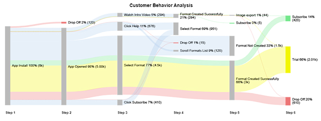
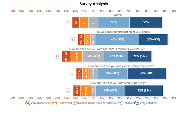
Here are the top 5 charts and graphs created in Excel using ChartExpo:

Multi Axis Line Chart

Multi Axis Line Chart After Learning How to Filter the Data in Excel

Sankey Chart

Sankey Chart After Learning How to Filter the Data in Excel

Likert Scale Chart

Likert Scale Chart After Learning How to Filter the Data in Excel

Comparison Bar Chart

Comparison Bar Chart After Learning How to Filter the Data in Excel

Circular Org Chart

Circular Org Chart After Learning How to Filter the Data in Excel

Let’s learn how to install ChartExpo in Excel.

  1. Open your Excel application.
  2. Open the worksheet and click the “Insert” menu.
  3. You’ll see the “My Apps” option.
  4. In the Office Add-ins window, click “Store” and search for ChartExpo on my Apps Store.
  5. Click the “Add” button to install ChartExpo in your Excel.

ChartExpo charts are available both in Google Sheets and Microsoft Excel. Please use the following CTAs to install the tool of your choice and create beautiful visualizations with a few clicks in your favorite tool.

Example

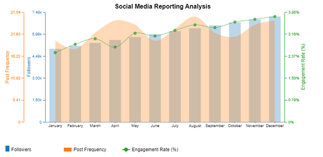
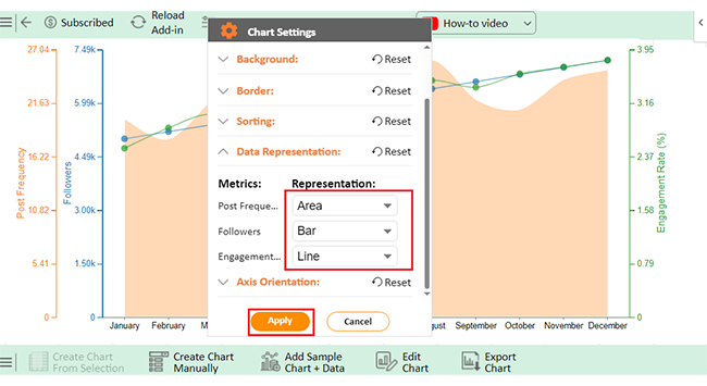
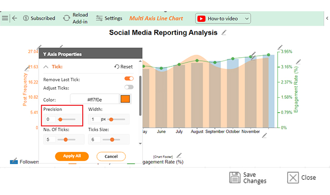
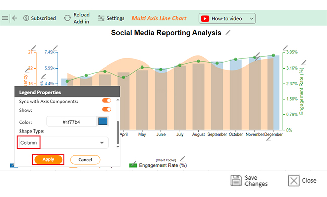
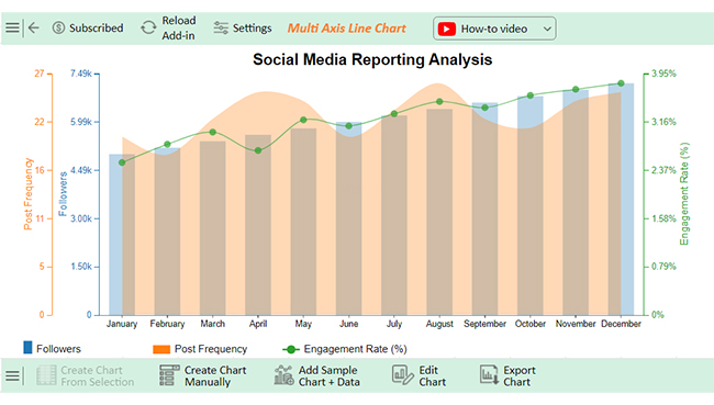
Let’s analyze this sample data in Excel using ChartExpo. This tool streamlines analyzing and interpreting data, transforming raw numbers into actionable insights with ease, so you can make data-driven decisions confidently.

Month Followers Engagement Rate (%) Post Frequency
January 5000 2.5 20
February 5200 2.8 18
March 5400 3 22
April 5600 2.7 25
May 5800 3.2 24
June 6000 3.1 20
July 6200 3.3 23
August 6400 3.5 26
September 6600 3.4 22
October 6800 3.6 21
November 7000 3.7 24
December 7200 3.8 25
  • To get started with ChartExpo, install ChartExpo in Excel.
  • Now Click on My Apps from the INSERT menu.
insert chartexpo in excel
  • Choose ChartExpo from My Apps, then click Insert.
open chartexpo in excel
  • Once it loads, scroll through the charts list to locate and choose the “Multi Axis Line Chart”.
search multi axis line chart in excel
  • You will see a Multi Axis Line Chart on the screen.
Multi Axis Line Chart Page After Learning How to Filter the Data in Excel
  • Click the “Create Chart From Selection” button after selecting the data from the sheet, as shown.
Click Create Chart From Selection After Learning How to Filter the Data in Excel
  • ChartExpo will generate the visualization below for you.
Initial Visual After Learning How to Filter the Data in Excel
  • Click on Settings and change the “Data Representation” as follows.
Edit Chart After Learning How to Filter the Data in Excel
  • If you want to add anything to the chart, click the Edit Chart button:
Add Chart Header After Learning How to Filter the Data in Excel
  • Click the pencil icon next to the Chart Header to change the title.
  • It will open the properties dialog. Under the Text section, you can add a heading in Line 1 and enable Show.
  • Give the appropriate title of your chart and click the Apply button.
Give Appropriate Title of Chart After Learning How to Filter the Data in Excel
  • You can add the sign of (%) with the Engagement Rate value:
Add Postfix With Engagement Rate Value After Learning How to Filter the Data in Excel
  • You can change the precision value of Orders to zero as follows:
Change Precision Value of Orders to Zero After Learning How to Filter the Data in Excel
  • You can change the precision value of the Profit Margin to zero as follows:
Change Precision Value of Profit Margin After Learning How to Filter the Data in Excel
  • Change the Legend shape of “Followers” to Column and click the “Apply” button.
Change Legend Shape of Followers After Learning How to Filter the Data in Excel
  • Change the Legend shape of “Engagement Rate” into a Line and Circle and click the “Apply” button.
Change Legend Shape of Engagement Rate After Learning How to Filter the Data in Excel
  • Click the “Save Changes” button to persist the changes made to the chart.
Click Save Changes After Learning How to Filter the Data in Excel
  • Your final Multi Axis Line Chart will look like the one below.
Final How to Filter the Data in Excel

Insights

  • The follower count grew steadily, reaching 7,200 by December.
  • Engagement rate peaked at 3.8%.
  • Post frequency varied slightly but stayed relatively consistent.
  • Results highlight effective strategies for audience growth and engagement.

Revolutionize Chart Visuals with Data Filtering in Excel:

  1. Open your Excel Application.
  2. Install ChartExpo Add-in for Excel from Microsoft AppSource to create interactive visualizations.
  3. Select the Multi-Axis Line Chart from the list of charts.
  4. Select your data.
  5. Click on the “Create Chart from Selection” button.
  6. Customize your chart properties to add header, axis, legends, and other required information.

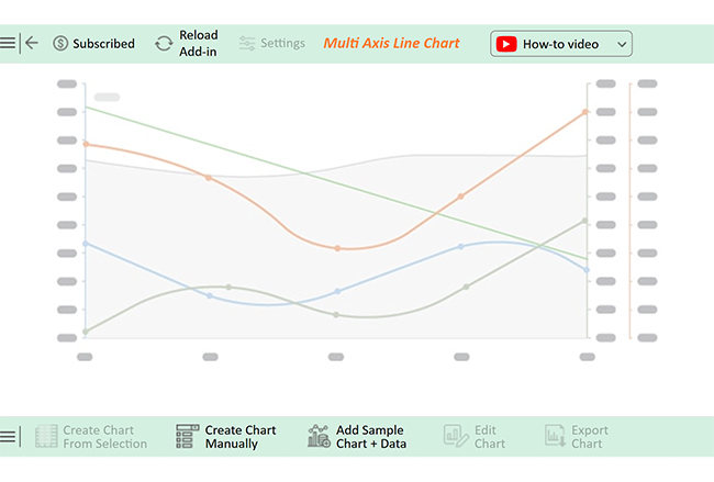
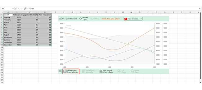
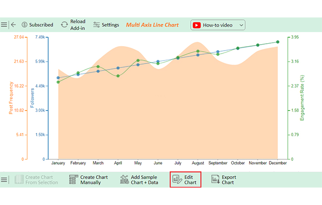
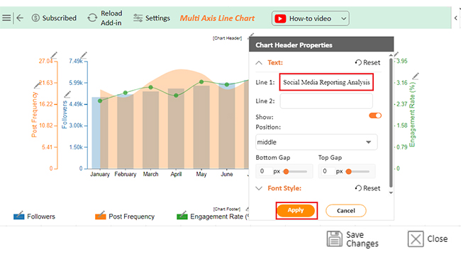
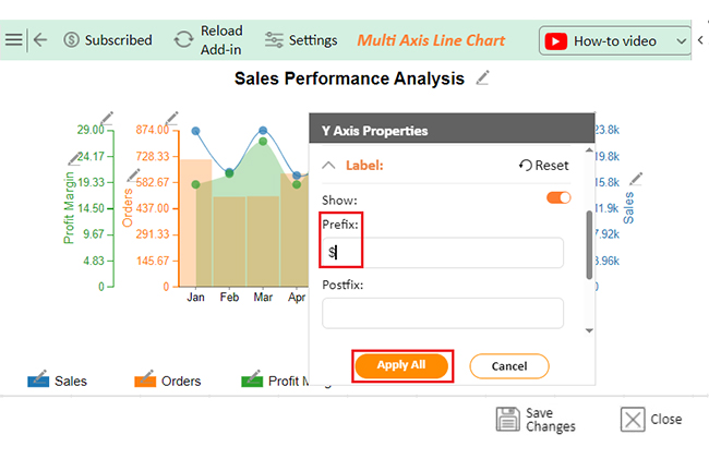
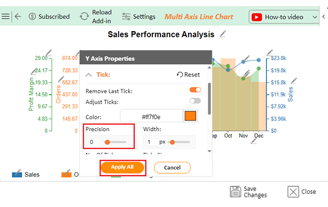
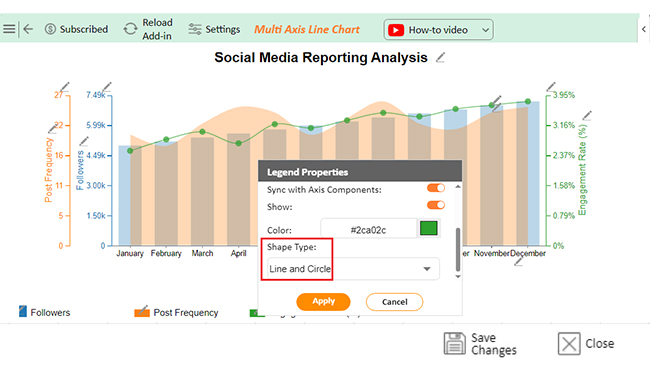
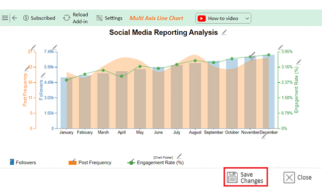
The following video will help you create a Multi-Axis Line Chart in Microsoft Excel.

FAQs

How do I filter specific data in Excel?

To filter specific data in Excel:

  • Select your dataset.
  • Click the Data tab and choose Filter.
  • Drop-down arrows will appear in column headers. Click them to apply conditions, such as text, numbers, or dates, to display relevant entries.

How to filter data in Excel automatically?

To filter data automatically in Excel, use the AutoFilter feature:

  • Select your dataset
  • Go to the Data tab and click Filter.
  • Set conditions using drop-down arrows.
  • Use formulas with FILTER() in Excel 365 or later for dynamic filtering.

What is the formula for filtering data in Excel?

The formula for filtering data in Excel is FILTER(). It works in Excel 365 or later. Here’s the syntax: =FILTER(array, include, [if_empty]). Replace the array with the dataset, and include criteria and if_empty with a value for no matches.

Wrap Up

Filtering data in Excel is a vital skill for efficient data management. It allows you to focus on specific information. Whether working on small or large datasets, it simplifies your tasks.

Mastering filters saves time and effort. You can quickly locate values, highlight trends, or exclude irrelevant entries. It’s an essential tool for professionals across industries.

Excel offers versatile filtering options. From basic comparisons to advanced custom filters, the possibilities are endless. These tools make data analysis flexible and precise.

Using filters also improves decision-making. Clear, filtered data helps you spot patterns and draw accurate conclusions. It is useful for projects requiring timely insights.

Dynamic filtering keeps your analysis current. As your data updates, filters adjust automatically. This ensures you always work with the most relevant information.

Now, you know how to filter the data in Excel effectively. Use these features to streamline workflows and boost productivity. Filtering isn’t just about managing data; it’s about transforming it into actionable insights.

How much did you enjoy this article?

ExcelAd1
Start Free Trial!
145596

Related articles

next previous
Microsoft Excel11 min read

Succession Planning Template for Long-Term Success

Succession Planning Templates help businesses prepare for leadership changes. Learn to create, analyze, and use them for seamless transitions and growth.

Microsoft Excel10 min read

Grant Tracking Spreadsheet: Insights Made Easy

A Grant Tracker Spreadsheet helps track funding, deadlines, and expenses in Excel. Learn to use grant tracking templates, analyze data, and stay organized.

Microsoft Excel10 min read

What is Excel Software Used for: A Complete Guide

What is Excel software used for? It organizes, analyzes, and manages data. Explore its workplace applications, benefits, and top tips for efficiency and more.

Microsoft Excel12 min read

Artificial Intelligence in Excel for Clear Insights

Discover how AI elevates Excel, from automation to advanced data analysis. This blog covers benefits, limitations, and examples to enhance your productivity.

Microsoft Excel8 min read

Excel Task Tracker Template for Smarter Task Insights

Task tracker template in Excel organizes tasks, tracks deadlines, and boosts efficiency. Learn its benefits, and explore expert tips to simplify task management.

ChartExpo logo

Turn Data into Visual
Stories

CHARTEXPO

  • Home
  • Gallery
  • Videos
  • Services
  • Pricing
  • Contact us
  • FAQs
  • Privacy policy
  • Terms of Service
  • Sitemap

TOOLS

  • ChartExpo for Google Sheets
  • ChartExpo for Microsoft Excel
  • Power BI Custom Visuals by ChartExpo
  • Word Cloud

CATEGORIES

  • Bar Charts
  • Circle Graphs
  • Column Charts
  • Combo Charts
  • Comparison Charts
  • Line Graphs
  • PPC Charts
  • Sentiment Analysis Charts
  • Survey Charts

TOP CHARTS

  • Sankey Diagram
  • Likert Scale Chart
  • Comparison Bar Chart
  • Pareto Chart
  • Funnel Chart
  • Gauge Chart
  • Radar Chart
  • Radial Bar Chart
  • Sunburst Chart
  • see more
  • Scatter Plot Chart
  • CSAT Survey Bar Chart
  • CSAT Survey Chart
  • Dot Plot Chart
  • Double Bar Graph
  • Matrix Chart
  • Multi Axis Line Chart
  • Overlapping Bar Chart
  • Control Chart
  • Slope Chart
  • Clustered Bar Chart
  • Clustered Column Chart
  • Box and Whisker Plot
  • Tornado Chart
  • Waterfall Chart
  • Word Cloud
  • see less

RESOURCES

  • Blog
  • Resources
  • YouTube
SIGN UP FOR UPDATES

We wouldn't dream of spamming you or selling your info.

© 2025 ChartExpo, all rights reserved.