Categories
By ChartExpo Content Team
A survey result isn’t just numbers. It’s a snapshot of opinions, behaviors, and trends. It guides businesses, researchers, and policymakers in making informed decisions.
But raw data alone doesn’t provide value. The way it’s analyzed, interpreted, and presented determines its impact.
A structured approach to survey result analysis prevents misinterpretation. It filters out inconsistencies, highlights key trends, and avoids common pitfalls.


Without careful analysis, results can mislead, leading to poor decisions. Clear methods and strong data validation ensure accuracy and reliability.
A well-organized survey result delivers more than statistics. It reveals patterns, exposes gaps, and highlights opportunities. Businesses use it to refine strategies. Researchers use it to validate theories.
Every survey result holds a story—if analyzed correctly.
First…
Survey results encapsulate the gathered data from survey responses. They reflect the collective input of participants. This data is crucial for uncovering insights and trends. It is analyzed to guide decision-making processes. Businesses, researchers, and public bodies use survey results to gauge opinions, satisfaction, and needs.
Survey results reports are pivotal tools in strategic decision-making. They provide a structured overview of data collected through surveys. These reports help organizations understand the attitudes, experiences, and requirements of their stakeholders.
By doing so, they can make informed decisions that enhance their services or products. The insights derived from these reports guide strategic planning, product development, and customer service enhancements.
Strategically presenting survey results is key to effective communication. It ensures that the data’s implications are clear and actionable. Presentations must be tailored to the audience, highlighting relevant findings and omitting extraneous data.
This approach maximizes the impact of the data, facilitating data-driven decisions and strategic actions. Properly presented results can influence policy, shape business strategies, and drive change.
Every business should tailor its survey report form to its specific needs. However, there are common elements that should be included. Start with a title page that includes the survey’s title, the name of the organization, and the date. A table of contents should follow if the report is lengthy.
The next part should be an executive summary. This gives key findings and implications in a brief format. It’s crucial for readers who need a quick overview.
The main body should break down the survey results question by question. Include participant demographics at the start to give context to the responses. End with a conclusion section that summarizes the findings and their implications for the business.
Formatting is crucial in making a survey report impactful. Use a clean, professional font like Arial or Times New Roman. Text size should make the report easy to read, usually around 11 or 12 points.
Organize content with clear headings and subheadings. This guides the reader through the report. Use bold or italics for emphasis but do so sparingly.
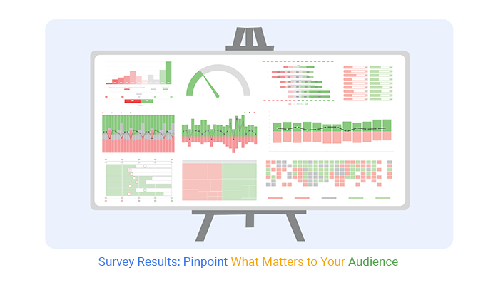
Visuals can greatly enhance the report’s impact. Include charts, graphs, and tables to represent data visually. Make sure each visual has a caption explaining what it shows.
Ensure each page has a footer with the page number. This helps in keeping the report organized. Include an appendix for detailed tables or questionnaires used in the survey.
Let’s dissect a sample survey report to understand its structure and content better. The report should start with an introduction. This sets the scene, explaining why the survey was conducted and what it aimed to find out.
Following the introduction, there should be a section detailing the methodology. This includes sample size, data collection methods, and any limitations of the study. This section is vital as it underpins the credibility of the survey results.
The main body of the report should present the data in a structured way. If the survey covered multiple topics, organize the data into sections by topic. Use different types of charts and graphs to make the data more digestible and engaging.
Each data presentation should be followed by an analysis. This shouldn’t just describe the data but should also offer insights into what the data means. This section is where the value of the survey really comes to light.
The report should end with a summary of the key findings. This ties all the data presented back to the survey’s original goals. This section should be brief and to the point, providing a clear conclusion based on the data.
When you conduct a survey, you gather more than just data; you unlock insights into your clientele’s minds. This information is crucial for tailoring your services and products to better meet their needs. Understanding survey results can transform your business approach, guiding you toward more focused and effective strategies.
For instance, if a survey reveals that most customers value quick service over cost, a business might reorganize its operations to boost efficiency, thereby increasing customer satisfaction and loyalty.
Incorporating survey findings into business strategies doesn’t just align products or services with customer expectations; it also enhances your market positioning. This alignment can lead to increased market share and improved customer retention.
By analyzing customer feedback, businesses can identify specific areas needing improvement or innovation, leading to a more refined business model.
Moreover, the process of analyzing these results involves a detailed examination of customer preferences and behaviors. This examination can reveal trends and patterns that may not have been apparent before, providing businesses with a strategic advantage.
They can anticipate market shifts more accurately through business analytics and adjust their strategies accordingly, ensuring they remain competitive and relevant in a rapidly changing market.
A well-crafted report on survey findings doesn’t just summarize data; it translates it into strategic insights. This report serves as a roadmap for decision-makers, highlighting key areas of opportunity and concern.
For example, if a survey indicates a high dissatisfaction rate with customer service, the report will not only point this out but also suggest actionable steps to address the issue.
Such reports often include visual data representations, like graphs and charts, which make the data accessible and understandable at a glance.
By presenting data visually, the report makes it easier for strategy teams to grasp complex patterns and relationships. This clarity supports quicker and more informed decision-making.
Furthermore, a thorough analysis in the report can help prioritize actions based on the impact they may have on business goals. This prioritization ensures that resources are allocated efficiently, focusing on areas that will yield the most significant benefits.
By guiding strategic planning in this way, a survey report becomes an essential tool for any business aiming to adapt and thrive based on customer feedback.
Presenting the results of a survey effectively involves understanding the psychological impact of how information is conveyed. The format and structure of the presentation can greatly influence how the audience interprets and reacts to the data.
For instance, positive results presented upfront can create an optimistic context for the audience, making them more receptive to subsequent data, even if it’s less favorable.
The use of colors and shapes in data visualization also plays a significant role in psychological impact. Warm colors like red and yellow can evoke a sense of urgency, which might be useful when presenting data that requires immediate action.
In contrast, cool colors like blue and green tend to have a calming effect and might be better suited for presenting complex data that requires thoughtful consideration.
Moreover, the language used in presenting survey results can affect audience engagement and understanding. Simple, clear language helps ensure that the audience can easily grasp the implications of the data. Strategic use of language can also guide the audience’s emotional response, which can be pivotal in persuading them to support a proposed business strategy or change.
By considering these psychological elements, the presentation of survey results can be optimized to achieve maximum impact and effectiveness.
The CSAT survey chart is a simple yet powerful tool to gauge client contentment. It directly reflects customer feedback on services or products. Typically, it uses a scale (like 1 to 5) where customers rate their satisfaction. These scores are then averaged and presented in a percentage format to provide a clear view of overall satisfaction.
This chart type is highly effective for businesses to quickly assess service or product approval rates. It helps identify strong points and areas needing improvement.
Likert scale charts are indispensable in survey analysis for quantifying subjective data, whether you are using a 5-point Likert scale or a 7-point Likert scale. They are typically used in surveys that measure attitudes or feelings toward a specific topic. Respondents choose from a range of options that best describe their opinion or experience, from “strongly agree” to “strongly disagree.”
These charts aggregate responses and display them in a format that highlights predominant opinions. This visualization makes it easier to pinpoint consensus among participant answers, providing clear insights into public sentiment. Such precise measurement aids businesses and researchers in making informed decisions based on public opinion trends.
The following video will help you to create a Likert Scale Chart in Microsoft Excel.
The following video will help you to create a Likert Scale Chart in Google Sheets.
The following video will help you create a Likert Scale Chart in Microsoft Power BI.
To captivate your audience, make your survey report visually appealing and easy to read. Use infographics to summarize key points. These visual elements help break up text and make the report less intimidating.
Consider adding a few pull quotes or highlighted statistics to draw attention to important data points. Use bullet points for clarity and to aid in quick reading. Engage readers by posing questions that the survey data answers, making the report interactive and thought-provoking. By focusing on these elements, your report will not only inform but also engage.
In any survey report, the narrative is key. It’s not just about the data; it’s about the story the data tells. Start with the main findings. What did your survey uncover? What patterns emerged?
Each major point in your narrative should act as a chapter in your story. The data visualization comes next. Charts and graphs not only add visual interest but also help clarify complex data. They make comparisons and trends easier to see at a glance.
Finally, link these visuals back to your narrative. How do they support the story you’re telling? This approach keeps your audience engaged and makes your findings memorable.
When writing for executives, focus on the bottom line. Executives need to quickly grasp the key findings and implications of the survey results. Use summaries and bullet points to highlight critical data and decisions needed. Charts should be simple and convey messages at a glance.
Conversely, analysts require detailed data and complex analysis. Provide comprehensive data tables, methodology descriptions, and in-depth analysis of trends and patterns. This detailed approach helps analysts delve into the data, providing the insights necessary for detailed scrutiny and decision-making.
A common error in survey reporting is overlooking the importance of visual data presentation. Avoid cluttered or complex graphics that can confuse rather than clarify.
Another frequent mistake is not tailoring the report to the audience. A report meant for stakeholders who need decision-making data shouldn’t delve too deeply into methodology or statistical analysis suited for technical experts.
Also, failing to proofread can lead to errors that undermine the credibility of the report. Ensure that your survey report is free from such oversights to maintain its effectiveness and professionalism.
In dissecting survey results, understanding the science is key. It starts with data collection methods. How was the data gathered? Was it through online polls, paper questionnaires, or direct interviews? Each method influences the type of data you get.
Next, consider the sample size and its representation of the larger population. A small or biased sample can skew results, leading to incorrect conclusions. Hence, ensuring a representative sample is crucial for reliable data.
Finally, data cleaning plays a pivotal role. This involves removing incomplete, incorrect, or irrelevant data, which can affect the overall analysis. By ensuring the data’s cleanliness, you boost its accuracy and reliability.
To extract key insights from a survey report, focus first on the main objectives of the survey. What were the key questions? Understanding these will guide you in identifying the most relevant data points.
Next, look at the data distribution. Are there patterns or trends that point to general conclusions? For instance, if you’re analyzing customer satisfaction, are there recurring themes in feedback?
Lastly, prioritize the insights that align closely with the survey’s goals. For example, if increasing user engagement is a goal, highlight feedback that sheds light on this area. By focusing on these aspects, you can draw actionable conclusions from the report.
Statistical testing is integral in analyzing survey findings, as it helps confirm whether the patterns you see in the data are statistically significant or just by chance. Statistical graphs play a key role in visualizing these patterns, making it easier to interpret the results.
One common test is the t-test, which compares two averages to see if they are different from each other in a meaningful way. This is useful when comparing responses from two different groups in your survey.
Another important test is the chi-square test, which is used to determine if there’s a significant association between two categorical variables. This can help in understanding relationships within the data, such as if age group relates to preference in a product survey.
Using these tests, you can support your data interpretations of the survey data with solid statistical evidence, giving more weight to your findings.
Open-ended responses offer a treasure trove of feedback but pose significant analysis challenges. Without the limits of predefined choices, respondents provide rich, varied insights. However, this variety can complicate synthesis and interpretation.
Analysts must first read through a vast array of unique answers, which can be time-consuming and subject to personal bias.
One primary issue is the inconsistency in responses. Participants might express similar opinions in vastly different ways, which complicates straightforward categorization. Additionally, these responses may include irrelevant information, making it harder to extract useful data.
Analysts must develop a methodical approach to distill these responses into actionable insights effectively.
Efficiently managing this data requires tools and techniques that can handle its unstructured nature. Software equipped with natural language processing capabilities can assist in identifying themes and sentiments, streamlining the initial stages of data analysis.
This approach ensures a more objective interpretation by minimizing the analyst’s interpretive input.
Sentiment analysis plays a pivotal role in interpreting open-ended survey responses. By assessing the tone and emotions behind words, it helps in gauging public opinion accurately.
This automated analysis classifies responses into categories like positive, negative, or neutral, which simplifies understanding the overall sentiment of the feedback.
Implementing sentiment analysis allows organizations to process large volumes of data efficiently. This tool is particularly useful in highlighting areas of concern or satisfaction among respondents. For instance, a surge in negative sentiments can alert firms to potential issues, prompting quicker response actions.
Moreover, sentiment analysis aids in tracking changes over time. By comparing results from different periods, companies can assess if changes in their services or products are well-received. This ongoing feedback loop is crucial for continuous improvement and customer satisfaction.
Categorizing responses in a survey report is crucial for effective data presentation and analysis. Thematic analysis helps by identifying common themes and keywords within the open-ended feedback. Grouping similar responses under these common themes helps in organizing the data more coherently.
Next, create a coding scheme based on these themes. Each response is assigned a code that corresponds to a specific category. This method not only simplifies the analysis but also maintains consistency in how responses are interpreted and reported.
Additionally, consider the frequency of certain responses to determine their significance. Higher frequency themes might indicate broader issues or trends that need addressing.
Using software that supports text analysis can automate much of this work, allowing for quicker and more accurate categorization. This structured approach to open-ended data aids stakeholders in making informed decisions based on comprehensive feedback analysis.
Longitudinal analysis offers a detailed look at survey data collected over time. This method reveals patterns and changes in responses, providing a clearer picture of trends.
By examining the same variables consistently, analysts can identify shifts in public opinion or consumer behavior. This approach is crucial for organizations aiming to adapt to their audience’s evolving needs.
Data should be compared when you have multiple survey periods. This comparison can highlight trends or changes in respondent attitudes.
For businesses, such comparisons are vital during product launches, policy changes, or after marketing campaigns. In academic or social research, this method helps in understanding shifts in public opinion or societal trends over time.
Visual tools, like graphs and charts, are indispensable for displaying trends in survey data. Tools such as line graphs illustrate changes over multiple points clearly. Bar charts can compare different groups or time periods side by side. Using these tools makes complex data more accessible and understandable, aiding in quicker decision-making.
Visual representation tools transform raw survey data into understandable trends. Multi axis line charts track changes and progressions over time, making them perfect for longitudinal data. Clustered stacked bar charts offer a clear comparison between different groups or different survey times. These tools help in making data-driven decisions and strategies.
Reporting survey findings requires an objective stance to avoid biases that can mislead readers. Confirmation bias is a common issue where analysts might focus more on data that supports their hypotheses.
To combat this, include all relevant data, not just what supports the initial theory. Another bias is the nonresponse bias, where the opinions of respondents differ significantly from those who didn’t participate. Increasing response rates and adjusting the data to reflect various demographics can mitigate this risk.
Also, watch out for question order bias, as the sequence of questions can influence how respondents understand and answer them. Awareness of these biases helps maintain the data integrity of survey reports.
Graphs and charts are pivotal in communicating survey results, but they can mislead if not used correctly.
One common issue is scaling; for example, using a non-zero baseline in bar graphs can exaggerate minor differences between data points. Always use appropriate scales and include all relevant data points to avoid distorting the information.
Another issue is choosing the wrong type of chart for the data. Pie charts, for instance, are less effective for showing small percentage differences.
Instead, bar graphs or line charts might display the data more clearly and accurately. Also, avoid using too many colors or complex designs as they can distract from the key information. Clear, simple visuals often make the strongest impact in conveying accurate data.
Presenting survey results effectively involves clarity, accuracy, and a focus on the main findings. Start by clearly defining the objectives of the survey and the key questions it aimed to answer. Organize the presentation around these points to keep it focused. Use visuals like charts and graphs to highlight the main data points; ensure these visuals are straightforward and support the narrative you’re trying to convey.
When discussing the results, be honest about the limitations of the survey, such as sample size or potential biases. This transparency builds trust with your audience. Finally, if making recommendations based on the survey, link them directly to the data to show how you’ve derived them. This method ensures your presentation is both credible and useful.
Google Forms is renowned for its simplicity and integration with other Google applications. It allows users to create surveys swiftly with a drag-and-drop interface. Its real strength lies in the seamless connection with Google Sheets. This feature facilitates immediate data transfer from surveys to Sheets.
When survey results populate in Google Sheets, users can utilize the ChartExpo add-on for enhanced visual analytics. This tool transforms raw data into compelling charts, aiding in better data interpretation. Note, ChartExpo operates with Google Sheets but does not directly integrate with Google Forms.
Microsoft Forms is another robust tool that integrates deeply with the Office 365 suite. It provides a user-friendly interface that supports quick survey creation and customization. The integration with Microsoft Excel is particularly beneficial for users looking for advanced data analysis.
Survey results from Microsoft Forms can be exported to Excel where the ChartExpo add-in comes into play. This add-in enables users to create detailed visual representations, making data easier to analyze and understand. It’s important to note that while ChartExpo enhances Excel functionality, it is not usable directly within Microsoft Forms.
Deciding on the best tool for survey results hinges on specific needs and existing software ecosystems. If deeply embedded in Google’s ecosystem, Google Forms provides a streamlined, cost-effective solution. Its integration with Google Sheets and the ChartExpo add-on makes it a formidable choice for those prioritizing accessibility and integration.
On the other hand, Microsoft Forms is ideal for those who rely on Microsoft products. Its robust features and seamless integration with Excel make it perfect for users who require more sophisticated data manipulation capabilities. The availability of the ChartExpo add-in for Excel only adds to its appeal for detailed analytical tasks.
Statistical significance in survey results reveals whether outcomes likely reflect true patterns. This isn’t about importance but about certainty in the data’s implications.
When a survey finding is statistically significant, it suggests that observed effects are probably not due to random chance. This helps in making informed decisions based on these findings.
For instance, if a survey shows a significant preference for a product among a certain demographic, businesses can confidently tailor marketing strategies. Understanding this concept is crucial for interpreting survey reports accurately.
It ensures that the actions taken are backed by solid evidence rather than guesswork.
Confidence intervals provide a range in which we expect the true population parameter to fall. In survey reporting, these intervals are critical for understanding the precision of the estimated results. They offer a way to gauge the reliability of survey findings, often visualized through a confidence interval graph for clearer interpretation. A narrow confidence interval indicates a higher precision of the estimate, which enhances the trustworthiness of the data.
For example, a survey result stating 60% +/- 5% approval rating with a 95% confidence interval suggests that there’s a 95% chance the true approval rating is between 55% and 65%. This statistical tool is indispensable for researchers and analysts to communicate the uncertainty in the findings effectively.
Explaining statistical findings involves clarifying what the data suggests about the population surveyed. Start by stating the key findings plainly. Next, contextualize these findings within the confidence intervals and significance levels mentioned. It’s also helpful to discuss the potential impact or implications of these findings.
For example, if a survey shows a significant increase in customer satisfaction after changes in service, underline how the data supports the effectiveness of these changes. Always link back to the practical implications of the statistics to make the information actionable and relevant for stakeholders.
This approach not only informs but also empowers decision-making based on the survey data.
Survey results shape decisions. They show trends, reveal concerns, and highlight opportunities. Without a clear approach, data is wasted. Each response holds value, but only when structured and analyzed correctly.
Raw numbers don’t drive change—insights do. A structured report presents findings in a way that informs action. Charts, tables, and summaries make complex data easy to understand. Clear storytelling connects the numbers to real outcomes.
Accuracy matters. Bias, misinterpretation, and missing data weaken results.
Cleaning responses, validating trends, and using the right analysis tools prevent costly mistakes. Every data point should serve a purpose.
Well-structured reports guide better choices. Customer feedback shapes product strategies.
Employee surveys improve workplace culture. Market research strengthens business moves. Good data leads to better actions.
Survey results are more than numbers. They guide decisions that shape the future. Use them wisely.
How much did you enjoy this article?


Google Forms to Google Sheets keeps your data organized and current with every submission. Learn the steps, methods, and tips now!

Product survey questions reveal what customers truly think. Learn how to ask the right ones and act on the survey results. Read on!

Learn how the 5-Point Performance Rating Scale improves employee evaluations with clear, consistent, and fair performance reviews across teams.


