Categories
Embarking on the journey of business growth demands insights, and the key lies in asking the right business survey questions.


When running a business, it’s crucial to find out how it is doing. In the past, customer service agents were entrusted with resolving issues as they arose. But now, they must take the initiative to address issues before they arise.
But how can a customer care team anticipate these client wants and address them daily? By creating comprehensive survey questions for business.
How? Crafting comprehensive business survey questions is essential to collecting useful data, understanding customer needs, and improving your products and services.
The good news is that you will learn how to identify the right questions to ask in this guide. You’ll also learn how to develop a survey structure and design a survey that will help you gain valuable insights into customer wants, needs, and preferences.
With this guide, you can create a survey that will yield valuable data to help you make better business decisions still interested? Let’s keep rolling!
Definition: A business survey is a research method used by companies to gather information, feedback, and opinions from stakeholders, such as customers, employees, or partners.
The purpose is to understand various aspects of the business, such as customer satisfaction, market trends, employee engagement, or product performance. Surveys can be conducted through various channels, such as online forms, phone interviews, or in-person questionnaires, and help businesses make informed decisions to improve strategies, products, services, and overall operations.
Surveys provide an avenue for your business to collect direct feedback from customers. This helps identify areas for improvement, enhance customer experiences, and develop better products or services.
Surveys are vital in conducting market research. They allow you to collect valuable data on market trends, customer behavior, and competitors. This information helps you with informed decision-making, pinpoint target markets, and formulate impactful marketing strategies.
Surveys allow you to collect opinions and suggestions. This offers insights into customer expectations, new product ideas, and how to refine existing offerings. This customer-centric approach increases the chances of creating products that meet customer needs and demands.
Surveys offer a measurable approach to assessing customer satisfaction. This enables you to gauge the extent to which you meet customer expectations. This data is crucial for upholding high levels of customer satisfaction, enhancing retention rates, and cultivating customer loyalty.
Surveys offer insights based on data that inform decision-making processes. They allow you to assess options, understand customer preferences, and anticipate market trends. This valuable information serves as a guide for strategic planning, resource allocation, and initiatives aimed at business growth.
Surveys enable you to measure the effectiveness of your marketing campaigns. By utilizing a survey template in Excel, you can easily incorporate questions related to advertising awareness, brand perception, and purchase intent. This information helps you optimize marketing strategies, allocate resources efficiently, and maximize return on investment (ROI).
Start by clarifying the purpose of your business survey. What specific information do you need to gather? Identify the key objectives and goals to guide your survey design process.
Consider demographic variables like age, gender, location, and occupation that align with your research objectives. This will assist you in customizing the survey to resonate with the specific audience you intend to reach.
Avoid using jargon or complex language that may confuse respondents. Use simple language to ensure clarity and minimize the chances of misinterpretation.
Use a combination of question types to gather comprehensive data. Include multiple-choice questions, rating scales, open-ended questions, and demographic inquiries. This variety allows you to capture both quantitative and qualitative insights.
Structure your survey in a logical flow. Start with simple, non-sensitive questions before moving to more complex or personal ones. This helps to engage respondents and maintain their interest throughout the survey.
Steer clear of leading questions that may influence or skew respondents’ opinions. Use balanced language that doesn’t sway respondents in a particular direction.
Before launching your new business questionnaire, conduct a pilot test with a small group of individuals. This allows you to identify any potential issues with question clarity or survey flow. Based on the feedback received, refine and improve the survey accordingly.
Communicate instructions for completing the survey. Specify any guidelines, time expectations, or additional information required from respondents. This will help ensure consistency and accuracy in responses.
Assure respondents that their survey responses will remain confidential and anonymous. This fosters trust and encourages honest feedback. Clearly state your data privacy practices and how the collected information will be used.
Once you have collected enough survey responses, analyze the data carefully. Look for patterns, trends, and insights to inform your business decisions. Consider using Excel for this process, as it provides various tools and functions that make it easier to analyze survey data.
Understanding how to analyze survey data in Excel will enable you to efficiently organize, filter, and visualize the information. Act on the findings to make improvements, address issues, or capitalize on opportunities identified through the survey.
The ability to produce, design, and disseminate surveys has grown thanks to modern technologies. A new range of choices is now open to businesses looking to acquire a deeper understanding of their primary research.
A well-structured business survey questionnaire ensures accurate and actionable insights. Here’s what to include:
There are many business survey examples, each used for different purposes and providing different types of information. Here are some examples of the most common types of survey questionnaires:
This survey is used to gather data and opinions on the quality of a particular product or service, such as customer satisfaction with a hotel stay or an airline flight.
You might learn what your clients think of your service or product and how well it satisfies their demands with the help of this survey.
Imagine you are the owner of a bank and you want to research what your customers think of your employees. To do this, you emailed them a few questions using the Likert Scale. After some time, you will receive the results, which are displayed below:
| Questions | Ratings | Responses |
| How do you rate our bank staff’s behavior? | 1 | 229 |
| How do you rate our bank staff behavior? | 2 | 76 |
| How do you rate our bank staff’s behavior? | 3 | 110 |
| How do you rate our bank staff’s behavior? | 4 | 50 |
| How do you rate our bank staff behavior? | 5 | 150 |
| How do you rate our ATM services? | 1 | 71 |
| How do you rate our ATM services? | 2 | 73 |
| How do you rate our ATM services? | 3 | 85 |
| How do you rate our ATM services? | 4 | 238 |
| How do you rate our ATM services? | 5 | 91 |
| Will you recommend our bank services in your circle? | 1 | 233 |
| Will you recommend our bank services in your circle? | 2 | 46 |
| Will you recommend our bank services in your circle? | 3 | 144 |
| Will you recommend our bank services in your circle? | 4 | 246 |
| Will you recommend our bank services in your circle? | 5 | 129 |
The results will be as below:

An event satisfaction survey is a type of customer service evaluation where customers rate their experience at an event. These surveys are often conducted after an event has taken place. You could ask the audience members to fill out a survey about their experience.
This survey helps you improve on upcoming events by giving you valuable information about how attendees felt about various areas of your event.
| Questions | Scales | Responses |
| The objectives of the training were clearly defined. | 1 | 12 |
| The objectives of the training were clearly defined. | 2 | 10 |
| The objectives of the training were clearly defined. | 3 | 24 |
| The objectives of the training were clearly defined. | 4 | 29 |
| The objectives of the training were clearly defined. | 5 | 30 |
| The training experience will be useful in my work. | 1 | 11 |
| The training experience will be useful in my work. | 2 | 7 |
| The training experience will be useful in my work. | 3 | 26 |
| The training experience will be useful in my work. | 4 | 24 |
| The training experience will be useful in my work. | 5 | 37 |
| The trainer was knowledgeable about the training topics. | 1 | 7 |
| The trainer was knowledgeable about the training topics. | 2 | 12 |
| The trainer was knowledgeable about the training topics. | 3 | 30 |
| The trainer was knowledgeable about the training topics. | 4 | 27 |
| The trainer was knowledgeable about the training topics. | 5 | 29 |
| The training objectives were met. | 1 | 11 |
| The training objectives were met. | 2 | 6 |
| The training objectives were met. | 3 | 27 |
| The training objectives were met. | 4 | 31 |
| The training objectives were met. | 5 | 30 |
And this is your final visualization.

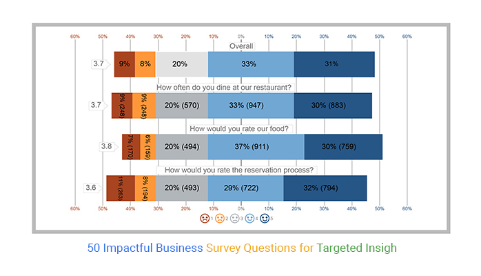
A restaurant satisfaction survey is similar to an event satisfaction survey. However, instead of asking people what they thought of an event, you’re asking them what they thought of their meal. A restaurant satisfaction survey is done after a customer has finished eating. Below we have restaurant satisfaction survey data:
| Questions | Scales | Responses |
| How often do you dine at our restaurant? | 1 | 248 |
| How often do you dine at our restaurant? | 2 | 248 |
| How often do you dine at our restaurant? | 3 | 570 |
| How often do you dine at our restaurant? | 4 | 947 |
| How often do you dine at our restaurant? | 5 | 883 |
| How would you rate our food? | 1 | 170 |
| How would you rate our food? | 2 | 159 |
| How would you rate our food? | 3 | 494 |
| How would you rate our food? | 4 | 911 |
| How would you rate our food? | 5 | 759 |
| How would you rate the reservation process? | 1 | 263 |
| How would you rate the reservation process? | 2 | 194 |
| How would you rate the reservation process? | 3 | 493 |
| How would you rate the reservation process? | 4 | 722 |
| How would you rate the reservation process? | 5 | 794 |
This is your final visualization

Website evaluation surveys are done online. Customers visit a website and answer questions about the site. The information, including feedback on information design, helps web admins improve their sites.
A website evaluation survey helps you enhance your website by providing valuable insights into how users perceive various aspects, including the design and usability of your site.
| Questions | Scale | Responses |
| The website was easy to navigate | 1 | 122 |
| The website was easy to navigate | 2 | 238 |
| The website was easy to navigate | 3 | 430 |
| The website was easy to navigate | 4 | 780 |
| The website was easy to navigate | 5 | 908 |
| The checkout process was simple | 1 | 287 |
| The checkout process was simple | 2 | 223 |
| The checkout process was simple | 3 | 571 |
| The checkout process was simple | 4 | 852 |
| The checkout process was simple | 5 | 852 |
| The product you received was what you are expecting | 1 | 201 |
| The product you received was what you are expecting | 2 | 153 |
| The product you received was what you are expecting | 3 | 475 |
| The product you received was what you are expecting | 4 | 841 |
| The product you received was what you are expecting | 5 | 764 |
This is your final visualization

Before creating a survey, identify its purpose. Are you measuring customer satisfaction, testing a new product, or analyzing market trends? A clear goal ensures relevant and effective questions.
Use a mix of question formats to collect well-rounded data:
Ensure your survey reaches the right respondents, whether customers, employees, or industry experts. Distribute it through email, social media, or website pop-ups.
Once responses are gathered, organize and analyze the data. ChartExpo can help visualize survey results with clear, easy-to-read charts and graphs.
Use the findings to make informed business decisions, such as improving products, enhancing customer service, or refining marketing strategies.
Traditional survey chart producers rely heavily on manual labor, are prone to mistakes, and are biased by humans. So, the question is: Do you need software?
Although you may initially think this is the most cost-effective option, it frequently costs you more in the long run. The reason is the time required to set up and analyze, the need for human resources, and any errors or biases that result in inaccurate data analysis, leading to faulty interpretation of the data.
Dealing with a lot of data makes it tough to manage it effectively. For example, whether it’s a long-term study or if you want to eliminate bias, if there is simply too much of it. Then, using software is the only alternative left.
ChartExpo is ideal for visualizing survey findings at scale, especially when working with 5-point performance rating scale data, as it makes it easy to handle and graph large datasets. It also offers additional tools that enhance your analysis. Below are a few chart types you can use to present survey results, giving you a sense of the platform’s flexibility and range.


You could determine the opinions of your clients about your restaurant through this Likert Scale Chart.
Business surveys are a powerful tool for market research, providing valuable insights that help companies make informed decisions. Here are the key benefits:
Define the survey’s purpose, whether it’s for customer feedback, market research, or employee engagement. A focused goal ensures meaningful and actionable responses.
Use clear, straightforward language to avoid confusion. Shorter surveys with well-structured questions improve response rates and data accuracy.
Combine multiple-choice, rating scales, and open-ended questions to capture both quantitative and qualitative insights. This approach provides a well-rounded view of customer opinions.
Frame questions neutrally to collect honest feedback. Instead of asking, “How great was our service?”, use “How would you rate our service?” to get unbiased responses.
Leverage tools like ChartExpo to convert raw survey data into easy-to-understand visual insights. Clear charts and graphs help businesses make informed decisions quickly.
There are many ways to conduct a business survey. One way is to ask your customers directly. Another way is to send them a questionnaire. You may also create a website where your customers can fill out a survey online.
The primary goal of business survey questions is to gather targeted information and insights that aid in understanding various aspects of a business. Whether assessing customer satisfaction, employee engagement, or market trends, these questions serve as a valuable tool for informed decision-making and strategic planning.
Determining the right business survey questions involves a thoughtful analysis of your objectives. Identify the specific areas or aspects of your business you want to explore, whether it’s customer feedback, employee satisfaction, or market trends. Tailor your questions to align with these objectives, ensuring that the data collected provides actionable insights for improvement.
Absolutely. Business survey questions are versatile and can be employed for a range of assessments, both internal and external. Internally, they can gauge employee satisfaction, assess workflow efficiency, or evaluate internal processes. Externally, these questions can be directed at customers to understand their needs, preferences, and overall satisfaction, contributing to a comprehensive view of the business landscape.
Business surveys are an excellent way to obtain feedback and information on your products, services, and overall operations. They can help you understand what customers like and dislike and the reasons behind their opinions and choices.
Surveys can also help you determine what additional products or services your customers need and want. They can help you identify potential problems or concerns with your business operations.
Crafting the perfect customer survey questions can be a daunting task. However, with the right guidance and tools, you can create a comprehensive business survey report in Excel. This can help you get the insights you need to make informed decisions for your business.
How much did you enjoy this article?


Google Forms to Google Sheets keeps your data organized and current with every submission. Learn the steps, methods, and tips now!

Product survey questions reveal what customers truly think. Learn how to ask the right ones and act on the survey results. Read on!

Learn how the 5-Point Performance Rating Scale improves employee evaluations with clear, consistent, and fair performance reviews across teams.


