Categories
Get ready to uncover some fascinating insights with a short survey.


Surveys can be boring, right?
But, this one’s different. It’s not your typical run-of-the-mill data collection tool. This survey is designed to grab your audience’s attention, tickle their curiosity, and give you a sneak peek into your audience’s minds.
A short survey is like a mini question-and-answer session. It aims to gather specific data from a specific target audience.
It’s a quick and efficient way to collect data without overwhelming participants.
Think of it as a friendly chat over a cup of coffee, where your audience gets to express their opinions.
These surveys usually consist of a handful of questions, carefully crafted to cover a specific topic.
Short surveys are everywhere.
You’ve probably encountered them. They pop up after you make an online purchase or visit a website. These surveys can range from probing your target audience’s satisfaction to seeking opinions on a new feature or design.
The beauty of a short survey lies in its simplicity.
Unlike lengthy questionnaires, short surveys keep it snappy and to the point. They respect your target respondents’ time.
Let’s take a closer look at the benefits they bring to the table:
Short surveys respect your target audience’s time and are less daunting to complete.
This encourages higher participation rates as your target respondents are more likely to take a few moments to share their thoughts.
By keeping the number of questions concise, short surveys prevent your target respondents from feeling overwhelmed.
This consideration leads to better-quality responses.
With fewer questions, your target respondents will likely complete the entire survey.
Since short surveys generate fewer responses, analyzing the data becomes less daunting. You can swiftly delve into the insights, enabling timely decision-making.
Short surveys allow for focused and targeted questions.
Each question contributes meaningfully, resulting in more precise responses.
Short surveys maintain respondent interest by keeping things concise.
If the survey is easy to follow, your respondents will likely remain engaged and provide thoughtful responses.
Below’s what makes Short surveys stand out:
Short surveys are straight to the point. They focus on essential information by eliminating fluff. This way, your respondents can swiftly provide their input.
Short surveys respect your respondents’ time by including only a few questions. This maintains engagement and increases the chances of getting a higher response rate.
Short surveys are designed with convenience in mind. They’re meant to be easily completed by your target respondents within a short time frame.
Short surveys are visually appealing. They have a clean layout with a logical flow, guiding your target respondents smoothly through the questions.
Below a step-by-step guide on how to create a short survey.
Let’s dive in.
Define the objectives of the survey.
Determine the specific data to collect and how it will contribute to your research.
Understand your participants’ demographics to tailor the survey questions accordingly.
Select the appropriate question types, such as multiple-choice, rating scales, Likert Scale, etc. to gather both quantitative and qualitative data.
Avoid unnecessary repetition, which can result in respondent fatigue.
Structure your survey with a logical flow. Begin with general or introductory questions and progress to specific topics.
Conduct a pilot test with a small sample group. This will help you to identify issues that could cause confusion.
Revise and refine your survey based on feedback received.
Use a visually appealing layout with consistent formatting.
Also include clear instructions and proper spacing to enhance readability and ease of completion.
Once you’ve gathered your data through a short survey, the next step is to dive into analysis.
While traditional tools like Excel have their merits, they lack charts for visualizing your short survey data.
But fear not.
There’s an exciting solution that can take your survey data analysis to a whole new level. It’s called ChartExpo.
ChartExpo is not your ordinary tool.
You heard that right.
It’s a powerful Excel add-in that will revolutionize how you analyze your short survey data.
With its user-friendly interface and a wide range of survey-based charts, ChartExpo effortlessly transforms survey responses into compelling data stories.
You don’t need to be a coding genius to use ChartExpo’s features. It’s designed to be intuitive and accessible to all users, regardless of technical expertise.
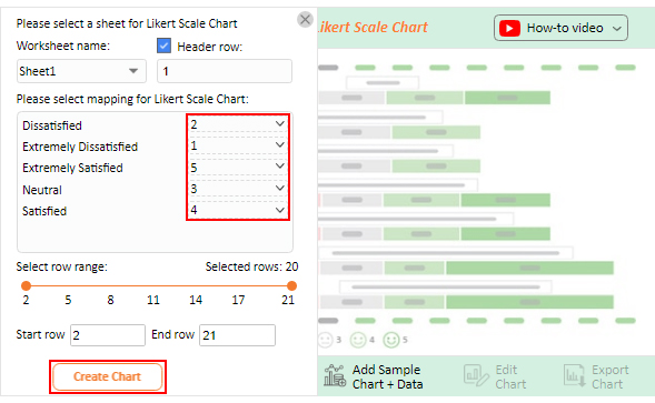
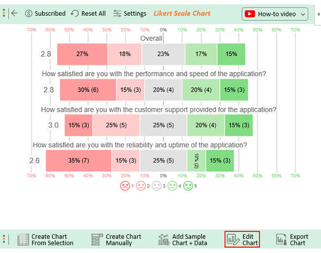
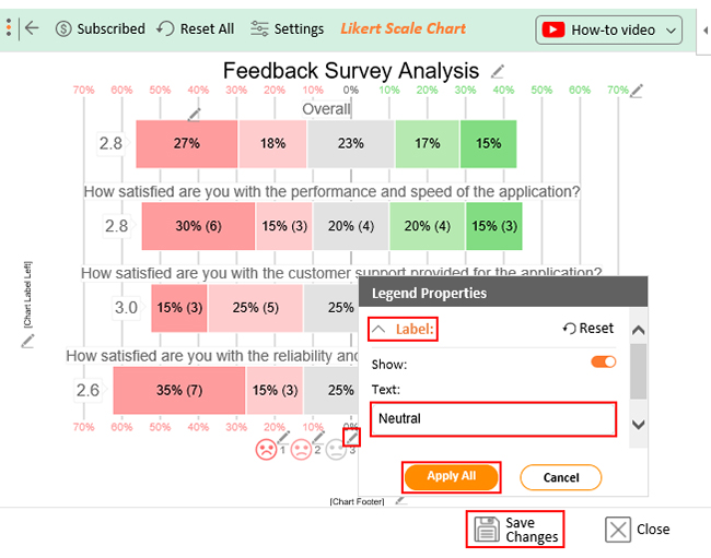
One of ChartExpo’s standout features is the Likert Scale Chart. This chart acts as a magnifying glass, allowing you to dive deep into your short survey data for hidden insights.
Try ChartExpo’s free 7-day trial and see how easily it handles 5-point performance rating scale data. After the trial period, you’ll only be charged a modest $10 per month.
Say goodbye to dull spreadsheets and hello to clear, engaging charts designed for survey insights.
How to Install ChartExpo In Excel?
ChartExpo charts and graphs are available both in Google Sheets and Microsoft Excel. Please use the following CTA’s to install the tool of your choice and create beautiful visualizations in a few clicks in your favorite tool.


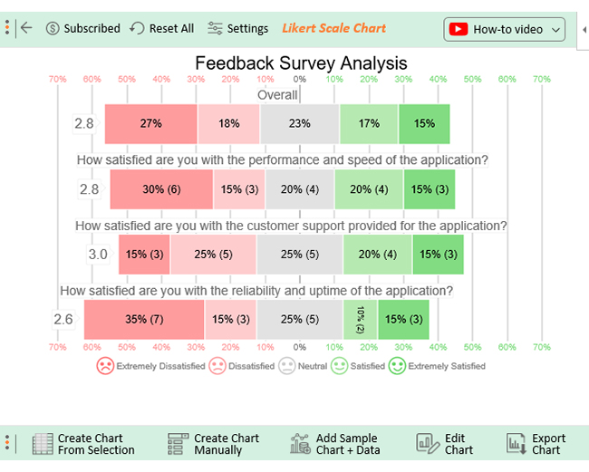
Let’s imagine you run a SaaS application company. You want to know whether your product meets your target market audience’s needs.
You’ve organized a survey to gather first-hand feedback from your target audience and used the sample questions below.
Let’s further imagine you’ll use the following answer options in your survey.
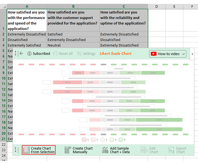
| How satisfied are you with the performance and speed of the application? | How satisfied are you with the customer support provided for the application? | How satisfied are you with the reliability and uptime of the application? |
| Extremely Dissatisfied | Satisfied | Extremely Dissatisfied |
| Dissatisfied | Extremely Dissatisfied | Dissatisfied |
| Extremely Satisfied | Neutral | Extremely Dissatisfied |
| Extremely Dissatisfied | Extremely Satisfied | Dissatisfied |
| Neutral | Dissatisfied | Extremely Dissatisfied |
| Dissatisfied | Extremely Dissatisfied | Extremely Dissatisfied |
| Satisfied | Dissatisfied | Neutral |
| Extremely Dissatisfied | Neutral | Neutral |
| Extremely Satisfied | Extremely Dissatisfied | Extremely Dissatisfied |
| Satisfied | Neutral | Extremely Dissatisfied |
| Neutral | Satisfied | Neutral |
| Satisfied | Satisfied | Satisfied |
| Dissatisfied | Satisfied | Extremely Dissatisfied |
| Extremely Dissatisfied | Extremely Satisfied | Dissatisfied |
| Neutral | Extremely Satisfied | Extremely Satisfied |
| Extremely Satisfied | Neutral | Extremely Satisfied |
| Satisfied | Dissatisfied | Neutral |
| Neutral | Dissatisfied | Satisfied |
| Extremely Dissatisfied | Neutral | Neutral |
| Extremely Dissatisfied | Dissatisfied | Extremely Satisfied |
This table contains example data. Expect many responses and questions in real life.


A short survey is a questionnaire that includes a limited number of questions, usually ranging from 3 to 10. Its purpose is to gather specific data while respecting respondents’ time efficiently.
A short survey typically consists of between 3 to 10 questions.
By keeping the number of questions concise, you can ensure a streamlined data collection process.
Below’s a short script you can use:
“We’d love to hear your thoughts! Could you please spare a moment to complete a short survey? Your feedback is incredibly valuable to us. Thank you so much in advance.”
In conclusion, short surveys offer numerous benefits, especially if your goal is to gather specific data faster.
With their concise format, short surveys ensure higher response rates and increased completion rates. They respect your target respondents’ time and effort, resulting in higher-quality responses.
Short surveys are cost-effective, requiring fewer resources for administration, data collection, and analysis. Also, they offer flexibility and adaptability. And this is because they can be easily modified.
To unlock the true potential of your survey data, use ChartExpo, a game-changing tool that revolutionizes survey data analysis.
With its user-friendly interface and survey-based charts, ChartExpo transforms your short survey data into a compelling data story.
Take advantage of ChartExpo’s free 7-day trial.
Try ChartExpo now to uncover actionable insights into your short survey data.
How much did you enjoy this article?


Google Forms to Google Sheets keeps your data organized and current with every submission. Learn the steps, methods, and tips now!

Product survey questions reveal what customers truly think. Learn how to ask the right ones and act on the survey results. Read on!

Learn how the 5-Point Performance Rating Scale improves employee evaluations with clear, consistent, and fair performance reviews across teams.


