Categories
Have you ever researched the similarities and differences between Scatter Plot vs. Line Chart in Google Sheets? If not, you probably misunderstood the role of the two visualizations.


A Line Chart helps you display patterns and trends of variables in your data. On the other hand, another type of chart enables you to visualize critical data variables.
The truth is that both charts are essential in your data story. Why? It’s because they are easy to plot and decode.
This blog will teach you more about the differences and similarities. You have much to understand about both charts.
Let’s get down to business.
A Scatter plot is a visualization that displays relationships between vital data points. This visualization has several dots that are essential in showing the correlation between the variables you plot.
This chart best suits the job if your objective is to reveal hidden insights between two variables. Let’s use the example below. We want to see if there is a correlation between height and age in both genders.
| Gender | Name | Age (Years) | Height (inches) | Weight (lb) |
| Male | Martin | 8 | 50 | 52 |
| Male | Martin | 11 | 62 | 73 |
| Male | Martin | 16 | 66 | 134 |
| Male | Martin | 20 | 71 | 155 |
| Male | Kim | 6 | 48 | 52 |
| Male | Kim | 13 | 63 | 76 |
| Male | Kim | 17 | 68 | 131 |
| Male | Kim | 19 | 73 | 153 |
| Female | Jada | 9 | 52 | 57 |
| Female | Jada | 14 | 57 | 79 |
| Female | Jada | 16 | 62 | 117 |
| Female | Jada | 20 | 66 | 126 |
| Female | Aubree | 8 | 54 | 56 |
| Female | Aubree | 11 | 61 | 81 |
| Female | Aubree | 15 | 62 | 115 |
| Female | Aubree | 20 | 63 | 127 |
When you visualize the above data using it, it will appear as shown below.
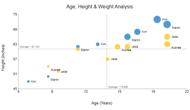
Some of the insights you can identify from your graph include the following:
Understanding Line Graph
A Line Graph is also known as a Line Chart. A Line Graph is a visualization that shows how a variable changes over time.
You can also use the Line Graph to display how several variables change over time. One of the significant benefits of using a Line Graph is that it is simple to read and interpret.
You can use a Line Graph to display categorical and continuous data.
Let’s use an example of data you can use as a Line graph. The table below shows the age and height of several female respondents.
| Age (Years) | Height (inches) |
| 8 | 50 |
| 11 | 57 |
| 14 | 63 |
| 18 | 64 |
The Line Graph of the above data will appear as shown below.

One of the insights you can retrieve from the Line Graph is:
The height of the female respondents increases with age. In essence, the older respondents are taller than the younger ones.
Let’s now identify the differences between the two graphs.
Here are the differences between these two charts:
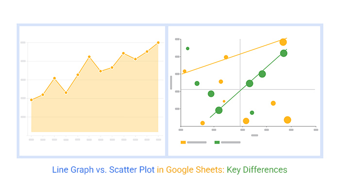
The image below shows a clear difference between the two graphs.

Graph A is a Line Graph. Graph B is the other one.
As you can see, one uses a line of best fit to display a relationship between two varying data sets, while the other relies on dots to show correlations and associations in your raw data.
On the other hand, a Line Graph connects various data points using straight line segments, unlike a Dot plot chart, which displays individual data points as dots. There is no line of best fit in a Line Graph; the straight-line segments help you identify trends and patterns in your data.
Generally, it is better to use a Line Graph if your raw data includes non-numeric values. If your raw data only has numeric values, use the other chart.
You can use a simple Line Graph or a Line graph with multiple lines if you want to label your horizontal axis with text labels. These labels can represent evenly spaced values such as days, weeks, or years.
If you’re working with data in a table format, you can create a graph from the table to visualize the information. Additionally, you can use a Correlation Chart to modify the horizontal axis scale.
Let’s take a look at each in detail.
When to Use a Scatter Graph in Google Sheets?
When to Use a Line Graph in Google Sheets?
|
Feature
|
Line Graph | Scatter Graph |
| Purpose | A Line Graph in Google Sheets displays meaningful insights into continuous data over time.
The graph uses line segments to connect key data points relative to a specified time. A Line Graph is ideal for showing growth rates or trends at even intervals. |
A Scatter chart in Google Sheets is best for displaying relationships between varying variables.
It’s suitable for displaying associations and correlations. Still, you can use a Point Chart in cause-and-effect analysis for in-depth insights. |
| Axis | The x-axis shows dimensional variables, such as months and years.
The y-axis displays key metrics in your data. |
Both x and y axes depict varying metrics, which are, in most cases, numerical. |
| Plots | Line segments join key data points. | You draw a line of best fit in areas where the dots are mostly concentrated. |
| Amount of Data | One of the disadvantages of the Line Chart is the fact that it cannot handle bulky and complex data. | Point Plots are suitable for visualizing bulky and complex data sets. |
Google Sheets is a spreadsheet application that most business professionals use. However, it has a basic Scatter Graph vs. Line Graphs in Google Sheets library, which often requires extra customization to fully align with advanced visuals like an exponential growth chart when analyzing long-term trends.
That is why you will need much customization to obtain both graphs as well as many more charts, like a Chord Diagram that is in harmony with your data story.
The best approach is to supercharge your Google Sheets with a third-party add-on called ChartExpo.
You can easily install ChartExpo in your Google Sheets with minimal help from a manual. ChartExpo has plenty of good visualizations you can use for your data stories.
With ChartExpo, you can restate the Scatter Chart vs. Line Graph in Google Sheets. The third-party add-on helps you to distinguish between the two graphs easily.
Let’s find out how to make each visualization in Google Sheets.


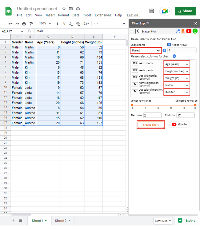
Let’s compare the age, height, and weight of both genders.
The table below shows such data.
| Gender | Name | Age (Years) | Height (inches) | Weight (lb) |
| Male | Martin | 8 | 50 | 52 |
| Male | Martin | 11 | 62 | 73 |
| Male | Martin | 16 | 66 | 134 |
| Male | Martin | 20 | 71 | 155 |
| Male | Kim | 6 | 48 | 52 |
| Male | Kim | 13 | 63 | 76 |
| Male | Kim | 17 | 68 | 131 |
| Male | Kim | 19 | 73 | 153 |
| Female | Jada | 9 | 52 | 57 |
| Female | Jada | 14 | 57 | 79 |
| Female | Jada | 16 | 62 | 117 |
| Female | Jada | 20 | 66 | 126 |
| Female | Aubree | 8 | 54 | 56 |
| Female | Aubree | 11 | 61 | 81 |
| Female | Aubree | 15 | 62 | 115 |
| Female | Aubree | 20 | 63 | 127 |


Crafting Line Graph With Google Sheets:
Let’s use a different example to help you create one in your Google Sheets.
Let’s compare the age and height. You will use the table below.
| Age (Years) | Height (inches) |
| 8 | 50 |
| 11 | 62 |
| 14 | 66 |
| 18 | 71 |


Let’s recap what you have learned so far.
Despite the Scatter Graph vs. Line Graph in Google Sheets looking similar, you now understand that they perform different jobs.
We have learned that the difference between the two is that an XY Plot displays relationships between vital data variables. On the other hand, a Line Graph shows trends and changes in variables.
You can now end the misconception about these two graphs by understanding when you use them. What is common about both charts is that they are straightforward when plotting points.
You have learned how to create a Scatter Plot vs. Line Graph in Google Sheets. With the help of a third-party add-on called ChartExpo, you could easily create an incredible chart.
Now it’s your turn to create yours. Start a 7-day free trial today to access both Graphs.
How much did you enjoy this article?


SUMPRODUCT in Google Sheets handles multi-condition calculations without extra columns. Master its syntax, uses, and errors. Read on!

An annual budget template in Google Sheets organizes your yearly finances, tracks every dollar, and reveals spending patterns. Read on!

Learn the best graph to show profit and loss with practical examples and use cases. Discover how to visualize your business data, track trends, and make smarter financial decisions.


