Categories
By ChartExpo Content Team
Ever been impressed by a word cloud, only to wonder what it really told you? That’s the trap. Word clouds catch your eye, but they rarely give you real answers.


The problem with a word cloud is simple. It looks good, but it hides more than it shows. Big words pop out, small ones fade, and meaning gets lost. You think you’re seeing the big picture, but you’re not. Important details hide in plain sight.
A word cloud can steer you wrong. It can lead to bad choices, wasted time, and lost trust. Relying on a word cloud alone risks your message falling flat. But there’s a fix. You can turn a word cloud from fluff into fact—if you know what to change.
Keep reading to find out how to make a word cloud work for you, not against you.
Many folks think that the prettier the visual, the better it communicates. But beauty can mask flaws. Engaging graphics can distract from the inaccuracies of the data. Instead of revealing truths, they become art that doesn’t persuade or inform. This can make your presentations look good but fall flat in impact.
Why doesn’t a pretty graphic persuade? The answer is simple. It lacks depth. Imagine a book with a stunning cover but a confusing story inside. In business, decisions need more than eye-candy. They require solid, clear insights that drive action. So, invest time in understanding the data behind the display, not just the display itself.
A misleading graphic can be like a magician’s trick. It draws the eye to what’s not important. Big words might grab attention, but essential details can hide in the corners. This false focus can lead to poor judgments. Imagine prioritizing the wrong problem because it seemed bigger.
Failing hard in this context means bad business decisions. These choices can lead to lost opportunities. They might also cost money and time. The real challenge is ensuring that what looks right is actually right. Always question the validity behind the visuals. Make sure they represent the whole picture, not just the flashy part.
In business, accuracy is everything. Relying on misleading visuals can be a risky move. When decisions are based on incomplete data, the consequences can be severe. It could mean following a trend that isn’t as popular as it seems. Or, missing out on a crucial insight hidden in the small text.
The cost of getting it wrong isn’t just financial. It can damage reputation, too. Imagine presenting flawed insights to stakeholders. Trust can wane, and credibility can be hard to rebuild. The lesson here is to dig deeper. Ensure the visuals you rely on are more than eye-catching—they need to be truth-telling.
Word clouds offer a fast, visual way to highlight common terms in text. They are simple to create and can quickly grab attention. But their visual appeal can also mislead. They don’t show context, relationships, or importance beyond word count.
While helpful for quick summaries, they can hide key insights. Use them to start a conversation, not end one. For real decisions, pair them with deeper analysis. A word cloud works best as a tool for first impressions, not final answers.
| Aspect | Advantage | Disadvantage |
| Quick Overview | Shows common words fast | Misses deeper meaning |
| Easy To Create | Simple tools make creation fast | Poor tools give bad results |
| Visual Appeal | Grabs attention in presentations | Can mislead with looks over meaning |
| Text Summarization | Helps spot key terms in large text | Ignores word order and context |
| Feedback Analysis | Highlights common feedback themes | Rare feedback may get lost |
| Customization | Fonts, colors, and shapes can be changed | Poor design choices hurt clarity |
| Audience Engagement | Engages non-technical viewers easily | Experts may find it lacking detail |
| Time-Saving | Saves time for basic insights | Wastes time if deeper analysis is needed |
| No Numbers Needed | Works without needing exact figures | Lacks precise data for decision-making |
| Versatility | Can be used in many topics and fields | Not useful for all data types or detailed insights |
Picture this: a group of people staring blankly at your presentation. They’ve lost interest, and it’s because of poor design choices. If the visual doesn’t look good, your audience won’t buy in.
Think of color choice as the clothes your visual wears. If the colors clash, it can look unprofessional. Fonts are like the voice of your presentation. If they’re hard to read, your message gets ignored. A good design means your audience will trust your message.
Imagine trying to find a book in a messy library. That’s what raw data is like. Cleaning data is like organizing that library. It helps you find the right information quickly.
Remove duplicates and irrelevant words. This makes your visual clearer. It’s like cleaning a dirty window so you can see through it. The clearer data is, the clearer your message will be.
Time is ticking, and your visual needs help fast. Start by focusing on the most important words. They’re the stars of your show. Make them stand out by increasing their size.
Next, check your color scheme. Make sure it doesn’t hurt the eyes. A simple tweak can make all the difference. Finally, adjust the layout. It should be balanced, like a well-set table, inviting and orderly.
Word clouds can be tricky. Big words can fool you, rare ones get lost, and messy design blocks your message. The problem? People trust the look without checking the meaning. The fix is simple. Clean your data, use clear fonts, smart colors, and question what you see.
Don’t let size guide you—let the story behind the words lead. Use word clouds with care, and always back them up with facts. A good visual should help, not hide.
| Aspect | Problem | Solution |
| Word Size Misleads | Large words seem more important, even if they are not. | Check if large words really matter before acting. |
| Lack of Context | Word clouds don’t show how words are used together. | Use other visuals to show word use in context. |
| Overlooks Rare Terms | Rare but important terms get ignored. | Review text to spot rare but key ideas. |
| Poor Color Choice | Bad colors make it hard to focus or read. | Pick colors that help the viewer focus. |
| Hard to Read Fonts | Fancy fonts make words unclear. | Use clear, easy-to-read fonts. |
| No Numeric Data | No exact values are shown, only size. | Add charts for exact numbers if needed. |
| Too Many Words | Too many small words clutter the view. | Limit words to key terms only. |
| Ignores Word Relationships | Words appear without links to others. | Use diagrams to show word links. |
| Automation Errors | Automated tools may miss key terms. | Review auto results for missing words. |
| Wrong Tool Selection | The tool may lack needed features. | Choose tools that match your goal and data size. |
Customer feedback is gold. But sometimes, it’s hard to dig through all the comments. Word clouds make this task easier. They take the jumble of words and show which ones stand out. They’re like a magnifying glass, helping you see what customers talk about most.
These visuals help businesses understand what customers love or dislike. They help in spotting trends in feedback. When a word appears often, it signals something important. Maybe a product feature needs fixing, or a service is a hit. Word clouds help turn feedback into clear directions for improvement.
In product development, knowing what users want is key. Word clouds help by showing what users talk about most. They’re like a compass pointing to what matters in the sea of feedback. When planning new features, these visuals guide teams to focus on what users need.
By highlighting frequent topics in user feedback, word clouds reveal priorities. They show which features users love, and which ones need work. This helps teams decide what to tweak or add next. It’s a smart way to align product plans with user expectations. It ensures that development efforts hit the mark.
Executives need quick insights. Word clouds provide this by turning complex data into simple images. They’re like a snapshot of what’s happening, easy to grasp at a glance. When presenting to executives, these visuals help convey the essence of data without drowning them in detail.
In decision-making, clarity is key. Word clouds offer a clear view of the main points. They help executives see what’s top of mind for customers or employees. This aids in making informed choices. By highlighting the most important words, these visuals help executives cut through the noise and focus on strategic moves.
Imagine a product team facing diverging opinions. Word clouds helped bring everyone on the same page. By showing what users talked about most, these visuals helped align the team’s focus. They acted as a bridge, connecting different viewpoints with concrete data.
The team used this tool to prioritize features based on user feedback. This visual guide helped in discussions, ensuring everyone worked towards the same goals. It was like having a map in a maze, showing the way forward. The result? A product that resonated with users and achieved success. Word clouds helped the team see eye-to-eye, making sure every decision was backed by real data.


Free tools can be a lifesaver when you’re on a budget. Many deliver results without costing a dime. They might not have all the bells and whistles, but they get the job done. Some free options are surprisingly robust, allowing users to create visualizations with ease. They often come with templates that simplify the process and make it accessible to beginners.
On the flip side, some paid tools promise the moon but fall short of expectations. They can be clunky, with features that sound good in theory but don’t work well in practice. Users might find themselves paying for extras they don’t need, which can be frustrating. It’s essential to read reviews and maybe try a demo before committing to a paid tool.
When picking a tool, it’s important to focus on the features that matter. These might include ease of use, customization options, and the ability to handle large amounts of data. Businesses need tools that align with their goals, whether it’s creating simple visuals or more complex ones. The right tool should support these goals without unnecessary complications.
Hype can be misleading. A tool might sound great on paper, with lots of fancy features, but those features don’t always translate to real-world benefits. It’s important to look beyond the marketing and focus on what the tool can genuinely deliver. Make a checklist of must-have features and see how each option measures up.
Imagine a small business facing a tight deadline on a client project. They needed a tool that could quickly create a visual representation of their text data. The team had little time to waste, so they chose word cloud known for its speed and simplicity. It allowed them to generate visuals without a steep learning curve, keeping the project on track.
The right choice made all the difference. The client was impressed with the visuals, which helped convey complex information clearly. This success strengthened the business-client relationship. By choosing wisely, the small business not only met its deadline but exceeded the client’s expectations, proving the importance of selecting the right tool for the job.
Word clouds are quick but not clear. Bar charts give exact counts. Pie charts show parts of a whole. Heatmaps add depth by showing where words appear. Tag clouds offer more control over design. Tables give full detail but need more effort to read.
Word clouds grab attention, but these tools give better insight. If you need facts, not flair, choose what fits your goal. Each tool has its place—don’t let looks win over meaning.
| Alternative | Comparison | Contrast |
| Bar Chart | Bar charts show exact word counts and are easy to compare. | Word clouds are faster for visual impact but lack precision. |
| Pie Chart | Pie charts display word frequency as parts of a whole. | Word clouds are more visual, pie charts give clearer proportions. |
| Heatmap | Heatmaps highlight intensity of words in context or location. | Word clouds don’t show where words appear, heatmaps can. |
| Tag Cloud | Tag clouds are similar but allow more design control. | Word clouds are more basic, tag clouds offer more styling. |
| Table | Tables give detailed word data with exact values and context. | Word clouds are visual, tables are precise but less engaging. |
Handling large text sets can feel overwhelming. Analysts need a way to present data that makes sense to everyone. Here, visual word displays come to the rescue. They highlight frequent words in a text, allowing viewers to see patterns without wading through endless lines of data.
The magic lies in its simplicity. Large words represent frequent terms, while smaller ones show less common words. This visual hierarchy helps maintain the original message’s essence. It’s like having a bird’s eye view of data, where important themes jump out, making big data less daunting.
Automation promises to save time. But is it always the best choice for word-based visuals? On the positive side, automated tools can quickly process vast data, generating results in seconds. They take the grunt work out of the equation, allowing teams to focus on analysis.
However, there’s a downside. Automation might overlook nuances that a human eye would catch. It may not always understand context, leading to misleading results. So, while automation can be a friend, it needs careful monitoring to ensure accuracy and relevance.
In some reporting scenarios, manual or structured visual approaches may still be preferred as an alternative of Pie chart, especially when clarity and context matter more than speed.
In the fast-paced world of analytics, dashboards sometimes miss subtle trends. Here’s where word visuals shine. Picture a retail company swamped with customer feedback. Traditional dashboards failed to spot a recurring complaint about product quality. A word display, however, made “quality issue” stand out, prompting further investigation.
This tool acts like a detective, highlighting problems that might otherwise go unnoticed. By showcasing frequent terms from customer reviews, analysts can pinpoint areas needing attention. It’s a simple yet effective way to uncover insights that numbers alone might miss.
Word clouds show word size by frequency, while tag clouds size words by meaning or category. Word clouds are simple, fast, and grab attention. Tag clouds give more control over design and better reflect what matters.
Word clouds lack context and depth. Tag clouds add clarity and focus. Both look alike, but tag clouds let you guide the message more. If you need more than looks, tag clouds are the better choice.
| Aspect | Word Cloud | Tag Cloud |
| Visual Style | Simple and bold visuals | More refined visuals |
| Word Sizing | Size based on frequency | Size based on importance or tags |
| Customization | Basic style options | More design flexibility |
| Clarity | May mislead with size | Better at showing relevance |
| Data Depth | Surface-level view | Can reflect deeper meaning |
| Ease of Use | Very easy to create | Slightly more effort needed |
| Purpose | Quick insights | Shows relevance or category |
| Design Control | Limited control over layout | High control over style |
| Context Awareness | Lacks context | Can show tag relations |
| Engagement | Grabs quick attention | Engages with better focus |
Visuals should clarify, not confuse. Yet, word clouds often do the latter. They can lure us into thinking we see the whole picture when we only see a part. This can be a real trust-buster in data presentation. The lack of precise metrics in a word cloud can make it hard to gauge the true significance of the information.
Moreover, word clouds can be seen as gimmicky. If your audience senses style over substance, their trust evaporates. They might question your grasp of the data and your ability to present it clearly. It’s essential to choose visuals that support your message, not undermine it.
Sometimes, simple charts or tables do a better job. They offer clarity and precision, showing exact numbers and relationships. Unlike word clouds, a chart can highlight trends and patterns over time. This makes it easier to spot what’s really important in your data.
Tables can also be heroes in the right context. They allow for detailed comparisons that a word cloud simply can’t match. When you need to present specific data points, a table shines by offering the exact figures that inform sound decisions.
Imagine a boardroom filled with eager minds, ready to make decisions. A word cloud is presented, but it falls flat. The cloud’s pretty colors fail to answer the pressing questions. Confusion spreads as the visual lacks depth and detail.
Then, a simple chart comes to the rescue. It shows the data clearly, highlighting trends and key numbers. The room breathes a sigh of relief as the decision-makers finally see the full picture. The chart saves the presentation, proving once again that clarity is king.
Word clouds are great for fast views and catching attention. Use them to show common words or start talks. But don’t trust them for deep study or real choices. They miss details, context, and numbers.
When facts matter, use charts or tables instead. Word clouds are a tool for quick looks, not full answers. Use them to open the door, not to close it.
| Aspect | When to use Word Cloud | When Not to use Word Cloud |
| Quick Overview | To show common words quickly | When deep insight is needed |
| Presentation Visual | To make slides more visual | When clarity is more important than design |
| Audience Engagement | To catch viewer interest fast | When data needs careful reading |
| Text Feedback Summary | To highlight repeated feedback terms | When rare feedback matters |
| First Impressions | To start a discussion | When facts matter more than visuals |
| Precise Analysis | Not for detailed analysis | Use tables or charts |
| Data Context | Not when context matters | Use full-text or context tools |
| Complex Relationships | Not for linked word patterns | Use network or flow charts |
| Decision-Making | Not for final decisions | Use detailed reports |
| Numeric Detail | Not when numbers are needed | Use graphs or tables |
Seeing a word cloud is one thing; using it is another. These visuals are like treasure maps, guiding teams toward strategic decisions. The key is to connect what you see with what you do. If “communication” stands out, for example, it might be time to focus on improving team interactions. This way, visuals become action plans.
Think of a word cloud as a springboard for discussions. It provides a starting point for brainstorming and decision-making. By focusing on the prominent words, teams can prioritize their actions. This approach turns abstract visuals into concrete strategies, bridging the gap between seeing and doing.
Word clouds help teams align by highlighting common goals. They turn abstract data into a visual story everyone can understand. This shared vision fosters teamwork and cooperation, as everyone sees the same priorities. It’s like having a roadmap that guides everyone in the same direction.
By using word clouds, teams can discuss and understand priorities. This common understanding ensures everyone is rowing in the same direction. When team members see the same key terms, they feel part of a collective effort. This alignment boosts morale and makes achieving objectives a team effort.
In a high-stakes meeting, executives faced a mountain of data. They needed a way to make sense of it all. Enter word clouds. These visuals highlighted key terms, turning chaos into clarity. Executives could quickly see what mattered most and align their strategies accordingly.
The word cloud served as a visual anchor, keeping the discussion focused. It allowed executives to cut through the noise and target the most pressing issues. By seeing the big picture, they could make informed decisions and drive the company forward. It was a simple tool, but it made a big impact.
Basic visuals can get the job done, but why stop there? Using different fonts, shapes, and layouts can make your message pop. Picture a heart shape for a campaign about love or a star for achievement highlights. It’s not just about making it look nice; it’s about making it memorable.
Think of it as dressing up for a big event. The right outfit can make a huge difference. The same goes for choosing fonts and colors in your project. A bold font might convey strength, while a gentle color scheme can calm the viewer. These choices help the viewer remember not just the look, but the message behind it.
Speed is great, but not if it loses accuracy. Shortcuts can help you deliver fast results without missing the mark. Start with templates that match your goals. Templates set the stage, so you focus on the content. You’re not starting from scratch each time, saving precious minutes.
Another quick tip is to use pre-made lists of stop words—those pesky little words that don’t add much value. By filtering them out, you focus on the words that matter. It’s like cleaning your room before a big family visit. You want to put your best foot forward and leave a great impression.
Visuals can be the secret sauce in a high-stakes pitch. Imagine a marketing agency trying to land a big client. They used visuals to show the client’s brand strengths and customer opinions. This wasn’t just a pretty picture; it was a story told through visual data. It caught the client’s eye and showed they understood the brand’s needs.
The agency chose colors that matched the client’s brand. They picked shapes that echoed the client’s values. This attention to detail made the presentation not just informative, but persuasive. The client saw their own story reflected back to them, which made them more likely to say yes.
A weak word cloud is like a jigsaw puzzle with all the wrong pieces. If the viewer can’t grasp the main idea quickly, it’s a problem. Too many small words can drown out the main message, turning your visual into a sea of clutter.
Consider the font size and style. Fancy fonts can be fun, but if they make words hard to read, they’re doing more harm than good. Ensure that the most important words are prominent and clear. Your visual should be a helpful guide, not a confusing maze.
Sometimes, you need to decide if your word cloud deserves its spot. Does it add value, or is it just taking up room? A useful visual should provide insights at a glance. If it doesn’t, it might be time to rethink your approach.
Ask yourself if the visual tells a story or sparks curiosity. If the answer is no, consider other ways to present your data. Charts or graphs might do a better job of communicating your message. Always choose the method that best serves your audience’s needs.
Imagine presenting to a boardroom full of decision-makers. You need your data to speak volumes with clarity and precision. In one case, a presenter swapped a confusing word cloud for a simpler visual. This choice changed the entire dynamic of the meeting. The audience engaged with the data, leading to insightful discussions.
The new visual highlighted trends and key points effectively. It turned a potential disaster into a successful presentation. This example shows that choosing the right visual can make all the difference. It proves that sometimes less is more when it comes to data visualization.
A word cloud should make key terms clear and spark useful talks. If it helps people see trends fast, it’s working. But if it hides facts, confuses viewers, or looks nice without meaning, it’s hurting. Check if your word cloud shows truth, not just style.
Use it to start, not finish. If decisions depend on it, rethink your tool. A word cloud helps when it shows what matters and hurts when it blocks real insight.
| Aspect | Helping | Hurting |
| Clarity | The main words are easy to spot | Words blend with no clear focus |
| Accuracy | It matches the actual data | It hides or skews data facts |
| Audience Understanding | Viewers get the key idea fast | Viewers are confused or misled |
| Visual Appeal | It adds interest without confusion | Looks good but adds no value |
| Message Focus | It points to real issues or themes | Distracts from real meaning |
| Data Depth | Simple overview is enough | Detailed insight is needed |
| Decision Support | Used to start ideas, not end them | Relied on for final calls |
| Context | Context is not critical | Context is key to meaning |
| Feedback Use | Shows trends in feedback | Misses rare but key feedback |
| Engagement | Grabs attention quickly | Interest fades with no follow-up |
Creating an effective cloud is like baking a cake. If you skip a key ingredient, it all falls apart. The failed cloud often results from poor choices in design. Maybe the font sizes are too similar or the colors are too bold. This can leave you with a blob of text rather than an engaging graphic.
The repercussions can be significant. Your audience might miss the message entirely. This means lost opportunities to communicate effectively. It’s a reminder of the importance of thoughtful design in conveying your message.
Sometimes, small tweaks can make a world of difference. Picture a cloud that was once a chaotic jumble. By adjusting the font sizes, suddenly certain words stand out, grabbing attention. It’s like giving each word its own spotlight on stage.
Now, think about color. A simple switch from a jarring palette to a harmonious one can transform the visual experience. These changes might seem minor, but they have a major impact on how the audience perceives the information.
The cloud finally works because of smart visual choices. It’s about more than just slapping words together. It’s about telling a story through design. The use of hierarchy in font size and color draws the eye naturally. Key terms shine, guiding the viewer’s understanding.
Also, consider the background and spacing. A clean background helps the words pop, while proper spacing ensures readability. These elements work together to create a cohesive piece. It’s all about making the message clear and engaging for anyone who sees it.


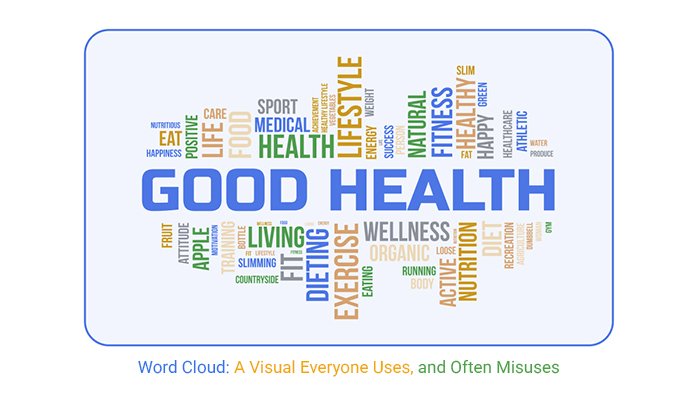
A word cloud is a visual made from text, where the size of each word shows how often it appears. Words used more often are larger, while less common ones are smaller. It’s a quick way to spot repeated terms in feedback, reports, or any large block of text.
To make a word cloud, start by collecting text. Clean the data by removing common, unimportant words. Use a tool such as ChartExpo that creates the visual by sizing words based on how often they appear. Focus on key terms that reflect the main ideas or themes in the text.
Word clouds can be misleading because they don’t show word meaning, order, or context. Big words might seem important but lack real value without deeper analysis. They also ignore how words connect, which can cause key insights to be missed or misread. They are best used with care.
A word cloud can help you spot patterns in text fast. But don’t let looks fool you. A large word doesn’t always mean it matters most.
Using a word cloud without checking the meaning behind the words can lead to bad calls. It might push you toward the wrong focus. That’s risky for any team or project.
If you use a word cloud, clean your data first. Pick the right tool. Then check if the visual shows what’s real—or just what looks big.
Sometimes, another chart does a better job. If the word cloud confuses more than it helps, drop it. Clear beats clever every time.
A word cloud works only when paired with thinking. Use your eyes, then ask hard questions.
Pretty visuals don’t drive results. Truth does.
How much did you enjoy this article?


Calculate accounts receivable turnover ratio to measure credit collection speed, improve cash flow, and strengthen your financial strategy. Read on!

Change Management KPIs are the key to tracking adoption, performance, and ROI during transitions. Find out which metrics matter. Read on!

Data collection methods and techniques determine the quality of every insight you act on. Explore key approaches for gathering reliable data. Read on!


