Categories
Do you want to create a survey that engages and delights your audience?
Look no further.
The answer to all your survey problems is simple – sample survey examples.


Let’s say you’re running a small business and want to improve customer satisfaction. You decide to create a survey to gather feedback from your customers. You could spend hours coming up with questions, or you could use a sample survey example.
Why use a sample survey example?
A sample survey will help you ensure you’re asking pertinent questions. Furthermore, the format ensures that it yields meaningful results.
Let’s say the sample survey data analysis reveals that customers are frustrated with the lack of product variety. Armed with this information, you can adjust your business model, including expanding your product line. As a result, customer satisfaction improves, and your business thrives.
These sample survey examples will help you save time, enhance survey quality, and inform decision-making. In this blog, you will learn:
Let’s get started.
Definition:
Surveying every individual in a population is not always practical or feasible. To obtain an accurate representation of the overall population, you select a smaller group known as a sample. Utilizing a survey template in Excel can help streamline the process of collecting and organizing data from your selected participants.
The participants are picked randomly to guarantee accurate representation. Furthermore, the sample size should be large enough to produce statistically significant results.
Discover how sample survey examples can assist you in creating the ideal survey:
Understanding customer satisfaction is one of the best uses of a sample survey. You can inquire about product quality, usability, customer support, and other pertinent issues. By evaluating the data, you can ascertain whether your consumers are pleased with your offerings. Also, you can identify areas necessitating improvement and take the necessary steps.
Service quality is a critical aspect of any business. You can use a survey sample to gauge the quality of your customer service. You might inquire about the speed of service, staff friendliness, and overall experience. This information will help you to pinpoint areas where your service needs improvements and act accordingly.
A sample survey can also help you understand how your customers use your product. You can ask questions about the frequency of use, features, and other relevant topics. By analyzing the data, you can determine whether your customers are happy with the product. Also, if any features need improvement.
A sample survey can help you understand how the attendees perceived the event. You can ask questions about the venue, food, speakers, and other aspects. By analyzing the data, you can identify the strengths and weaknesses. Consequently, take corrective measures for future events.
Here are a few sample survey examples:
Gather feedback on your products and services to assess customer satisfaction levels.
Measure the level of engagement and satisfaction among employees within your organization.
Collect insights on specific product features, usability, and overall user experience.
Leverage a market research survey to gain insights into market trends, preferences, and consumer behavior, enabling you to develop informed and effective business strategies.
Evaluate the success of an event and gather suggestions for improvement.
Assess the usability and effectiveness of your website for visitors.
Obtain feedback from participants to improve the quality and effectiveness of training programs.
Assess the well-being and health habits of individuals for research or organizational purposes.
Understand public opinions and preferences on political issues or candidates.
Gather feedback from students to enhance the quality of educational courses and programs.
Let’s say you want to launch a new mobile phone. You want to know what customers want. Therefore, you want to conduct a survey with the following sample survey questions.
You want to map the following responses to each question.
How do you go about this?
Use a Google Forms survey form template to create your survey.
How?
Follow these steps to create a sample survey in Google Forms;


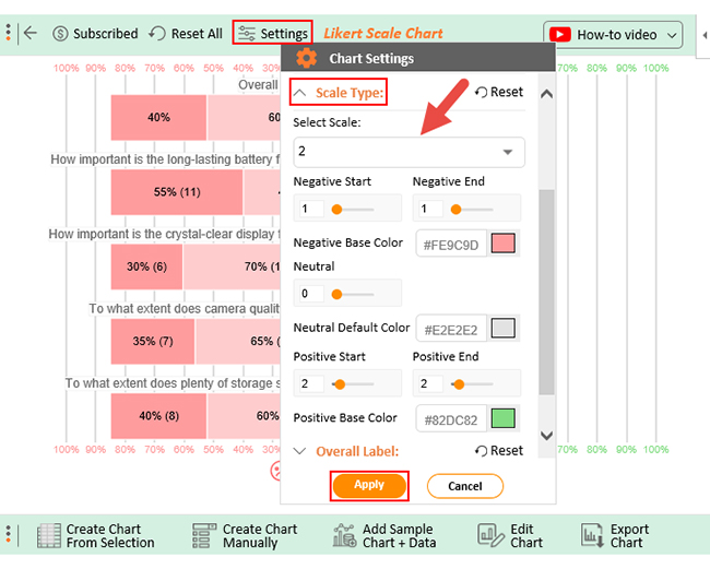
Excel is a go-to tool for many when analyzing survey results. But with so much data available, trying to make sense of it all can be overwhelming. Also, Excel is ideal for data organization compared to visualization.
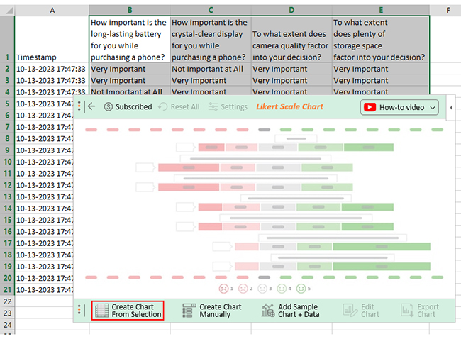
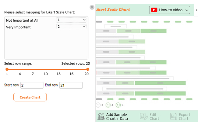
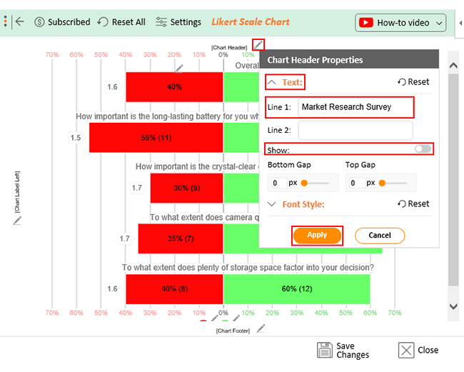
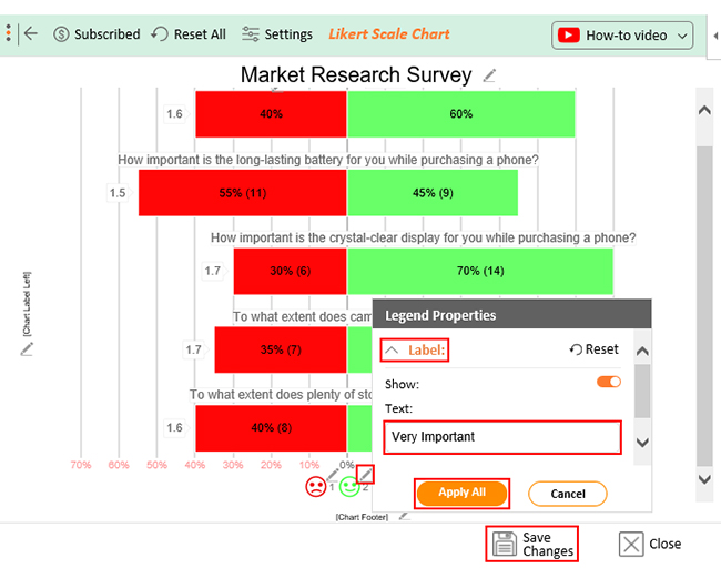
That’s where ChartExpo comes in.
This powerful Excel add-in is the perfect solution for visualizing survey results clearly and concisely. With ChartExpo, you can create insightful charts and graphs with just a few clicks. This makes analyzing your data and drawing meaningful insights easier than ever.
How to Install ChartExpo in Excel?
ChartExpo charts are available both in Google Sheets and Microsoft Excel. Please use the following CTA’s to install the tool of your choice and create beautiful visualizations in a few clicks in your favorite tool.

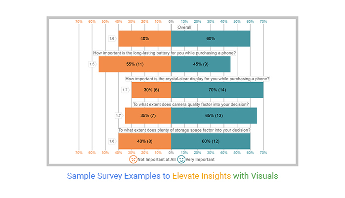
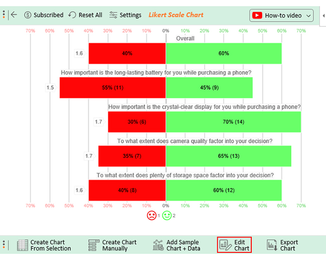
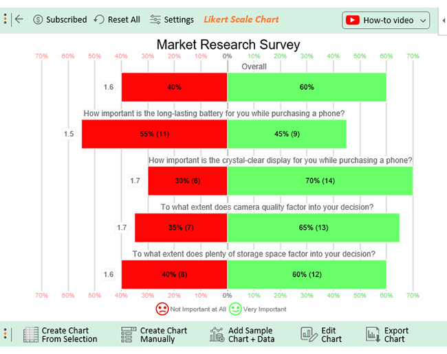
Let’s say your survey yields the data table below.
| Timestamp | How important is the long-lasting battery for you while purchasing a phone? | How important is the crystal-clear display for you while purchasing a phone? | To what extent does camera quality factor into your decision? | To what extent does plenty of storage space factor into your decision? |
| 10-13-2023 17:47:33 | Very Important | Not Important at All | Very Important | Very Important |
| 10-13-2023 17:47:33 | Very Important | Very Important | Very Important | Very Important |
| 10-13-2023 17:47:33 | Not Important at All | Very Important | Very Important | Very Important |
| 10-13-2023 17:47:33 | Very Important | Very Important | Very Important | Not Important at All |
| 10-13-2023 17:47:33 | Not Important at All | Very Important | Very Important | Very Important |
| 10-13-2023 17:47:33 | Very Important | Not Important at All | Very Important | Not Important at All |
| 10-13-2023 17:47:33 | Not Important at All | Very Important | Very Important | Not Important at All |
| 10-13-2023 17:47:33 | Not Important at All | Very Important | Very Important | Not Important at All |
| 10-13-2023 17:47:33 | Very Important | Very Important | Very Important | Not Important at All |
| 10-13-2023 17:47:33 | Not Important at All | Very Important | Not Important at All | Very Important |
| 10-13-2023 17:47:33 | Very Important | Very Important | Not Important at All | Very Important |
| 10-13-2023 17:47:34 | Not Important at All | Very Important | Not Important at All | Very Important |
| 10-13-2023 17:47:35 | Not Important at All | Very Important | Very Important | Not Important at All |
| 10-13-2023 17:47:36 | Not Important at All | Not Important at All | Very Important | Very Important |
| 10-13-2023 17:47:37 | Not Important at All | Not Important at All | Not Important at All | Very Important |
| 10-13-2023 17:47:38 | Not Important at All | Very Important | Not Important at All | Very Important |
| 10-13-2023 17:47:39 | Very Important | Very Important | Very Important | Not Important at All |
| 10-13-2023 17:47:40 | Not Important at All | Not Important at All | Not Important at All | Not Important at All |
| 10-13-2023 17:47:41 | Very Important | Very Important | Very Important | Very Important |
| 10-13-2023 17:47:42 | Very Important | Not Important at All | Not Important at All | Very Important |
This table contains example data. Expect many responses and questions in real life.


A customer satisfaction survey is a good example of a sample survey. A sample of customers is chosen to provide opinions on their experiences with a product or service. This data helps in identifying improvement areas and informing decisions.
Sample surveys collect reliable information about a particular population or phenomenon. They are designed to gather data from a representative group of individuals, also known as a sample.
The ideal sample size for a survey depends on the population size. Also, the desired degree of precision matters. Typically, a sample size of at least 100 is recommended to assure statistically significant results.
If you want your survey results to represent the larger population accurately, randomly pick your sample group. More importantly, ensure your sample size is big enough to yield reliable results.
There is no denying that happy customers help your business succeed. The same can be said about surveys. They will yield more information if they are more pertinent and valuable.
The best way to improve survey quality is to have a sample survey example that inspires you. Then tweak it as necessary to get the most accurate results.
A sample survey is a great way to gather feedback from customers. Sample Survey example: It can help you improve your products, gain clarity regarding customer satisfaction, and identify areas that need attention.
Sample surveys are available on almost any topic conceivable. That is the beauty. They are adaptable, easy to use, and have a wide range of uses.
What do you do with the data?
Tip – create a visualization to help you glean insights.
How?
Use ChartExpo for Excel. It makes creating slick, next-level visuals possible to wow your viewers with insights and data points.
How much did you enjoy this article?


Google Forms to Google Sheets keeps your data organized and current with every submission. Learn the steps, methods, and tips now!

Product survey questions reveal what customers truly think. Learn how to ask the right ones and act on the survey results. Read on!

Learn how the 5-Point Performance Rating Scale improves employee evaluations with clear, consistent, and fair performance reviews across teams.


