Categories
You’ll agree that Excel has ready-made charts for data storytelling but they are very basic and to made them interactive, it involves lots of complicated steps.

Essentially, you’ve got to either migrate to another tool. Or install third-party applications to expand Excel’s functionalities. The third-party applications we’re talking about are called add-ins.
Add-ins allow you to access extra functions that are unavailable in Excel. Think of an iPhone and Play store, where you can easily install apps to enjoy features missing in iOS.
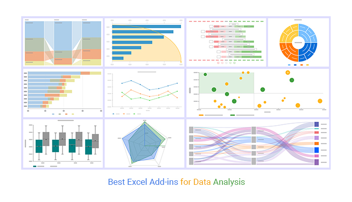
Excel has an inbuilt library with charts and graphs for visualizing data for analysis purposes. However, it is very difficult to create specialized charts for data analysis, such as a Funnel graph.
You don’t have to do away with Excel. You can supercharge it with a particular add-in to access ready-made graphs and charts, such as Radar and Sankey Diagrams.
Keep reading because we’ll be talking more about the best Excel add-ins for data analysis. You don’t want to miss this.
In this blog, you’ll learn:
Before jumping right into the how-to guide, we’ll address the following question: what are add-ins in Excel?
Most Excel users don’t know there’s a whole world of third-party apps just itching to make their jobs much more manageable.
Yes, you heard that right.
You can install third-party apps in Excel to boost your productivity, and even generate the best ready-made charts, like a Waterfall chart in Excel for your data stories. Other add-ins can help you run your business more effectively and save time analyzing your data.
So, what are add-ins in Excel?
They’re extensions that increase more features and options in your Microsoft Excel. Besides, they provide additional functions, such as replacing the missing charts, maps, and graphs e.g. chord diagrams.
You have to enable add-ins to use them. Once add-ins are enabled, they’ll activate once the Excel starts.
Excel add-ins can drive your productivity through the roof. This is because they turn your spreadsheet into a one-stop shop for all your tasks.
For instance, some add-ins can help you save time in dealing with duplicate values. Other add-ins come with an email function, which implies you can easily collaborate with others in real time.
Additionally, certain add-ins offer features for Mekko chart analysis, enhancing your ability to visualize and interpret complex data effectively.
Excel had an inbuilt library with basic charts. But, it lacks charts for specific and specialized tasks, such as surveys and pay-per-click.
Add-ins, such as ChartExpo, have over many charts, including survey charts and a tornado chart in Excel.
Some add-ins can help you create compelling and stunning presentations for your audience. One such tool is the ChartExpo add-in, which is incredibly easy to use.

Excel has many add-ins due to its widespread usage. Add-ins help you perform complex tasks that are not easily accomplished in Excel alone. Some add-ins focus on creating interactive charts, while others are designed for cleaning data or performing forecasting.
Additionally, there are add-ins for advanced features like Treemap analysis, which helps in visualizing hierarchical data effectively.
Here are some of the best Excel add-ins for analyzing data:
In this section, we’ll use ChartExpo to demonstrate how to install Excel add-ins.
There are 2 ways of installing the Excel chart add-in (ChartExpo) for data analysis.


When you buy a new phone, you most likely have to install third-party apps to access extra functionalities. This analogy applies to Excel spreadsheets as well, especially if you’re using add-ins for Excel Mac or Windows to enhance your data processing and analysis capabilities.
Excel had an inbuilt library with basic charts. But, it lacks charts for specific and specialized tasks, such as surveys and pay-per-click.
This is where the best Excel add-ins for data analysis come in. Add-ins, such as ChartExpo, can help you save time and boost productivity through the roof by enabling a Side-By-Side Bar Chart.
With tools like ChartExpo, you can perform complex tasks such as Mosaic plot analysis effortlessly, enhancing your data visualization capabilities significantly
What is ChartExpo?
ChartExpo is an add-in you can easily install in your Excel to access ready-made charts for your data stories.

Imagine you run a beauty brand and want to know the best and worst-sellers in a given financial year. The products in your inventory include face creams, skin-lightening, and beauty creams.
This section will use a Radar Chart (one of the missing charts in Excel) to visualize the table below.
Let’s use the table below for our scenario.
| Product | Month | Number of Orders |
| Face Cream | Jan | 80 |
| Face Cream | Feb | 99 |
| Face Cream | Mar | 93 |
| Face Cream | April | 80 |
| Face Cream | May | 70 |
| Face Cream | June | 65 |
| Face Cream | July | 85 |
| Face Cream | Aug | 90 |
| Face Cream | Sep | 80 |
| Face Cream | Oct | 75 |
| Face Cream | Nov | 65 |
| Face Cream | Dec | 80 |
| Skin Lightening Cream | Jan | 75 |
| Skin Lightening Cream | Feb | 109 |
| Skin Lightening Cream | Mar | 80 |
| Skin Lightening Cream | April | 109 |
| Skin Lightening Cream | May | 75 |
| Skin Lightening Cream | June | 95 |
| Skin Lightening Cream | July | 60 |
| Skin Lightening Cream | Aug | 100 |
| Skin Lightening Cream | Sep | 75 |
| Skin Lightening Cream | Oct | 95 |
| Skin Lightening Cream | Nov | 60 |
| Skin Lightening Cream | Dec | 100 |
| Beauty Cream | Jan | 44 |
| Beauty Cream | Feb | 48 |
| Beauty Cream | Mar | 39 |
| Beauty Cream | April | 56 |
| Beauty Cream | May | 45 |
| Beauty Cream | June | 39 |
| Beauty Cream | July | 30 |
| Beauty Cream | Aug | 45 |
| Beauty Cream | Sep | 40 |
| Beauty Cream | Oct | 51 |
| Beauty Cream | Nov | 55 |
| Beauty Cream | Dec | 50 |
To get started with ChartExpo in Excel, follow the steps below:


Remember, you can only access this chart if you install the Excel Chart add-in (ChartExpo).
Charts and graphs are used interchangeably because they mean the same thing. In other words, they mean visual illustrations you can use to display insights into your data. Some of the charts and graphs you can use include:
Some of the best Excel add-ins for data analysis are free, while others are paid versions. ChartExpo is an example of a paid version. The add-in gives you a 7-day free trial before you embark on a $10 monthly subscription.
For an investment of $10 monthly, you get unlimited access to many ready-to-go and visually appealing charts.

Excel lacks ready-made charts for data analysis.
You’ve got to either migrate to another tool. Or install third-party applications to expand Excel’s functionalities. The third-party applications we’re talking about are called add-ins.
Add-ins allow you to access extra functions that are unavailable in Excel.
The spreadsheet application has an inbuilt library with charts and graphs for visualizing data. However, it lacks ready-made and specialized charts for visualizing data, such as a Radar Graph.
You don’t have to do away with Excel.
We recommend you install third-party apps, such as ChartExpo, to access ready-to-go and visually stunning comparison graphs, such as Radar.
How much did you enjoy this article?


Learn how to use sparklines in Excel to quickly visualize trends inside cells. Discover types, creation steps, customization, use cases, benefits, and best practices.

Learn what a confidence interval graph is, how to create it in Excel, and how to interpret results to make more reliable, data-driven decisions.

A correlation matrix in Excel helps identify relationships between variables. Learn how to create, read, and use it for effective data analysis.


