Categories
The ability to filter through the noise and uncover meaningful insights in today’s information overload is paramount. Dive into the world of data analytics with Power BI Cross Filter Direction, where bidirectional and single filtering strategies pave the way for navigating the data jungle and emerging with valuable insights.


Now, how many types of cross-filter directions Power BI has to offer? Hold on to your hats because we’re about to take a whirlwind tour of this powerful tool.
First up, we have the “Both” direction, where the relationship between tables works in both directions. It’s like a two-way street, allowing data to flow freely between tables, creating a beautiful dance of insights.
Next, we have the “Single” direction, where the relationship only works in one direction. It’s like a one-way ticket to data town. Information can only travel in a specific direction, ensuring order and control.
So, are you ready to take your data analysis to the next level? Let’s explore these Power BI cross-filter directions and see how they can benefit your data analysis efforts.
Definition: Power BI Cross Filter Direction refers to the relationship between tables in a Power BI data model. It determines how filters applied to one table affect another. There are two directions: Single and Both.
Single allows filtering in one direction, whereas Both enable filtering in both directions. This feature is crucial for maintaining the integrity of data relationships in Power BI reports.
Definition: Bidirectional cross-filtering in Power BI allows data to flow both ways between related tables in a model.
This means that when you select a value in one table, it not only filters the related data in that table but also applies filters to the connected table.
This is particularly useful in scenarios where you have complex relationships, enabling a more dynamic and interactive user experience.
To activate bidirectional cross-filtering in Power BI:
In Single Cross Filter Direction in Power BI For Mac or Windows, filtering flows from one table (the primary table) to another (the related table). For instance, let’s say that Table A is related to Table B with a single filter direction. Selections or filters in Table A will impact the data displayed in Table B.
Use case: Useful when you want changes or selections in one table to influence the data shown in another table.
Both Cross Filter Direction enables bidirectional filtering between two related tables. Changes in either table can influence the other. Assume that Table A is related to Table B with both cross-filter directions. Selections in Table A affect Table B and vice versa.
Use case: Suitable when you need interactivity in both directions, allowing changes in either table to impact the other dynamically.
Here are some instances when, where, and why you would want to use this feature.
Single Cross Filter Direction proves advantageous when establishing hierarchical relationships in your data model. For instance, when you have one table as a dimension or hierarchy and another as a fact table. Using a Single Cross Filter Direction, Power BI ensures a clear and controlled filtering flow.
Opt for a Single Cross Filter Direction when you want precise control over data flow direction. This is particularly useful when changes in the primary table must distinctly influence the related table. For example, you can filter customers based on selections made in a geographical region table.
Consider Single cross-filtering in situations where bidirectional filtering might introduce unnecessary complexity and potentially impact performance. This choice aims to streamline query execution and maintain a more efficient process.
For simpler data models, a Single Cross Filter Direction can simplify relationships. It is suitable when bidirectional relationships may not be necessary for the intended analysis. For example, when connecting a calendar table to a sales table for basic date-based filtering.
For specific analysis scenarios where a clear understanding of data flow requirements exists, choose Single Cross Filter. This approach helps mitigate information overload by focusing on one-directional relationships.
It can be particularly useful when analyzing specific aspects of the data without bidirectional influences. An example includes analyzing product sales based on specific product categories.
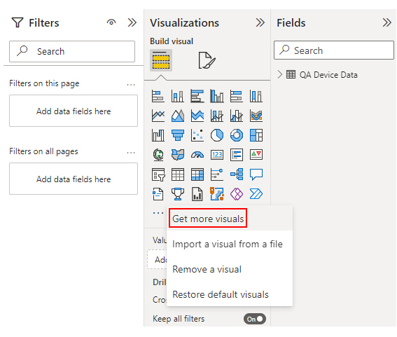
Follow these steps to harness the robust features of Sankey Diagram in Power BI for effective data visualization.


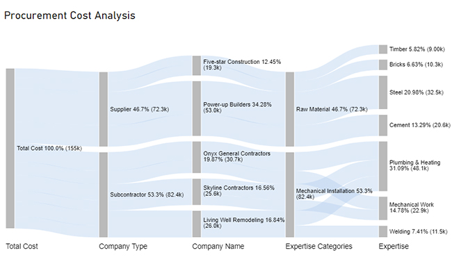
| Total Cost | Company Type | Company Name | Expertise Categories | Expertise | Cost |
| Total Cost | Subcontractor | Skyline Contractors | Mechanical Installation | Plumbing & Heating | 15456 |
| Total Cost | Subcontractor | Skyline Contractors | Mechanical Installation | Mechanical Work | 10159 |
| Total Cost | Subcontractor | Onyx General Contractors | Mechanical Installation | Plumbing & Heating | 18045 |
| Total Cost | Subcontractor | Onyx General Contractors | Mechanical Installation | Mechanical Work | 12695 |
| Total Cost | Subcontractor | Living Well Remodeling | Mechanical Installation | Plumbing & Heating | 14589 |
| Total Cost | Subcontractor | Living Well Remodeling | Mechanical Installation | Welding | 11456 |
| Total Cost | Supplier | Power-up Builders | Raw Material | Cement | 20561 |
| Total Cost | Supplier | Power-up Builders | Raw Material | Steel | 32456 |
| Total Cost | Supplier | Five-star Construction | Raw Material | Bricks | 10253 |
| Total Cost | Supplier | Five-star Construction | Raw Material | Timber | 9000 |


Power BI Cross Filter Direction holds immense significance in report creation and data analysis for several reasons:
Bidirectional filtering in Power BI can lead to increased complexity, potential performance issues, and unexpected results. It might create circular dependencies, impacting query performance and making the data model challenging to understand and maintain.
You can change the filter direction in Power BI by managing relationships. Navigate to the “Model” view, right-click the relationship line, and select “Manage Relationships”. Then, choose the desired relationship and modify the Cross Filter Direction in the Relationship dialog.
Best practices for using Cross Filter Direction in Power BI include;
The versatility of cross-filter direction in Power BI illuminates the path to insightful data analysis. From establishing data relationships to ensuring consistency and enabling interactive reporting, its impact resonates across every analysis facet.
The significance of cross-filtering Power BI becomes particularly evident in contextual analysis. Directing how filters influence related data paints a vivid picture of information within specific contexts. Consequently, it fosters a deeper understanding of the data landscape.
Power BI relationships cross-filter direction not only optimize performance but also promote user-friendly exploration. It guides users intuitively through the data, making the analytical journey smoother and more engaging. Moreover, its role in maintaining data model flexibility empowers adaptability to evolving business needs.
In data analytics, Power BI Cross Filter Direction stands as a pillar of adaptability, responsiveness, and user-centric exploration. It is an invisible architect shaping the user journey through data. Each click, each interaction, is orchestrated by the strategic influence of cross-filtering, transforming data into actionable insights.
Do not hesitate.
Embrace the cross-filtering in Power BI and take your data analysis game to the next level.
How much did you enjoy this article?


Discover diverse and high-quality Power BI report examples for inspiration and insights. Elevate your reporting with strategic visualization techniques.

A Customer Relationship Management Dashboard centralizes data, tracks key metrics, and drives smarter business decisions. Discover now!

Explore Healthcare Dashboard Examples and learn how to turn complex healthcare data into clear, actionable insights for better decision-making.


