Categories
Creating a hierarchy in Power BI is a pivotal skill for anyone seeking to enhance their data management and visualization capabilities.
Effective management and delegation of tasks are paramount to the smooth operation of companies.


Similar to organizational hierarchies, data management and analysis depend on structured hierarchies for efficient utilization of information.
In Power BI, data is organized within an organization based on ranks, roles, and user-specific needs.
It establishes an order that enables data to flow seamlessly from high-level categories to low-level categories.
Power BI offers a unique feature known as hierarchies, which essentially creates a parent-child relationship within your data.
Within this structure, upper-tier classifications serve as the “guardians,” overseeing lower-tier classifications referred to as the “offspring.” This arrangement allows an intuitive, organized, and user-specific data access experience.
In this article, we will guide you on creating a hierarchy in Power BI. We begin by defining what a Power BI hierarchy is.
We’ll also learn the benefits of using hierarchies in Power BI. We’ll also know when to use hierarchies in Power BI.
Definition: A PowerBI Hierarchy is a structured way to organize related data fields so users can explore information across different levels of detail. It allows for easy drill-down analysis, starting from a broad view and moving into more specific data.
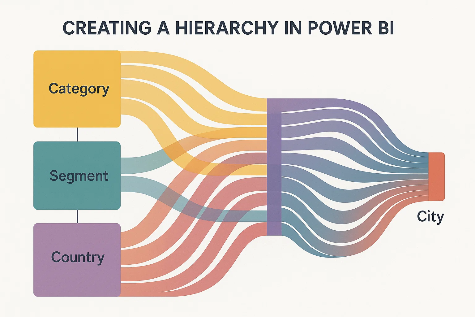
Hierarchies follow a parent-child structure, making it easier to group data logically. For example, a date hierarchy might include: Year > Quarter > Month > Day. Likewise, a geography hierarchy might be: Country > State > City.
Using hierarchies in Power BI improves data navigation, enhances visuals, and supports deeper insights without cluttering your report with multiple visuals.
By following this video tutorial, we can easily visualize data from the Power BI hierarchy table:
Power BI hierarchies help organize data into multiple levels—such as Year > Quarter > Month—to enable step-by-step analysis. Using different levels in a hierarchy makes it easy to drill down and explore patterns without switching between multiple charts.
For example, a sales manager can start by viewing yearly sales and then quickly drill into quarters, months, or even days. This layered approach enhances data clarity, reduces clutter, and supports interactive dashboards for better decision-making.
Here are some instances in which you should consider creating a hierarchy in Power BI:
The use of hierarchies in Power BI is best when your data exhibits a hierarchical structure. For example, data on geographic regions and dates inherently exhibits hierarchical structures.
In organizations, users at different levels may need to examine data at various levels of detail.
Power BI hierarchies facilitate seamless data exploration, improving communication and information flow through drill-up and drill-down capabilities.
Additionally, hierarchies can help restrict data access to those who should have it, ensuring data security.
Creating a hierarchy in Power BI offers significant advantages, especially when dealing with dynamic datasets that undergo structural changes over time. In such scenarios, hierarchies play a crucial role in simplifying report maintenance.
Instead of altering individual visuals, users can seamlessly adjust the hierarchy definition based on evolving data structures.
This flexibility is exceptionally valuable, providing an efficient way to adapt to changes in your dataset without the need for extensive modifications.
Hierarchies simplify data navigation and exploration, making them well-suited for complex data structures or large datasets.
This enables users to find relevant information efficiently, reducing the cognitive load associated with understanding complex data.
Hierarchies provide a means of allowing users to customize their data analysis. This customization promotes user exploration and expansion of data, allowing a focus on specific areas of interest.
Hierarchies empower users to customize their data analysis, enhancing user engagement and data-driven decision-making.
Creating a hierarchy in Power BI is pivotal for the consolidation of data, particularly when aiming to generate user-friendly reports and dashboards. They enable the presentation of multiple levels of detail in a single visual.
This reduces clutter in your reports and ensures that users can quickly access the information they require.
When choosing a hierarchy, it’s crucial to evaluate your data, business requirements, and information flow.
One can create various types of measures in Power BI based on your data and analysis requirements.
Common types of measures in Power BI are:
The measures you create in DAX format depend on your Power BI project’s specific analysis and reporting needs. This allows you to extract valuable insights and generate informative reports and dashboards.
We need to follow these steps to create a hierarchy in Power BI Desktop:
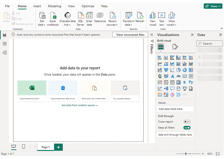
Begin by launching Power BI Desktop and opening your existing report or dataset. Ensure that your data is properly loaded and structured.
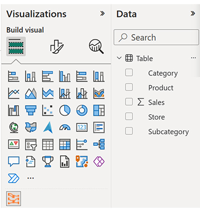
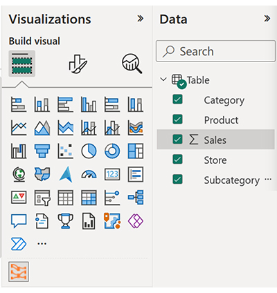
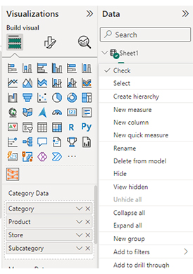
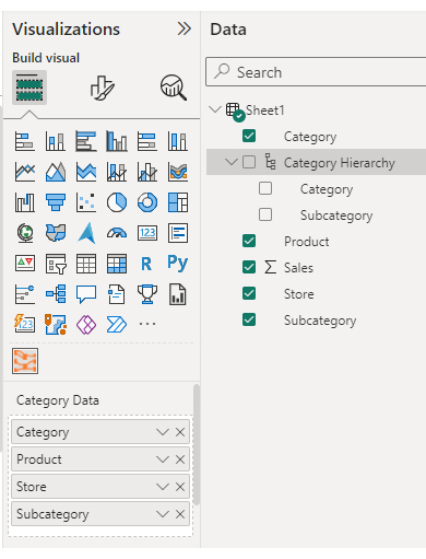
On the right-hand side, find the Fields pane. This pane displays all your data tables and fields, which you’ll use to build the hierarchy.
Determine the fields that naturally follow a parent-child relationship. For example, a hierarchy might include Year > Quarter > Month > Day. In a location-based table, it could be Country > State > City > Store.
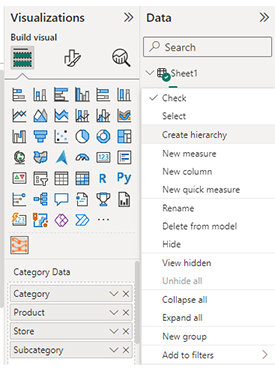
Right-click the field you want as the top level (e.g., “Year”) and select Create hierarchy. Power BI will automatically create a new hierarchy and include this field as its first level.
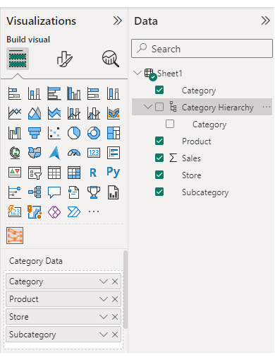
To add more levels, drag each additional field (such as “Month” or “Day”) into the newly created hierarchy, directly under the top-level field. Ensure the order follows a logical drill-down structure.
Right-click the hierarchy title to rename it—this is especially helpful for clarity when using multiple hierarchies in your report.
Now you can drag the hierarchy into a visual (like a bar chart, line graph, or matrix). With Power BI visualize hierarchy features, users will be able to interactively drill down or drill up, exploring data across levels with ease.
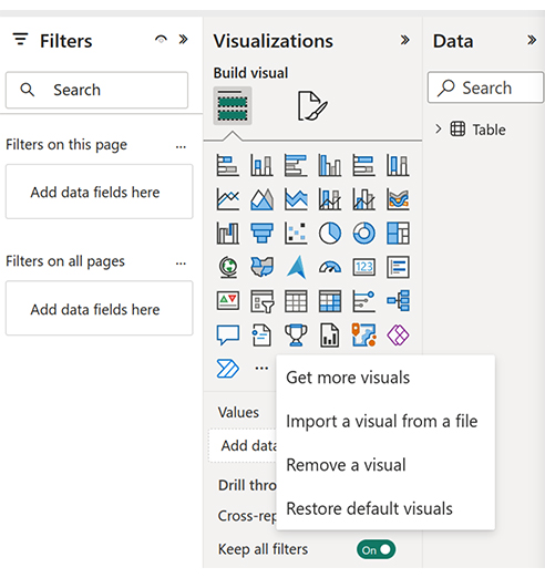
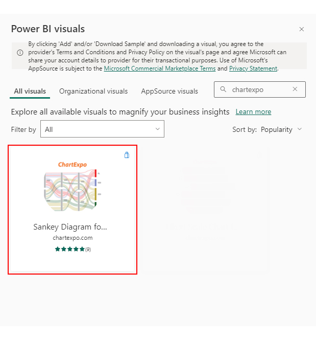
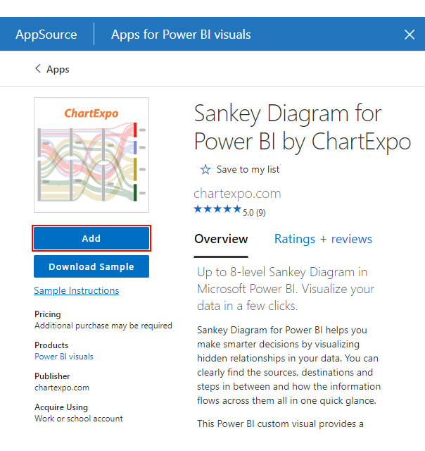
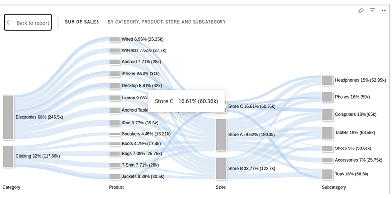
In this section dedicated to creating hierarchical charts in Power BI, we delve into utilizing hierarchies to fashion more informative and insightful visualizations. We’ll use the Sankey Diagram (Sankey Chart) as a hierarchical chart in a Power BI business dashboard example.
You need at least two tables to create a hierarchy in a Sankey diagram in Power BI:
The Sankey diagram flows from the Source Table values to the Destination Table values.
Additionally, you can include intermediate tables for extra hierarchical levels. As well as Power BI, create a hierarchy from different tables.
It is generally better practice to import the source and destination data together into a single Power BI dataset rather than separately. This is because there should be a link between them.
Note that you might need to use Power BI Desktop to display hierarchical data in Power BI easily. Creating a Sankey chart follows the same procedure in both Power BI Desktop and Power BI Online.
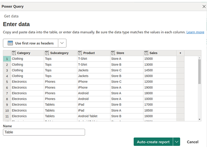
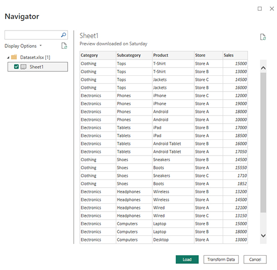
Let’s first log in to Power BI and upload our dataset.


| Category | Subcategory | Product | Store | Sales |
| Clothing | Tops | T-Shirt | Store A | 15000 |
| Clothing | Tops | T-Shirt | Store B | 13000 |
| Clothing | Tops | Jackets | Store C | 14500 |
| Clothing | Tops | Jackets | Store B | 16000 |
| Electronics | Phones | iPhone | Store C | 12000 |
| Electronics | Phones | iPhone | Store A | 19000 |
| Electronics | Phones | Android | Store A | 18000 |
| Electronics | Phones | Android | Store A | 10000o |
| Electronics | Tablets | iPad | Store B | 17000 |
| Electronics | Tablets | iPad | Store A | 18500 |
| Electronics | Tablets | Android Tablet | Store B | 16000 |
| Electronics | Tablets | Android Tablet | Store A | 17050 |
| Clothing | Shoes | Sneakers | Store B | 14500 |
| Clothing | Shoes | Boots | Store A | 15550 |
| Clothing | Shoes | Sneakers | Store C | 1710 |
| Clothing | Shoes | Boots | Store A | 1852 |
| Electronics | Headphones | Wireless | Store B | 13200 |
| Electronics | Headphones | Wireless | Store A | 14500 |
| Electronics | Headphones | Wired | Store A | 12100 |
| Electronics | Headphones | Wired | Store C | 13150 |
| Electronics | Computers | Laptop | Store B | 15000 |
| Electronics | Computers | Laptop | Store B | 18000 |
| Electronics | Computers | Desktop | Store A | 13000 |
| Electronics | Computers | Desktop | Store C | 19000 |
| Clothing | Accessories | Bags | Store A | 12500 |
| Clothing | Accessories | Bags | Store A | 13250 |
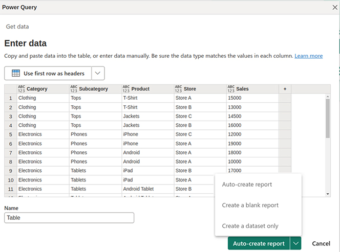


We’ll use the same dataset we used to create our Sankey Diagram in the previous step. You need to load it into the Power BI Desktop.
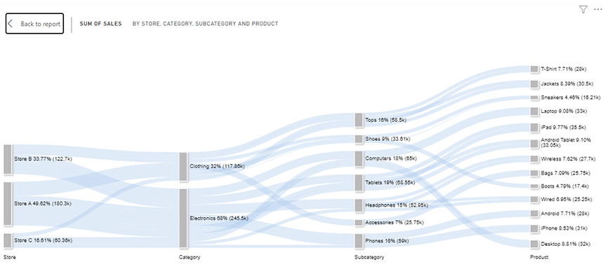
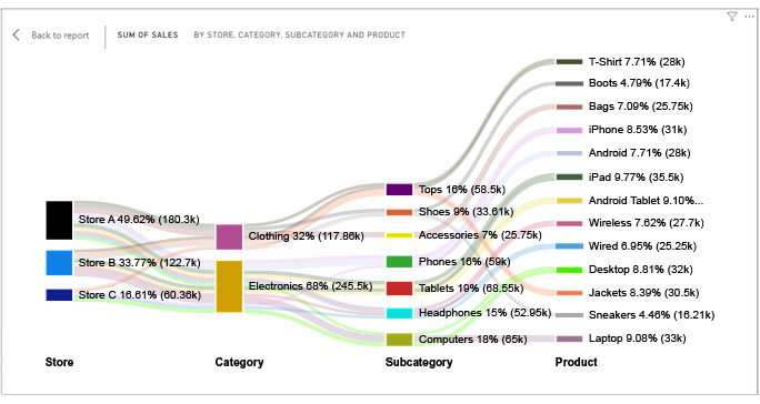
Our Sankey diagram shows a hierarchy that flows from Category to Subcategory to Product.
The Sales Field helps to visualize the volume or magnitude of flow between the hierarchical nodes. Level 1 shows the Store field, which helps to further filter the data.
Creating a Power BI custom hierarchy offers several valuable benefits, especially for reporting and data analysis. Here are the key advantages:
Custom hierarchies make it easy to explore your data at multiple levels. Users can drill down from broader categories (like Year) to finer details (like Month or Day) within the same visual. This simplifies data exploration and helps identify trends, outliers, or performance shifts over time.
Using hierarchies keeps your report visuals clean and well-structured. Instead of dragging multiple fields onto a visual, you can just use one hierarchy, which improves clarity and reduces clutter, making dashboards easier to understand for all users.
With a custom hierarchy, analysts and decision-makers can quickly shift focus between levels of detail without redesigning visuals or recreating charts. This speeds up workflows and ensures consistency in how data is analyzed across the report.
Hierarchies add interactivity to visuals, allowing users to click and drill through the data with ease. This interactive functionality makes reports more engaging and user-friendly, encouraging deeper exploration and better decision-making.
Custom hierarchies let you tailor your data structure to fit your business model, such as Region → Division → Branch, or Category → Subcategory → Product. This flexibility ensures that your reports reflect your organization’s logic, making them more meaningful and actionable.
Once created, hierarchies follow a fixed level order—users can’t dynamically change the drill path.
Power BI doesn’t auto-detect custom hierarchies; you must build them manually.
You can only include fields from the same table unless relationships are properly set.
You can’t show or hide hierarchy levels based on slicers or user actions.
Deep hierarchies with large datasets may slow down visual loading and performance.
Before building, clearly define the logical order of your data levels (e.g., Year > Quarter > Month). This ensures consistency and helps users understand your data flow.
Use familiar terms and logical groupings that your audience can easily relate to. Avoid overly complex hierarchies that might confuse users.
Use descriptive and readable names (e.g., “Product Category Hierarchy”) to make navigation easy for report consumers.
Ensure that all fields within a hierarchy are of consistent and compatible data types. This prevents issues during filtering or drilling down.
After creating a hierarchy, test its drill-down and drill-up behavior in visuals to make sure it works smoothly and reveals insights effectively.
Yes, you can create a hierarchy in Power BI. In the Fields pane, simply drag one field onto another to form a hierarchy. You can then add more fields to it, rename it, and use it in visuals to enable drill-down and drill-up functionality.
To create a hierarchy in Power BI using DAX, you can’t directly build a hierarchy like in the Fields pane, but you can create calculated columns that represent each level (e.g., Region, Country, City) using DAX. Then, use these columns in visuals and group them manually to mimic a hierarchy structure.
Creating a hierarchy from the same column in Power BI can be achieved through two distinct approaches:
The first method involves utilizing conditional columns and fill-downs. This technique utilizes conditional columns to categorize data into various levels. The “Fill Down” operation is then used to propagate these values throughout the column.
The other approach is to use a DAX formula like ”˜PATHLEVEL’ to create a hierarchy within the calculated column.
Note that the effective creation of hierarchies is well-suited for data exhibiting a natural hierarchical structure.
To manually create a hierarchy in Power BI:
Not all visualizations treat hierarchies the same. Trying different types may be necessary to find the most effective approach for your data.
Leveraging hierarchies in Power BI proves instrumental for efficient data categorization, simplifying information into distinct classes.
This not only aids in streamlined data organization but also facilitates targeted data dissemination.
This ensures limited data access for authorized individuals, with information shared only within their organizational levels.
Creating a hierarchy in Power BI ensures limited data access for authorized individuals, with information shared only within their organizational levels.
Power BI offers two main hierarchy creation methods: manual configuration and DAX formulas, ensuring user flexibility.
Note that hierarchies are not established with any random information. Instead, your data must exhibit a structure resembling a tree or nest for hierarchies to be formed.
Mastering hierarchy creation empowers users to unlock Power BI’s full potential for thorough data analysis and reporting.
How much did you enjoy this article?


Discover diverse and high-quality Power BI report examples for inspiration and insights. Elevate your reporting with strategic visualization techniques.

A Customer Relationship Management Dashboard centralizes data, tracks key metrics, and drives smarter business decisions. Discover now!

Explore Healthcare Dashboard Examples and learn how to turn complex healthcare data into clear, actionable insights for better decision-making.


