• Home
  • Tools dropdown img
    • Spreadsheet Charts

      • ChartExpo for Google Sheets
      • ChartExpo for Microsoft Excel
    • Power BI Charts

      • Power BI Custom Visuals by ChartExpo
    • Word Cloud

  • Charts dropdown img
    • Chart Category

      • Bar Charts
      • Circle Graphs
      • Column Charts
      • Combo Charts
      • Comparison Charts
      • Line Graphs
      • PPC Charts
      • Sentiment Analysis Charts
      • Survey Charts
    • Chart Type

      • Box and Whisker Plot
      • Clustered Bar Chart
      • Clustered Column Chart
      • Comparison Bar Chart
      • Control Chart
      • CSAT Survey Bar Chart
      • CSAT Survey Chart
      • Dot Plot Chart
      • Double Bar Graph
      • Funnel Chart
      • Gauge Chart
      • Likert Scale Chart
      • Matrix Chart
      • Multi Axis Line Chart
      • Overlapping Bar Chart
      • Pareto Chart
      • Radar Chart
      • Radial Bar Chart
      • Sankey Diagram
      • Scatter Plot Chart
      • Slope Chart
      • Sunburst Chart
      • Tornado Chart
      • Waterfall Chart
      • Word Cloud
    • Google Sheets
      Microsoft Excel
  • Services
  • Pricing
  • Contact us
  • Blog
  • Support dropdown img
      • Gallery
      • Videos
      • Contact us
      • FAQs
      • Resources
    • Please feel free to contact us

      atsupport@chartexpo.com

Categories
All Data Visualizations Data Analytics Surveys
Add-ons/
  • Google Sheets
  • Microsoft Excel
  • Power BI
All Data Visualizations Data Analytics Surveys
Add-ons
  • Google Sheets
  • Microsoft Excel
  • Power BI

We use cookies

This website uses cookies to provide better user experience and user's session management.
By continuing visiting this website you consent the use of these cookies.

Ok

ChartExpo Survey


Home > Blog > Power BI

How to Create a Measure in Power BI?

When working with data, sometimes you need to work with aggregations like sum, average, minimum, and maximum. In a sales data set, you can calculate the value of your total sales.

Create a Measure in Power BI

As part of this process, you may find it necessary to create a measure in Power BI. This measure allows you to represent and visualize the calculated values in a Power BI visual, providing a comprehensive understanding of your sales data.

Measures are how you represent aggregations in Power BI. Measures tend to be a single value that results from a calculation of a column, for example.

A total sales measure could be the sum of all the sales amounts in your dataset. It could even be a single column in an Excel sheet or database.

In this article, we learn all about measures in Power BI. We will begin by defining a measure in Power BI. We will then learn why we create measures in Power BI.

Table of Contents:

  1. What is a Measure in Power BI?
  2. Why Create a Measure in Power BI?
  3. Types of Measures in Power BI
  4. How to Create a Measure in Power BI: Step-by-Step
  5. How to use the Measure in the Report?
  6. What are the Common Functions Used in Measure Formulas?
  7. Using Measure In Different Forms
  8. Tips For Creating Measures in Power BI
  9. Wrap Up

We will then learn how to create a measure in Power BI. Finally, we’ll look at how to analyze measures in Power BI.

What is a Measure in Power BI?

Definition: A measure in Power BI is a calculation or aggregation that processes data in your dataset.

These computations encompass a wide range of mathematical, statistical, or logical operations, such as

  • Aggregations, such as sum, average, count, and minimum/maximum
  • Ratios and percentages
  • Calculations based on multiple tables
  • Complex calculations using DAX functions

Measures, vital components in Power BI, are created using the Data Analysis Expressions (DAX) language. DAX, a robust tool language, empowers you to seamlessly ‘Create a measure in Power BI’ by facilitating complex calculations on your dataset.

Measures can be utilized to gather data insights, generate metrics, and establish key performance indicators (KPIs).

This makes them indispensable for creating meaningful and interactive reports and dashboards in Power BI.

Why Create a Measure in Power BI?

Measures play a crucial role in data analysis and reporting within the Power BI environment. Creating measures in Power BI is essential for several reasons:

Summarizing Data

Measures provide a way to summarize and aggregate data and give it meaning. This helps in identifying trends and patterns and deriving insights.

Streamlining the Creation and Maintenance of Reports

Using the DAX language, measures can be used to perform complex calculations on your data. These calculations include growth rates and advanced statistical analysis. This streamlines the creation and maintenance of reports.

Ensuring Consistency

Measures allow for reusable formulas across visuals and dashboards. This promotes consistency and minimizes repetitive calculations.

Combining Data from Multiple Sources

Power BI measures enable data integration from diverse sources, simplifying the calculation of desired data. This promotes seamless data analysis and integration.

Types of Measures in Power BI

You can create various types of measures in Power BI based on your data and analysis requirements.

Common types of measures in Power BI include:

  • Simple measures – These are basic measures that perform calculations on your data, like sums, counts, and averages. These allow you to quickly get totals and other aggregates.
  • Calculated measures – These are more complex Calculated Measures, where you write DAX formulas to define custom calculations. This allows you to create measures that are not available out of the box.
  • Time intelligence measures – these are pre-defined DAX functions for time calculations like year-to-date, rolling averages over time, and year-over-year growth. They make time-based analysis easier.
  • Quick measures – these are automatically generated aggregates like sum, count, and average for a selected column. They save time when compared to creating basic measures.
  • Semi-additive measures – These are measures that can be partially summed across dimensions. Useful for things like account balances.
  • Implicit measures – these are created automatically from model relationships. We use DAX variables like SUMX or CALCULATE to dynamically filter results.
  • Automatic measures – these refer to the pre-built or automatically generated measures that Power BI creates for you. They are based on the relationships and data models you’ve established in your report.

How to Create a Measure in Power BI: Step-by-Step

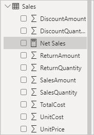
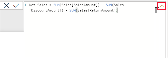
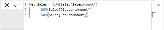
Consider that you need to evaluate your net sales by deducting discounts and returns from the total sales amount. To do this, you need to create a measure that subtracts the sum of DiscountAmount and ReturnAmount from the sum of SalesAmount. Although you don’t see a field labeled “Net Sales” in the Fields list, you can easily build your measure to calculate it.

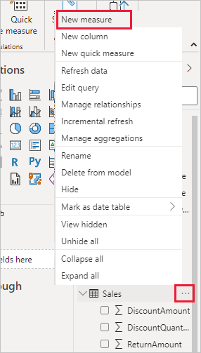
To create a measure, follow these steps:

  1. In the Fields pane, right-click on the Sales table, or hover over the table and select the More options (…) menu.
  2. From the dropdown, choose “New measure.”
    • This action will place your new measure within the Sales table, making it easy to locate.
Measures in Power BI 1
  • Another option is to create a measure by selecting ‘New Measure’ from the Calculations group found on the Home tab of the Power BI Desktop ribbon.
Measures in Power BI 2
  • Tip: When creating a measure from the ribbon, you have the flexibility to add it to any table. However, to keep things organized, it’s best to add it to the table where you plan to use it.
    • The formula bar will appear at the top of the report canvas, allowing you to rename your measure and enter a DAX formula.
Measures in Power BI 3
  1. New measures are automatically named ‘Measure’ by default. If you don’t rename them, additional measures will be labeled ‘Measure 2,’ ‘Measure 3,’ and so on. To make it easily identifiable, highlight “Measure” in the formula bar and change the name to “Net Sales.”
  2. Start typing your formula. After the equals sign, begin typing SUM. As you type, a drop-down list of DAX functions will appear, showing all functions starting with the letters you typed. If needed, scroll down to find and select SUM from the list, then press Enter.
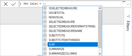
Measures in Power BI 4
    • An opening parenthesis will appear, along with a list of available columns that can be passed to the SUM function.
Measures in Power BI 5
  1. Expressions should always be enclosed in parentheses. For this example, your expression will contain one argument for the 
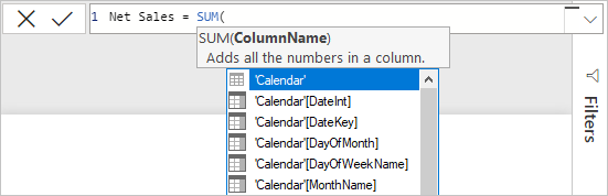
SUM function: the SalesAmount column. Begin typing SalesAmount until Sales[SalesAmount] remains the only option in the list.
    • The column name, along with its table name, is known as the fully qualified name of the column, which makes your formulas easier to understand.
Measures in Power BI 6
  1. Select 
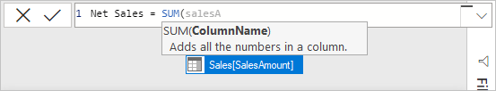
Sales[SalesAmount] from the list, then close the parenthesis.
    • Tip: Syntax errors often occur due to missing or misplaced parentheses.
  1. Subtract the other two columns within the formula:
    • a. After the closing parenthesis of the first expression, type a space, a minus sign (-), and another space.
    • b. Add another SUM function, then type DiscountAmount until you can select Sales[DiscountAmount] as the argument. Close the parenthesis.
    • c. Type a space, a minus sign, another space, and then another SUM function with Sales[ReturnAmount] as the argument. Close the parenthesis.
Measures in Power BI 7

8. Press Enter or click the Commit button (checkmark icon) in the formula bar to finalize and validate the formula.

    • Your validated “Net Sales” measure is now ready for use in the Sales table within the Fields pane.
Measures in Power BI 8
  1. If you need more space to enter the formula or prefer to split it into separate lines, click the down arrow on the right side of the formula bar.
    • This will expand the formula bar, providing more room to work.
Measures in Power BI 9
  1. To separate parts of your formula, press Alt + Enter for a new line, or use the Tab key for indentation.
Measures in Power BI 10

How to use the Measure in the Report?

Stage 1: Logging in to Power BI

You need to install Power BI Desktop if you don’t already have it.

  • If you’re using Power BI Desktop for the first time after installation, you need to log in.
  • Enter your email. Click the “Submit” button.
Enter email to login to Power BI
  • Enter your password and click “Sign in“.
Enter Password to login to Power BI
  • Choose whether to stay signed in.
Click on stay signed in

Stage 2: Select the Contoso Sales Sample Dataset and Import it to the Power BI Desktop

  • We’ll use the Contoso sales sample dataset in the official Microsoft documentation. It’s a fictional dataset with measures that simulate real-world sales data.
  • Download the Contoso dataset and extract the zip file. You should have the dataset as a .pbix file.
  • Log in to Power BI Desktop. You should see the Power BI home page as shown below.
select Paste or manually enter data in Power BI ce483
  • Select “File” and then choose “Open.”
Open File in Power BI ce483
  • Access the Contoso.pbix file from recent files or OneDrive. You can also click “Browse this device” if the file is not on OneDrive or recent files.
  • The data should now be loaded, and you should see some tables under “Data” as shown below.
Click on Data Loaded ce483
  • You may see a notification like “One or more calculated objects need to be manually refreshed.”
  • Click on “Refresh now,” and you should be good to go.

Stage 3: Adding the Power BI Sankey Diagram Extension by ChartExpo

We need to add a Sankey diagram as the visual we’ll use, along with measures.

  • Navigate to the Power BI Visualizations panel.
  • Click the ellipsis (…) highlighted below to import the Power BI Sankey Diagram extension by ChartExpo.
Report Canvas screen in Power BI ce483
  • Select the “Get more visuals” option.
  • Enter “Sankey Diagram for Power BI by ChartExpo” in the highlighted search box.
  • You should see the “Sankey Diagram for Power BI by ChartExpo”, as shown in the image below.
Sankey Diagram for Power BI by ChartExpo
  • Click the highlighted “Add” button.
Click the Add button
  • Power BI will add the “Sankey Diagram for Power BI by ChartExpo” in the visualization panel.
Click on Sankey Diagram Icon

Stage 4: Drawing a Sankey Diagram with ChartExpo’s Power BI extension

  • Select the “Sankey Diagram for Power BI by ChartExpo” icon in the visualization panel.
  • The following window opens in the report section of your dashboard:
Report Section in Dashboard ce483
  • You can resize the visual as needed.
  • We can now add some automatic measures to the Sankey diagram.
  • To do this, expand the Sales table under the “Fields” pane, as shown below.

Select fields for Sankey diagram ce483

  • Select the SalesAmount field. This field contains measures that are the total of the sales amounts. Note that all fields in the Sales table are numeric.
  • We also need to select other fields in the Sankey diagram. This will help demonstrate the flow of different values or items.
  • We can select the following additional fields:
    • ClassName (from the Product table)
    • ProductCategory (from the ProductCategory table)
    • StoreType (from the Stores table)
  • Our Sankey chart will be updated as follows:
Create a Measure in Power BI 1
  • If you don’t have a ChartExpo license key, provide your email address or a ChartExpo license key.
enter email for ChartExpo license ce430

Stage 5: Activate your ChartExpo Trial or Apply a Subscription Key

  • Select the ChartExpo visual.
  • You should see three icons below “Build Visual” in the Visualizations panel.
Build visual panel in Power BI
  • Select the middle icon, “Format visual“.
  • The visual properties will be populated as shown below.
visual properties in Power BI
  • If you are a new user,
    • Type in your email under the section titled “Trial Mode”.
    • This should be the email address that you used to subscribe to the ChartExpo add-in. It is where your ChartExpo license key will be sent.
    • Ensure that your email address is valid.
    • Click “Enable Trial.” You’ll get a 7-day trial.
enter email id
    • You should receive a welcome email from ChartExpo.
    • The Sankey Diagram you create under the 7-day trial contains the ChartExpo watermark.
  • If you have obtained a license key:
    • Enter your license key in the “ChartExpo License Key” textbox in the “License Settings” section (see below).
    • Slide the toggle switch next to “Enable License” to “On.”
enter email for ChartExpo license
  • To add colors, expand the “Level Colors” properties and select a color.
  • Do this to change the color of each node.
  • All changes are automatically saved.
Coloring Sankey Diagram ce483
  • Your final chart should look like the one below. If you get a license, the Sankey Chart will not have a watermark.
Final Create a Measure in Power BI

Insights

We have used selected fields from the Contoso sales sample dataset. This helps to show the flow of products when using SalesAmount as the measure.

It’s important to note that the default measure is sum. Our example uses automatic measures. However, you can also create a measure in Power BI that is custom.

  • At level 1, ClassName, the category with the most sales was Regular (62.04%). Deluxe came in second at 23.74%. The economy had the fewest sales at 14.49%.
  • At level 2, ProductCategory, computers were the category with the most sold items at 38%. Cameras and camcorders came in second at 31%. TV and Video was third at 16%.
  • At level 3, StoreType, most sales were made at the store (58.20%). Online sales came in second at 20.21%. Reseller sales were third at 13.24%. Catalog sales were the fewest, at 8.34%.

What are the Common Functions Used in Measure Formulas?

  1. SUM: Adds up all values in a column.
    DAX
    TotalSales = SUM(Sales[SalesAmount])
  2. AVERAGE: Calculates the average value of a column.
    DAX
    AverageSales = AVERAGE(Sales[SalesAmount])
  3. COUNT: Counts the number of rows in a column.
    DAX
    TotalOrders = COUNT(Sales[OrderID])
  4. COUNTROWS: Counts the number of rows in a table.
    DAX
    NumberOfSales = COUNTROWS(Sales)
  5. MAX: Returns the maximum value in a column.
    DAX
    MaxSales = MAX(Sales[SalesAmount])
  6. MIN: Returns the minimum value in a column.
    DAX
    MinSales = MIN(Sales[SalesAmount])
  7. DIVIDE: Performs division and handles division by zero.
    DAX
    SalesRatio = DIVIDE([TotalSales], [TotalOrders])
  8. CALCULATE: Changes the context in which the data is evaluated.
    DAX
    SalesInRegion = CALCULATE([TotalSales], Sales[Region] = "North")
  9. FILTER: Filters a table based on a condition.
    DAX
    SalesFiltered = CALCULATE([TotalSales], FILTER(Sales, Sales[SalesAmount] > 1000))
  10. ALL: Removes filters from a column or table.
    DAX
    TotalSalesAll = CALCULATE([TotalSales], ALL(Sales[Region]))

Using Measure In Different Forms

Measure with a slicer

  • Add a Slicer: Drag the desired field (e.g., Product Category) to the canvas and convert it to a slicer.
  • Create a Measure: Right-click your table, select “New measure,” and write your DAX formula, e.g.,
    DAX
    SelectedSales = SUM(Sales[SalesAmount])
  • Apply the Measure: Drag the measure to a visual.
  • Test: Use the slicer to filter the visual based on your selection.

Measure in Another Measure

  • Create Base Measure: Define a measure, e.g., TotalSales = SUM(Sales[SalesAmount]).
  • Use in Another Measure: Reference the base measure, e.g.,
    DAX
    SalesPercentage = DIVIDE([TotalSales], [TotalSales], 0)
  • Apply the Measure: Add it to a visual.

Tips For Creating Measures in Power BI

Utilizing Power BI measures empowers users to unlock the potential of their data and monitor key metrics. They are also able to guide their organizations toward data-driven decision-making.

Here are the benefits of using measures in Power BI:

Simplified DAX calculations

Measures simplify complex DAX calculations, enhancing report development and comprehension. These calculations can be reused across visuals, which prevents duplication of the formulas.

Clean Data Models

The utilization of measures minimizes the need for unnecessary calculated columns. This helps in keeping your data model tidy. As a result, the data model is easier to manage and becomes more efficient and well-organized.

Interactivity

Power BI measures allow user interactions by responding to user input, such as filters and slicers. This enables users to explore data and gain insights through report adjustments, whether using Power BI for Mac or other platforms, eliminating manual data manipulation.

Enhanced Visuals

Measures enable the creation of informative visuals like trendlines, moving averages, or advanced types of charts. This provides deeper data insights and increased report engagement.

Version Control

Reports are easier to maintain and update. Centralized calculation changes in measures ensure consistency and simplify the evolution of your reports.

FAQs:

How Do I Create a Measure Based on a Column in Power BI?

To create a Power BI measure from a column, employ DAX formulas to specify the calculation.

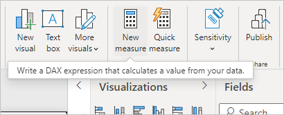
Open your Power BI report and select the relevant data source in the “Fields” pane. Then, access the “Modeling” tab and click “New Measure.”

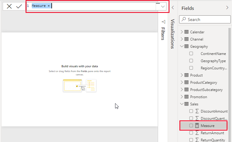
Assign a meaningful name to your measure, ensuring it follows DAX naming conventions. In the formula bar, enter a DAX expression that describes your calculation.

After pressing Enter, your measure is created and can be used in your report’s visuals. Save your report and test the measure’s functionality, making adjustments to meet your specific analysis requirements.

How Do You Write a DAX Measure in Power BI?

When crafting DAX measures in Power BI, you should understand business needs. Use clear naming, add comments, manage errors, and test for accuracy.

Consider performance implications, ensure data model integrity with proper relationships, and select appropriate aggregation functions.

Address filter context and document measures for collaboration and future reference. Implement version control in team settings to maintain consistency.

These guidelines lead to accurate, efficient, and well-documented DAX measures. This improves the overall quality and usability of Power BI reports and dashboards.

How do you speed up measures in Power BI?

First, you’ll have to reduce complexity to optimize the DAX formula, and also minimize the use of FILTER and CALCULATE functions. Next, optimize the data model relationships, and use the DirectQuery mode.

Wrap-Up

We have journeyed through how to create a measure in Power BI.

Creating measures in Power BI is essential to extracting valuable insights from your data. These measures serve as the powerhouse behind data-informed decision-making.

The language employed in constructing these measures is known as the DAX language.

Understanding the DAX language and employing techniques, tools, and strategies are key.

These calculated fields can summarize data, facilitate in-depth analysis, and reveal critical patterns and trends.

To derive valuable insights, it’s crucial to know the nuances of creating measures. Properly formatted measures can enhance the readability of your reports and dashboards.

This enables you to leverage your data’s potential for well-informed decision-making. Mastering these skills can transform raw data into actionable insights, guiding your business toward success.

How much did you enjoy this article?

PBIAd1
Start Free Trial!
131771

Related articles

next previous
Power BI12 min read

Power BI Group By Guide for Effective Data Insights

Learn how Power BI Group By helps you aggregate data, clarify trends, and create reports by grouping values to make large datasets manageable & insightful.

Power BI12 min read

How to Create Sankey Diagram in Microsoft Power BI?

Learn How to Create Sankey Diagram in Microsoft Power BI using Desktop & Web Service. What they are and how to use them effectively.

Power BI8 min read

Power BI Artificial Intelligence: Insights Using Visuals

Discover all there is to know about the Power BI artificial intelligence. You'll also discover how AI is used in Power BI, and how to use it for analysis and more.

Power BI9 min read

Budgeting in Healthcare: Use Visuals to Spot Budget Gaps

This guide helps you discover what budgeting in healthcare is. You'll also discover the factors that affect hospital budgets and types of budgeting in healthcare.

Power BI9 min read

Predictive Analytics in Power BI for Making Insightful Visuals

This guide shows you everything you need to know about Predictive Analytics in Power BI. It also shows you how it works, and how to interpret the results.

ChartExpo logo

Turn Data into Visual
Stories

CHARTEXPO

  • Home
  • Gallery
  • Videos
  • Services
  • Pricing
  • Contact us
  • FAQs
  • Privacy policy
  • Terms of Service
  • Sitemap

TOOLS

  • ChartExpo for Google Sheets
  • ChartExpo for Microsoft Excel
  • Power BI Custom Visuals by ChartExpo
  • Word Cloud

CATEGORIES

  • Bar Charts
  • Circle Graphs
  • Column Charts
  • Combo Charts
  • Comparison Charts
  • Line Graphs
  • PPC Charts
  • Sentiment Analysis Charts
  • Survey Charts

TOP CHARTS

  • Sankey Diagram
  • Likert Scale Chart
  • Comparison Bar Chart
  • Pareto Chart
  • Funnel Chart
  • Gauge Chart
  • Radar Chart
  • Radial Bar Chart
  • Sunburst Chart
  • see more
  • Scatter Plot Chart
  • CSAT Survey Bar Chart
  • CSAT Survey Chart
  • Dot Plot Chart
  • Double Bar Graph
  • Matrix Chart
  • Multi Axis Line Chart
  • Overlapping Bar Chart
  • Control Chart
  • Slope Chart
  • Clustered Bar Chart
  • Clustered Column Chart
  • Box and Whisker Plot
  • Tornado Chart
  • Waterfall Chart
  • Word Cloud
  • see less

RESOURCES

  • Blog
  • Resources
  • YouTube
SIGN UP FOR UPDATES

We wouldn't dream of spamming you or selling your info.

© 2025 ChartExpo, all rights reserved.