• Home
  • Tools dropdown img
    • Spreadsheet Charts

      • ChartExpo for Google Sheets
      • ChartExpo for Microsoft Excel
    • Power BI Charts

      • Power BI Custom Visuals by ChartExpo
    • Word Cloud

  • Charts dropdown img
    • Chart Category

      • Bar Charts
      • Circle Graphs
      • Column Charts
      • Combo Charts
      • Comparison Charts
      • Line Graphs
      • PPC Charts
      • Sentiment Analysis Charts
      • Survey Charts
    • Chart Type

      • Box and Whisker Plot
      • Clustered Bar Chart
      • Clustered Column Chart
      • Comparison Bar Chart
      • Control Chart
      • CSAT Survey Bar Chart
      • CSAT Survey Chart
      • Dot Plot Chart
      • Double Bar Graph
      • Funnel Chart
      • Gauge Chart
      • Likert Scale Chart
      • Matrix Chart
      • Multi Axis Line Chart
      • Overlapping Bar Chart
      • Pareto Chart
      • Radar Chart
      • Radial Bar Chart
      • Sankey Diagram
      • Scatter Plot Chart
      • Slope Chart
      • Sunburst Chart
      • Tornado Chart
      • Waterfall Chart
      • Word Cloud
    • Google Sheets
      Microsoft Excel
  • Services
  • Pricing
  • Contact us
  • Blog
  • Support dropdown img
      • Gallery
      • Videos
      • Contact us
      • FAQs
      • Resources
    • Please feel free to contact us

      atsupport@chartexpo.com

Categories
All Data Visualizations Data Analytics Surveys
Add-ons/
  • Google Sheets
  • Microsoft Excel
  • Power BI
All Data Visualizations Data Analytics Surveys
Add-ons
  • Google Sheets
  • Microsoft Excel
  • Power BI

We use cookies

This website uses cookies to provide better user experience and user's session management.
By continuing visiting this website you consent the use of these cookies.

Ok

ChartExpo Survey


Home > Blog > Power BI

How to Create, Add and Use Slicers in Power BI?

Power BI is a business analytics solution that utilizes data visualization, including powerful Slicers in Power BI, to share insights effectively with its users. Recognized as a robust tool, it excels in simplifying complex datasets.

Slicers in Power BI

Beyond its apparent capabilities, Power BI reveals additional features that enhance easy access and navigation through various visualization types.

They are used to filter data in visualizations and reports, enabling a precise focus on specific insights.

At their core, Power BI Slicers is a powerful way to filter and dissect your datasets. They offer a dynamic way to interact with your information.

You can easily access the desired insights from specific data by simply clicking on the slicers. Slicers isolate targeted data points within the broader dataset.

Slicers enable users to delve deeper into their data and speed up the extraction of crucial information.

In this article, we are going to learn about Power BI Slicers. We’ll begin by defining what slicers are. We will also learn the benefits of using slicers in Power BI.

We will then discuss the types of slicers. We’ll also learn how to create a slicer in Power BI. We will then explore the best practices for using slicers. We will finally learn how to use slicers for filtering chart data.

Table of Content:

  1. What are Slicers in Power BI?
  2. How to Create a Slicers in Power BI?
    1. Step 1: Hierarchy Slicer
    2. Step 2: Slicer Setup
    3. Step 3: Excluding Items from a Slicer
    4. Step 4: Filter Settings
    5. Step 5: Syncing Slicers
    6. Step 6: Editing slicer interactions
    7. Step 7: Split Canvas
  3. How Slicers Work in Power BI?
  4. Why Use Slicers in Power BI?
  5. When to use Power BI Slicers?
  6. Types of Slicers in Power BI
  7. Power BI Slicers Examples
  8. How to Use Power BI Slicers?
  9. Benefits of Using Slicers vs Filters
  10. How to Enable The Sync Slicer Feature?
  11. How to Format Slicers in Power BI?
  12. Best Practices for Using Slicers
  13. Limitations of Slicer in Power BI
  14. Wrap Up

What are Slicers in Power BI?

Definition: Slicers in Power BI are visual controls. They enable users to filter and segment specific data within a report or dashboard.

They are displayed in various formats, such as dropdown lists, checkboxes, and buttons. These controls allow users to filter data dimensions such as product categories or date ranges.

They enable a user to view only the selected values from the larger Dataset or visualization.

Upon user selection from the dropdown list, for example, the remaining information is hidden. This ensures that only the chosen values are prominently displayed, refining the focus on selected data points.

How to Create a Slicers in Power BI?

Here are the steps to create a slicer:

Step 1: Hierarchy Slicer

  • To optimize space, you can combine multiple fields in a slicer visual, forming a hierarchy slicer. This functionality is available for both list and dropdown filters.
Slicers in Power BI 1


Step 2: Slicer Setup

  • To create a hierarchy slicer, add extra columns to the Fields area. After establishing a hierarchy, you can personalize the slicer’s appearance through the Hierarchy options. This allows you to modify the indentation of each hierarchy level and choose the icon for expanding or collapsing the hierarchy.
Slicers in Power BI 2

Step 3: Excluding Items from a Slicer

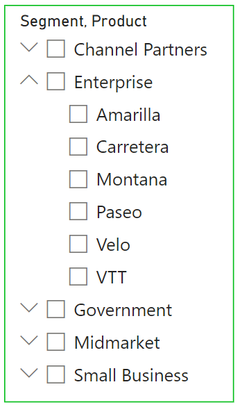
To exclude items from a slicer:

  1. Right-click the item you wish to remove.
  2. Select the “Exclude” option.
    • You can verify which items have been excluded by hovering over the ‘Applied filters’ icon in the top right corner of the slicer. This will display all excluded and filtered items.
Slicers in Power BI 3

Step 4: Filter Settings

  • You can hide specific filters or exclusions to prevent them from appearing in the ‘Applied filters’ list. To do this, click the show/hide icon located in the filters pane on the right side of the report. To clear an exclusion, simply remove the filter from the filter pane.
Slicers in Power BI 4

Step 5: Syncing Slicers

  • To synchronize slicers across multiple pages in your report, activate the ‘Sync slicers’ pane from the ribbon.
Slicers in Power BI 5
  • This capability can save you a lot of time when dealing with the same slicers, like a date filter, across multiple pages. By choosing a date range on one page, it will be automatically reflected on all other pages with the same slicers in the report.
Slicers in Power BI 6

Step 6: Editing slicer interactions

  • The ‘Edit interactions’ function found in the ribbon enables you to set which visuals are affected by a slicer, offering you enhanced control and customization for your report.
Slicers in Power BI 7

Step 7: Split Canvas

  • I’ve discovered that this feature is incredibly useful for making comparisons in reports. For instance, if you’re comparing the sales performance of two different stores, you can split your report canvas into two sections.
  • Place the same visuals on both sides and use slicers that only affect the visuals within their respective sections.

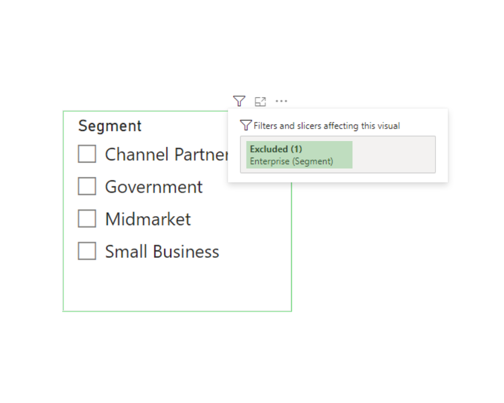
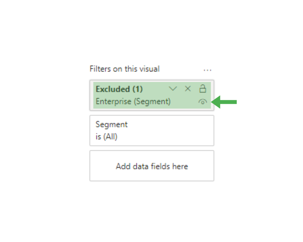
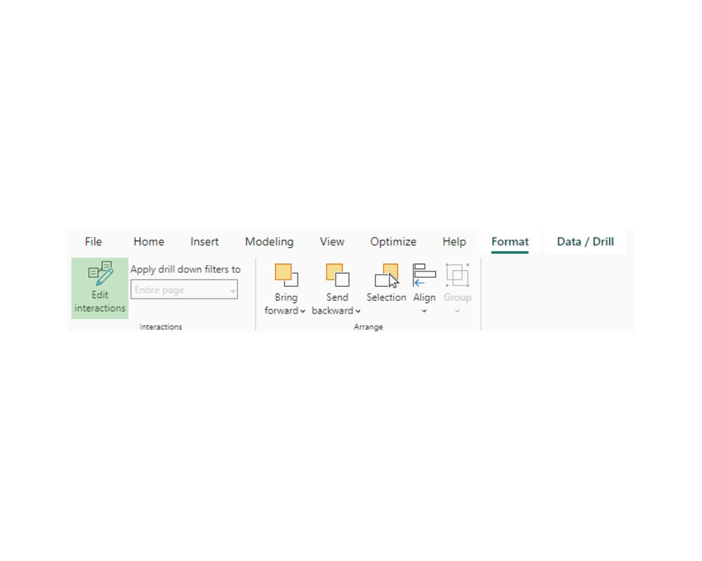
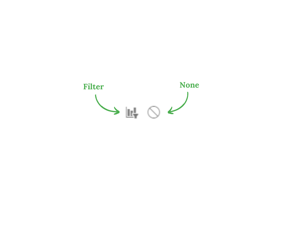
When editing a slicer’s interactions with other visuals, you have two main options:

  • Filter: This choice configures the slicer to control which data is shown in the visuals.
  • Note: Choosing this option means the slicer won’t impact the visuals.
Slicers in Power BI 8

How Slicers Work in Power BI?

Slicers in Power BI work by filtering data on your report based on user selections. Here’s a quick overview of how they function:

  • Add a Slicer: Choose the slicer icon from the Visualizations pane to add it to your report.
  • Configure Fields: Drag and drop fields from your data into the Values area of the slicer. This determines what data users can filter.
  • User Interaction: Users can select options in the slicer (like dates, categories, or ranges) to filter the data displayed in other visuals on the report.
  • Apply Filters: The slicer updates other visuals on the page based on the selected filter criteria, affecting charts, tables, and maps.
  • Customize: You can customize the slicer’s appearance, layout, and behavior through the Format pane.

Why Use Slicers in Power BI?

Slicers in Power BI, including the Power BI connector, are used to filter data visually and interactively. They provide a user-friendly way to slice and dice data in reports and dashboards, allowing users to dynamically control what information they see.

By selecting values from slicers, users can filter data across multiple visuals simultaneously, making it easier to analyze specific subsets of data and gain insights quickly.

Slicers enhance the interactivity and usability of Power BI reports, enabling users to customize their viewing experience and focus on the most relevant data for their analysis.

When to use Power BI Slicers?

  1. Filtering Data: Slicers allow users to filter data based on specific criteria such as dates, categories, or regions. This is useful when users need to focus on specific subsets of data to analyze trends or patterns.
  2. Comparing Segments: Slicers enable users to compare data across different segments or categories. Users can easily switch between segments to analyze variations in performance or behavior.
  3. Drilling Down: Slicers can be used to drill down into hierarchies or levels of data. Users can navigate through different levels of detail to gain deeper insights into the data.
  4. Dynamic Reporting: Slicers provide a way to create dynamic reports where users can control what information they see. This flexibility allows users to customize their viewing experience and explore data according to their needs.
  5. Enhancing Interactivity: Slicers enhance the interactivity of reports and dashboards, making them more engaging and user-friendly. Users can interact with slicers to refine their analysis and answer specific questions about the data.

Types of Slicers in Power BI

Power BI encompasses a range of slicer types that present various methods for interacting with filtering options.

Below are the types of slicers in Power BI:

  • The list slicer: This slicer presents values in either a vertical or horizontal list layout. This facilitates effortless scrolling and selection of multiple values.
  • The basic/standard slicer: This slicer type showcases a list of values derived from a particular field in the dataset. These could be regions, categories, or dates.
  • The date slicer: The date slicer is used for date-related fields. It provides a calendar interface or a range selector. This enables users to filter data by selecting dates or date ranges like months, quarters, or years.
  • The dropdown slicer: This slicer provides a streamlined interface compared to basic slicers. It shows a list of values from which the user can select to filter data.
  • The hierarchy slicer: This type of slicer is used only when dealing with hierarchical data. It allows users to expand and collapse different levels within the hierarchy. This filters data at various levels of detail.
  • The range slicer: This slicer enables users to set a range of values. This includes defining both a minimum and maximum value within a field. This aids in filtering data that falls within the designated range.
  • The input slicer: This slicer allows users to enter text or value strings manually. This helps filter data according to the provided input.

Power BI Slicers Examples

Here are some examples of slicers in Power BI:

  1. Date Slicer: Filters data by a specific date range.
  2. Category Slicer: Filters data by categories like products or regions.
  3. Numeric Slicer: Filters data by numeric ranges.
  4. Hierarchical Slicer: Allows filtering by multiple levels, like Country > State > City.
  5. List Slicer: Displays a list of items for selection.
  6. Dropdown Slicer: Shows options in a dropdown menu.

How to Use Power BI Slicers?

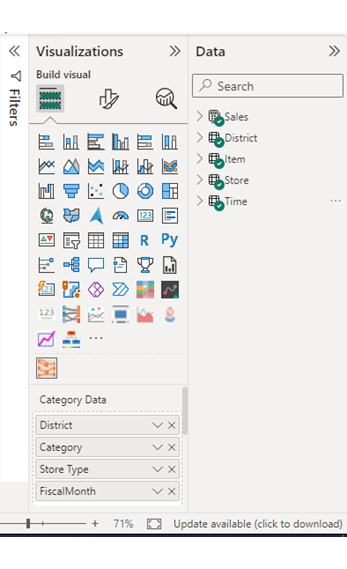
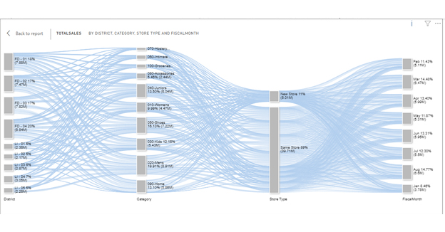
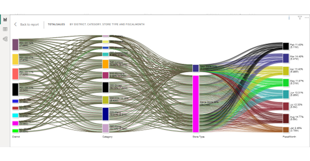
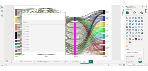
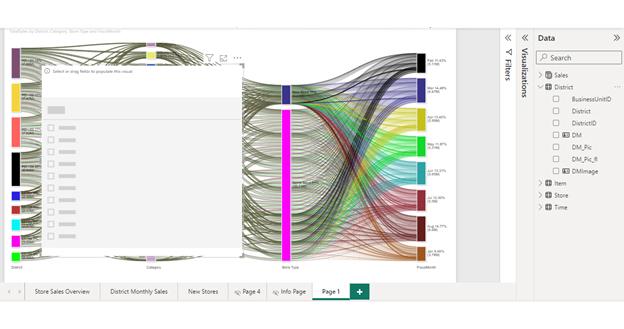
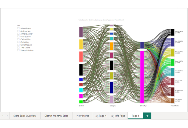
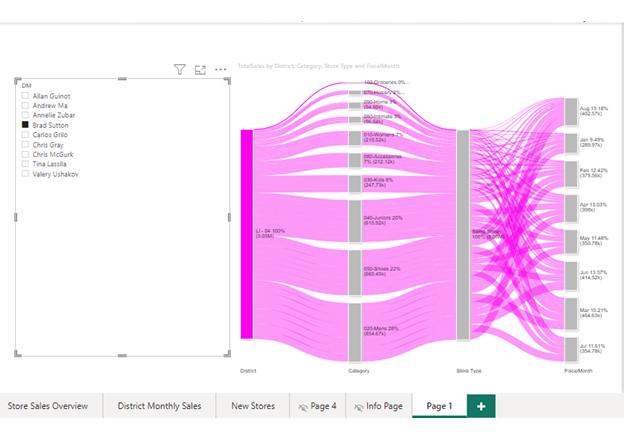
In this section, we learn how to use slicers for filtering charts in Power BI. We’ll use the Sankey Diagram (Sankey Chart) as an example by using a Power BI report builder.

Stage 1: Logging in to Power BI

  • Log in to Power BI.
  • Enter your email. Click the “Submit” button.
Enter email to login to Power BI
  • You are redirected to your Microsoft account.
  • Enter your password and click “Sign in“.
Enter Password to login to Power BI
  • You can choose whether to stay signed in.
Click on stay signed in

Stage 2: Select the Store Sales Sample Dataset and Import it to the Power BI Desktop

  • We’ll use the store sales sample in the official Microsoft documentation. It is designed for use on Power BI Desktop.
  • Download the store sales sample dataset. If it downloads as a zip file, you need to extract the pbix file.
  • Log in to Power BI Desktop. You should see the Power BI home page as shown below.
Log in to Power BI Desktop
  • Select “File” and then choose “Open.”
select Paste or manually enter data in Power BI ce496
  • Access the store sales sample pbix file from recent files or OneDrive. You can also click “Browse this device” if the file is not on
  • OneDrive or recent files.
  • The data should now be loaded, and you should see some tables under “Data” as shown below.
Data Shown Below ce496

Stage 3: Adding the Power BI Sankey Diagram Extension by ChartExpo

  • You can create a new page where you’ll create your Sankey diagram. Click on the green plus button next to “Info Page.”
  • The report comes with built-in reports.
report comes with built-in reports ce496
  • We need to add a Sankey diagram as the visual we’ll use, along with slicers.
  • Navigate to the Power BI Visualizations panel.
  • Click the ellipsis (…) highlighted below to import the Power BI Sankey Diagram extension by ChartExpo.
Navigate PBI Visualizations panel ce496
  • Select the “Get more visuals” option.
  • Enter “Sankey Diagram for Power BI by ChartExpo” in the highlighted search box.
  • You should see the “Sankey Diagram for Power BI by ChartExpo,” as shown in the image below.
Sankey Diagram for Power BI by ChartExpo
  • Click the highlighted “Add” button.
Click the Add button
  • The ChartExpo Sankey Diagram will be added to your Power BI dashboard as shown below. Click “OK”.
PBI dashboard shown ce496
  • Power BI will add the “Sankey Diagram for Power BI by ChartExpo” icon in the visualization panel.
Click on Sankey Diagram Icon

Stage 4: Drawing a Sankey Diagram with ChartExpo’s Power BI extension

  • Select the “Sankey Diagram for Power BI by ChartExpo” icon in the visualization panel.
Fields next to visualizations ce496
  • The following window opens in the report section of your dashboard:
resize the visual ce496
  • You can resize the visual as needed.
  • Go to the right-hand side of your Power BI dashboard.
Select fields for Sankey diagram ce496
  • You’ll select the fields to use in your Sankey chart here.
  • Select the fields in the following sequence:
    • TotalSales (from the Sales Table)
    • District (from the District Table)
    • Category (from the Item Table)
    • Store Type (from the Store Table)
    • FiscalMonth (from the Time Table)
Select fields for Sankey diagram 1 ce496
  • You’ll be asked for a ChartExpo license key or email address.
enter email for ChartExpo license ce430

Stage 5: Activating your ChartExpo Trial or Applying a Subscription Key

  • Select the ChartExpo icon. You should see three icons below “Build Visual” in the Visualizations panel.
Build visual panel in Power BI
  • Select the middle icon, “Format visual.”
  • The visual properties will be populated as shown below.
visual properties in Power BI
  • If you are a new user,
    • Type in your email under the section titled “Trial Mode”.
    • This should be the email address that you used to subscribe to the ChartExpo add-in. It is where your ChartExpo license key will be sent.
    • Ensure that your email address is valid.
    • Click “Enable Trial.” You’ll get a 7-day trial.
enter email id
    • You should receive a welcome email from ChartExpo.
    • The Sankey Diagram you create under the 7-day trial contains the ChartExpo watermark.
Slicers in Power BI-1
  • If you have obtained a license key:
    • Enter your license key in the “ChartExpo License Key” textbox in the “License Settings” section (see below).
    • Slide the toggle switch next to “Enable License” to “On.”
enter license key
  • To add colors, expand the “Level Colors” properties and select a color.
coloring sankey diagram ce496
  • Do this to change the color of each node.
  • All changes are automatically saved.
    • Your final chart should look like the one below. If you get a license, the Sankey Chart will not have a watermark.
Slicers in Power BI-2
  • Click on “File” then “Save” to save the Sankey Diagram.

Stage 6: Power BI add slicers

  • We now need to create the slicers to use with our Sankey diagram. We are going to work with the Power BI slicer visual.
  • Select the slicer icon on the Visualizations panel. A slicer visual should appear on top of the Sankey diagram as shown below.
Slicers in Power BI-3
  • Expand the District Table from the Data panel on the right of your Power BI dashboard.
Slicers in Power BI-4
  • Select DM. This populates the slicer.
  • You can resize the Sankey diagram to create space for the slicer.
Slicers in Power BI-5
  • The slicer contains district managers and checkboxes, which you can use to filter the Sankey diagram.
  • Let’s choose “Brad Sutton” for example.
Final Slicers in Power BI
  • The Sankey diagram now only shows data related to Brad Sutton.
  • You can select more slicers and see their effect on the Sankey Diagram.

Benefits of Using Slicers vs Filters

Slicers: Intuitive and Visual

  1. User-Friendly: Slicers offer an easy, visual way to filter data with clickable buttons or checkboxes.
  2. Quick Selection: They allow fast selection or deselection of multiple items, ideal for interactive dashboards.
  3. Visual Appeal: Slicers enhance the aesthetics of your reports.
  4. Multiple Slicers: Use several slicers simultaneously for layered filtering.

Filters: Powerful and Flexible

  1. Detailed Options: Filters provide complex criteria and conditions, like ranges or specific dates.
  2. Space-Saving: Filters take up less space, keeping your dashboard clean.
  3. Broad Application: Apply filters across different data visualizations.
  4. Advanced Filtering: Perform sorting and top/bottom N selections for in-depth analysis.

Choosing Between Them

  • Slicers are best for quick, intuitive filtering in dashboards.
  • Filters are ideal for detailed, flexible data refinement.

How to Enable The Sync Slicer Feature?

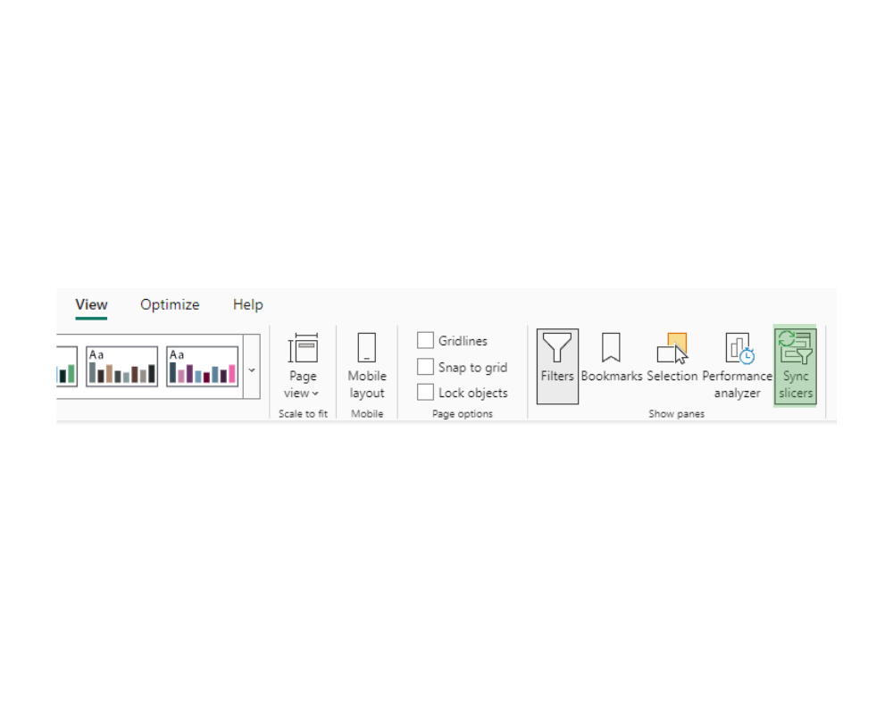
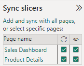
To enable the Sync Slicer feature in Power BI, follow these steps:

  1. Open Your Report: Launch Power BI Desktop and open the report where you want to sync slicers.
  2. Add Slicers: Make sure you have at least two slicers on your report pages that you want to sync.
  3. Open the Sync Slicers Pane:
    • Navigate to the ‘View’ tab on the ribbon.
    • Select ‘Sync Slicers’ to open the Sync Slicers pane on the right side of your screen
  4. Sync Your Slicers:
    • In the Sync Slicers pane, you’ll see a list of all slicers available on your report pages.
    • For each slicer, check the boxes under “Sync” for the pages where you want that slicer to be synchronized. This means that if you change the slicer on one page, it will automatically change on all the other pages you’ve synced it with.
  5. Test the Sync:
    • After syncing the slicers, test them by selecting different values. The selections will automatically be applied across all pages where the slicers are synced.
  6. Save Your Report: Once everything is set up, save your report to keep the slicer sync settings.

How to Format Slicers in Power BI?

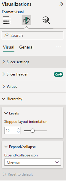
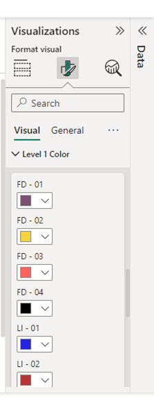
To format slicers in Power BI, follow these steps:

  1. Select the Slicer: Click on the slicer you want to format. This will display the “Format” pane on the right side of the Power BI window.
  2. Access Formatting Options: In the “Format” pane, you’ll find various options to customize the appearance of the slicer. These options include settings for general formatting, header, items, and slicer-specific settings.
  3. General Formatting: Under the “General” section, you can adjust settings like background color, border color, and transparency to customize the overall look of the slicer.
  4. Header Formatting: The “Header” section allows you to customize the header of the slicer, including font size, font color, and background color. You can also choose whether to display the header and adjust its alignment.
  5. Item Formatting: In the “Items” section, you can customize the appearance of individual items in the slicer. This includes settings for font size, font color, background color, and whether to display tooltips.
  6. Slicer-specific Settings: Depending on the type of slicer (e.g., list, dropdown, or date range), you may have additional formatting options specific to that slicer type. These options allow you to fine-tune the appearance and behavior of the slicer to suit your needs.
  7. Preview Changes: As you make changes to the formatting options, you’ll see a live preview of how the slicer will look in your report. This allows you to experiment with different settings and see the results in real-time.
  8. Apply Formatting: Once you’re satisfied with the formatting changes, click outside the slicer or press Enter to apply the changes. Your slicer will now be formatted according to the settings you’ve specified.

Best Practices for Using Slicers

Optimizing slicer functionality in Power BI requires implementing key best practices to enhance the user experience.

Below are the best practices for using slicers:

  • Limit the number of slicers to prevent overwhelming both the visualization and its users while navigating.
  • Use slicers to filter the most relevant data.
  • Use the slicer type that best suits the data being filtered for optimal effectiveness.
  • Group related slicers together or place them near corresponding visuals to facilitate easier analysis.
  • Give descriptive titles to slicers, specifying the filtered data type. This clarity aids users in understanding each slicer’s purpose without ambiguity.
  • For hierarchical data like categories with subcategories, employ hierarchical slicers for efficient navigation through various levels.

Limitations of Slicer in Power BI

  1. Limited Customization: Slicers offer fewer formatting and design options compared to other visuals.
  2. No Hierarchical Filtering: Slicers don’t support hierarchical data filtering by default.
  3. Incompatibility with Measure Values: Slicers cannot directly filter data based on measures or calculated columns.
  4. Limited Cross-Filtering: Slicers often don’t interact with visuals outside their assigned report page.
  5. Performance Impact: Excessive use of slicers can slow down report performance, especially with large datasets.

FAQs

Where is the slicer in Power BI?

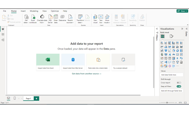
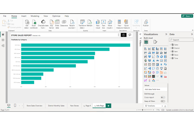
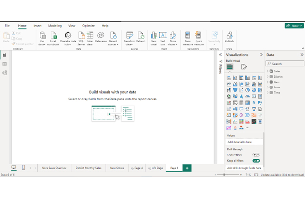
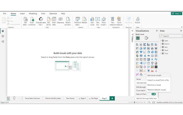
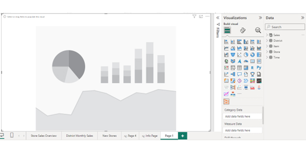
In Power BI, you can find the slicer in the Visualizations pane on the right side of the screen. Look for the icon that looks like a filter or a list. Click on it to add a slicer to your report, where you can then configure it to filter data by different fields or values.

What is the Difference Between a Filter and a Slicer?

Filters and slicers refine displayed data in Power BI reports, yet differ in visibility and interaction.

Filters operate discreetly, modifying visuals or datasets based on set criteria without a visible on-canvas presence.

They restrict specific values behind the scenes, altering calculations without immediate user visibility.

Slicers, on the other hand, are interactive visuals on the report canvas. They enable direct manipulation of filtering criteria by visually selecting specific values.

Filter options in reports or dashboards offer users clear control and visibility over the applied filters.

What are the Limitations of a Slicer?

Slicers have an important function in helping us see specific information in a dataset. However, they have certain limitations. These include:

  • When handling numerous unique values, they might take up considerable space on the report canvas. This potentially causes visual clutter, slower loading times, or reduced interactivity when not efficiently optimized.
  • Slicers do not support input fields, limiting users to typing specific filter values or ranges directly.
  • They do not support complex logical operations or conditional filtering requirements.
  • Slicers cannot be affixed to a dashboard. This prevents them from being permanently saved on the dashboard canvas.

To address these limitations, combine slicers with DAX measures, custom visuals, and advanced Power BI functions. This enhances filtering and improves visualization performance.

Wrap Up

Slicers in Power BI serve as remarkable tools that facilitate seamless navigation through visualizations. They streamline the retrieval of specific information from reports, allowing focused insights.

A significant benefit of this feature is the ability of the Power BI slicer visual to retain your data while applying filters. Beyond aiding data exploration, they enhance analysis and visualization.

They are also designed to suit the users’ specific needs and diverse data structures. Power BI slicers filter specific data like dates, ranges, and hierarchical data among various structured data.

This article provides insights into understanding slicers. It explores their benefits and types, as well as learning how to create and utilize them effectively.

By delving into this content, users can gain valuable guidance on leveraging slicers optimally. It will also help in selecting the most fitting options for their data needs.

How much did you enjoy this article?

PBIAd2
Start Free Trial!
132446

Related articles

next previous
Power BI12 min read

How to Create Sankey Diagram in Microsoft Power BI?

Learn How to Create Sankey Diagram in Microsoft Power BI using Desktop & Web Service. What they are and how to use them effectively.

Power BI8 min read

Power BI Artificial Intelligence: Insights Using Visuals

Discover all there is to know about the Power BI artificial intelligence. You'll also discover how AI is used in Power BI, and how to use it for analysis and more.

Power BI9 min read

Budgeting in Healthcare: Use Visuals to Spot Budget Gaps

This guide helps you discover what budgeting in healthcare is. You'll also discover the factors that affect hospital budgets and types of budgeting in healthcare.

Power BI9 min read

Predictive Analytics in Power BI for Making Insightful Visuals

This guide shows you everything you need to know about Predictive Analytics in Power BI. It also shows you how it works, and how to interpret the results.

Power BI8 min read

Quarterly Business Review Template for Optimum Reports

Discover what the quarterly business review template is. This guide also shows you the best practices to consider when using the QBR template.

ChartExpo logo

Turn Data into Visual
Stories

CHARTEXPO

  • Home
  • Gallery
  • Videos
  • Services
  • Pricing
  • Contact us
  • FAQs
  • Privacy policy
  • Terms of Service
  • Sitemap

TOOLS

  • ChartExpo for Google Sheets
  • ChartExpo for Microsoft Excel
  • Power BI Custom Visuals by ChartExpo
  • Word Cloud

CATEGORIES

  • Bar Charts
  • Circle Graphs
  • Column Charts
  • Combo Charts
  • Comparison Charts
  • Line Graphs
  • PPC Charts
  • Sentiment Analysis Charts
  • Survey Charts

TOP CHARTS

  • Sankey Diagram
  • Likert Scale Chart
  • Comparison Bar Chart
  • Pareto Chart
  • Funnel Chart
  • Gauge Chart
  • Radar Chart
  • Radial Bar Chart
  • Sunburst Chart
  • see more
  • Scatter Plot Chart
  • CSAT Survey Bar Chart
  • CSAT Survey Chart
  • Dot Plot Chart
  • Double Bar Graph
  • Matrix Chart
  • Multi Axis Line Chart
  • Overlapping Bar Chart
  • Control Chart
  • Slope Chart
  • Clustered Bar Chart
  • Clustered Column Chart
  • Box and Whisker Plot
  • Tornado Chart
  • Waterfall Chart
  • Word Cloud
  • see less

RESOURCES

  • Blog
  • Resources
  • YouTube
SIGN UP FOR UPDATES

We wouldn't dream of spamming you or selling your info.

© 2025 ChartExpo, all rights reserved.