• Home
  • Tools dropdown img
    • Spreadsheet Charts

      • ChartExpo for Google Sheets
      • ChartExpo for Microsoft Excel
    • Power BI Charts

      • Power BI Custom Visuals by ChartExpo
    • Word Cloud

  • Charts dropdown img
    • Chart Category

      • Bar Charts
      • Circle Graphs
      • Column Charts
      • Combo Charts
      • Comparison Charts
      • Line Graphs
      • PPC Charts
      • Sentiment Analysis Charts
      • Survey Charts
    • Chart Type

      • Box and Whisker Plot
      • Clustered Bar Chart
      • Clustered Column Chart
      • Comparison Bar Chart
      • Control Chart
      • CSAT Survey Bar Chart
      • CSAT Survey Chart
      • Dot Plot Chart
      • Double Bar Graph
      • Funnel Chart
      • Gauge Chart
      • Likert Scale Chart
      • Matrix Chart
      • Multi Axis Line Chart
      • Overlapping Bar Chart
      • Pareto Chart
      • Radar Chart
      • Radial Bar Chart
      • Sankey Diagram
      • Scatter Plot Chart
      • Slope Chart
      • Sunburst Chart
      • Tornado Chart
      • Waterfall Chart
      • Word Cloud
    • Google Sheets
      Microsoft Excel
  • Services
  • Pricing
  • Contact us
  • Blog
  • Support dropdown img
      • Gallery
      • Videos
      • Contact us
      • FAQs
      • Resources
    • Please feel free to contact us

      atsupport@chartexpo.com

Categories
All Data Visualizations Data Analytics Surveys
Add-ons/
  • Google Sheets
  • Microsoft Excel
  • Power BI
All Data Visualizations Data Analytics Surveys
Add-ons
  • Google Sheets
  • Microsoft Excel
  • Power BI

We use cookies

This website uses cookies to provide better user experience and user's session management.
By continuing visiting this website you consent the use of these cookies.

Ok

ChartExpo Survey


Home > Blog > Power BI

What is DAX in Power BI and Its Impact on Data Insights

The Data Analysis Expressions (DAX) is a formula language in Power BI used for the creation of custom calculations and aggregations. It helps users to effectively analyze and manipulate data within Power BI reports.

What is DAX in Power BI

This guide provides answers to the popular “what is DAX in Power BI” question. It also uncovers why DAX is used, key components of DAX, and the advantages of using DAX formulas in Power BI.

Table of Contents:

  1. What is DAX in Power BI?
  2. Why Use DAX?
  3. What are the Key Components of DAX?
  4. How to Use DAX in Power BI?
  5. How Do You Create an Attractive Visualization in Power BI?
  6. What are the Advantages of using DAX formulas in Power BI?
  7. Wrap Up

First…

What is DAX in Power BI?

Definition: Data Analysis Expressions (DAX) is a formula language used in Power BI. It plays a crucial role in creating custom calculations and expressions for data modelling, analysis, and reporting within the Power BI data model, enabling more powerful insights and decision-making.

It helps users to build calculated columns and sophisticated measures, and that allows for advanced data manipulation and data analysis. This will, in turn, help you draw valuable insights from the datasets.

Why Use DAX?

DAX helps users create custom expressions and calculations, and that provides flexibility beyond standard data manipulations. This capability is necessary for tailoring analyses to specific business needs and ensures that Power BI reports reflect the intricacies of a given dataset.

Furthermore, DAX helps in the creation of calculated columns and measures, and that enhances the depth of analysis by generating new insights, metrics, and KPIs.

What are the Key Components of DAX?

Some of the key components of DAX are:

  • Formulas: DAX is a formula language. Users can create formulas to perform calculations, manipulate data, and define custom metrics within Power BI.
  • Functions: DAX offers a wide range of functions. This helps users to perform specific operations on data. These functions could be statistical, date, mathematical, text, or time functions. Users can combine these functions to create complex expressions.
  • Measures: Measures are dynamic calculations or aggregations that respond to user interactions. **DAX measures** are often used to create key performance indicators (KPIs) and other summary statistics that update in real time. These measures are essential when working with aggregated data, allowing for flexible and insightful analysis based on different user inputs and data contexts.
  • Calculated Columns: DAX allows the creation of calculated columns within tables, defined by DAX formulas. These columns introduce new data elements based on existing data. By utilizing DAX variables, you can optimize the calculations, improving performance and readability within your data model.
  • Tables and Relationships: Power BI DAX operates within the context of tables and relationships in Power BI. Having a good grasp of how tables relate to each other will help you write effective DAX formulas, and that comes in handy when working with multiple tables in a data model.

How to Use DAX in Power BI?

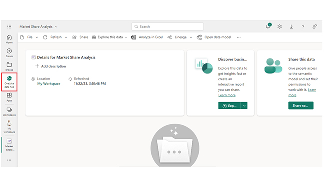
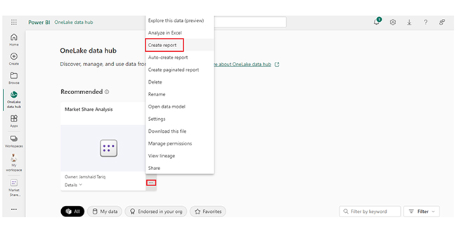
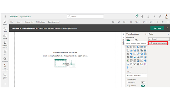
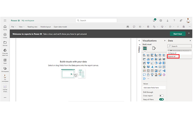
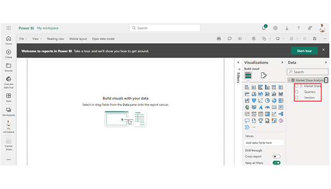
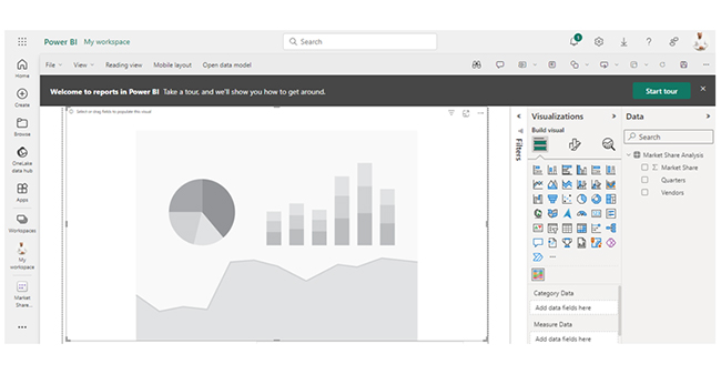
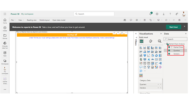
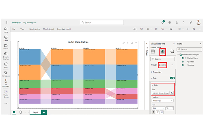
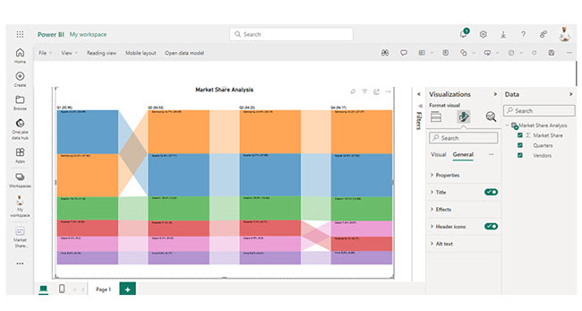
Here’s an easy step to help you use DAX in Power BI.
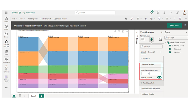
  • Open Power BI Desktop: The first step is to launch the Power BI Desktop.
  • Load Data: Import or connect to the data source within Power BI. Your sources could be databases, online services, or Excel files.
  • Create Data Model: To design a data model, you’ll have to define relationships between tables. This helps in DAX calculations. After all, DAX works within the context of tables and relationships.
  • Access Data View: Navigate to the “Data” view in Power BI Desktop. The Data view shows the tables and fields in the data model.
  • Create Calculated Columns: Right-click on the table and select “New Column” to create a calculated column. Next, enter a DAX formula to define the calculation for the new column.
  • Create Measures: To create a DAX measure, right-click on the table and select “New Measure.” Measures are dynamic calculations that respond to user interactions. Enter the DAX formula for the measure.
  • Use DAX Functions: Use DAX functions to perform specific operations in your formulas. Functions can be statistical, mathematical, text-related, date and time-related. It can also be specialized for business intelligence.
  • Incorporate Time Intelligence: If the data comes with a time-series analysis, use the DAX time intelligence functions to calculate metrics like year-to-date, quarter-to-date, and moving averages.
  • Test Formulas: Validate the DAX formulas by testing them in the “Data” view. Always ascertain that the results align with your expectations and that there are no errors.
  • Switch to Report View: To start building data visualizations, navigate to the “Report” view in Power BI Desktop. Drag and drop fields from the data model onto the canvas to create tables, charts, and other visual elements.
  • Incorporate DAX Measures into Visualizations: You should consider using DAX measures in your visualizations to showcase custom calculations. Drag and drop measures onto the values section of the tables or charts.
  • Interact with Visualizations: Interact with the visualizations to see how DAX measures respond dynamically to user actions. These actions could be filtering or drilling down into data.

How Do You Create an Attractive Visualization in Power BI?

Stage 1: Log into Power BI, enter your email, and click “Submit.”

  • Log in to Power BI.
  • Enter your email address and click the “Submit” button.
Enter email to login to Power BI
  • You are redirected to your Microsoft account.
  • Enter your password and click “Sign in“.
Enter Password to login to Power BI
  • You can choose whether to stay signed in.
Click on stay signed in
  • Once done, the Power BI home screen will open.

Stage 2: Create a Data Set and Select the Data Set to Use in the Sankey Chart

  • Go to the left-side menu and click the “Create” button.
  • Select “Paste or manually enter data“.
select Paste or manually enter data in Power BI ce487
  • We’ll use the sample data below for this example.
Quarters Vendors Market Share
Q1 Samsung 27.69
Q1 Apple 28.45
Q1 Xiaomi 11.8
Q1 Huawei 6.53
Q1 Oppo 5.3
Q1 Vivo 4.19
Q2 Samsung 28.14
Q2 Apple 27.58
Q2 Xiaomi 12.62
Q2 Huawei 6.17
Q2 Oppo 5.5
Q2 Vivo 4.21
Q3 Samsung 28.45
Q3 Apple 27.71
Q3 Xiaomi 12.9
Q3 Huawei 6
Q3 Oppo 5.29
Q3 Vivo 4.17
Q4 Samsung 27.97
Q4 Apple 27.62
Q4 Xiaomi 12.68
Q4 Huawei 5.17
Q4 Oppo 6.07
Q4 Vivo 4.66
  • Paste the data table above into the “Power Query” window, and name it “Market Share Analysis.” Next, select the “Create a dataset only” option.
Paste Data Table into Power Query After Learning What is DAX in Power BI
  • Navigate to the left-side menu, and click on the “Data Hub” option. Power BI will populate the data set list. If no data set has been created, you’ll get an error message.
Click on Data Hub Option After Learning What is DAX in Power BI
  • Click on “Create report.”
Click on Create Report After Learning What is DAX in Power BI
  • Click on Market Share Analysis.
Click on Market Share Analysis After Learning What is DAX in Power BI
  • Click on “Expand All.”
Click on Expand All After Learning What is DAX in Power BI
  • After that, click on “Expand All” to see the chart metrics.
See Chart Metrics After Learning What is DAX in Power BI
  • Click on “Get more visuals.”
Click on Get more visuals After Learning What is DAX in Power BI
  • Search “ChartExpo” and select “Comparison Bar Chart.”
Select Comparison Bar Chart After Learning What is DAX in Power BI
  • Click on “Add.”
Click on Add Button After Learning What is DAX in Power BI
  • After that, you’ll see the Comparison Bar Chart in the visuals list.
See Comparison Bar Chart in Visuals List After Learning What is DAX in Power BI
  • You can expand the chart space.
Expand Chart Space After Learning What is DAX in Power BI
  • After that, select the metrics of your data.
Select Metrics of Data After Learning What is DAX in Power BI
  • Click on the second icon of Format Visuals and click on Visual.
Click on Second Icon of Format Visuals After Learning What is DAX in Power BI
  • In Visual, click on License Settings and add the key. After adding a key, you’ll see the comparison bar chart.
Click on License Key After Learning What is DAX in Power BI
  • After adding the header text, click on the General tab. After that, add the header text to the title.
Add Chart Header Text After Learning What is DAX in Power BI
  • Here’s the final look at the Comparison Bar Chart in Power BI.
Final What is DAX in Power BI

Insights:

  • Apple and Samsung are the top 2 vendors in market share, with Samsung taking the lead.
  • Xiaomi has been gaining market share, while Huawei has been losing market share.
  • Vivo and Oppo have been relatively stable in terms of market share. In the last quarter, there was a transition between Huawei and Oppo.

Transform Reporting in Power BI Using DAX to Create Impactful Charts in Power BI:

  1. Open your Power BI Desktop or Web.
  2. From the Power BI Visualizations pane, expand three dots at the bottom and select “Get more visuals”.
  3. Search for “Comparison Bar Chart by ChartExpo” on the AppSource.
  4. Add the custom visual.
  5. Select your data and configure the chart settings to create the chart.
  6. Customize your chart properties to add header, axis, legends, and other required information.
  7. Share the chart with your audience.

The following video will help you create a Comparison Bar Chart in Microsoft Power BI.

What are the Advantages of using DAX formulas in Power BI?

Using DAX (Data Analysis Expressions) formulas in Power BI provides numerous advantages that enhance the analysis, visualization, and reporting capabilities of the tool. Below are some key benefits:

  • Flexibility in Calculations: DAX offers a flexible and powerful syntax for creating custom calculations. With DAX, users can define complex formulas, and these formulas are used to draw insights tailored to specific business requirements.
  • Custom Metrics and KPIs: DAX helps in the creation of custom measures. It allows users to define Key Performance Indicators (KPIs) and other performance metrics that are not available in the raw data.
  • Integration with Power BI Visualizations: DAX can easily integrate with Power BI visualizations. By incorporating DAX measures into tables, charts, graphs, and other visual elements, users are able to create dynamic and interactive reports.
  • Ease of Learning and Adoption: DAX comes with a syntax that’s easy to learn, and that comes in handy for users who are already familiar with Excel formulas. It also makes it accessible to a broad range of users, and that includes data professionals and business analysts.

FAQs

What is DAX used for?

DAX in Power BI creates custom calculations, aggregations, and measures. It enables users to analyze and derive insights from data through tailored formulas.

What is the difference between Power BI and DAX?

Power BI is a business analysis service used for data visualization and sharing. DAX is a formula used within Power BI for the creation of custom calculations and measures.

How many DAX formulas are there in Power BI?

There are no fixed number of DAX formulas in Power BI. It’s an evolving ecosystem with numerous functions for diverse analyses and calculations.

Wrap Up

DAX in Power BI helps users create custom calculations, aggregations, and measures. It also provides a powerful toolset for in-depth data analysis and reporting. With visualizations, complex calculations are presented in an understandable format, making data insights accessible and actionable for decision makers.

But what are the advantages of using DAX formulas in Power BI? Well, DAX formulas are consistent across reports. Once defined, they can be reused across multiple reports, and that ensures consistency in calculations and metrics. Consistent formulas come in handy for users who will be working on standardized (or recurring) reporting tasks.

Furthermore, the DAX syntax is easy to learn and adopt. If you’re already familiar with Excel formulas, it will become easy for you to adopt DAX. This makes it accessible to a broad range of users.

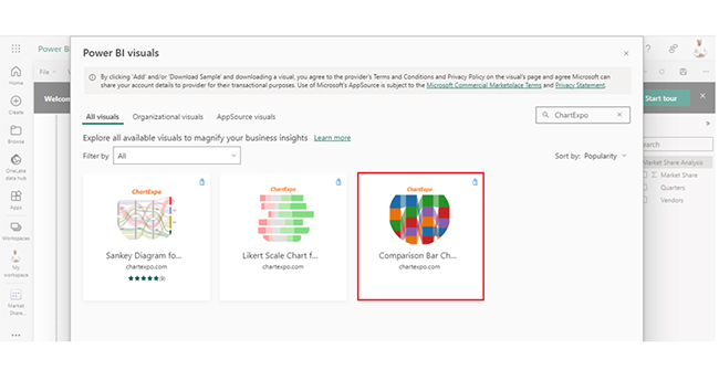
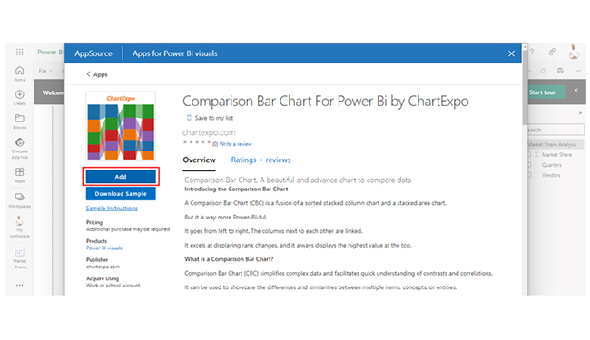
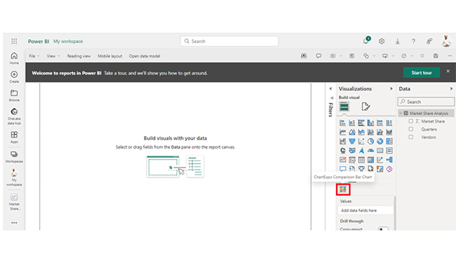
This guide shows you easy ways to create a comparison bar chart in Power BI. You can get started by using the ChartExpo add-in, and also perform complex analyses and calculations with the DAX formulas.

How much did you enjoy this article?

PBIAd2
Start Free Trial!
145374

Related articles

next previous
Power BI12 min read

How to Create Sankey Diagram in Microsoft Power BI?

Learn How to Create Sankey Diagram in Microsoft Power BI using Desktop & Web Service. What they are and how to use them effectively.

Power BI8 min read

Power BI Artificial Intelligence: Insights Using Visuals

Discover all there is to know about the Power BI artificial intelligence. You'll also discover how AI is used in Power BI, and how to use it for analysis and more.

Power BI9 min read

Budgeting in Healthcare: Use Visuals to Spot Budget Gaps

This guide helps you discover what budgeting in healthcare is. You'll also discover the factors that affect hospital budgets and types of budgeting in healthcare.

Power BI9 min read

Predictive Analytics in Power BI for Making Insightful Visuals

This guide shows you everything you need to know about Predictive Analytics in Power BI. It also shows you how it works, and how to interpret the results.

Power BI8 min read

Quarterly Business Review Template for Optimum Reports

Discover what the quarterly business review template is. This guide also shows you the best practices to consider when using the QBR template.

ChartExpo logo

Turn Data into Visual
Stories

CHARTEXPO

  • Home
  • Gallery
  • Videos
  • Services
  • Pricing
  • Contact us
  • FAQs
  • Privacy policy
  • Terms of Service
  • Sitemap

TOOLS

  • ChartExpo for Google Sheets
  • ChartExpo for Microsoft Excel
  • Power BI Custom Visuals by ChartExpo
  • Word Cloud

CATEGORIES

  • Bar Charts
  • Circle Graphs
  • Column Charts
  • Combo Charts
  • Comparison Charts
  • Line Graphs
  • PPC Charts
  • Sentiment Analysis Charts
  • Survey Charts

TOP CHARTS

  • Sankey Diagram
  • Likert Scale Chart
  • Comparison Bar Chart
  • Pareto Chart
  • Funnel Chart
  • Gauge Chart
  • Radar Chart
  • Radial Bar Chart
  • Sunburst Chart
  • see more
  • Scatter Plot Chart
  • CSAT Survey Bar Chart
  • CSAT Survey Chart
  • Dot Plot Chart
  • Double Bar Graph
  • Matrix Chart
  • Multi Axis Line Chart
  • Overlapping Bar Chart
  • Control Chart
  • Slope Chart
  • Clustered Bar Chart
  • Clustered Column Chart
  • Box and Whisker Plot
  • Tornado Chart
  • Waterfall Chart
  • Word Cloud
  • see less

RESOURCES

  • Blog
  • Resources
  • YouTube
SIGN UP FOR UPDATES

We wouldn't dream of spamming you or selling your info.

© 2025 ChartExpo, all rights reserved.