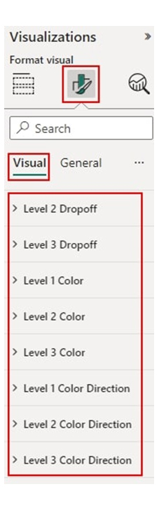
• Home
  • Tools dropdown img
    • Spreadsheet Charts

      • ChartExpo for Google Sheets
      • ChartExpo for Microsoft Excel
    • Power BI Charts

      • Power BI Custom Visuals by ChartExpo
    • Word Cloud

  • Charts dropdown img
    • Chart Category

      • Bar Charts
      • Circle Graphs
      • Column Charts
      • Combo Charts
      • Comparison Charts
      • Line Graphs
      • PPC Charts
      • Sentiment Analysis Charts
      • Survey Charts
    • Chart Type

      • Box and Whisker Plot
      • Clustered Bar Chart
      • Clustered Column Chart
      • Comparison Bar Chart
      • Control Chart
      • CSAT Survey Bar Chart
      • CSAT Survey Chart
      • Dot Plot Chart
      • Double Bar Graph
      • Funnel Chart
      • Gauge Chart
      • Likert Scale Chart
      • Matrix Chart
      • Multi Axis Line Chart
      • Overlapping Bar Chart
      • Pareto Chart
      • Radar Chart
      • Radial Bar Chart
      • Sankey Diagram
      • Scatter Plot Chart
      • Slope Chart
      • Sunburst Chart
      • Tornado Chart
      • Waterfall Chart
      • Word Cloud
    • Google Sheets
      Microsoft Excel
  • Services
  • Pricing
  • Contact us
  • Blog
  • Support dropdown img
      • Gallery
      • Videos
      • Contact us
      • FAQs
      • Resources
    • Please feel free to contact us

      atsupport@chartexpo.com

Categories
All Data Visualizations Data Analytics Surveys
Add-ons/
  • Google Sheets
  • Microsoft Excel
  • Power BI
All Data Visualizations Data Analytics Surveys
Add-ons
  • Google Sheets
  • Microsoft Excel
  • Power BI

We use cookies

This website uses cookies to provide better user experience and user's session management.
By continuing visiting this website you consent the use of these cookies.

Ok

ChartExpo Survey


Home > Blog > Power BI

DAX Variables for Unlocking Effective Data Insights

When working with Microsoft’s Power BI and Excel, there will be a need to store reusable calculations or expressions within the DAX (Data Analysis Expressions), that’s where DAX variables come in.

DAX Variables

This guide will help you understand what the DAX variable is, why it is used in the Power BI variable, and how to create variables in DAX.

Table of Contents:

  1. Why Do We Use the Power BI Variable?
  2. How to Use Variables in Power BI?
  3. How to Create Variables in DAX?
  4. How to Create Visualizations in Power BI?
  5. What are the Best Practices for Using Variables in Power BI?
  6. What are the Benefits of Using Variables in Power BI DAX Formulas?
  7. Wrap Up

First…

Why Do We Use the Power BI Variable?

Using variables in Power BI, particularly within DAX (Data Analysis Expressions), offers several benefits that help improve both the readability and performance of your calculations. Here are the key reasons why we use variables in Power BI:

  • Enhanced Readability

Variables help in the breaking down of complex calculations into smaller, named parts. This will, in turn, make DAX formulas more understandable and readable.

  • Facilitate Maintenance

Variables centralize the definitions of complex expressions, simplifying the maintenance of the DAX formula and enhancing the clarity of the DAX format. All these aspects make it easy to modify or update logic.

  • Code Reusability

With variables, you can reuse intermediate calculations or results within a DAX expression. And that helps in promoting consistency and reducing redundancy.

  • Performance Optimization

Power BI variables store intermediate results. That improves query performance and reduces the number of times you need to recalculate complex calculations.

How to Use Variables in Power BI?

Here are easy steps to help you use variables in DAX.

  • Define the Variable

You can use the VAR keyword followed by the variable name and expression (or calculation) you want to store.

  • Use the Variable

To reuse your stored calculation (or value), you’ll have to reference the variable within the DAX formula.

  • Return the Result

To specify the final result of the DAX expression, use the RETURN keyword.

How to Create Variables in DAX?

Variables are usually created using the VAR keyword followed by the variable name and an expression. To define the output of the expression, use the RETURN keyword.

The general syntax for creating variables in DAX is:

  • VAR VariableName =<expression>
  • RETURN<result_expression>

Here’s what to do if you want to calculate the total sales for a product category, and also use the total in another calculation.

  • VAR SalesCategory = CALCULATE(SUM(Sales[SalesAmount]), Sales[Category] = “Electronics”)
  • RETURN SalesCategory.

How to Create Visualizations in Power BI?

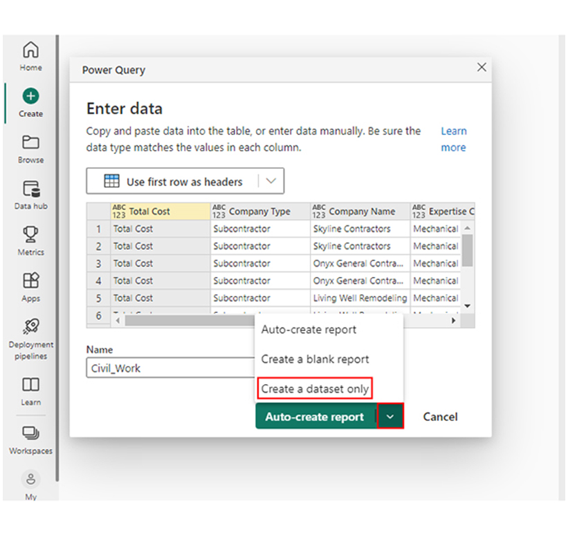
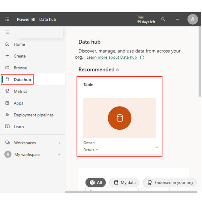
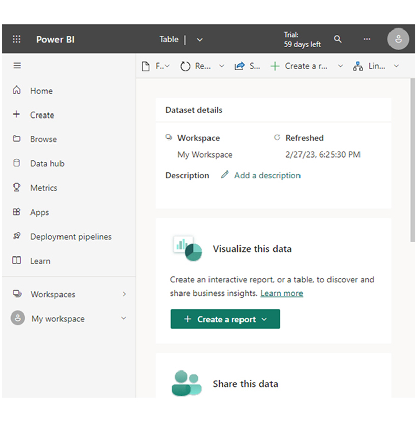
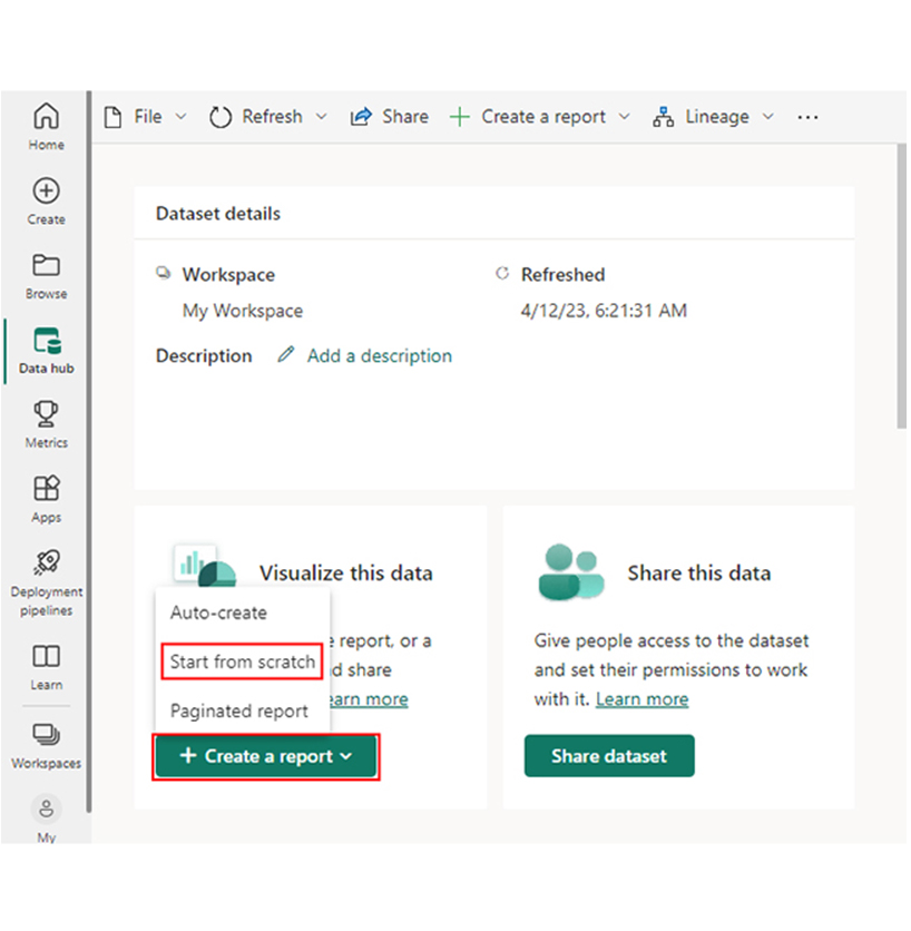
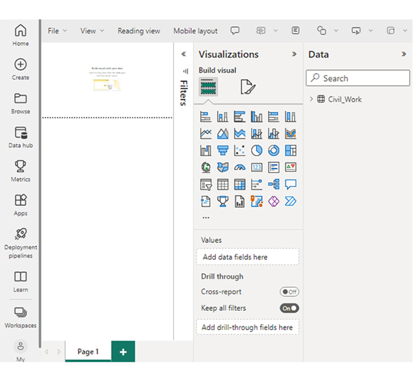
Stage 1: Logging in to Power BI

  • Log in to Power BI.
  • Enter your email address and click the “Submit” button.
Enter email to login to Power BI
  • You are redirected to your Microsoft account.
  • Enter your password and click “Sign in“.
Enter Password to login to Power BI
  • You can choose whether to stay signed in.
Click on stay signed in
  • Once done, the Power BI home screen will open.

Stage 2: Creating a Data Set and Selecting the Data Set to Use in Your Chart

  • Go to the left-side menu and click the “Create” button.
  • Select “Paste or manually enter data“.
select Paste or manually enter data in Power BI ce487
  • We’ll use the sample data below for this example.
Total Cost Company Type Company Name Expertise Categories Expertise Cost
Total Cost Subcontractor Skyline Contractors Mechanical Installation Plumbing & Heating 15456
Total Cost Subcontractor Skyline Contractors Mechanical Installation Mechanical Work 10159
Total Cost Subcontractor Onyx General Contractors Mechanical Installation Plumbing & Heating 18045
Total Cost Subcontractor Onyx General Contractors Mechanical Installation Mechanical Work 12695
Total Cost Subcontractor Living Well Remodeling Mechanical Installation Plumbing & Heating 14589
Total Cost Subcontractor Living Well Remodeling Mechanical Installation Welding 11456
Total Cost Supplier Power-up Builders Raw Material Cement 20561
Total Cost Supplier Power-up Builders Raw Material Steel 32456
Total Cost Supplier Five-star Construction Raw Material Bricks 10253
Total Cost Supplier Five-star Construction Raw Material Timber 9000
  • Paste the data into the “Power Query” window. Choose the “Create a dataset only” option.
Click Create a Dataset Only for Visualizing DAX Variables
  • Navigate to the left-side menu, and click “Data Hub.” Power BI populates the data set list. However, you’ll get an error message if the data set has not been created.
Click Data Hub for Visualizing DAX Variables
  • Select the data set to be used in the creation of the Sankey diagram. After that, Power BI populates the screen.
Select Data Set to be Used for Visualizing DAX Variables
  • Click “Create a report,” and choose “Start from scratch.”Click Create a Report for Visualizing DAX Variables
  • The Report Canvas screen is displayed as shown below.
Report Canvas Displayed for Visualizing DAX Variables

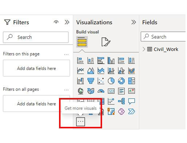
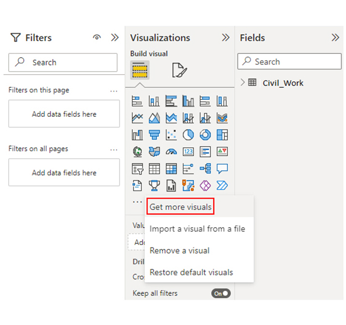
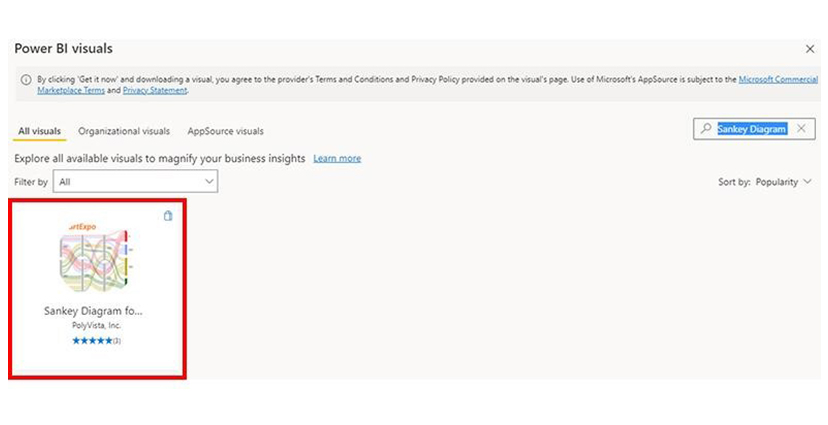
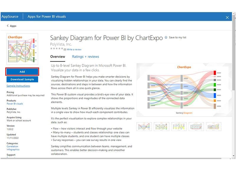
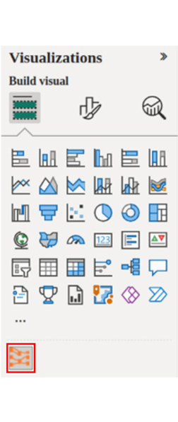
Stage 3: Add the Power BI Sankey Diagram Extension by ChartExpo

  • To do that, you have to use the Power BI visual or add-in from AppSource. After that, navigate to the right side of your dashboard and open the Power BI Visualizations panel.
  • Look out for the ellipsis symbol (…) and click it. It will import the Power BI Sankey Diagram extension by ChartExpo.
Click Three Dots for Visualizing DAX Variables
  • From the menu that opens, select “Get more visuals.”
Select Get More Visuals for Visualizing DAX Variables
  • Input “Sankey Diagram for Power BI by ChartExpo” in the highlighted search box. Next, you’ll see the “Sankey Diagram for Power BI by ChartExpo” option.
Search Sankey Diagram for Visualizing DAX Variables
  • Click the “Add” button.
Click Add Button for Visualizing DAX Variables
  • The “Sankey Diagram for Power BI by ChartExpo” icon will be added to the visualization panel.
Sankey Diagram Icon Added Visualization Panel for Visualizing DAX Variables

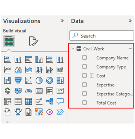
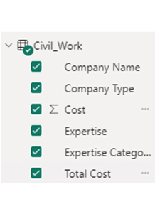
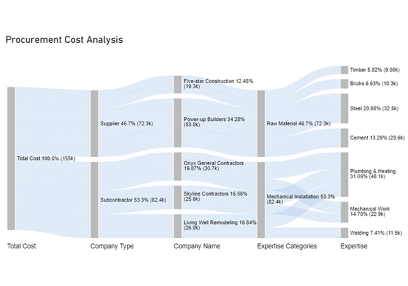
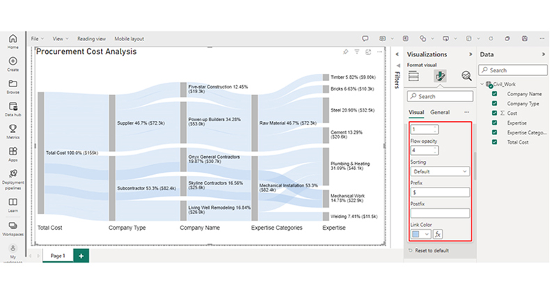
Stage 4: Drawing the Sankey Diagram with ChartExpo’s Power BI extension.

  • Navigate to the visualization panel, and choose “Sankey Diagram for Power BI by ChartExpo.” A window similar to the one below will be displayed.
Choose Sankey Diagram Icon Displayed for Visualizing DAX Variables
  • You have the option to resize the visual. After that, navigate to the right side of the Power BI dashboard and look out for “Fields” found next to “Visualizations.”
Select Fields Next to Visualizations for Visualizing DAX Variables
  • You’ll have to choose the fields to use in the Sankey chart. Select the ChartExpo visual, and choose the fields in the following sequence:
    • Total Cost
    • Company Type
    • Company Name
    • Expertise Categories
    • Expertise
    • Cost
Choose Fields for Visualizing DAX Variables
  • You’ll have to provide the ChartExpo license key or your email address.
Provide License Key for Visualizing DAX Variables

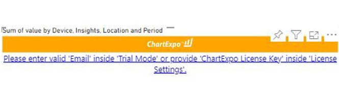
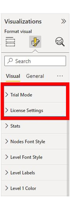
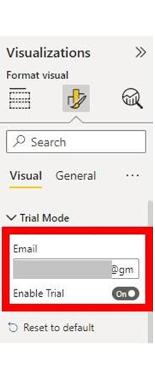
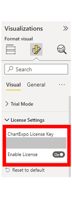
Stage 5: Activate the ChartExpo Trial or Apply a Subscription Key

  • Select the ChartExpo visual, and look out for the three icons below “Build Visual” in your visualizations panel.
Build Visual inVisualization Panel for Visualizing DAX Variables
  • Choose the middle icon, “Format visual.” After that, the visual properties will be populated.
Choose Format Visual for Visualizing DAX Variables
  • If you’re a new user, you’ll have to input your email address in the textbox found under the “Trial Mode” section. After that, the License key will be sent to your email address. Your email address has to be up-to-date and accurate. To activate the 7-day trial, toggle the “Enable Trial” icon.
Activate 7-Days Trial for Visualizing DAX Variables
  • The Sankey Diagram will come with the ChartExpo watermark.
Sankey Diagram with Watermark for Visualizing DAX Variables
  • If you already have a license key, enter it in the “ChartExpo License Key” textbox in the “License Settings” section. After that, slide the toggle switch next to “Enable License” to “on.”
Enable License for Visualizing DAX Variables
  • The Sankey diagram is ready, and it comes without a watermark.
Sankey Diagram without Watermark for Visualizing DAX Variables
  • You can add a Prefix (like the $ sign) with the numeric values in the chart. Next, expand the “Stats” properties to include the Prefix value.
Add Prefix for Visualizing DAX Variables
  • To add colors to each node, expand the “Level Colors” properties and choose the colors.
Expand Colors for Visualizing DAX Variables
  • Changes will be saved automatically.
Final DAX Variables

Insights

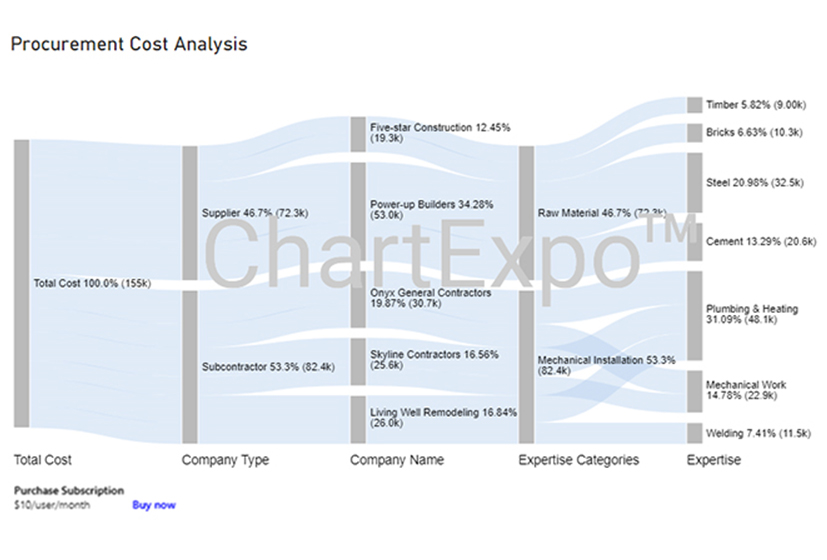
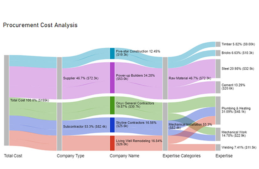
Here are three insights from the chart.

  • The procurement cost at Level 1 (Total Cost) is $155k.
  • At Level 2 (Company Type), out of the $155k cost, $82.4k (53.3%) was spent on subcontractors, while $72.3k (46.7%) was allocated to the supplier.
  • At Level 3 (Company Name), the $72.3k supplier cost was divided between two companies: Five-star Construction and Power-up Builder, with charges of $19.3k and $53.0k, respectively.

Enhance Data Accuracy and Efficiency Using DAX Variables in Power BI Visuals:

Explore the power of DAX Variables in this hands-on tutorial. These essential tools help streamline your calculations and improve performance in Power BI and Excel. By leveraging DAX Variables, you can simplify complex expressions, enhance readability, and reduce redundancy in your formulas. Mastering DAX Variables allows you to unlock more efficient data modeling, enabling clearer and more dynamic insights. When used in conjunction with charts and graphs, DAX Variables can transform your data visualizations, ensuring that your reports are both accurate and responsive, driving better decision-making and more effective data-driven strategies.

What are the Best Practices for Using Variables in Power BI?

Using variables in Power BI with DAX (Data Analysis Expressions) can greatly improve the efficiency, readability, and performance of your reports. Here are some best practices to consider when using variables:

  • Meaningful Names

Descriptive names should be used for variables that show their purpose, or the value they score. Do not use generic names like Temp or Var1.

  • Simplify Complex Calculations

Always break down complex expressions into more manageable, smaller parts. This will make your DAX formula easier to understand, read, and debug.

  • Documentation and Comments

Comments within the DAX code can be used to document the logic and purpose of the variables. It helps other users understand the rationale behind the calculations.

  • Performance Optimization

Intermediate results should be stored in variables. It helps eliminate recalculating the same expression multiple times. And if you’re working with complex calculations or large datasets, it will help improve the performance of your queries.

What are the Benefits of Using Variables in Power BI DAX Formulas?

Using variables in Power BI DAX (Data Analysis Expressions) formulas provides several benefits that can improve both the efficiency and clarity of your calculations. Here are the key benefits:

  • Improved Readability

Variables break down complex calculations into manageable, named parts. And that makes it easy to read and understand DAX formulas.

  • Performance Optimization

Storing intermediate results in variables helps you to avoid recalculating the same expressions multiple times. That helps in improving the overall query performance.

  • Consistency in Calculations

Variables ascertain consistent use of intermediate results. And that reduces the risk of errors caused by discrepancies in repeated calculations.

  • Enhanced Maintainability

Variables make it easy to manage and update formulas.

FAQs

Are variables in DAX immutable?

Yes, variables in DAX are immutable. If a variable is defined with a value, it cannot be reassigned or changed within the same expression.

Are DAX variables case-sensitive?

Yes, DAX variables are case-sensitive. Variable names must always match in the case when they’re referenced and defined within the same expression.

Can you use variables in Power BI?

Yes, variables can be used in Power BI to create calculated columns and measures. It stores intermediate calculations within the DAX expressions, thereby improving performance and readability.

Wrap Up

DAX variable in Power BI improves performance, manages intermediate calculations, and enhances readability. To create one, you’ll have to use VAR and reference with RETURN. For instance: VAR TotalSales = SUM(Sales[Amount]) RETURN TotalSales.

Various benefits come with using DAX variables. These benefits include:

  • Performance optimization
  • Clearer logic
  • Simplified debugging
  • Improved readability
  • Enhanced maintainability
  • Reduction of redundancy.

DAX variables help you to easily store intermediate results. And that helps in improving query performance and reducing the number of times complex calculations are recalculated. If you want to debug, variables can help you do just that. It helps the user inspect intermediate results, and gain an in-depth understanding of how calculations are evaluated.

How much did you enjoy this article?

PBIAd2
Start Free Trial!
139231

Related articles

next previous
Power BI12 min read

How to Create Sankey Diagram in Microsoft Power BI?

Learn How to Create Sankey Diagram in Microsoft Power BI using Desktop & Web Service. What they are and how to use them effectively.

Power BI8 min read

Power BI Artificial Intelligence: Insights Using Visuals

Discover all there is to know about the Power BI artificial intelligence. You'll also discover how AI is used in Power BI, and how to use it for analysis and more.

Power BI9 min read

Budgeting in Healthcare: Use Visuals to Spot Budget Gaps

This guide helps you discover what budgeting in healthcare is. You'll also discover the factors that affect hospital budgets and types of budgeting in healthcare.

Power BI9 min read

Predictive Analytics in Power BI for Making Insightful Visuals

This guide shows you everything you need to know about Predictive Analytics in Power BI. It also shows you how it works, and how to interpret the results.

Power BI8 min read

Quarterly Business Review Template for Optimum Reports

Discover what the quarterly business review template is. This guide also shows you the best practices to consider when using the QBR template.

ChartExpo logo

Turn Data into Visual
Stories

CHARTEXPO

  • Home
  • Gallery
  • Videos
  • Services
  • Pricing
  • Contact us
  • FAQs
  • Privacy policy
  • Terms of Service
  • Sitemap

TOOLS

  • ChartExpo for Google Sheets
  • ChartExpo for Microsoft Excel
  • Power BI Custom Visuals by ChartExpo
  • Word Cloud

CATEGORIES

  • Bar Charts
  • Circle Graphs
  • Column Charts
  • Combo Charts
  • Comparison Charts
  • Line Graphs
  • PPC Charts
  • Sentiment Analysis Charts
  • Survey Charts

TOP CHARTS

  • Sankey Diagram
  • Likert Scale Chart
  • Comparison Bar Chart
  • Pareto Chart
  • Funnel Chart
  • Gauge Chart
  • Radar Chart
  • Radial Bar Chart
  • Sunburst Chart
  • see more
  • Scatter Plot Chart
  • CSAT Survey Bar Chart
  • CSAT Survey Chart
  • Dot Plot Chart
  • Double Bar Graph
  • Matrix Chart
  • Multi Axis Line Chart
  • Overlapping Bar Chart
  • Control Chart
  • Slope Chart
  • Clustered Bar Chart
  • Clustered Column Chart
  • Box and Whisker Plot
  • Tornado Chart
  • Waterfall Chart
  • Word Cloud
  • see less

RESOURCES

  • Blog
  • Resources
  • YouTube
SIGN UP FOR UPDATES

We wouldn't dream of spamming you or selling your info.

© 2025 ChartExpo, all rights reserved.