Categories
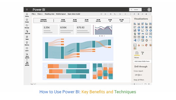
You might wonder how to use Power BI if you are accustomed to spreadsheets in Excel. Power BI (PBI) is a much more powerful data analysis tool.


You need to understand its features and the kind of data visualizations that you have access to. This way, you can utilize it effectively. Most importantly, you need to ensure that you work with good-quality data. A powerful tool is not a replacement for bad data.
You also need to ensure that you work with data in the correct format. Access and permissions should also be granted carefully. Defining your data points and KPIs will also make it easier to work with PBI.
In this article, we learn how to use Power BI and define it. We’ll discuss core PBI features and, finally, how to use PBI to create charts for data analysis.
Definition: Power BI is used for connecting, analyzing, and visualizing data to support better decision-making. It allows users to pull data from various sources, such as Excel, cloud services, or databases, clean and transform it with Power Query, and then build interactive reports and dashboards.
Businesses use Power BI to track KPIs, identify trends, and share insights across teams, making it a powerful tool for data-driven collaboration.
Here are some key points to describe what Power BI is used for:
One of the primary uses is Power BI for data visualization. It allows you to create interactive visualizations that help you understand complex data sets quickly. Also, you can customize the visualizations to suit your needs that resonate with your brand identity.
Power BI offers robust data analysis capabilities, including data modeling, visualization, and exploration. You can connect to various data sources and clean and transform data. Then perform complex calculations to glean valuable insights that inform decision-making.
Power BI is a potent business intelligence reporting tool. You can create custom reports that offer insights into your operations. You can use these reports to track performance, monitor KPIs, and pinpoint improvement areas.
Power BI facilitates data analysis in real-time. It lets you connect to streaming data sources and create real-time dashboards and reports.
You can monitor key metrics and make informed decisions using these real-time data analysis features.
Using a KPI visual in Power BI further enhances this by allowing you to track performance metrics instantly and respond to changes as they happen.
Power BI connects you to data sources like Excel spreadsheets, SQL databases, and cloud-based services. This empowers you to consolidate your data and create a unified view of your business operations.
Power BI integrates with Excel, databases, cloud platforms, and hundreds of other sources. This helps bring all your business data together in one place.
Using Power Query, you can prepare raw data by cleaning, shaping, and modeling it for accurate analysis.
Power BI allows you to design charts, graphs, and visual reports to track KPIs, monitor performance, and spot trends easily.
With automatic data refresh, you can analyze real-time updates and make faster, data-driven decisions.
Reports and dashboards can be published to the Power BI service, making it simple to share insights with teams and stakeholders.
Power BI is designed for a wide range of users across industries and job roles. Its flexibility makes it useful for both technical and non-technical professionals.
They use Power BI to explore data, build dashboards, and create reports that guide strategic decisions.
Leaders rely on Power BI dashboards to track KPIs, monitor performance, and stay updated with real-time insights.
Data engineers, scientists, and IT teams use Power BI to integrate, model, and analyze complex datasets.
They use it to understand customer behavior, measure campaign performance, and forecast future trends.
Power BI helps finance teams analyze budgets, expenses, and revenue streams with clear, interactive reports.
Power BI Desktop is completely free, making it an excellent choice for individuals and businesses to start analyzing and visualizing data without upfront costs.
It allows users to connect to a wide range of data sources such as Excel, SQL Server, cloud services, and APIs, making it versatile for different business needs.
With Power Query Editor, you can clean, transform, and shape raw data into meaningful datasets before creating reports.
It offers a wide variety of customizable charts, graphs, and dashboards that help in better data storytelling and decision-making.
Power BI Desktop enables users to create relationships between datasets, define calculated columns, and use DAX (Data Analysis Expressions) for advanced calculations.
Power BI is a powerful tool that helps businesses turn raw data into actionable insights. With features like conditional formatting in Power BI, you can highlight key trends and patterns for better visualization. Whether you run a small company or a large enterprise, it can support smarter decision-making. Here’s how you can use it for your business:
Import data from Excel, Google Analytics, CRM systems, databases, or cloud apps to bring everything into one place.
Use Power Query to remove errors, standardize formats, and structure data for analysis. This ensures reports are accurate and reliable.
Create charts, graphs, and KPIs that track business performance. Dashboards let you monitor sales, marketing, operations, and financial metrics in real time.
Set up KPIs to measure business goals like revenue growth, customer acquisition, or employee productivity.
Publish dashboards to the Power BI Service, making them accessible on web or mobile. This improves collaboration and keeps teams aligned.
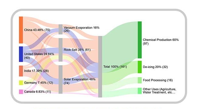
Read more here about the Sankey Chart app for Power BI.
You can use Microsoft Power BI for data analysis to visualize complex data flows and uncover insights effortlessly with tools like a Sankey diagram generator.


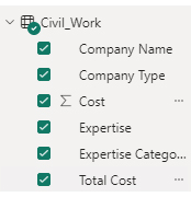
| Total Cost | Company Type | Company Name | Expertise Categories | Expertise | Cost |
| Total Cost | Subcontractor | Skyline Contractors | Mechanical Installation | Plumbing & Heating | 15456 |
| Total Cost | Subcontractor | Skyline Contractors | Mechanical Installation | Mechanical Work | 10159 |
| Total Cost | Subcontractor | Onyx General Contractors | Mechanical Installation | Plumbing & Heating | 18045 |
| Total Cost | Subcontractor | Onyx General Contractors | Mechanical Installation | Mechanical Work | 12695 |
| Total Cost | Subcontractor | Living Well Remodeling | Mechanical Installation | Plumbing & Heating | 14589 |
| Total Cost | Subcontractor | Living Well Remodeling | Mechanical Installation | Welding | 11456 |
| Total Cost | Supplier | Power-up Builders | Raw Material | Cement | 20561 |
| Total Cost | Supplier | Power-up Builders | Raw Material | Steel | 32456 |
| Total Cost | Supplier | Five-star Construction | Raw Material | Bricks | 10253 |
| Total Cost | Supplier | Five-star Construction | Raw Material | Timber | 9000 |


Businesses use Power BI dashboards to monitor sales revenue, conversion rates, and customer acquisition trends, helping identify top-performing products or regions.

Finance teams create interactive reports to track expenses, profit margins, and cash flow, replacing manual spreadsheets with automated, accurate insights.

Marketers analyze campaign performance by connecting Power BI to Google Analytics or social media data, measuring ROI, and optimizing ad spend by using a Sankey Diagram in Power BI.

Operations teams use Power BI to track inventory levels, supplier performance, and logistics efficiency, ensuring cost savings and timely deliveries.
Power BI helps HR teams and recruiters track job applications across different stages of the hiring process. It provides visual dashboards to monitor applicant sources, interview progress, and time-to-hire, making recruitment more efficient and data-driven.
Power BI is one of the most popular business intelligence tools, but like any software, it comes with both strengths and limitations.
Yes, Power BI is beginner-friendly. The drag-and-drop interface makes it easy to create basic reports and dashboards without coding.
Beginners can quickly connect Excel sheets or simple datasets, apply filters, and build visuals. However, advanced features like DAX formulas, data modeling, and custom visuals may require some learning.
Power BI is Microsoft’s business intelligence tool used to turn raw data into interactive dashboards and reports. You can use it by:
Power BI is a powerful business analytics tool. It can be used for a variety of purposes in different industries. Some of the common use cases to understand how to use Power BI:
Power BI is one of the most powerful business intelligence tools for analyzing and visualizing data.
Our main focus throughout this article has been learning how to use Power BI. To do this, we went through the process of using it to create a data analysis chart.
We used the ChartExpo add-in from AppSource to help us create our chart.
We also looked at what Power BI is and briefly discussed its core features. The most important features include data visualizations, customizable templates and dashboards, and data integration.
Finally, we answered some FAQs. We hope you are ready to explore and learn how to use Power BI.
How much did you enjoy this article?


Discover diverse and high-quality Power BI report examples for inspiration and insights. Elevate your reporting with strategic visualization techniques.

A Customer Relationship Management Dashboard centralizes data, tracks key metrics, and drives smarter business decisions. Discover now!

Explore Healthcare Dashboard Examples and learn how to turn complex healthcare data into clear, actionable insights for better decision-making.


