Categories
Are you tired of scrolling through endless reports in Power BI? Do you often find yourself lost in a sea of data, desperately searching for that one crucial insight?


Fear not – I have a solution that will revolutionize your Power BI experience.
Introducing bookmarks.
Yes, bookmarks, those little bookmarks that you use in your favorite novel to mark your favorite pages. But in Power BI, bookmarks are so much more than that. They are your secret weapon in the battle against data overload.
With the strategic use of a bookmark in Power BI, you can transform your data exploration into a seamless and organized journey, ensuring you never miss a valuable insight again.
With bookmarks, you can bookmark specific views, filters, and interactions in your report. This lets you easily navigate your data and find what you need with just a click. It’s like having an assistant who knows what you’re looking for and presents it on a silver platter.
That’s not all – bookmarks also give you the power to control the interactivity of your report.
Want to restrict certain visuals from being clicked?
Bookmark it.
Want to hide sensitive information?
Bookmark it.
The possibilities are endless, my friend.
Bookmark in Power BI is a feature that allows you to capture and save specific views of a report. It captures the layout, visuals, and filters, allowing you to revisit specific views easily. Thus, they act as a GPS pin for your insights.
You can create multiple bookmarks to preserve different perspectives within the report and easily navigate between them. This enhances the interactivity and presentation capabilities, especially when using the Power BI connector, enabling a more dynamic and personalized user experience.
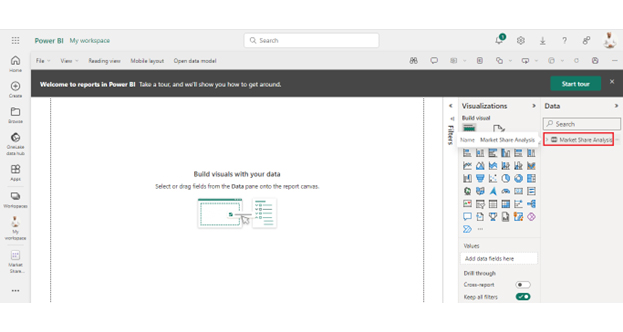
Bookmarking in Power BI is your ticket to a more organized and dynamic reporting experience. Here’s a step-by-step guide to bookmark brilliance:
Here’s a breakdown of how bookmarks can elevate your data game:
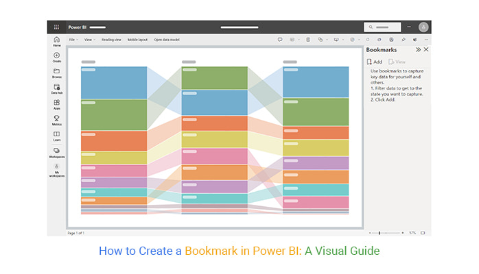
Learn how to analyze bookmarks in Power BI to control views, enhance interactivity, and improve insights using Power BI charts.


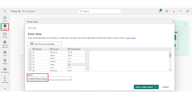
| Quarters | Vendors | Market Share |
| Q1 | Samsung | 27.69 |
| Q1 | Apple | 28.45 |
| Q1 | Xiaomi | 11.8 |
| Q1 | Huawei | 6.53 |
| Q1 | Oppo | 5.3 |
| Q1 | Vivo | 4.19 |
| Q2 | Samsung | 28.14 |
| Q2 | Apple | 27.58 |
| Q2 | Xiaomi | 12.62 |
| Q2 | Huawei | 6.17 |
| Q2 | Oppo | 5.5 |
| Q2 | Vivo | 4.21 |
| Q3 | Samsung | 28.45 |
| Q3 | Apple | 27.71 |
| Q3 | Xiaomi | 12.9 |
| Q3 | Huawei | 6 |
| Q3 | Oppo | 5.29 |
| Q3 | Vivo | 4.17 |
| Q4 | Samsung | 27.97 |
| Q4 | Apple | 27.62 |
| Q4 | Xiaomi | 12.68 |
| Q4 | Huawei | 5.17 |
| Q4 | Oppo | 6.07 |
| Q4 | Vivo | 4.66 |

The following video will help you create a Comparison Bar Chart in Microsoft Power BI.
From saving time to making your reports organized, the benefits of Power BI bookmarks are endless;
Bookmarks elevate Power BI reports from mere data displays to engaging, interactive presentations. Creating bookmarks at key junctures allows you to switch between views dynamically during a presentation. Consequently, this fosters audience engagement and ensures the narrative aligns with audience interest.
Bookmarks cater to diverse user needs. Teams with different focuses or stakeholders with distinct interests can have personalized snapshots. Thus, each viewer interacts with the data from a perspective most relevant to them. This customization enhances user engagement and understanding.
Bookmarks serve as a GPS for data exploration, guiding users through a structured journey across complex Datasets. Predefining specific views and analyses empowers your viewers to navigate the data landscape efficiently. This empowers them to unlock insights without feeling overwhelmed by the sheer volume of information.
Navigating through extensive reports can take time and effort. However, bookmarks act as efficient waypoints, allowing you to jump to predefined views effortlessly. This streamlines the user experience and ensures the audience focuses on the most critical aspects of the report.
Maintaining a consistent user experience is crucial for effective communication. Bookmarks provide a solution by standardizing the views. This ensures that all users receive a coherent and uniform data presentation regardless of their roles or requirements.
Bookmarks empower you to personalize dashboards according to your preferences. Whether arranging charts, selecting filters, or highlighting specific metrics, you can create a dashboard tailored to your needs. Consequently, this fosters a sense of ownership and usability.
In the design phase, bookmarks allow you to focus on crafting impactful visualizations. Strategically placing bookmarks helps to ensure that users follow a logical flow. This makes the report visually appealing and intuitively navigable.
Associating bookmarks with interactive elements enhances user engagement. Clickable visuals, charts, or elements trigger specific bookmarks, enabling you to delve deeper into relevant insights with minimal effort. This fosters a more interactive user experience.
Bookmarks become storytelling tools, enabling you to structure a narrative within the data. Sequential bookmarks guide the audience through a coherent story. As a result, this helps them understand the context, challenges, and resolutions embedded in the data.
For both creators and users, bookmarks are a time-saving feature. Creators save time by eliminating the need for users to navigate through layers of data manually. Users, in turn, save time accessing pertinent information directly, improving overall efficiency in data analysis and decision-making.
In Power BI, a bookmark is similar to a digital bookmark in a book, but for your report. It captures the current state, including filters and visuals. This allows you to effortlessly revisit and share specific views or stages of your data analysis.
While both involve navigation in Power BI, bookmarks are versatile snapshots of report states, capturing filters and visuals. Page navigation involves moving between report pages, providing a broader organizational structure for your data insights.
Use bookmarks in Power BI to create snapshots of specific report states, capturing filters and visuals. Then, combine them with slicers’ interactive filter controls to enhance user experience with dynamic data exploration and analysis.
The benefits of using bookmarks in Power BI are simply bookmarkable. These dynamic tools elevate user engagement by providing a personalized, interactive experience.
The dynamic nature of bookmarks enhances storytelling by documenting each analysis step, creating an engaging narrative. By saving filter configurations, bookmarks bring efficiency to repetitive tasks, acting like personalized data lenses.
Moreover, the capability to test what-if scenarios is a significant asset. Bookmarks provide a risk-free environment for exploring hypothetical situations. The integration with slicers further augments the interactive experience, allowing users to control and filter data dynamically.
As a version control tool, bookmarks ensure that your analysis remains organized and traceable. This feature prevents mishaps and facilitates easy comparison between different iterations of your report.
In essence, bookmarks in Power BI transcend mere navigation tools. They become the storytellers, guiding users through a curated journey of data insights. The data analysis journey becomes not just comprehensive but also captivating, turning raw information into a visual narrative.
Level up your data game: Bookmark now, thank yourself later’ the Power BI way.
How much did you enjoy this article?


Discover diverse and high-quality Power BI report examples for inspiration and insights. Elevate your reporting with strategic visualization techniques.

A Customer Relationship Management Dashboard centralizes data, tracks key metrics, and drives smarter business decisions. Discover now!

Explore Healthcare Dashboard Examples and learn how to turn complex healthcare data into clear, actionable insights for better decision-making.


