Categories
Your accounting department is likely the core of your entire operation. Yes, you read that right.
Besides, it’s difficult for your business to thrive without financial fluency and skills in data visualization. You can not create a monthly financial report template in Excel without using visualizations.


It can make or break your business.
As a business owner, you need a reliable financial report template to standardize the analysis phase and extract actionable insights. Also, the report can help you to increase long-term profitability.
A phenomenal finance report shows insights into accounting information that covers a specified period, such as:
This report is also an effective means of remaining updated with significant progress or changes in your finances, and using a finance dashboard in Excel can help you measure your cash flow and overall financial position.
Excel comes with pivot tables, charts, and graphs for visualizing data. However, it lacks a monthly financial reports template.
You don’t have to discard your Excel in favor of other expensive data visualization tools. You can supercharge it with a particular add-in to access ready-made monthly financial report templates and charts.
In this blog, you’ll learn:
Before jumping into the how-to guide, we’ll address the following question: what is a monthly financial report template in Excel?
Definition: A monthly financial report template is a management tool you can easily use to communicate critical financial insights into your data.
You can easily track growth and revenue by covering every aspect of your financial affairs with the help of key metrics. Remember, we’re now living in a data-driven age where the ability to extract actionable insights and incorporate them into your strategy is likely to set you apart from the pack.
To gain a bird’s eye view of your business’s financial position, you need a monthly financial report template in Excel.
So, what is the importance of financial reports?
Monthly financial reports template, including a 3-statement financial model template, can help you identify trends, patterns, and potential roadblocks for real-time insights.
Staying on top of your monthly financial statements template provides you with bird’s-eye view-level insights, enabling quick and informed decision-making.
This report can provide you with actionable insight into your current assets and liabilities.
Accurate financial reporting is aligned with compliance terms set forth by most governments worldwide. You can quickly improve your performance while staying within legal limits.
We’ll take you through monthly financial report templates in the ensuing section. Also, you’ll learn the key types of financial reports that every business needs.
There are 4 critical types of financial statements you can find in a monthly financial report template in Excel, namely:
An income statement, widely known as a profit and loss statement, can be effectively organized using an income statement template. This report summarizes your business’s revenue, expenses, and profits. It can easily show you how much the income earned or lost during a particular period.
A Balance Sheet is a report that shows high-level insights into your capital, assets, and liabilities. In other words, the balance sheet is a financial statement that provides a macro view of what your business owns and owes and investors’ equity. You can use this report to conduct a fundamental analysis.
The statement of retained earnings reveals the financial health of the company and how much profit has been retained over some time.
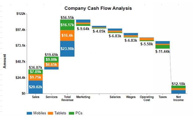
Cash flow is the net amount of cash coming in and out of your business.
The incoming cash depicts inflows in your business. Conversely, the expenditures are represented by outflows. Positive cash flows determine your ability to create value for investors.
The amount of data generated when tracking cash flows is massive. You risk analysis paralysis if you go manual. Using a Stacked waterfall chart in Excel can simplify this process and provide clear insights.
We’ll take you through monthly financial report examples in the coming section.
Some of the monthly financial report templates in Excel for you to get started include:
Keep reading because you’ll learn how to create a monthly financial report template in Excel.
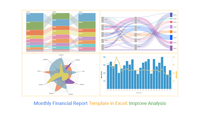
A visualization is a form of analysis you can use to extract answers from your data. One of the standard tools for visualizing data using charts, graphs, and maps is Excel. Here are some beautiful chart opportunities available for your financial data, like a Waterfall chart and a Sankey chart.
However, the spreadsheet application lacks ready-made charts for analyzing a monthly financial reports template and does not guide how to create a monthly budget in Excel.
We’re not advising you to do away with Excel in favor of other expensive tools.
This is because there’s an affordable visualization tool available as an Excel add-in that lets you create insightful and easy-to-customize charts for analyzing a monthly financial reports template. It helps you turn complex data into clear financial charts in Excel in just a few clicks. The application is called ChartExpo.
What is ChartExpo?
ChartExpo is an add-in you can easily install in your Excel without needing tutorials.
With amazing ready-to-go and insightful charts, graphs, and maps, ChartExpo turns your complex, raw data into easy-to-interpret and visually appealing Excel charts for analyzing a monthly financial reports template.
More benefits
In the coming section, we’ll show you how to analyze your data using the monthly financial report template in Excel, and how a finance dashboard in Excel can make insights clearer and easier to track.


This section will use a Radar Chart to visualize the table below.
| Product | Month | Sales |
| TV | Jan | 80 |
| TV | Feb | 65 |
| TV | Mar | 75 |
| TV | Apr | 80 |
| TV | May | 90 |
| TV | Jun | 85 |
| TV | Jul | 65 |
| TV | Aug | 70 |
| TV | Sep | 80 |
| TV | Oct | 93 |
| TV | Nov | 99 |
| TV | Dec | 80 |
| Smart Phones | Jan | 100 |
| Smart Phones | Feb | 60 |
| Smart Phones | Mar | 95 |
| Smart Phones | Apr | 75 |
| Smart Phones | May | 100 |
| Smart Phones | Jun | 60 |
| Smart Phones | Jul | 95 |
| Smart Phones | Aug | 75 |
| Smart Phones | Sep | 109 |
| Smart Phones | Oct | 80 |
| Smart Phones | Nov | 109 |
| Smart Phones | Dec | 75 |
| Computers | Jan | 50 |
| Computers | Feb | 55 |
| Computers | Mar | 51 |
| Computers | Apr | 40 |
| Computers | May | 45 |
| Computers | Jun | 30 |
| Computers | Jul | 39 |
| Computers | Aug | 45 |
| Computers | Sep | 56 |
| Computers | Oct | 39 |
| Computers | Nov | 48 |
| Computers | Dec | 44 |
To get started with ChartExpo in Excel, install ChartExpo into your Excel by clicking this link. Now follow the steps below:


The Comparison Bar Chart is one of the tested and recommended ways of engaging with your data to draw insights into comparative relationships between key data points.
This section will use a Comparison Bar Chart to visualize the table below.
| Months | Name | Sales |
| March | Alan | 90 |
| March | David | 82 |
| March | Lewis | 66 |
| March | Boris | 72 |
| April | Alan | 85 |
| April | David | 62 |
| April | Lewis | 50 |
| April | Boris | 73 |
| May | Alan | 40 |
| May | David | 60 |
| May | Lewis | 80 |
| May | Boris | 76 |


The above chart shows the employees’ comparison based on their monthly sales.
This section will use a “Double Axis Line Graph and Bar Chart” to visualize the tabular data below.
| Months | Revenue | Profit Margin |
| Jan | 5000 | 5 |
| Feb | 2500 | 10 |
| Mar | 3600 | 7 |
| Apr | 3250 | 14 |
| May | 1975 | 19 |
| Jun | 1874 | 20 |
| Jul | 3952 | 6 |
| Aug | 2222 | 9 |
| Sep | 4260 | 4 |
| Oct | 3300 | 22 |
| Nov | 1500 | 17 |
| Dec | 1160 | 9 |


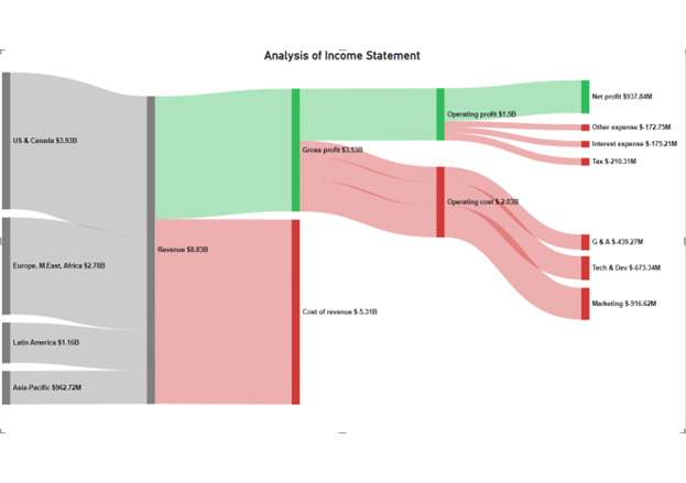
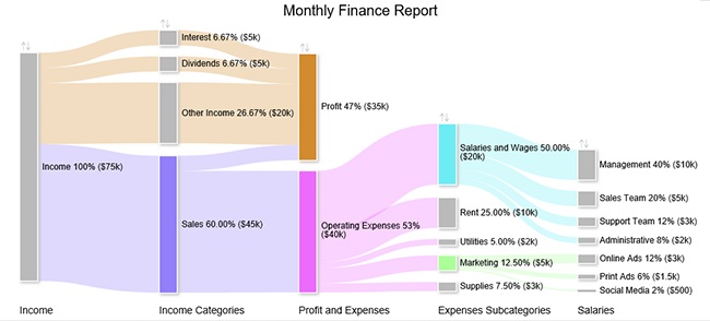
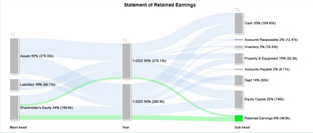
A Sankey chart in Excel is a visualization chart you can use to display insights into a flow of data through stages or phases.
While initially the charts were used to only showcase energy flows in an engineering system, they’re now used in other disciplines, such as finance and accounting.
This section will use a Sankey Diagram to analyze and visualize the cash flow of tabular data below for P&L Analysis.
| Locations | Revenue | Expenses | P&L Analysis | Count |
| North America | Revenue | Loss | Cost of Sales | 132 |
| North America | Revenue | Loss | Cost of General and Administrative | 159 |
| North America | Revenue | Loss | Cost of Marketing | 170 |
| North America | Revenue | Profit | Tax | 182 |
| North America | Revenue | Profit | Profit After Tax | 834 |
| International | Revenue | Loss | Cost of Sales | 162 |
| International | Revenue | Loss | Cost of General and Administrative | 158 |
| International | Revenue | Loss | Cost of Marketing | 145 |
| International | Revenue | Profit | Tax | 171 |
| International | Revenue | Profit | Profit After Tax | 753 |
| Middle East | Revenue | Loss | Cost of Sales | 155 |
| Middle East | Revenue | Loss | Cost of General and Administrative | 166 |
| Middle East | Revenue | Loss | Cost of Marketing | 199 |
| Middle East | Revenue | Profit | Tax | 151 |
| Middle East | Revenue | Profit | Profit After Tax | 685 |


The above Sankey diagram shows the Profit and Loss Analysis based on different locations.
A monthly financial report is a management tool you can easily use to communicate vital financial insights into your data.
You can easily track growth by covering every aspect of your financial affairs with the help of key metrics. The report should have up-to-date reporting of the cash inflows, profit and loss statements, etc.
Excel lacks financial report templates, such as the Sankey Diagram, Double Axis Line Graph & Bar Chart.
We’re not advising you to do away with Excel.
There’s an amazingly affordable visualization tool that comes as an add-in called ChartExpo that you can easily install in Excel to access easy-to-customize charts for analyzing monthly financial reports template.
Your accounting department is likely the core of your entire operation.
Yes, you read that right.
Besides, it’s difficult for your business to thrive without financial fluency and skills in data visualization.
It can make or break your business.
As a business owner, you need a reliable financial report template to standardize the analysis phase and extract actionable insights. Also, the report can help you to increase long-term profitability.
A phenomenal finance report shows insights into accounting information that covers a specified period, such as:
This report is also an effective means of remaining updated with significant progress or changes in your finances. And it can help you measure your cash flow and overall financial position.
Excel comes with pivot tables, charts, and graphs for visualizing data. However, the app is unlikely to help you create a monthly financial report template in Excel.
We recommend you install third-party apps, such as ChartExpo, to access ready-to-use data visualization graphs, such as the Sankey Diagram and Radar Charts.
ChartExpo is an Excel add-in loaded with insightful and ready-to-go visualization charts, some of which you can use to visualize monthly financial reports template.
Sign up for a 7-day free trial today to access ready-made charts for analyzing monthly financial reports template.
How much did you enjoy this article?


Learn how to use sparklines in Excel to quickly visualize trends inside cells. Discover types, creation steps, customization, use cases, benefits, and best practices.

Learn what a confidence interval graph is, how to create it in Excel, and how to interpret results to make more reliable, data-driven decisions.

A correlation matrix in Excel helps identify relationships between variables. Learn how to create, read, and use it for effective data analysis.


