Categories
Are you tired of staring at a never-ending sea of numbers on your Excel worksheet? Are you looking for a way to make your data appealing and easier to understand?


Look no further.
This guide will show you how to add a chart in Excel. You can transform your data into an insightful and illuminating chart with only a few clicks.
Yes, you read that right.
Let me share a case study to illustrate the significance of charting in Excel. One of my clients needed help comprehending his sales team’s performance. He had access to a large quantity of data, but it was challenging to make sense of it. I advised him to add charts in Excel to visualize the data.
This transformed how he handled this data. It enabled him to discover patterns and trends that were not apparent. As a result, it assisted him in making wiser business choices.
Charts not only make data visually appealing. They also highlight trends and patterns that might take time to notice in raw data.
Grab your mouse, and let’s get charting.
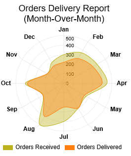
A Radar Chart, or a Spider Chart, is a two-dimensional chart representing multidimensional data. It arranges the data to form a spider-web-like shape. Each variable has its axis that starts from the center. It plots the value of each variable along the same axis and joins them together to form a polygon. This chart is ideal for performance analysis.
Let’s say you have the following data for your online store.
| Months | Orders Received | Orders Delivered |
| Jan | 300 | 220 |
| Feb | 370 | 300 |
| Mar | 400 | 350 |
| Apr | 450 | 400 |
| May | 270 | 250 |
| Jun | 300 | 300 |
| Jul | 400 | 250 |
| Aug | 500 | 400 |
| Sep | 250 | 250 |
| Oct | 400 | 380 |
| Nov | 200 | 200 |
| Dec | 250 | 210 |
As shown below, you can map this data on a Radar Chart to analyze the performance of yearly orders.
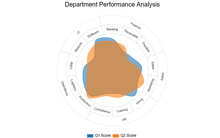
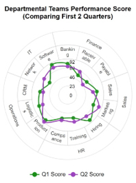
A Circular Org Chart, or a Circular Organizational Structure, is a hierarchical structure chart. Senior-level employees occupy the inner rings of a circle, while lower-level employees occupy the outer rings. This structure fosters collaboration, inclusivity, and creativity within the organization.
Assume you have the data scores below for different departments of different teams.
| Departments | Teams | Q1 Score | Q2 Score |
| Finance | Banking | 80 | 73 |
| Finance | Receivable | 57 | 67 |
| Finance | Payable | 59 | 47 |
| Sales | Sales | 75 | 65 |
| Sales | Marketing | 70 | 85 |
| HR | Hiring | 85 | 72 |
| HR | Training | 60 | 70 |
| HR | Compliance | 61 | 66 |
| Operations | Production | 85 | 91 |
| Operations | Logistics | 78 | 68 |
| Operations | CRM | 71 | 63 |
| IT | Network | 56 | 73 |
| IT | Software | 87 | 79 |
You can observe how a Circular Org Chart presents this data clearly and concisely.
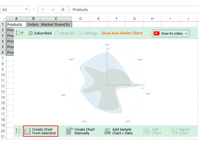
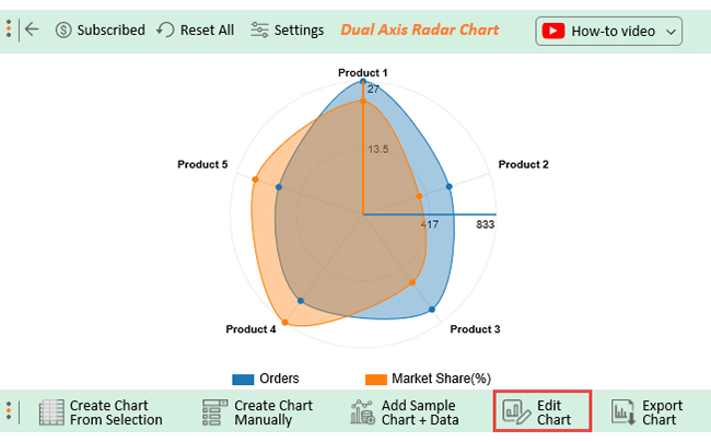
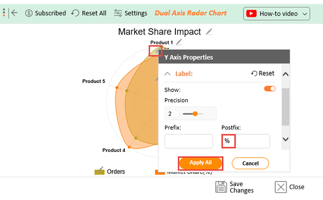
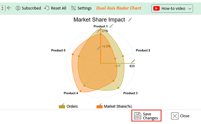
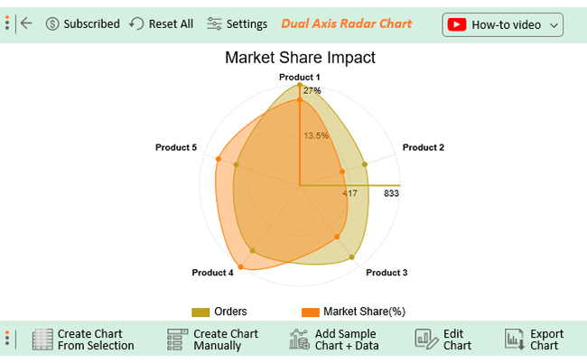
A Dual Axis Radar Chart facilitates the comparison of two different data sets. It has two radial axes with different scales and units of measurement. This allows you to compare two data sets with different ranges or units.
Let’s say you have the data below on data about orders and market share impact on different products.
Follow through as I show you how to use ChartExpo to create a Dual Axis Radar Chart.
Are you looking for an easy and efficient way to add charts to your Excel spreadsheets?
Look no further than ChartExpo.
This add-in takes the hassle out of charting in Excel. You can easily add informative charts to your data with only a few clicks. Business owners, marketers, and data analysts can choose from a wide range of chart types, including an Area chart or Multi-Axis graph Excel ChartExpo offers.
The best part?
Its user-friendly interface allows even beginners to create insightful charts, including a Waterfall chart in Excel, without any coding experience.
Benefits of Using ChartExpo
How to Install ChartExpo in Excel?
ChartExpo charts and graphs are available in both Google Sheets and Microsoft Excel. Use the following CTAs to install the tool of your choice and create interactive visualizations in just a few clicks in your preferred platform, including a tornado chart in Excel.


These are the steps for adding charts in Excel:


Choosing the right chart type is crucial to visualize your data effectively. The following are tips on which chart to use in Excel based on the type of data:
A wide variety of charts are available with just a few mouse clicks in Excel. Creating a chart in Excel doesn’t require you to be a data visualization pro, even when working with structured visuals like a population pyramid.
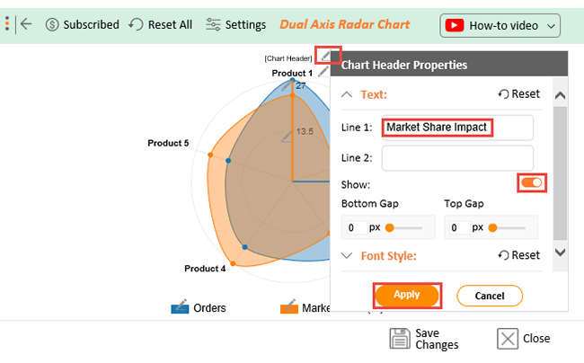
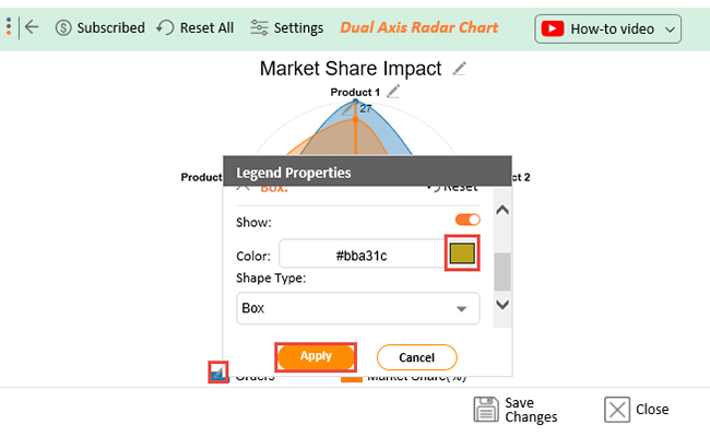
You can modify Excel charts to meet your specifications. You can alter the colors, fonts, and layouts to match your brand aesthetics.
You can quickly update your chart if any of its data changes. Based on the new data, Excel will automatically update the chart. This saves you from having to start from scratch with each update.
Excel charts are versatile. You can put them to a variety of uses, including data analysis and presentation for example a Sunburst chart.
Excel offers a variety of customization options; however, there are limitations to what you can accomplish. This necessitates using a third-party application to create a highly customized chart.
You can access several chart types in Excel, but others are not available. This necessitates utilizing a different tool, such as ChartExpo, if you require a specific chart type. Having said that, every existing chart and graph is available on ChartExpo, including advanced options like a Control chart in Excel for monitoring process stability and variations.
Excel charts are not very interactive. While you can add some interactivity, such as tooltips, there are limits to what you can do.
The most important thing about a chart is its ability to convey the relationship between data sets. Consequently, helps viewers understand the relationships better than reading blocks of text/numbers.
Choosing the right chart type depends on the following factors;
Therefore, you should choose the type of chart to use in Excel based on the factors above.
Sure, you can make your chart interactive. This enables you to increase its potency and make it more captivating for your viewers. ChartExpo is the finest tool available for creating interactive charts.
Excel is a potent tool for managing and analyzing data. Whether you’re working with financial data or sales figures doesn’t matter. Excel can help you make sense of it all.
One of the most valuable features of Excel is its charting ability to represent your data visually. Charts can help you spot trends, identify patterns, and communicate your findings to others clearly and concisely.
We have discussed how to add a chart in Excel and tips on which chart to use. These tips will help you create compelling data visualizations that facilitate insightful decision-making. Remember to always choose the right chart type for your data. Most importantly, keep it simple and easy to understand.
How do you do this?
Use ChartExpo for Excel.
This innovative Excel add-in simplifies the process of chart creation. With ChartExpo, you can create insightful charts with just a few clicks and no advanced Excel skills necessary.
Say goodbye to tedious charting.
Incorporate ChartExpo into your Excel and start creating charts like a pro.
How much did you enjoy this article?


Learn how to use sparklines in Excel to quickly visualize trends inside cells. Discover types, creation steps, customization, use cases, benefits, and best practices.

Learn what a confidence interval graph is, how to create it in Excel, and how to interpret results to make more reliable, data-driven decisions.

A correlation matrix in Excel helps identify relationships between variables. Learn how to create, read, and use it for effective data analysis.


