Categories
By ChartExpo Content Team
In today’s data-driven landscape, understanding information swiftly and decisively is paramount. Circular Charts, with their elegant arcs and precise divisions, offer more than just a snapshot – they are a strategic toolkit.
They distill intricate datasets into digestible insights, empowering decision-makers to spot patterns, identify outliers, and chart courses of action effortlessly. Here, data isn’t merely numbers; it’s a language that speaks volumes, and Circular Charts are your fluent interpreters.
Why are Circular Charts indispensable? Picture a compass guiding you through a sea of numbers, pointing towards trends, correlations, and anomalies that might otherwise go unnoticed. From pie charts that slice through market share complexities to radial bar charts that spotlight performance metrics, each format serves a unique purpose, ensuring your data isn’t just understood but embraced for its transformative potential.
So, buckle up as we embark on a journey through the art and science of Circular Charts. Let’s demystify their mechanics, explore their versatility, and unlock the insights they hold. Whether you’re a seasoned analyst or a curious novice, prepare to dive into a world where clarity meets precision, and where every arc tells a story worth knowing.
First…
Data used to be boring. Rows and columns, plain grids. Then, Circular Charts transformed dull data into vibrant visuals. Picture the shift from black-and-white TV to full-color. Circular Charts made data engaging, breaking the monotony with dynamic, eye-catching designs. They brought life to numbers, making them easier to understand and remember.
Why do we love Circular Charts? Simple. Our eyes are drawn to them. Circles are smooth, without sharp edges, making them naturally pleasing to look at. They stand out, grabbing attention instantly.
And once we’re hooked, they guide us through the data effortlessly. Think of a Ferris wheel, where every part is equally important. As a chart maker, you’ll find that Circular Charts balance information, making it all seem equally significant.
Circular Charts don’t just display data; they tell a story. Imagine a pie chart breaking down a budget, or a radar chart showing a company’s performance. Each slice, each spoke, is a chapter in a visual narrative. Traditional charts might show you the numbers, but Circular Charts explain them. They connect the dots, revealing patterns and trends in a way that’s both intuitive and insightful.
Our brains love circles. They’re wired to process radial designs quickly and efficiently. When we see a Circular Chart, we instantly get the whole picture. It’s like looking at a clock and understanding time at a glance. This natural processing makes Circular Charts powerful tools for communicating complex information swiftly and clearly.
Circular Charts are democratic. They give equal space to each data point, unlike bar graphs where longer bars steal the show. Imagine a round table where everyone has a voice.
Circular Charts foster balanced attention, ensuring no piece of data gets overshadowed. This equality helps in delivering a fair and comprehensive view of the information, making it an effective tool for information visuals that emphasize impartiality and clarity.
Circular Charts excel at showing connections. Think of a radar chart displaying skills or a pie chart illustrating market share. They offer a 360-degree view, uncovering relationships that linear charts might miss. This comprehensive perspective helps in understanding how different data points interact and influence each other.
Every Circular Chart has a center, the hub, anchoring the data. In a pie chart, it’s where all slices converge, and in a radar chart, it’s the origin of the spokes. This central focal point provides stability and context, helping us understand the chart’s structure and focus. However, it’s important to be aware of anchoring bias, as the central point or initial data can sometimes unduly influence our interpretation of the rest of the information.
Spokes and segments are the backbone of Circular Charts. They radiate from the center, organizing data into clear, distinct categories. Think of the spokes on a bike wheel, each one supporting the rim. These elements bring clarity, breaking down data into manageable, understandable pieces.
The outer rim of a Circular Chart is where the data culminates. It’s the edge, the boundary that gives the chart its shape. This rim is crucial for understanding the full scope of the data. It’s like the horizon, defining the limits and providing a complete view. Utilizing this space effectively ensures that all data points are represented and visible.
Circles break the mold. They offer a fresh, engaging way to display data. Unlike rows and columns, circles can show connections and patterns that linear formats miss. Think of them as the new frontier in data visualization.
Circles show connections. They make relationships clear. In a circle, everything links back to the center. You see how each part connects to the whole. This layout brings hidden relationships to light.
Circles pack in data. They make the most of limited space. With circles, you can show more information in a smaller area. This efficiency is great for dashboards and reports where space is tight.
Circles feel whole. They represent completeness. This sense of wholeness makes data in Circular Charts easier to understand. Our brains naturally find circles more pleasing and complete than lines.
Circles draw the eye. They focus attention. Overlapping circles create focal points that guide viewers through the data. This technique helps keep viewers engaged and focused on the key information.
Circles are memorable. Symmetry helps with recall. Circular Charts, like mandalas, use symmetry to make patterns stick in the mind. This boosts memory and makes the data more impactful.
Circles tell stories. They bring narratives full circle. Circular storytelling uses this shape to create engaging, memorable narratives. It makes the story feel complete and satisfying.
Circles match cycles and are great for illustrating patterns over time. When considering what a data analyst does, Circular Charts become particularly useful for visualizing cyclical data.
They represent time well and are perfect for displaying data on cycles and seasons. Circular Charts effectively highlight the repetitive nature of these patterns, making them clear and intuitive.
Circles show hierarchies. Concentric circles work well for nested data. They make it easy to see levels of information at a glance. This clarity is helpful for complex datasets.
Circles aid comparisons. They highlight differences. Circular layouts make comparing data straightforward. This intuitive approach helps viewers quickly grasp contrasts and trends.
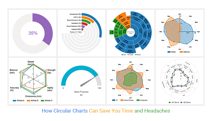
Circular Charts come in many forms, each with its unique strengths. Let’s explore three key types.
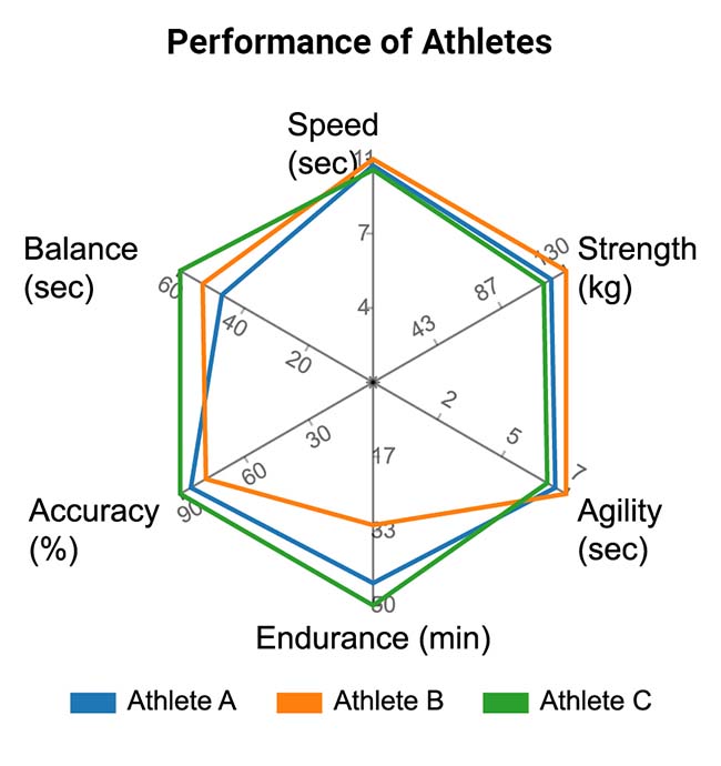
Radar or spider charts display multiple variables on a single chart. Each axis represents a different variable, and the data is plotted as a point on each axis. Connect these points, and you get a shape that shows the overall data pattern. This type of chart is perfect for comparing different entities across several metrics.
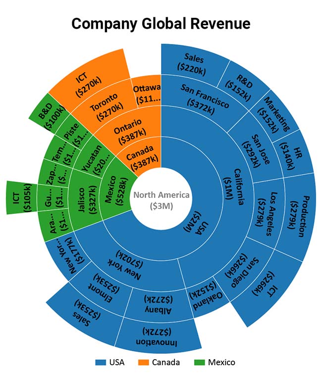
Sunburst charts take hierarchical data and present it in a nested circle layout. The innermost circle represents the top level of the hierarchy, and each layer outwards represents a deeper level. This chart lets you see the structure and relationships within your data, making complex hierarchies more accessible.
Circular bar charts are an innovative take on traditional bar charts. Bars extend radially from the center, creating a circular arrangement. This format is useful for ranking data and showing relationships among categories in a visually appealing way.
You can create a Circular Chart in your favorite spreadsheet. Follow the steps below to create a Circular Chart.
The following video will help you to create a Circular Chart in Microsoft Excel.


Choosing the right Circular Chart for your data can be a challenge. Here’s a guide to help you decide.
Circular Charts can show time-based data effectively, but they’re best for data with clear, repeating patterns. Think about using a polar area chart to show seasonal variations or cycles.
The key to a good circle graph is getting the proportions right. Each segment must reflect its part of the whole accurately. Keep your segments meaningful and avoid overloading the chart with too many slices, which can lead to information overload and make interpretation difficult.
Sometimes, one layer isn’t enough. Multi-layer charts, like nested pie charts, allow you to show more detail. Use these when you need to display complex data with multiple dimensions.
Ready to take your Circular Charts to the next level? Here are some advanced techniques to consider.
Layering data in your charts adds depth and context. For instance, combining a pie chart with an outer ring of additional data can provide a more comprehensive view. This technique helps in making connections between different data points clear.
Interactive and animated charts engage your audience and make data exploration more intuitive. Tools like ChartExpo let you create dynamic visuals, including a Scatter chart, that respond to user inputs and bring your data to life.
Every dataset has its story. Customize your charts to highlight the most important aspects of your data. Change colors, adjust labels, or add annotations to ensure your message is clear and impactful.
Imagine drawing circles with ancient wisdom in mind. The Golden Ratio guides our eyes and helps balance our charts. Use it to place elements in a way that feels natural and balanced.
Negative space, or empty areas, can make your chart stand out. Leave some parts blank to highlight key areas. This helps the audience focus on what matters most.
Text on a curve needs to be clear. Use fonts that are easy to read. Keep the text size consistent. Place text strategically to avoid clutter.
Colors tell stories. Use color theory to make your data pop. Complementary colors help segments stand out. Analogous colors create harmony.
Patterns add depth. Use different textures to differentiate segments. This makes your chart visually appealing and easy to understand.
Gradients can guide the eye. Use them to show progression or highlight important parts. Soft transitions can create a 3D effect, making your chart more engaging.
Start with rough sketches. Draw circles and segment them. Think about what data you want to show and how to arrange it. This is your creative playground.
Build a rough draft of your chart. Use software to test different layouts. Don’t be afraid to make changes. Iterate until your chart communicates clearly.
Time for the final touches. Check for clarity. Make sure all elements are balanced. Adjust colors, text, and spacing. A polished chart is clear and impactful.
Circular charts are important for tracking business metrics, much like an IELTS band score chart for visualizing language proficiency. These charts make complex data simple to grasp at a glance. Picture a pie chart showing how each department contributes to revenue, or an IELTS band score chart displaying proficiency levels. Both are clear, easy to read and help teams or individuals focus on what’s working.
These charts let you see performance trends, making it easier to spot what’s driving success. Use them to highlight areas needing improvement, ensuring everyone stays on the same page.
Want to understand your position in the market? Circular Charts are your best friend. They show market shares, highlighting competitors and your slice of the pie. This visualization helps you quickly grasp who the major players are and where you fit in.
It’s a powerful way to strategize, identify growth opportunities, and make informed decisions. Think of these charts as a snapshot of the competitive landscape, making complex market data easy to digest.
Sustainability is key in today’s business world. Circular Charts help illustrate how your company contributes to a sustainable economy. They can show how resources are recycled and reused, highlighting your commitment to the environment.
These charts are ideal for sharing your green initiatives with stakeholders, making the impact of your efforts clear and compelling. By visualizing sustainable practices, you can inspire confidence and promote eco-friendly business models.
In genomics, data can be overwhelming. Circular Charts, like genomic wheels, simplify this complexity. They map out genetic information in a clear, visual way. Researchers can see relationships between genes and spot patterns that might be missed in traditional charts. These wheels are invaluable for understanding the intricacies of genetic data, making complex information accessible and actionable.
Climate change data is vast and varied. Circular Charts, or climate clocks, help make sense of this data by displaying long-term trends in an easy-to-understand format. They can show temperature changes over decades, highlight seasonal variations, and illustrate the impact of human activities on the environment. These visual tools are essential for communicating the urgency of climate issues to a broad audience.
In physics and chemistry, atomic orbitals are often represented in circular formats. These charts offer a precise and clear visualization of electron positions and behaviors. They help students and researchers alike grasp fundamental concepts in atomic theory. By using Circular Charts, complex scientific models become more intuitive, enhancing learning and discovery.
Understanding population data is vital for policy and planning. Circular Charts, such as demographic discs, display population distributions and trends. They can show age groups, gender distributions, and other demographic factors in a visual format that’s easy to interpret. These charts help demographers, policymakers, and researchers make informed decisions based on clear, accessible data.
Social networks are complex, but Circular Charts simplify them. They map relationships and influence patterns, showing how individuals or groups connect. This visualization helps identify key influencers and understand social dynamics. Businesses can use these charts to target marketing efforts, while researchers can study social behaviors and trends effectively.
Global studies often involve comparing cultures and perspectives. Circular Charts, or cultural compasses, make this comparison straightforward. They can represent various cultural dimensions, such as values, practices, and beliefs, in a visual format. These charts help highlight similarities and differences, promoting a better understanding of global diversity. They are valuable tools for educators, researchers, and anyone interested in cultural studies.
Circular Charts can get messy with too much data. Simplify by grouping similar data points. This reduces clutter and highlights key trends. Think of it as trimming the fat to reveal the core insights.
Ever wished you could dig deeper into a specific segment? Implement drill-down features. Click on a slice to explore its details. This keeps the main chart clean while offering depth when needed.
Legends are the map of your data. Place them smartly around the chart. Use clear labels and distinct colors. An intuitive legend makes even the busiest charts understandable.
Not all data points are equal. Large segments can overshadow smaller ones. Use techniques like exploding slices to highlight smaller, significant data. Ensure every piece of the pie gets its due attention.
Outliers can distort the whole chart. Consider using separate indicators for extreme values. This keeps the chart balanced and accurate without losing critical information.
Too much detail overwhelms too little and leaves questions. Find the sweet spot. Tailor the chart’s complexity to your audience’s knowledge level. The right balance keeps everyone informed and engaged.
Color choices matter. Use patterns and textures along with colors to make charts readable for everyone. This ensures your data speaks clearly to all viewers.
Alt text provides context for visually impaired users. Describe the main points and trends of the chart. Keep it concise yet informative. This way, everyone gets the story your data tells.
Audio descriptions can make data accessible to those with visual impairments. Narrate the chart’s key insights in a logical flow. This turns your visual data into a universally understandable format.
Ever noticed how some images just feel right? That’s the Rule of Thirds at work. Divide your circle into thirds. Place key elements along these lines or their intersections. This technique balances your chart and draws the viewer’s eye naturally to important data points.
Symmetry provides balance, but asymmetry grabs attention. Use symmetry to create a harmonious look when showing stable data. Break symmetry to highlight changes or contrasts. Know when to maintain order and when to introduce a bit of chaos for effect.
Don’t fear space. In Circular Charts, white space can clarify and emphasize. It gives the eyes a place to rest and helps viewers focus on key data. Use it strategically to avoid clutter and enhance readability.
Circular charts can distort data if not used carefully. Ensure segments are proportional to the data they represent. Misleading charts confuse and misinform. Double-check your math and keep proportions accurate to avoid misleading visuals.
Too much data crammed into one circle? Step back and simplify. Highlight the most important points. Use labels and colors wisely. If your chart feels crowded, it probably is. Simplify for clarity.
Comparing data in Circular Charts can be tricky. Avoid using them for direct comparisons between many categories. If you must, use consistent colors and clear labels. Consider other chart types for more straightforward comparisons.
Your chart needs to look good everywhere. Adjust size, resolution, and details based on where it’ll be seen. Screens offer vibrant colors and interactivity, while print needs clarity and simplicity. Optimize for the medium.
Your charts should look great on any device. Test them on different screen sizes. Ensure they’re readable on both large monitors and small smartphones. Flexibility is key. Keep the user experience consistent.
Social media demands eye-catching visuals. Make your Circular Charts pop. Use bold colors and clear fonts. Keep them simple and impactful. Shareable graphics get more engagement. Tailor your design for the platform’s specifics.
Circular Charts are intuitive. They help in comparing parts of a whole. Their shape is familiar, making them easy to understand. They’re visually appealing and can make data stand out.
Radar charts show multiple variables on a circular grid. They are used to compare several groups across different categories. Each axis represents a category. Data points are connected to form a shape. They are great for showing strengths and weaknesses.
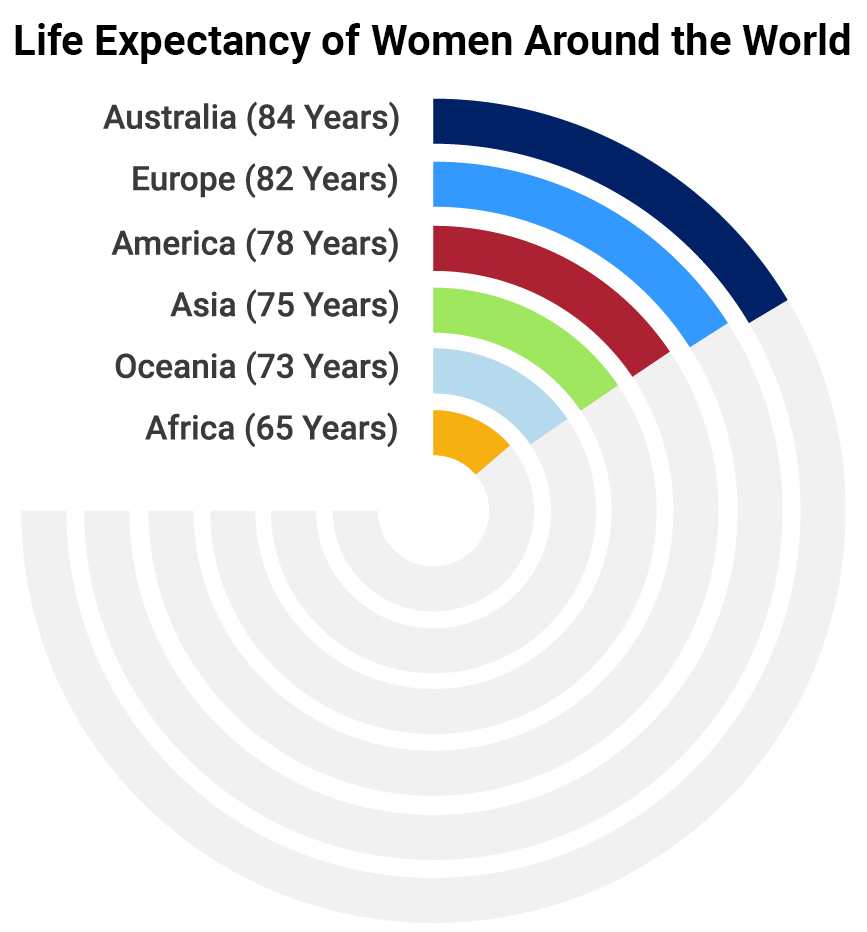
Polar area charts are a mix of pie charts and radar charts. They show data in sectors that extend from the center. The size of each sector represents a value. They are useful for showing data trends and distributions over time.
Keep it simple. Use clear labels and contrasting colors. Limit the number of categories to maintain clarity. Provide a legend if needed. Ensure the chart is easy to read and interpret.
Yes, Circular Charts can be interactive. Interactive charts allow users to hover over slices for more details. This can enhance understanding and engagement. Many tools offer features to create interactive charts.
No. Circular Charts are best for categorical data representing parts of a whole. They’re not suitable for time series data or data that doesn’t sum up to a whole.
You’ve explored Circular Charts inside and out. You’ve seen how pie charts slice data, how radar charts show many variables, and how sunburst charts reveal hierarchies. Circular Charts are great for storytelling. They make patterns easy to spot, help you see relationships, and turn numbers into clear visuals.
Circular Charts make data more engaging and easier to understand. They break away from the usual bar and line charts, giving a fresh perspective. They help you see connections and patterns that aren’t obvious in other chart types. Circular thinking means seeing the whole picture and how parts connect. This way of thinking can change how you approach data.
Circular Charts will keep growing in popularity. They offer a unique way to present data that sticks with people. As data grows, the need for clear, engaging ways to show it will grow too. Circular Charts will be a key tool in this. They make complex information easy to digest and can be used in many fields, from business to education.
Ready to create your Circular Charts? There are many tools to help. Programs like ChartExpo save time and are easy to use. Explore how-to tutorials and YouTube videos to learn new tricks and get inspired.
Practice makes perfect. Try creating a pie chart from your monthly expenses. Make a radar chart to track your fitness progress. Design a sunburst chart to show your family tree. These exercises will help you get comfortable with different types of Circular Charts and improve your design skills.
Join groups that focus on data visualization. Look for online communities, forums, and social media groups. Share your work, ask questions, and learn from others. Participating in these groups will keep you updated on the latest trends and techniques.
Learning about Circular Charts doesn’t end here. Keep exploring new ways to use them. Stay curious and open to new ideas. The more you learn, the better you’ll use these charts to tell stories with your data.
Circular thinking isn’t just for data. Use it in other areas too. Look at problems from all angles. Think about how different parts connect and impact each other. This approach can lead to new insights and better solutions in your work and personal life.
You’re now part of a growing community of data enthusiasts. Keep sharing your work and learning from others. Data visualization is always evolving, and there’s always something new to discover. Your journey with Circular Charts is just beginning. Keep exploring, experimenting, and pushing the boundaries of what’s possible.
How much did you enjoy this article?


Calculate accounts receivable turnover ratio to measure credit collection speed, improve cash flow, and strengthen your financial strategy. Read on!

Change Management KPIs are the key to tracking adoption, performance, and ROI during transitions. Find out which metrics matter. Read on!

Data collection methods and techniques determine the quality of every insight you act on. Explore key approaches for gathering reliable data. Read on!


