• Home
  • Tools dropdown img
    • Spreadsheet Charts

      • ChartExpo for Google Sheets
      • ChartExpo for Microsoft Excel
    • Power BI Charts

      • Power BI Custom Visuals by ChartExpo
    • Word Cloud

  • Charts dropdown img
    • Chart Category

      • Bar Charts
      • Circle Graphs
      • Column Charts
      • Combo Charts
      • Comparison Charts
      • Line Graphs
      • PPC Charts
      • Sentiment Analysis Charts
      • Survey Charts
    • Chart Type

      • Box and Whisker Plot
      • Clustered Bar Chart
      • Clustered Column Chart
      • Comparison Bar Chart
      • Control Chart
      • CSAT Survey Bar Chart
      • CSAT Survey Chart
      • Dot Plot Chart
      • Double Bar Graph
      • Funnel Chart
      • Gauge Chart
      • Likert Scale Chart
      • Matrix Chart
      • Multi Axis Line Chart
      • Overlapping Bar Chart
      • Pareto Chart
      • Radar Chart
      • Radial Bar Chart
      • Sankey Diagram
      • Scatter Plot Chart
      • Slope Chart
      • Sunburst Chart
      • Tornado Chart
      • Waterfall Chart
      • Word Cloud
    • Google Sheets
      Microsoft Excel
  • Services
  • Pricing
  • Contact us
  • Blog
  • Support dropdown img
      • Gallery
      • Videos
      • Contact us
      • FAQs
      • Resources
    • Please feel free to contact us

      atsupport@chartexpo.com

Categories
All Data Visualizations Data Analytics Surveys
Add-ons/
  • Google Sheets
  • Microsoft Excel
  • Power BI
All Data Visualizations Data Analytics Surveys
Add-ons
  • Google Sheets
  • Microsoft Excel
  • Power BI

We use cookies

This website uses cookies to provide better user experience and user's session management.
By continuing visiting this website you consent the use of these cookies.

Ok

ChartExpo Survey


Home > Blog > Data Analytics

Gross Annual Sales Mastery: A Visual Journey to Success

Gross Annual Sales – the money talk we all love to hate. It’s that magical number that can make or break a business. However, deciphering it can be like decoding hieroglyphics with a blindfold on.

Gross Annual Sales

Fear not, for Excel is here to save the day.

Excel possesses an array of tools and functions to analyze your gross sales like a pro. With the deft strokes of your keyboard, Excel unveils the secrets hidden within those digits. Thus, you can uncover the hidden treasures of your sales volumes and identify those high-impact revenue channels.

Not only can Excel help you analyze your gross sales, it can do it with style. You don’t have to settle for boring charts and graphs. With the right tools and a little bit of creativity, you can turn your data into a work of art.

It’s time to unleash the power of Excel and analyze your gross sales like a pro. You’ll slice, dice, pivot, and plot until the numbers confess their tales.

Let’s Excel together.

Table of Contents:

  1. What is Gross Annual Sales?
  2. Importance of Gross Annual Sales
  3. How to Calculate Gross Annual Sales?
  4. Analyze Gross Sale
  5. Wrap Up

What is Gross Annual Sales?

Gross Annual Sales, in essence, represent a company’s total revenue over a year. It’s the money generated before subtracting expenses, discounts, or returns. This metric indicates revenue-generating capabilities, offering insight into business financial performance. Simply, it’s the big picture of a company’s annual income before the nitty-gritty deductions come into play.

Why is It Important for Businesses to Track Gross Annual Sales?

Tracking Gross Annual Sales is vital for a multitude of reasons:

  1. Financial performance assessment: It serves as a key indicator of a company’s financial health and performance. A rising trend indicates growth, while a decline might signal trouble.
  2. Profitability analysis: You see, high sales don’t guarantee treasure chests of profit. Gross Annual Sales, when compared to expenses, unveils the accurate financial picture.
  3. Budgeting and planning: Gross Annual Sales helps chart your financial course. You can set budgets, plan for the future, and avoid dangerous economic storms.
  4. Investor and stakeholder confidence: Investors and stakeholders want to know you’re heading somewhere profitable. Sales data reassures them, boosting their trust and confidence in your venture.
  5. Strategic decision-making: Picture yourself at a crossroads in your business journey. Which path do you take? Annual Sales provides the signposts, helping you make informed choices.
  6. Tax compliance: Tax authorities often require businesses to report gross sales for tax assessment. Accurate tracking ensures compliance and minimizes tax-related issues.
  7. Benchmarking: How fast are your competitors sailing? Gross Sales helps you compare and see if you’re racing ahead or need to catch up.
  8. Long-term sustainability: Tracking sales reveals trends that can help you adapt to changing market conditions and ensure long-term sustainability.
  9. Performance metrics: Annual Sales serve as a critical performance metric. You can use it to assess the effectiveness of sales teams, marketing efforts, and overall business strategies.
  10. Historical data: Over time, this data forms a historical record. It provides insights into growth patterns, cyclical trends, and seasonality, aiding future decision-making.

Different Ways to Calculate Gross Annual Sales

Calculating Gross Annual Sales isn’t a one-size-fits-all affair; it’s more like choosing the right tool for the job. Here are ten different methods to crunch those numbers:

  • Direct Calculation

This is the simplest approach, where you add all the sales transactions made during the year. It’s like counting the money in your wallet.

Gross Annual Sales = Total Revenue from All Sources

  • Sales by Product/Service Category

This approach is useful for businesses with diverse product/service lines. It allows you to analyze the performance of individual categories. As a result, you can identify top-performing items and those that need improvement.

Gross Annual Sales = Sales Category 1 + Sales Category 2 + …

  • Point of Sale (POS) System

Modern businesses often rely on POS systems that automatically track and record sales as they happen. This method makes it easy to obtain real-time and annual sales data.

  • Sales by Location

This method is ideal for businesses with multiple branches. You can calculate sales for each location separately. It helps to identify high-performing and underperforming branches.

Gross Annual Sales = Sum of sales from each location

  • Quarterly/Monthly Calculation

Some businesses calculate Sales quarterly or monthly instead of looking at the entire year at once. This allows for more frequent performance assessments and adjustments.

Gross Annual Sales = Q1 Sales + Q2 Sales + Q3 Sales + Q4 Sales

  • Sales by Customer Segment

Segmenting customers by demographics or behavior lets you analyze which groups contribute the most to your sales. Consequently, this enables targeted marketing and sales strategies.

Gross Annual Sales = Sum of sales from each customer segment

  • Sales by Salesperson/Team

This method tracks individual or team performance, helping with commission calculations and identifying top performers.

Gross Annual Sales = Sum of sales for each salesperson or team

  • Sales by Channel

Assume you sell through various channels (e.g., online, in-store, through distributors). Analyzing sales by channel helps to reveal which ones are the most profitable.

Gross Annual Sales = Sum of sales from each sales channel

  • Accrual Accounting

This method records sales when earned, not when the cash is received. It’s more reflective of the business’s financial health, especially if you offer credit terms to customers.

Gross Annual Sales = Sales Earned – Sales Unearned (if any)

  • Cash Accounting

In contrast to accrual accounting, this method records sales when the cash is received. It’s simpler but might not accurately represent long-term financial performance.

Gross Annual Sales = Sales recorded when payment is received

How Do You Analyze Your Gross Annual Sales?

Data, they say, is the new gold. But let’s be real; raw data is about as exciting as watching paint dry on a spreadsheet. That’s where data visualization steps in, like a wizard casting a spell on those dull numbers.

Excel, the trusty spreadsheet sorcerer, can do some tricks. However, it’s no David Copperfield of data visualization.

So, how do you analyze your Annual Sales in Excel and transform it into a mesmerizing spectacle? Enter ChartExpo, your magical wand for turning data into dazzling, insightful visuals.

Benefits of Using ChartExpo

  • ChartExpo’s extensive repertoire of visualizations lets you handpick the perfect one for your data. Consequently, it makes data analysis and presentation a breeze.
  • Navigating ChartExpo’s user-friendly interface is as effortless as a stroll in the park. No coding wizardry is required; it empowers you to conjure insightful charts like a seasoned data sorcerer.
  • ChartExpo grants you visual superpowers and lets you unleash your creativity. Customize colors, fonts, and styles to sculpt your visuals into unique masterpieces that reflect your style.
  • Talk about bang for your buck! ChartExpo is as generous as a Vegas buffet. It throws in a 7-day trial for free. And its $10 monthly plan is the budget-conscious data lover’s dream come true.

How to Install ChartExpo in Excel?

  1. Open your Excel application.
  2. Open the worksheet and click the “Insert” menu.
  3. You’ll see the “My Apps” option.
  4. In the office Add-ins window, click “Store” and search for ChartExpo on my Apps Store.
  5. Click the “Add” button to install ChartExpo in your Excel.

ChartExpo charts are available both in Google Sheets and Microsoft Excel. Please use the following CTA’s to install the tool of your choice and create beautiful visualizations in a few clicks in your favorite tool.

Example

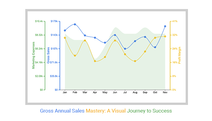
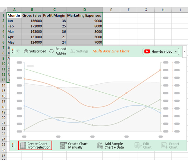
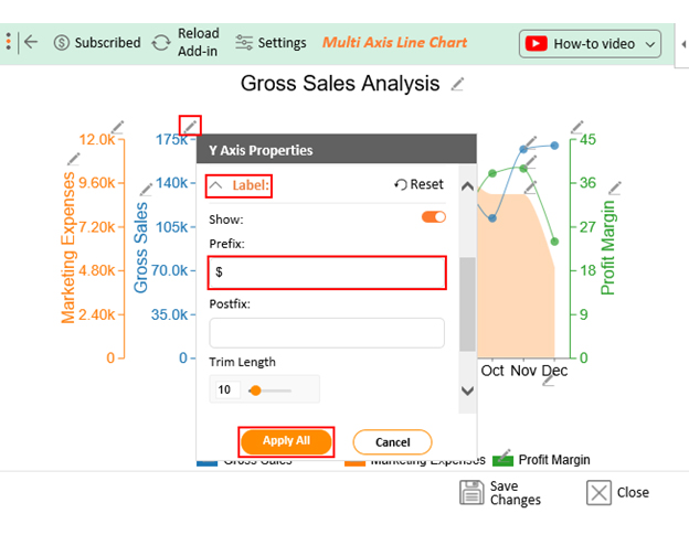
Let’s say you want to analyze the company data below on Gross Sales, Profit Margin, & Marketing Expenses.

Months Gross Sales Profit Margin Marketing Expenses
Jan 156000 38 9000
Feb 172000 25 8000
Mar 143000 36 8000
Apr 137000 21 5000
May 124000 24 7000
Jun 144000 36 10000
Jul 108000 26 9000
Aug 128000 21 9000
Sep 139000 28 10000
Oct 112000 38 9000
Nov 167000 39 9000
Dec 170000 24 5000

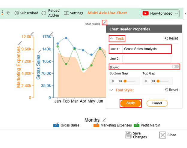
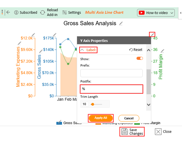
This analysis requires a chart with more than one axis. Thus, the Multi-Axis Line Chart suits this situation. Follow the steps below to learn how to create a Multi-Axis Line Chart in Excel with ChartExpo.
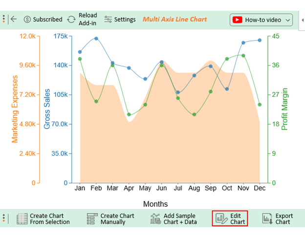
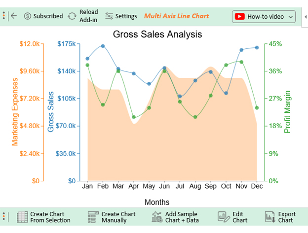
  • To get started with ChartExpo, install ChartExpo in Excel.
  • Now Click on My Apps from the INSERT menu.
insert chartexpo in excel
  • Choose ChartExpo from My Apps, then click Insert.
open chartexpo in excel
  • Once it loads, scroll through the charts list to locate and choose the “Multi-Axis Line Chart”.
search multi axis line chart in excel
  • Click the “Create Chart From Selection” button after selecting the data from the sheet, as shown.
Create Chart From Selection ce454
  • ChartExpo will generate the visualization below for you.
Gross Annual Sales Design Template
  • If you want to have the chart’s title, click Edit Chart, as shown in the above image.
  • Click the pencil icon next to the Chart Header to change the title.
  • It will open the properties dialog. Under the Text section, you can add a heading in Line 1 and enable Show.
  • Give the appropriate title of your chart and click the Apply button.
Apply Tittle on Chart ce454
  • Let’s add the Prefix (e.g., $ sign) with the advertising spending scale in the chart.
  • Click the highlighted pencil icon. Expand the “Label” properties to add the Prefix value (e.g., $ sign).
Apply Label on Chat ce454
  • Let’s add the Postfix (e.g., % Sign) with the Bounce Rate scale in the chart.
  • Click the highlighted pencil icon. Expand the “Label” properties to add the Postfix value (e.g., % sign).
  • To persist the changes made to the chart, you can click on the “Save Changes” button.
Apply Postfix Value on Chat ce454
  • Your final chart will look like the one below.
Final Gross Annual Sales

Insights

Gross Sales Trends

  • February and December stole the show with the highest gross sales, each surging past the $170,000 mark. July took the back seat, with sales hovering around $108,000.
  • Gross sales danced to their rhythm throughout the year, swaying to the tune of seasonal shifts or the impact of various marketing endeavors.

Profit Margin Trends

  • The profit margins fluctuate throughout the year, with the lowest recorded in April at 21% and the highest in November at 39%.
  • It’s imperative to look into the reasons behind November’s remarkable profit margin surge. Then, explore the potential for replicating this success in the other months.

Marketing Expenses

  • Marketing expenses show a merry-go-round pattern, reaching their zenith in June, September, and October, where the bill hits $10,000. April and December take it easy, clocking in at a modest $5,000.

Profitability Analysis

  • Investigate the intricate dance between profit margins, gross sales, and marketing expenses. This will help to identify the most lucrative months and whether boosting marketing spending leads to augmented profit margins.

The following video will help you to create the Multi-Axis Line Chart in Microsoft Excel.

FAQs

Is annual sales the same as gross profit?

No, annual sales and gross profit are not the same. Annual sales refer to the total revenue generated from sales of goods or services. Gross profit is the amount left after subtracting the cost of goods sold from total revenue.

Why is it called gross sales?

It’s called “gross sales” because it represents a business’s total revenue before any deductions or expenses. It’s the raw, unadjusted figure, giving the “gross” or comprehensive view of a company’s sales.

What are the gross annual sales on a balance sheet?

Gross annual sales don’t appear on a balance sheet. Balance sheets focus on a company’s assets, liabilities, and equity. Gross sales are found in the income or profit and loss statements.

Wrap Up

In business, the tale of Gross Annual Sales unfolds as a critical narrative. Analyzing this financial epic in Excel has been our quest. It’s safe to say that the journey has been both enlightening and empowering.

With its familiar interface and versatile tools, Excel serves as a trusty guide on this expedition. It offers a range of methods to dissect and understand the story behind the numbers.

You can break down sales by product categories, locations, or customer segments, allowing nuanced insights. Excel provides the canvas and the colors to paint a vivid picture of financial performance.

Yet, Excel has its limitations, particularly in data visualization. It falls short of delivering the visually captivating representations that modern businesses crave. This is where ChartExpo comes to the rescue, transforming mundane data into captivating, insightful visual tales.

In the grand finale, remember that Gross Sales aren’t just about figures. It’s the heartbeat of a business, the pulse of prosperity. Analyzing it is a strategic endeavor that shapes the course, fuels decision-making, and ensures financial health. With Excel and ChartExpo, your Gross Annual Sales story will always be one of growth, wisdom, and prosperity.

How much did you enjoy this article?

GSAd1
Start Free Trial!
130256

Related articles

next previous
Data Analytics12 min read

Business Intelligence in Healthcare Industry: A Visual Approach

Business Intelligence in the healthcare industry improves patient care and streamlines operations. Learn how BI works and benefits healthcare providers.

Data Analytics10 min read

Analytics in Telecom Industry for Better Insights

Analytics in the telecom industry optimizes networks, enhances customer experience, and detect fraud. Learn its key benefits, challenges, and use cases.

Data Analytics7 min read

Financial Forecasting for Startups: A Complete Guide

This guide dives deep into financial forecasting for startups. You'll also discover elements of a financial projection for a startup, and tips for creating one.

Data Analytics32 min read

Data Reporting: Making Your Reports Irresistible

Data reporting turns numbers into insights that guide decisions. Learn how to simplify complex data and make confident choices. Read on for key strategies!

Data Analytics10 min read

Employee Performance KPIs: Insights That Drive Action

Employee performance KPIs track productivity and success. Learn the key metrics, measurement methods, and analysis techniques to boost performance.

ChartExpo logo

Turn Data into Visual
Stories

CHARTEXPO

  • Home
  • Gallery
  • Videos
  • Services
  • Pricing
  • Contact us
  • FAQs
  • Privacy policy
  • Terms of Service
  • Sitemap

TOOLS

  • ChartExpo for Google Sheets
  • ChartExpo for Microsoft Excel
  • Power BI Custom Visuals by ChartExpo
  • Word Cloud

CATEGORIES

  • Bar Charts
  • Circle Graphs
  • Column Charts
  • Combo Charts
  • Comparison Charts
  • Line Graphs
  • PPC Charts
  • Sentiment Analysis Charts
  • Survey Charts

TOP CHARTS

  • Sankey Diagram
  • Likert Scale Chart
  • Comparison Bar Chart
  • Pareto Chart
  • Funnel Chart
  • Gauge Chart
  • Radar Chart
  • Radial Bar Chart
  • Sunburst Chart
  • see more
  • Scatter Plot Chart
  • CSAT Survey Bar Chart
  • CSAT Survey Chart
  • Dot Plot Chart
  • Double Bar Graph
  • Matrix Chart
  • Multi Axis Line Chart
  • Overlapping Bar Chart
  • Control Chart
  • Slope Chart
  • Clustered Bar Chart
  • Clustered Column Chart
  • Box and Whisker Plot
  • Tornado Chart
  • Waterfall Chart
  • Word Cloud
  • see less

RESOURCES

  • Blog
  • Resources
  • YouTube
SIGN UP FOR UPDATES

We wouldn't dream of spamming you or selling your info.

© 2025 ChartExpo, all rights reserved.