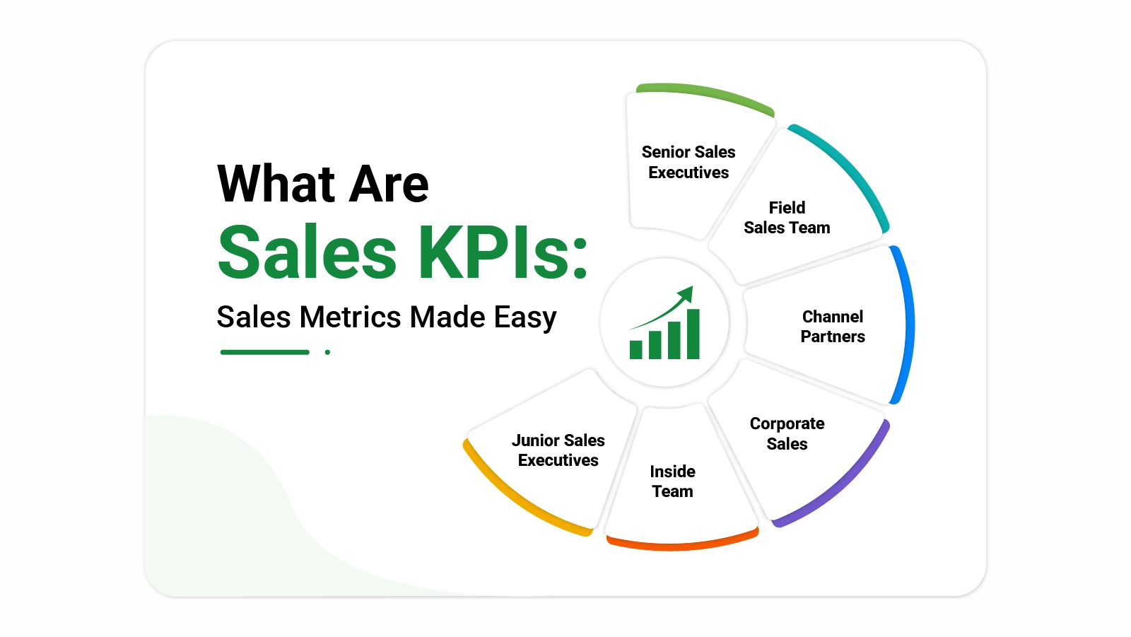
Categories
Revenue targets mean nothing without a reliable system to measure progress against them, for any organization with a dedicated sales function.
What sales KPIs are not just a useful question but a strategically critical one, because these indicators convert raw activity data into structured performance signals that leaders can analyze and act on with genuine confidence.
In this blog, you will learn which indicators matter most, how to choose the right ones for your specific business context, how to track and analyze them using a spreadsheet tool, and how consistent measurement leads to stronger decisions and better revenue outcomes over time.
Definition: What are sales KPIs? They are quantifiable performance measures that tell a business whether its sales team is meeting targets and generating revenue at the expected rate.
Rather than relying on intuition, companies use these indicators to turn activity into evidence, making it possible to spot problems early and redirect effort where it will have the greatest impact.
Each KPI provides a snapshot of a specific aspect of performance, from how quickly leads convert to how much each closed deal contributes to revenue.
Taken together, sales KPIs give managers a comprehensive view of results, making it far easier to compare performance across periods, refine forecasting accuracy, and ensure that daily activity stays aligned with broader objectives.
Businesses that understand what are sales KPIs gain a structured foundation for performance management and strategic planning.
Understanding what are sales KPIs also means knowing how they differ from general sales data points. A metric records any measurable activity or output, while a KPI is a carefully chosen indicator tied directly to a critical business objective. Not every measurement qualifies, and conflating the two leads to reporting overload without actionable focus.
KPIs are chosen with a specific goal in mind, and practitioners often turn to smart KPI to ensure each selected indicator is precise, measurable, and actionable. A daily call count is a metric that records activity; a monthly conversion rate is a KPI because it reveals whether that activity is translating into actual business results.
Part of knowing what are sales KPIs is knowing which specific measures matter most. Certain indicators appear consistently across industries because they capture the dimensions of performance that drive results: growth, efficiency, and the quality of customer relationships.
Tracks how much revenue has grown compared to a previous period, giving a clear signal of whether the business is expanding.
Shows the share of leads that become paying customers, often reviewed alongside b2b marketing KPIs to assess how well campaigns feed the pipeline.
Calculates the typical value of a closed deal, revealing how much revenue each individual sale contributes on average.
Quantifies the total investment required to bring one new customer on board, covering both marketing spend and sales effort.
Records the average duration from first contact to a signed agreement, highlighting where delays slow the closing process.
Projects the total revenue a single customer is expected to generate across the full span of the business relationship.
Measures the time between a new inquiry arriving and the sales team making first contact, a factor that can strongly influence conversion rates.
Breaks down revenue results by geography, and can connect with logistics KPIs to reveal how distribution patterns affect overall performance.
Expresses the proportion of pursued deals that resulted in a close, reflecting the overall effectiveness of the team’s sales approach.
Tracks the percentage of customers who continue purchasing over time, often evaluated together with customer satisfaction KPI to gauge long-term loyalty.
Selecting the right sales key performance indicators begins with a clear understanding of what the business is trying to achieve.
An organization focused on rapid expansion will prioritize different measures than one aiming to improve margin or deepen existing customer relationships. Relevance to actual goals is the primary selection criterion.
Beyond relevance, a useful indicator must be measurable, consistently trackable, and actionable. Many businesses cross-reference their choices against quality KPIs to confirm that the selected measures are both accurate and meaningful, ensuring that performance reviews are built on dependable data rather than imprecise approximations.
Seeing what are sales KPIs in practice makes the concept more concrete. The following examples show how specific indicators represent performance across different dimensions.
This chart displays each sales category’s progress against its revenue target as a percentage, making it straightforward to compare output across teams at a glance.
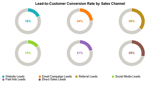
This visualization maps conversion rates by lead source, showing which acquisition channels produce the highest proportion of paying customers and which fall short.
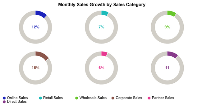
This example tracks month-over-month growth rates across sales channels, revealing which segments are gaining momentum and which require attention.
Once you know what are sales KPIs, the next step is setting up a reliable system to capture and organize the data. A spreadsheet is a practical starting point, provided it is structured clearly and updated on a consistent schedule.
Knowing what are sales KPIs is only part of the picture. Meaningful analysis requires comparing results against targets, examining patterns over time, and identifying the specific areas where performance is falling short of expectations.
Compare results with targets set in your sales plan Excel template to check progress.
Study past data to see growth, decline, or sudden changes in performance.
Analyze results across teams, regions, or products to find strengths and gaps.
Create charts to highlight patterns and make data easier to understand.
Identify low results and investigate the reasons behind them.
Update targets and plans based on insights to improve future performance.
Applying what are sales KPIs effectively means presenting data in a format that supports fast interpretation.
For more complex data sets, dedicated visualization tools surface patterns that basic spreadsheet charts may not present clearly enough for rapid decisions.
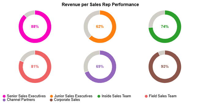
The dashboard shows revenue performance by sales roles, with Corporate Sales (93%) and Senior Sales Executives (88%) leading, while Junior Sales Executives (62%) lag behind.
Using ChartExpo, these donut charts highlight performance gaps across teams like Inside Sales (74%), Field Sales (81%), and Channel Partners (69%) for quick comparison.

What are sales KPIs without a plan to put them to work? Collecting data is only the first step. The real value comes from applying it to shape decisions, direct strategy, and hold teams accountable to shared targets.
Putting our sales KPIs to work through consistent tracking delivers compounding advantages, improving both day-to-day decisions and long-term strategic planning.
Getting the most from what are sales KPIs requires structured, disciplined monitoring. Sales key performance indicators only deliver sustained value when tracking is consistent. The following habits help teams extract reliable insight from their data.
A strong KPI connects directly to a specific business objective and can be measured consistently over time.
Answering what sales KPIs for your business are means starting with measures like conversion rate, revenue growth, customer retention, and average deal size.
The right choice depends on the stage and goals of the organization.
Knowing what are sales KPIs means having objective data to evaluate whether targets are being met.
Regular reviews allow teams to detect patterns, compare results across periods, and adjust before small gaps become larger problems.
Specific performance targets give team members something concrete to work toward.
Clear indicators allow individuals to monitor their own progress, understand where they stand against goals, and take ownership of their results.
For managers, the same data makes it straightforward to recognize strong performance and address shortfalls early.
Knowing what sales KPIs are is the essential first step toward building a sales function that runs on evidence rather than assumptions.
The indicators explored in this blog represent the core measures that high-performing teams use to evaluate progress, detect problems early, and sharpen their approach with each review cycle.
Selecting the right KPIs for your business, tracking them on a consistent schedule, and acting on what the data reveals creates a performance feedback loop that supports continuous improvement.
Teams that build this discipline into routine operations are better placed to hit targets, strengthen customer relationships, and achieve growth that holds up over time.
How much did you enjoy this article?


Calculate accounts receivable turnover ratio to measure credit collection speed, improve cash flow, and strengthen your financial strategy. Read on!

Change Management KPIs are the key to tracking adoption, performance, and ROI during transitions. Find out which metrics matter. Read on!

Data collection methods and techniques determine the quality of every insight you act on. Explore key approaches for gathering reliable data. Read on!


