• Home
  • Tools dropdown img
    • Spreadsheet Charts

      • ChartExpo for Google Sheets
      • ChartExpo for Microsoft Excel
    • Power BI Charts

      • Power BI Custom Visuals by ChartExpo
    • Word Cloud

  • Charts dropdown img
    • Chart Category

      • Bar Charts
      • Circle Graphs
      • Column Charts
      • Combo Charts
      • Comparison Charts
      • Line Graphs
      • PPC Charts
      • Sentiment Analysis Charts
      • Survey Charts
    • Chart Type

      • Box and Whisker Plot
      • Clustered Bar Chart
      • Clustered Column Chart
      • Comparison Bar Chart
      • Control Chart
      • CSAT Survey Bar Chart
      • CSAT Survey Chart
      • Dot Plot Chart
      • Double Bar Graph
      • Funnel Chart
      • Gauge Chart
      • Likert Scale Chart
      • Matrix Chart
      • Multi Axis Line Chart
      • Overlapping Bar Chart
      • Pareto Chart
      • Radar Chart
      • Radial Bar Chart
      • Sankey Diagram
      • Scatter Plot Chart
      • Slope Chart
      • Sunburst Chart
      • Tornado Chart
      • Waterfall Chart
      • Word Cloud
    • Google Sheets
      Microsoft Excel
  • Services
  • Pricing
  • Contact us
  • Blog
  • Support dropdown img
      • Gallery
      • Videos
      • Contact us
      • FAQs
      • Resources
    • Please feel free to contact us

      atsupport@chartexpo.com

Categories
All Data Visualizations Data Analytics Surveys
Add-ons/
  • Google Sheets
  • Microsoft Excel
  • Power BI
All Data Visualizations Data Analytics Surveys
Add-ons
  • Google Sheets
  • Microsoft Excel
  • Power BI

We use cookies

This website uses cookies to provide better user experience and user's session management.
By continuing visiting this website you consent the use of these cookies.

Ok

ChartExpo Survey


Home > Blog > Microsoft Excel

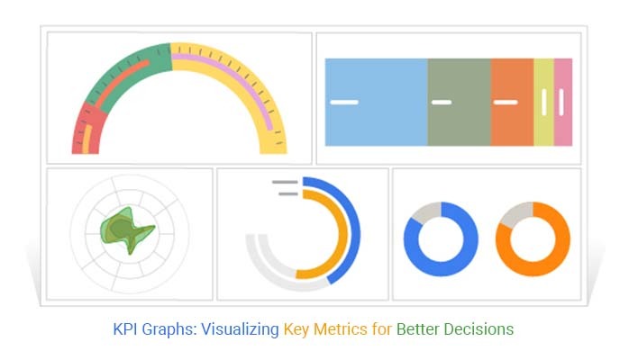
KPI Graphs: Harnessing Potential for Business Insights

Are you ready to unlock the mystery behind KPI graphs? Buckle up because we’re about to embark on a journey through the fascinating world of KPI graphs.

KPI Graphs

Key Performance Indicator graphs, or KPI graphs for short, have a history as intriguing as their name. The roots of KPI graphs can be traced to the early 20th century.

That’s when industrial engineers began using visual representations to track productivity and efficiency. The concept gained momentum in the mid-20th century as businesses sought efficient ways to monitor performance metrics.

Fast forward to the present, and KPI graphs have become indispensable tools for businesses and organizations across industries. They have been saving businesses from drowning in a sea of numbers.

Like ancient alchemists turning lead into gold, KPI charts work their magic, transforming raw data into actionable insights.

Whether you’re a seasoned data pro or just starting, understanding KPI graphs is vital in today’s data-driven world. So, buckle up and get ready to ride the KPI wave.

It’s time to decode the language of KPI graphs and harness their power to steer businesses toward success.

Table of Content:

  1. What are KPI Graphs?
  2. Different KPI Graphs Examples
  3. How to Choose the Right KPI Graph?
  4. Why are KPI Graphs Important?
  5. How to Create KPI Graphs?
  6. 4 Best Tools for Creating KPI Graphs
  7. What are the Benefits of Key Performance Indicators Charts?
  8. What are the Best Practices for Creating Effective KPI Graphs?
  9. Wrap Up

What are KPI Graphs?

Definition: KPI graphs, short for Key Performance Indicator graphs, are the visual powerhouses of data analysis. They distill complex business metrics into easily understandable visuals. These graphs serve as compasses, guiding organizations through the vast sea of data. Essentially, they provide a snapshot of a company’s performance at a glance.

From their humble beginnings in the mid-20th century, KPI graphs like Sunburst graphs have evolved into sophisticated tools. They transcend traditional charts and circular graphs, offering interactive dashboards for swift and insightful decision-making. Their historical roots are intertwined with the evolution of business analytics.

Different KPI Graphs Examples:

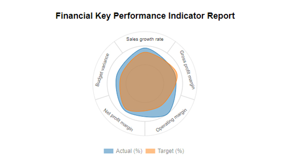
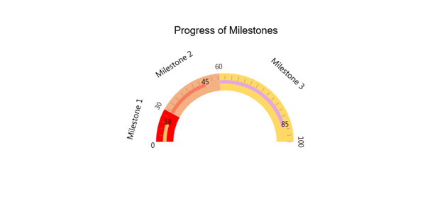
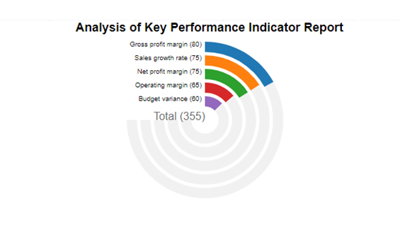
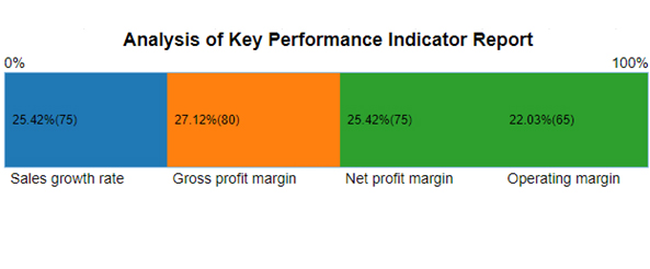
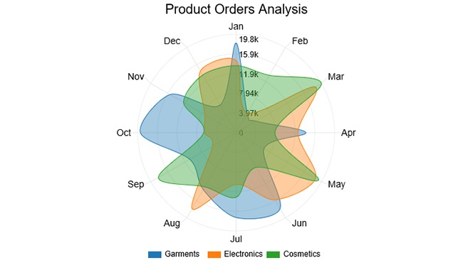
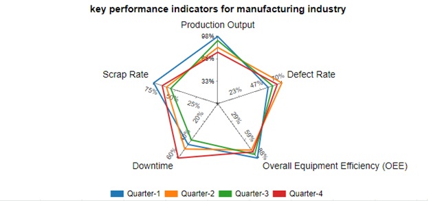
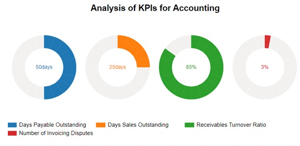
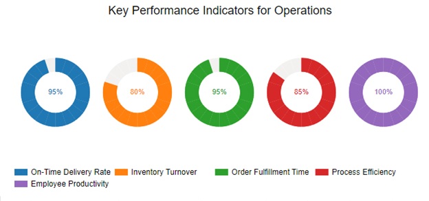
Below are 4 most common examples of KPI graphs to inspire you.

  • Circular Org Chart:

KPI Graphs 1
  • Multi Gauge Chart:

KPI Graphs 2
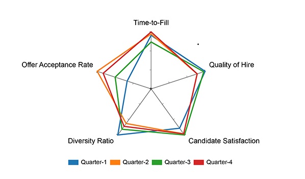
  • Radial Chart:

KPI Graphs 3
  • Performance Bar Chart:

KPI Graphs 4

How to Choose the Right KPI Graph?

Choosing the right KPI graph depends on the type of data you’re working with and the insights you want to convey. Here are some key points to help you decide your next KPI chart:

  1. Time-Series Data: Use line graphs to show trends over time.
  2. Categorical Comparisons: Use bar graphs or column charts to compare different categories.
  3. Proportional Data: Use pie charts to show parts of a whole.
  4. Progress Tracking: Use gauge or bullet graphs to show progress toward a goal.
  5. Complex Data Relationships: Use heatmaps for visualizing data intensity across two dimensions.

What are the Factors of a KPI Graph?

Understanding Key Performance Indicator (KPI) graphs involves unraveling the factors that compose these visual narratives. Each element contributes to the comprehensive understanding of your organization’s performance.

  1. Metric: At the core of a KPI graph is the metric ”“ the key parameter being measured. Whether it’s sales, customer satisfaction, or productivity, this factor is the heartbeat, providing the essential context for interpretation.
  2. Time frame: Temporal context is essential. The time frame delineates the performance journey, capturing trends, fluctuations, and patterns over a specific period. It’s the chronological backbone that adds depth to the KPI graph’s narrative.
  3. Targets: Targets set the destination on the performance roadmap. They define what success looks like. In a KPI graph, targets provide benchmarks against which actual data is measured, guiding the trajectory toward organizational goals.
  4. Actual data: The tangible evidence of performance resides in actual data. Graphically represented, this element showcases how well or how far your organization has progressed towards its objectives. It’s the reality check that fuels informed decision-making.
  5. Trend lines: Trend lines carve a visual path through the data terrain. They unveil the performance trajectory, indicating upward growth, stagnation, or potential areas of concern. Trend lines transform data points into actionable insights.
  6. Annotations: Annotations add context and nuance to the graph. They highlight significant events, milestones, or external factors influencing performance. Annotations turn a KPI graph into a narrative, providing a richer understanding of the data.
  7. Legend and labels: Clarity is paramount, and legends and labels ensure it. They decode the visual language of the graph, specifying what each color, line, or symbol represents. Legends and labels demystify complexity, making the graph accessible to a diverse audience.

Why are KPI Graphs Important?

KPI graphs are not mere adornments but indispensable tools illuminating the path to organizational success. Let’s unravel their significance.

  • Strategic Decision-Making

KPI charts serve as compasses in the sea of data, guiding strategic decision-making. By visually representing critical metrics, they empower you to make informed choices aligned with organizational objectives. This aids in steering the ship of business with precision.

  • Performance Monitoring and Analysis

At the heart of KPI charts lies performance monitoring and analysis. They provide a real-time, visual snapshot of key metrics and KPIs, enabling you to gauge success against predefined targets. Moreover, they facilitate a deeper understanding of patterns, helping identify areas of improvement and success.

  • Goal Alignment and Motivation

KPI charts foster a sense of goal alignment among team members. They communicate organizational objectives by presenting key metrics in a visual format. This transparency motivates teams and creates a shared understanding of the collective journey toward success.

  • Communication Tool

In a world inundated with information, communication is key. KPI charts transcend language barriers, presenting a universal visual language of progress. They convey complex data in a format that resonates with stakeholders across various levels of expertise. This accessibility promotes clear communication and a shared understanding of organizational performance.

  • Continuous Improvement and Adaptability

KPI charts are not static portraits but dynamic landscapes that evolve with your organization. By regularly monitoring and reviewing the charts and graphs, you can identify opportunities for continuous improvement. Moreover, the adaptability of KPI charts allows you to respond swiftly to market, industry, or internal dynamics changes. Consequently, this fosters a culture of resilience and agility.

How to Create KPI Graphs?

In the realm of data, KPI charts reign supreme, turning numbers into a visual symphony. However, Excel’s visualization prowess is not a showstopper.

Enter ChartExpo, your ticket to stunning and insightful data visuals. Say goodbye to Excel’s limitations and hello to a world of dynamic and engaging charts.

Now, let’s dive into creating KPI charts in Excel with a touch of flair.

Let’s learn how to Install ChartExpo in Excel.

  1. Open your Excel application.
  2. Open the worksheet and click the “Insert” menu.
  3. You’ll see the “My Apps” option.
  4. In the Office Add-ins window, click “Store” and search for ChartExpo on my Apps Store.
  5. Click the “Add” button to install ChartExpo in your Excel.

ChartExpo charts are available both in Google Sheets and Microsoft Excel. Please use the following CTA’s to install the tool of your choice and create beautiful visualizations in a few clicks in your favorite tool.

Example

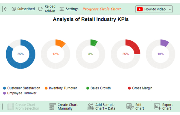
Let’s say you have a retail store’s KPI data tabled below.

Retail Industry KPIs Percentage (%)
Customer Satisfaction 85
Inventory Turnover 12
Sales Growth 8
Gross Margin 25
Employee Turnover 10

Let’s create a KPI chart in Excel for this data using ChartExpo.

  • To get started with ChartExpo, install ChartExpo in Excel.
  • Now Click on My Apps from the INSERT menu.
insert chartexpo in excel
  • Choose ChartExpo from My Apps, then click Insert.
open chartexpo in excel
  • Once it loads, scroll through the charts list to locate and choose the “Progress Circle Chart”.
search progress circle chart in excel
  • Click the “Create Chart From Selection” button after selecting the data from the sheet, as shown.
Create Chart From Selection ce530
  • ChartExpo will generate the visualization below for you.
KPI Graphs Design Template
  • If you want to add anything to the chart, click the Edit Chart button:
  • Click the pencil icon next to the Chart Header to change the title.
  • It will open the properties dialog. Under the Text section, you can add a heading in Line 1 and enable Show.
  • Give the appropriate title of your chart and click the Apply button.
Apply Tittle on Chart ce530
  • Change the Customer Satisfaction legend shape into a Circle as follows:
Change CSAT legend shape ce530
  • Click the “Save Changes” button to persist the changes made to the chart.
Save Changes ce530
  • Your final Progress Circle Chart will look like the one below.
Final KPI Graphs

Insights

  • Customer satisfaction boasts an impressive 85%, signaling robust customer approval and loyalty.
  • A 12% inventory turnover implies effective management of stock levels.
  • Sales growth maintains a steady pace at 8%, portraying a moderate but not rapid expansion.
  • A 25% gross margin reflects commendable profitability.
  • Employee turnover is a reasonable 10%, indicating satisfactory staff retention levels.

The following video will help you to create a Progress Circle Chart in Microsoft Excel.

4 Best Tools for Creating KPI Graphs

Several tools are available to help you create visually appealing and effective KPI graphs. Here are some popular options:

  1. Microsoft Excel: A versatile tool for creating a wide range of graphs, including bar charts, line graphs, and pie charts. Excel also offers basic dashboarding capabilities.
  2. Power BI: Microsoft’s business analytics service, which allows users to create interactive dashboards and share insights across an organization.
  3. Google Sheets: A free tool that integrates with various data sources, enabling users to create customizable KPI dashboards.
  4. ChartExpo: A plugin for Microsoft Excel, Google Sheets, and, Microsoft Power BI that simplifies the process of creating advanced KPI charts and graphs.

What are the Benefits of Key Performance Indicators Charts?

Key Performance Indicator (KPI) charts are like beacons, guiding organizations through the fog of data. They distill complex information into accessible insights, forming a visual language that speaks volumes. Let’s unravel the advantages that make KPI charts indispensable.

  • Visual representation: KPI charts, including Pyramid Charts, transform abstract data into a visual symphony, providing a clear, at-a-glance understanding of performance metrics. They turn numbers into a language anyone can interpret, fostering a shared understanding across teams.
  • Performance monitoring: These charts serve as vigilant sentinels, monitoring performance trends over time. They offer a real-time snapshot of how well objectives are met, enabling swift course corrections and proactive decision-making.
  • Goal alignment: KPI charts align teams with organizational goals. Presenting key metrics visually helps ensure everyone is on the same page, fostering a unified direction toward common objectives.
  • Transparency and accountability: KPI charts promote transparency by putting performance metrics on display. This openness fosters accountability, motivating teams to strive for excellence with clear visibility into their contributions.
  • Data-driven decision making: KPI charts help decision-makers confidently navigate the data landscape. These visual aids turn decision-making into a data-driven expedition, ensuring choices align with strategic objectives.
  • Performance improvement: The insights gleaned from KPI charts become catalysts for improvement. From identifying strengths and weaknesses, you can fine-tune strategies, optimize processes, and elevate overall performance.
  • Communication tool: KPI charts transcend linguistic barriers, becoming a universal language of progress. They present complex information in a format that resonates with stakeholders across various levels of expertise.

What are the Best Practices for Creating Effective KPI Graphs?

Chart KPI is not just about presenting data. It’s about crafting a visual narrative that propels your organization toward success. These best practices in KPI charting will help ensure the journey through data is insightful and transformative.

  • Select relevant metrics: Begin with precision. Choose metrics that align with your organizational goals. Selecting relevant KPIs ensures the chart tells a meaningful story, offering actionable insights.
  • Set clear targets: Clearly define what success looks like. Setting explicit targets in your KPI chart establishes benchmarks, guiding teams toward overarching objectives.
  • Choose appropriate chart types: Every story has its ideal format. Select the chart type that best suits your KPIs. Whether it’s a line graph for trends or a pie chart for proportions, the right choice enhances clarity.
  • Simplify visualization: Clutter obscures insights. Streamline visualizations to highlight key information. A clean, uncluttered KPI chart facilitates quick comprehension.
  • Use consistent formats: Consistency is the glue holding your visual story together. Employ standardized formats, colors, and symbols across KPI charts for a cohesive and easily understandable presentation.
  • Provide context: Context is the anchor. Add contextual information to your KPI chart historical data, external influences, or industry benchmarks. Context transforms data points into actionable intelligence.
  • Regular monitoring and review: Don’t let your chart collect dust. Regularly monitor and review your KPI charts. This practice ensures that insights remain relevant, and you can make timely adjustments for continuous improvement.
  • Promote accessibility: Democratize data. Ensure your KPI charts are easily accessible to relevant stakeholders. Making visualizations available to all team members who can benefit from the insights promotes transparency.
  • Encourage collaboration: KPIs are a team effort that encourages teams to discuss and interpret the charts collectively. Collaborative analysis promotes a shared understanding of performance metrics.
  • Continuous improvement: Evolve with the data landscape. Embrace a culture of constant improvement. Regularly assess and refine your KPI charting practices to adapt to changing organizational needs and industry dynamics.

Common Mistakes to Avoid with KPI Graphs

When creating KPI graphs, it’s essential to avoid common pitfalls that can lead to misinterpretation of data:

  • Overcomplicating the Graph: Too many data points or overly complex visuals can confuse the viewer. Keep your graphs simple and focused.
  • Ignoring Data Context: Always consider the context of your data to avoid drawing incorrect conclusions from your KPI graphs.
  • Misusing Graph Types: Choose the right type of graph for the data you’re visualizing. For example, don’t use a pie chart for time series data.

FAQs

What is the best chart for KPI?

The best chart for KPIs often depends on the nature of the data. For comparing values, a bar chart is effective; line charts are excellent for tracking trends over time. Use pie charts to illustrate proportions and radar charts to analyze multivariate data. Choose based on your specific KPI goals.

What is the best way to keep track of KPI?

To effectively keep track of KPIs, utilize performance dashboards that offer real-time updates. Implement regular reporting schedules, automate data collection where possible, and establish clear accountability. This ensures timely monitoring and informed decision-making for organizational success.

How do you make a KPI chart?

To make a KPI chart:

  1. Identify relevant metrics.
  2. Choose an appropriate chart type, like a line or bar chart.
  3. Set clear targets for each KPI.
  4. Organize data, add labels, and use consistent formatting.
  5. Regularly update and review the chart for ongoing insights.

Wrap Up

KPI graphs are not mere data visuals; they’re the architects of informed decisions. These visual narratives distill complexity, transforming raw metrics into a language of clarity. By encapsulating historical trends, they unveil the roadmap of organizational performance.

KPI graphs serve as beacons, guiding businesses through the intricacies of data. Selecting relevant metrics acts as the compass, providing direction in the sea of information. Clear targets set the course, ensuring the journey aligns with strategic goals.

Choosing appropriate chart types is the artistry of communication, turning numbers into a visual symphony. Simplifying visualizations ensures the message is heard without distortion, fostering quick comprehension among stakeholders. Consistent formats weave a thread of cohesion, connecting disparate data points into a meaningful narrative.

Providing context adds richness to the story, making the KPI graph a chronicle of progress. Moreover, regular monitoring and review keep the graph dynamic, adapting to the evolving needs of your organization. Accessibility democratizes insights, ensuring every team member can contribute to the narrative.

Encouraging collaboration transforms the graph from a static display to a living document of collective understanding. Continuous improvement becomes the heartbeat, echoing the rhythm of progress.

In essence, KPI graphs aren’t just visuals. They’re the storytellers shaping the destiny of organizations, navigating through the data landscape with precision and purpose.

Do not hesitate.

Embrace KPI graphs with ChartExpo today to achieve organizational excellence.

How much did you enjoy this article?

ExcelAd1
Start Free Trial!
133944

Related articles

next previous
Microsoft Excel8 min read

Excel Task Tracker Template for Smarter Task Insights

Task tracker template in Excel organizes tasks, tracks deadlines, and boosts efficiency. Learn its benefits, and explore expert tips to simplify task management.

Microsoft Excel10 min read

Invoice Tracker Template in Excel for Better Insights

An invoice tracker Excel template helps track invoices, due dates, and payments. Learn how to use this template for better financial management.

Microsoft Excel12 min read

Key Performance Indicators in Healthcare for Better Insights

Key Performance Indicators in healthcare track patient care and efficiency. Learn about these KPIs, top examples, and how to use them to improve outcomes.

Microsoft Excel10 min read

BMI Calculation Formula in Excel for Better Fitness Insights

The BMI calculation formula in Excel helps track and analyze body mass index. Explore step-by-step instructions and tips to simplify BMI tracking in Excel.

Microsoft Excel29 min read

How to Create a Tornado Chart in Excel? A Complete Guide

Click to learn how to plot a Tornado Chart in Excel using easy-to-follow steps. Also, we’ll address the following question: what is a Tornado Diagram?

ChartExpo logo

Turn Data into Visual
Stories

CHARTEXPO

  • Home
  • Gallery
  • Videos
  • Services
  • Pricing
  • Contact us
  • FAQs
  • Privacy policy
  • Terms of Service
  • Sitemap

TOOLS

  • ChartExpo for Google Sheets
  • ChartExpo for Microsoft Excel
  • Power BI Custom Visuals by ChartExpo
  • Word Cloud

CATEGORIES

  • Bar Charts
  • Circle Graphs
  • Column Charts
  • Combo Charts
  • Comparison Charts
  • Line Graphs
  • PPC Charts
  • Sentiment Analysis Charts
  • Survey Charts

TOP CHARTS

  • Sankey Diagram
  • Likert Scale Chart
  • Comparison Bar Chart
  • Pareto Chart
  • Funnel Chart
  • Gauge Chart
  • Radar Chart
  • Radial Bar Chart
  • Sunburst Chart
  • see more
  • Scatter Plot Chart
  • CSAT Survey Bar Chart
  • CSAT Survey Chart
  • Dot Plot Chart
  • Double Bar Graph
  • Matrix Chart
  • Multi Axis Line Chart
  • Overlapping Bar Chart
  • Control Chart
  • Slope Chart
  • Clustered Bar Chart
  • Clustered Column Chart
  • Box and Whisker Plot
  • Tornado Chart
  • Waterfall Chart
  • Word Cloud
  • see less

RESOURCES

  • Blog
  • Resources
  • YouTube
SIGN UP FOR UPDATES

We wouldn't dream of spamming you or selling your info.

© 2025 ChartExpo, all rights reserved.