Categories
Exponential growth happens when values increase at an accelerating rate over time.
Instead of growing by the same amount each time, the increase grows larger with each step.
For example, a value that doubles every year would grow from 2 to 4, then 8, 16, and beyond.
This type of growth is common in areas like population tracking, investment returns, website traffic, and business forecasting.
Because exponential data changes quickly, visualizing it in a table can make patterns difficult to interpret.
This is where an exponential growth chart becomes useful.
A line chart is one of the most effective ways to display exponential growth because it clearly shows how values accelerate over time.
In Excel, these charts help analysts and businesses track trends, compare growth patterns, and identify rapid changes more easily.
While Excel supports basic line charts, customizing them for clearer exponential trend analysis often requires additional formatting and design adjustments.
Definition: Exponential growth is a pattern where a value increases by the same percentage or factor over equal intervals of time.
Instead of adding a fixed amount each time, the growth builds on the previous value, causing the increase to accelerate as time progresses.
For example, if a value doubles each period, it may grow like this: 2, 4, 8, 16, and so on. Each step becomes larger because the increase is applied to a growing base.
This type of growth is commonly seen in real-world situations such as compound interest, population growth, viral content spread, and business scaling, where changes become more rapid over time rather than staying constant.
An exponential growth chart is important because it helps convert fast-changing numerical data into a clear visual pattern.
When values increase rapidly, it becomes difficult to perform trend analysis from raw numbers, but a chart makes the acceleration easy to see.
Exponential growth is best visualized using charts that clearly show accelerating changes over time.
Since the values increase rapidly, the right graph makes it easier to identify growth patterns, trends, and sharp upward movement.
Here are the most effective charts for displaying exponential growth:
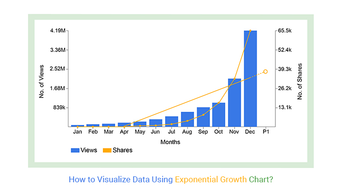
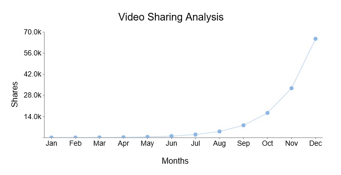
A Line Chart is one of the most effective ways to visualize exponential growth. It connects data points over time, making the accelerating curve easy to identify.
As the values increase, the line gradually becomes steeper, clearly showing how growth speeds up over time. This chart works well for:
Line charts are widely used in Excel because they are simple, readable, and ideal for time-series analysis.
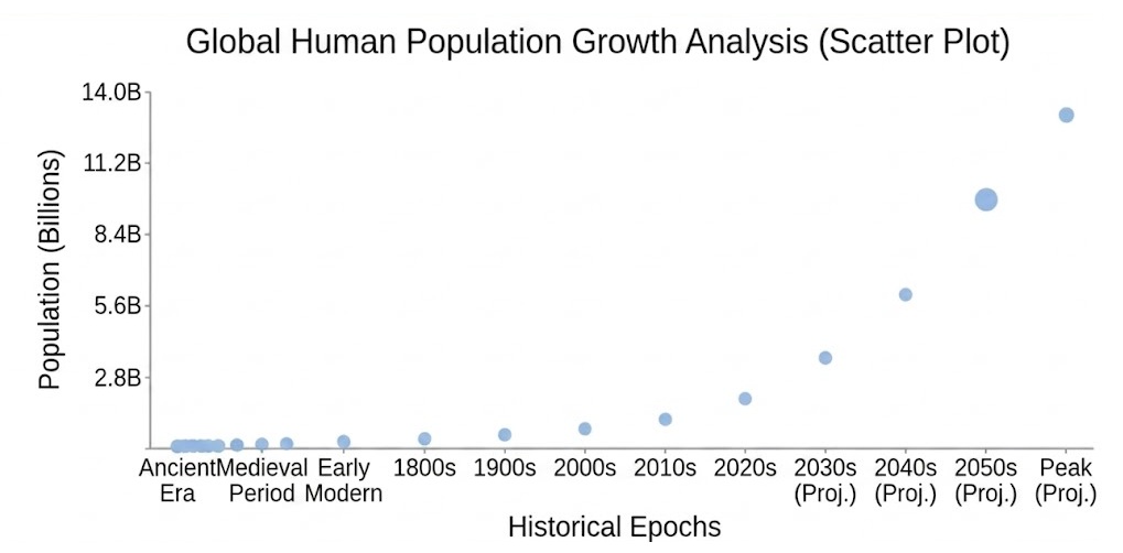
A Scatter Plot helps display exponential growth when analyzing relationships between variables. It shows how one variable changes as another increases.
This chart is useful in scientific analysis, forecasting models, and large datasets where identifying growth behavior is important.
Follow these simple steps to build a growth chart in Excel using a Line Chart (Double Axis Line Chart) for better trend visibility:
Organize your data in a clean table format.
Example:
Make sure values show increasing progression for exponential behavior.
This helps visualize rapid growth trends clearly over time.
If your dataset contains different scales:
This ensures both small and large values are visible without distortion.
This makes the exponential curve easier to identify.
Excel’s default line charts are basic and often require manual formatting for better clarity.
To simplify this process and get ready-made visualization styles, you can use ChartExpo directly inside Excel for faster chart creation and cleaner design output.


Exponential growth appears in many real-world situations where values increase rapidly over time.
Instead of growing by a fixed amount, the growth compounds and becomes larger during each stage.
Here are three common real-life examples:
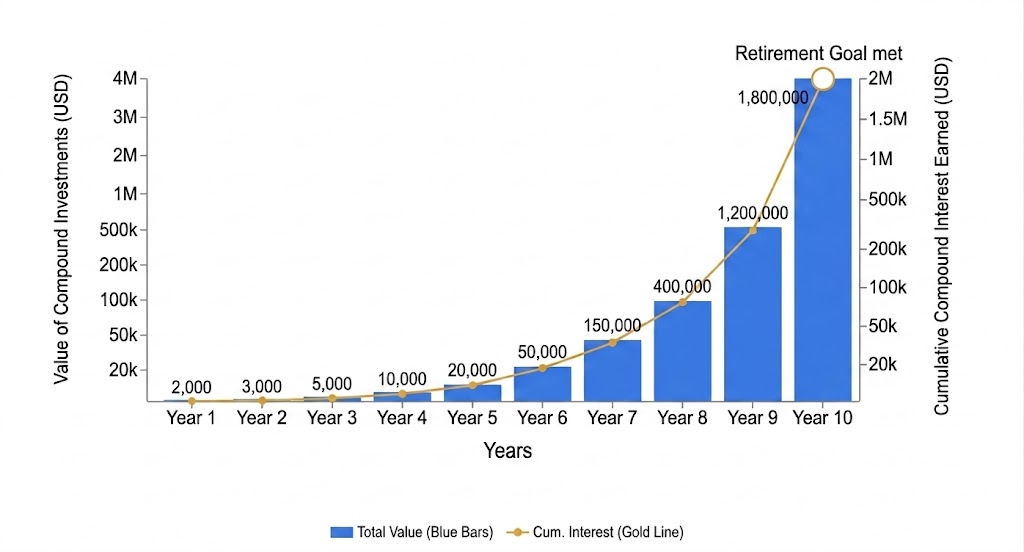
Compound interest is one of the most recognizable examples of exponential growth. Interest is earned not only on the original amount but also on previously accumulated interest.
For example, if you invest money in a savings account with compound interest, your balance grows faster over time because each new interest calculation is based on a larger total.
This is why long-term investing and early retirement savings can grow significantly over time.
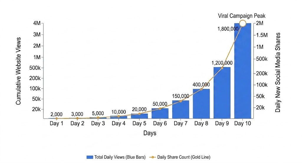
Content on social media platforms can spread exponentially when users continue sharing it with others.
For example, a video shared by 100 people may reach thousands within days if each viewer shares it further.
Website traffic can behave similarly when content gains visibility through SEO, referrals, or viral campaigns.
This type of rapid audience expansion is commonly visualized using a chart.
Population growth often follows an exponential pattern when resources are widely available. The same behavior can be seen in bacterial reproduction.
For example, a single bacterium can divide into two, then four, eight, and so on within a short period. Because the population doubles repeatedly, the growth accelerates very quickly.
Scientists and researchers use exponential growth models to study population trends, disease spread, and biological processes.

Exponential growth charts are misleading when the pattern is driven by seasonal or repeating cycles instead of true acceleration.
For example:
In these cases, the sharp increases are temporary, not exponential. A line chart may show a “growth curve,” but it does not reflect real long-term acceleration.
If data increases by a fixed amount each period, exponential charts become misleading and visually exaggerated.
For example:
Here, the pattern is predictable and stable, not compounding. Using a chart can falsely suggest acceleration where none exists.
Exponential growth charts should only be used for continuous, time-based data for a single metric.
They fail when you try to compare:
This creates visual distortion and makes the chart hard to interpret, especially in dashboards.
Exponential growth charts are most effective when they clearly highlight acceleration patterns without distortion or unnecessary complexity.
These practices help you build more accurate and readable visualizations in Excel.
This chart helps transform rapidly increasing data into a clear visual pattern, making it easier to understand how values accelerate over time.
This improves analysis, forecasting, and decision-making.
While charts are useful for visualizing accelerating trends, they are not suitable for every type of analysis.
Understanding their limitations helps ensure a more accurate interpretation of data.
Exponential growth helps you understand how data increases rapidly over time, forming a curve that becomes steeper as values accelerate.
In business and analytics, this pattern is commonly used to track trends like revenue growth, user acquisition, and performance scaling.
Visualizing it with a line chart makes these changes easier to interpret compared to raw numbers alone.
Excel provides basic tools for building these charts, but customizing them for clearer exponential trend analysis can require additional formatting and effort.
To simplify this process and make visualization faster, tools like ChartExpo can help you create more structured and ready-to-use growth charts directly inside Excel without complex setup or coding.
Used correctly, exponential growth charts make it easier to identify patterns early, track performance changes, and support better data-driven decisions.
How much did you enjoy this article?


Calculate accounts receivable turnover ratio to measure credit collection speed, improve cash flow, and strengthen your financial strategy. Read on!

Change Management KPIs are the key to tracking adoption, performance, and ROI during transitions. Find out which metrics matter. Read on!

Data collection methods and techniques determine the quality of every insight you act on. Explore key approaches for gathering reliable data. Read on!


