Categories
By ChartExpo Content Team
Ever wondered why your business isn’t running as smoothly as it should? The answer might lie in your processes. Business process mapping is the tool you need to visualize, analyze, and optimize your operations.
Business process mapping helps you see the big picture of how your company functions. It breaks down complex workflows into clear, visual representations. This clarity allows you to spot inefficiencies, bottlenecks, and areas for improvement that you might have missed before.
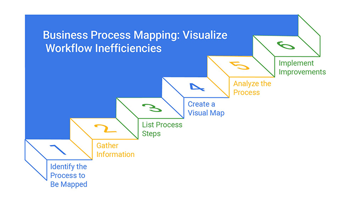


But business process mapping isn’t just about finding problems. It’s about creating solutions. By mapping out your processes, you can streamline operations, cut costs, and boost productivity. It’s a powerful way to transform your business from the inside out. Ready to learn more about how business process mapping can revolutionize your operations? Let’s get started!
First…
Ever notice how sometimes, despite everything seeming fine, work just doesn’t flow as it should?
That’s often due to invisible bottlenecks. In business process mapping, these are the spots where tasks pile up unnoticed, slowing down the entire operation. Identifying these hidden hiccups is the first step towards a smoother workflow.
By scrutinizing each step in your process map, you can pinpoint where delays occur most frequently and start addressing them.
Imagine a four-lane highway shrinking into one lane; the backup is inevitable, right?
The same happens in your business processes. Hidden bottlenecks act like that narrow lane, blocking the fast flow of operations and causing delays that affect your entire process. These bottlenecks are tricky because they aren’t always obvious but understanding where they occur can drastically enhance efficiency.
How do you know if your sales pipeline is clogged?
Look for signs like mounting delays, frustrated employees, or increasing customer complaints.
These symptoms suggest that somewhere in your process, there’s a blockage slowing everything down. Regularly checking these indicators can help you catch and clear clogs before they cause serious damage to your business efficiency.
A single bottleneck can send shockwaves through your entire workflow. It’s not just about one delayed process; it’s about how that delay can stall subsequent steps, creating a domino effect that magnifies the initial problem.
Understanding this ripple effect is crucial for maintaining a robust and responsive business process.
What usually causes bottlenecks? Common culprits include manual data entry, unclear task ownership, or insufficient resources. Each of these can slow down a process significantly.
Recognizing these typical troublemakers helps you stay one step ahead in optimizing your workflows.
Sankey diagram is a fantastic tool for visualizing how work flows within your processes. With their broad arrows and clear labels, they illustrate the volume of work at each stage, making it easier to spot where bottlenecks are forming.
This visual aid is invaluable for quickly diagnosing and addressing workflow issues.
Why are Sankey diagrams so good at spotting bottlenecks? Their layout allows you to see the balance – or imbalance – of workflow between steps.
You can immediately identify where resources are overtaxed or underutilized, helping you make precise adjustments to alleviate pressure points in your process.
Interpreting Sankey diagrams, or an energy flow diagram, involves more than seeing where the lines thicken. Analyze the flow patterns: Where do blockages occur? Are there steps where the flow splits inefficiently?
Answering these questions from your diagram data can provide powerful insights for optimizing your business processes.
Once you’ve interpreted your Sankey diagrams, it’s time to act.
Implement changes aimed at widening the narrow areas of your process. This might mean redistributing tasks, adding resources, or removing unnecessary steps. These actionable strategies are key to transforming insights into improved process efficiency.
A tech startup struggled with slow customer onboarding and couldn’t figure out why. The onboarding process seemed straightforward, but customers were dropping off midway.
The startup noticed significant delays in user activation but couldn’t pinpoint the cause. The process map looked perfect on paper, yet something was off.
Using a Sankey diagram, the startup mapped out the customer’s journey and immediately spotted the bottleneck. A single step involving manual verification was taking too long, causing the delays.
After automating the verification step, the onboarding process sped up significantly. This small change led to higher customer satisfaction and a notable increase in conversion rates.
The Sankey diagram was key to identifying and solving the bottleneck issue.
Business processes can be tough to explain. Often, what’s clear to one person is a puzzle to another.
When sharing these processes with stakeholders, it’s key to use clear, easy-to-understand language. Avoid technical jargon that might confuse those who aren’t specialists in your field. Instead, opt for straightforward explanations.
Remember, the goal is for every stakeholder to grasp the process fully, not just those who create it.
Flowcharts have been the go-to for mapping processes for ages. But they have limits.
They can’t capture the finer details of complex processes. This makes them less useful in situations where nuances play a big part in understanding the process. Flowcharts are great for simple, linear processes, but fall short when complexity rises.
Simple flowcharts are clean and easy to follow. However, they often fail to capture the full picture. They miss the overlaps and the side processes that are crucial for a complete understanding.
When a process involves multiple teams or phases, a simple flowchart might not tell the whole story, leading to misunderstandings.
There’s a fine line between too little and information overload.
Overloading a process map with every single detail can lead to confusion. Stakeholders might get lost in the minutiae, losing sight of the overall goal of the process. It’s important to strike a balance – include enough detail to be clear but not so much that it overwhelms.
Traditional process maps often look like a tangle of arrows and boxes. They can be hard to engage with.
Stakeholders might find them boring or overwhelming. This disengagement can lead to a lack of interest or misunderstanding of the process, which can impact the success of a project or strategy.
Sankey diagrams change the game by showing the flow of resources or information in a way that’s easy to understand. They use arrows of different thicknesses to represent different volumes, making it clear at a glance where the major parts of a process are. This can be a more intuitive way to present complex information.
Sankey diagrams are not just tools; they tell stories. They simplify complex processes by visually representing them, making it easier for stakeholders to follow along and understand.
Each flow is represented proportionally, so the bigger tasks or more resource-intensive steps stand out, providing instant insights.
In process flows, not every step is equally important.
Sankey diagrams highlight this by using thicker lines for flows that carry more weight. This visual cue helps stakeholders immediately see which parts of the process are key, aiding in data-driven decision-making and resource allocation.
Interactive Sankey diagrams take it a step further by allowing stakeholders to dive into the details that interest them. They can click on different flows to see more data or understand how changing one aspect affects others.
This interactivity not only keeps stakeholders engaged but also deepens their understanding of the process.
The following video will help you create a Sankey Chart in Microsoft Excel.
The following video will help you to create a Sankey Chart in Google Sheets.
Imagine setting up a row of dominoes. Knock one over, and they all tumble one after the other. That’s the domino effect in business process mapping.
Each step in a process is linked, so a hiccup in one area can trigger a chain of issues throughout. Identifying and understanding these dependencies helps businesses anticipate possible disruptions and plan more effectively.
Think of a machine where each gear depends on the next to function. If one gear jams, the entire machine can stop.
This scenario is similar in business processes where each part is interconnected. A delay in one segment can cause a ripple effect, slowing down other parts of the process or even bringing everything to a halt.
Sometimes, the connections between processes aren’t obvious.
It’s like discovering a spider web in a dimly lit room. Shining a light – mapping out these processes – reveals these hidden dependencies. Understanding these unseen links helps in crafting a more robust business strategy.
A small glitch can sometimes escalate into a major problem. It’s like a snowball rolling downhill, growing bigger as it goes.
In business, a minor issue in one area can set off a cascade of failures across other connected processes, leading to significant operational disruptions.
Evaluating risks in interconnected processes is akin to checking the weather before a big trip.
It helps in preparing for potential problems and mitigating risks effectively. By understanding how processes impact one another, businesses can create stronger contingency plans.
Sankey diagrams are like GPS for navigating process dependencies. They show the flow of resources and information, highlighting how various parts of a process are interconnected. This data visualization aids businesses in pinpointing critical areas that need attention or could be optimized for better performance.
Visualizing complex process relationships through diagrams or maps is like charting a path through a maze. Using clear financial charts alongside these visuals offers a guide on how different processes interact, helping businesses navigate their operations more smoothly and avoid potential pitfalls.
Identifying the critical path in a process is crucial for efficiency.
Using Sankey diagrams for this purpose helps highlight the most weighty dependencies that could impact timelines and resources. It’s like identifying the most crucial roads in a network that must be clear for traffic to flow smoothly.
Running what-if scenarios with Sankey models is like doing rehearsals before the big show. It allows businesses to simulate different situations and see the effects of changes in the process flow. This preparation is key to making informed decisions and adapting processes with minimal risk.
Imagine spinning a giant wheel every time you need to decide how to distribute your resources in business process mapping. Sounds risky, right? Well, it doesn’t have to be.
The key is to understand each step of your process and assign resources where they can make the biggest impact.
Think of it as placing your bets wisely in a game of roulette, where your chips are your resources, and the winning numbers are the stages in your process that yield the highest returns.
Have you ever seen a garden that’s not been watered enough? The plants start to wilt.
The same goes for your business processes. When resources are tight, you’ll see signs like delayed outputs and stressed-out teams. It’s like your process map is literally shouting for a bit of TLC. By spotting these cries for help early, you can prevent your garden – I mean, your business processes – from drying out.
Watch out for the warning signs! Are deadlines slipping? Is one team always in overdrive while another twiddles their thumbs? These are your red flags.
It’s like when your car starts making a weird noise. Ignoring it won’t make it go away; it’s time to pop the hood and check the engine, or in this case, your resource allocation.
Throwing more people or money at a problem doesn’t always fix it. It’s like trying to put out a fire with paper notes – you’ll just fuel the flames.
Sometimes, it’s not about how much you have, but how you use what you’ve got. Efficiency isn’t just a buzzword; it’s about making the best out of the resources at your disposal.
Balancing resources across a business process is like walking a tightrope. Lean too much on one side, and you’ll fall. It’s all about equilibrium. Distributing resources evenly ensures that each step of your process gets enough attention without causing bottlenecks or waste.
A Sankey diagram shows you where your resources are going – kind of like a map that highlights the busy roads and quiet alleys of your resource flow. Using these diagrams can help spot where resources are too thick (causing slowdowns) or too thin (causing breakdowns).
Keep your eyes on the prize! Monitoring how resources move through your processes is like tracking weather patterns. You need to know where the storms are brewing to prevent disaster and ensure smooth sailing. Regular checks help you adjust and redirect resources efficiently.
Armed with insights from your Sankey diagrams, you can start shifting things around. It’s like rearranging the furniture in your house for better flow and space usage.
Move resources from over-served areas to those starving for more, and watch your process efficiency soar.
When we talk about business process mapping, we’re really diving into how well a process performs. It’s not just about drawing lines and boxes.
Think of it as a detective figuring out where the time and resources are going. To really get a grip on this, businesses use specific measures to see if a process is as smooth and efficient as it should be. But here’s a twist: measuring this isn’t always straightforward.
Let’s face it; running a business on just a hunch can lead to missed opportunities. That’s why measuring process efficiency is key.
But how do you move from gut feeling to hard data? This is where the real challenge lies. It involves setting up systems to capture the right data and then making sense of that data to drive decisions.
Picking the right Key Performance Indicators (KPIs) can feel like finding your way through a maze. Each process might need different KPIs depending on what’s important for the business. It’s all about finding those metrics that truly reflect performance and can guide improvements effectively.
Getting your hands on accurate data can be tricky. It’s one thing to collect data; it’s another to ensure it’s reliable and reflects what’s really happening. Often, the challenge is not just in the tools used to collect the data, but also in training people to use them correctly and consistently.
Here’s where things get interesting. You’ve got the data, but what does it actually mean? Interpreting metrics within the right context is crucial. It’s about understanding not just the numbers themselves, but what they say about the health and efficiency of your business processes.
Sankey diagrams are powerful tools that show how resources move through a process. Think of them as your business efficiency calculator, highlighting where resources are well-spent and where they’re wasted.
Mapping out how fast a process moves and its throughput gives you a clear picture of process speed. This isn’t about rushing; it’s about maintaining a steady, efficient pace that gets results without wasted effort or resources.
No one likes waste, especially in business processes. Identifying where resources leak or where steps are unnecessary can dramatically boost efficiency. It’s like tightening a leaky faucet – the savings might surprise you!
Comparative analysis with Sankey diagrams allows businesses to set benchmarks and see how well they stack up against them. It’s a visual, straightforward way to compare different processes and spot areas for improvement.
Imagine a company where each department is an island, disconnected from the mainland where the rest of the business operates. This is the essence of the Silo Syndrome.
When departments function independently without proper communication, the company’s ability to execute cohesive business process mapping is compromised. By breaking down these barriers, businesses can ensure a more integrated and efficient approach to achieving their overall goals.
Silos don’t just limit the exchange of information; they sabotage entire business processes.
When departments operate in isolation, there’s a significant delay in the flow of data across the organization. This results in missed opportunities for collaboration and innovation. The impact? Slower decision-making and reduced agility in responding to market changes.
Ever played the telephone game? Information gets distorted as it passes through multiple people. Now, picture this happening in a company where departments don’t communicate effectively.
Misunderstandings become common, leading to errors and inefficiencies that could easily be avoided with clear and open channels of communication.
When departments don’t share their plans and achievements, the wheel gets reinvented over and over. This duplication of efforts not only wastes resources but also leads to inconsistencies in how tasks are performed across the company.
Streamlining communication can dramatically reduce these redundancies and cut costs.
Silos are like barriers to the free flow of ideas and innovation. When knowledge is not shared, the spark of creativity is stifled. Departments often end up sticking to ‘what works,’ missing out on opportunities to improve or innovate their processes and products. Breaking down these walls encourages a culture of continuous improvement and creative thinking.
Sankey diagrams are bridge builders in the world of business process mapping. These flow diagrams visually represent how different processes link and interact, making it easier to see where connections between departments can be improved or established.
To truly understand how a business operates, one must see the full picture.
Visualizing end-to-end processes helps highlight how each department contributes to the overall goals of the company. This big-picture view is crucial for identifying bottlenecks and areas for improvement.
Once you start looking at the processes across departments, you’ll begin to spot patterns and opportunities for synergy.
Maybe the marketing team’s data can help improve customer service protocols, or insights from sales can help streamline product development.
These discoveries are gold mines for boosting efficiency and effectiveness.
Using insights from Sankey diagrams, companies can develop strategies that foster better integration between departments.
Whether it’s aligning goals, sharing key data points, or co-developing processes, these strategies help ensure that departments are not just aware of each other’s existence but are actively collaborating to drive business success.
When you’re updating your business process map, it might feel like walking through a maze. Every turn presents a new challenge. The key is to keep a clear head and a sharp eye on your goals.
Remember, change is part of growth!
Why do teams resist updates to business process maps? Often, it’s fear of the unknown or comfort with the “way things have always been done.” To overcome this, communicate the benefits clearly and involve everyone in the planning stages.
How do you know it’s time to revamp your processes? Look for delays, bottlenecks, or complaints. These are your red flags waving high and saying, “Hey, it’s time for a change!”
People naturally resist change, especially in their work routines. Address this by highlighting the personal benefits of the new process. Show how changes can make their daily tasks easier or improve their work-life balance.
When considering changes, weigh the risks against the potential rewards. Will the new process save time, reduce errors, or improve output? Make sure the benefits justify the effort and resources.
Sankey diagrams are fantastic for showing the flow of processes before and after changes. They visually break down where resources and efforts go, making it easier to spot where improvements are needed.
Start with a Sankey diagram of your current process. This is your baseline map. It shows you the flow of work and resources as they stand now, helping you plan effectively for changes.
Imagine the ideal version of your process. What does it look like? Use a Sankey chart to map this future state. This visualization helps everyone see the goal and understand the changes needed.
Use Sankey diagrams to plan and guide your transition. They can help you allocate resources smartly and time your changes for minimal disruption.
In the realm of business process mapping, information overload can swamp decision-makers.
It’s critical to not only capture but also filter the right data. How do we tackle this deluge? Start with defining what information is a must-have versus nice-to-have. This sets the stage for more focused data collection that aligns with your business objectives.
Ever felt your business process map is more of a data dump than a useful tool? You’re not alone. This typically happens when there’s no clear strategy on what data should enter the map.
The fix? Establish filters right at the data entry point. By doing so, only relevant data makes it to your map, making it a lean and effective tool.
Too much data can freeze decision-making processes. It’s like having so many choices that you end up choosing none. To prevent this, apply thresholds that help prioritize data based on its impact on key business outcomes. This approach simplifies decision-making by highlighting what truly matters.
In the noise of vast data, identifying the signal – the information that drives action – is key.
Techniques like data segmentation can help by grouping similar data points together, making patterns more noticeable and actionable. This method enhances the clarity and usefulness of your business process maps.
Striking a balance between detail and clarity can be tricky. Too much detail and you lose clarity; too little and the map doesn’t help much.
The solution lies in tiered mapping. Start with a high-level map and drill down into detailed maps only where necessary. This keeps the main map uncluttered while still available for deep dives when needed.
Sankey diagrams are fantastic for filtering out the noise in complex process data. They visually show you where resources are being used, allowing you to pinpoint inefficiencies and streamline processes. The width of the lines or arrows in the diagram directly represents the flow volume, making it easier to interpret data at a glance.
Consolidating data can transform how insights are drawn and decisions are made. Aggregation techniques, such as summing up related data points or averaging them, provide a clearer picture by reducing complexity.
This consolidated view helps in identifying trends that might be missed in more granular data.
Creating a visual hierarchy in Sankey diagrams helps emphasize the data points that matter most. Use color coding or varying line thickness to highlight these key areas. This not only draws attention to important flows but also makes the diagrams easier to read and more effective as a tool for decision-making.
Dynamic Sankey diagrams allow users to interact with the data. By clicking on different elements, users can explore various paths and flows. This interactive exploration aids in a deeper understanding of the processes and the relationships between different data points, making it a powerful tool for detailed data analysis.
Businesses grow, and so should their processes. When a company expands, the initial business process maps might not fit the new scale. It becomes essential to adapt these maps to handle increased demands without causing disruptions.
Sometimes, a business outgrows its process maps. What worked for a small team might falter under the weight of a larger organization. This mismatch can lead to inefficiencies and missed opportunities.
Look for signs like delays, confusion about responsibilities, or increased errors. These symptoms suggest that some business processes no longer align with the organization’s size and need reevaluation.
Rigid process maps lock an organization into a fixed way of doing things. However, growth requires flexibility. Adapting to new market conditions or scaling operations is tough when your processes are set in stone.
When creating business processes, think ahead. Design them to handle more volume or different tasks. This foresight saves you from constant redesigns as your business grows.
Sankey diagrams show the flow of resources or information. They can be pivotal in spotting inefficiencies. Use these diagrams to see how well your processes handle changes in scale.
Simulate higher loads using Sankey models to predict how processes perform under stress. This testing can reveal potential failures before they become real problems.
Using predictive models, identify where bottlenecks are most likely to occur as your business scales. Knowing these points helps in redesigning processes to avoid future issues.
Sankey diagrams are not just for analysis but also for design. They help in creating flexible process maps that can adapt as business needs change, ensuring sustainability in growth.
Business process mapping helps you see the big picture and the details. It shows where things flow well and where they slow down. By using tools like Sankey diagrams, you can pinpoint bottlenecks and fix them fast. The goal is always to make your processes as efficient as possible.
But don’t stop at identifying issues – take action. Adjust, streamline, and refine your processes regularly to keep things running smoothly. The more you map and optimize, the more your business can grow without unnecessary delays or wasted resources.
Remember, business process mapping isn’t a one-time thing. It’s a continuous practice that helps you adapt and improve. Stay committed, and you’ll see the results where they matter most – your bottom line.
How much did you enjoy this article?


Calculate accounts receivable turnover ratio to measure credit collection speed, improve cash flow, and strengthen your financial strategy. Read on!

Change Management KPIs are the key to tracking adoption, performance, and ROI during transitions. Find out which metrics matter. Read on!

Data collection methods and techniques determine the quality of every insight you act on. Explore key approaches for gathering reliable data. Read on!


