The following video will help you create a Sankey Chart in Microsoft Excel using a Sankey diagram Excel.
Categories
By ChartExpo Content Team
A data flow diagram that looks clean is already a problem. If no one is asking questions, you’re showing fiction, not function.
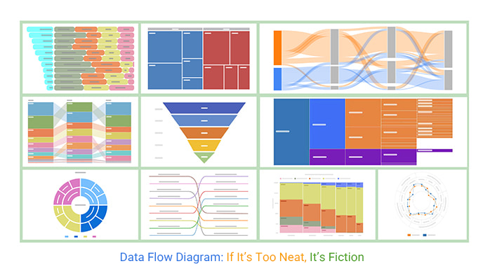
Every data flow diagram hides risks, gaps, and people who prefer things to stay unclear. That’s not a flaw. It’s a clue. The clean lines and neat boxes? They’re where the sabotage starts. If your data flow diagram doesn’t reveal friction, it’s incomplete. Teams need to see where delays start, who owns each step, and where things fall apart.
A data flow diagram isn’t about perfection. It’s a stress test. Without the bottlenecks, without the messy loops, you’ve wasted everyone’s time. If compliance hasn’t raised a flag, your data flow diagram is too safe. If leadership doesn’t squirm, it’s too smooth. This is the real value: a data flow diagram that sparks debate, forces ownership, and stops failure before it starts.
A diagram showing just efficiency is like a map without any roadblocks. It misses the real action. The hidden traps, silent resistance, and those sneaky little obstacles that can derail plans. A true map should highlight these disruptions. Start by asking the tough questions: Where do things slow down? Who benefits from these slowdowns? And if it looks too perfect, maybe it’s hiding something.
Bring in the people. Talk to them. They’ll often hint at issues that the diagram won’t show. Listen for whispers of frustration or the sighs that say, “Here we go again.” These clues reveal the spots where the flow isn’t as smooth as it seems. It’s about finding the rough edges and making sure they’re not glossed over.
Imagine a ship without a captain. That’s what happens when diagrams lack human accountability. Each flow should have a name attached, not just a role. It’s about making sure there’s someone who’ll feel the heat if things go south. Without this, you’re setting yourself up for chaos.
Names mean responsibility. They mean that when things get messy, you know who to call. It’s about turning vague lines into real-world accountability. By labeling with names, you’re not just mapping data; you’re mapping accountability. This way, when questions arise, there’s no finger-pointing, just solutions.
Comfort is the enemy of attention. If your diagram doesn’t make someone a bit uneasy, it’s likely collecting dust. Embrace the chaos. Show where things don’t connect. Highlight the friction, the delays, the spots that cause headaches. These are the parts that need attention.
A good diagram makes people shift in their seats. It should be a conversation starter, sparking debate and driving decision-making. If everyone’s nodding in agreement, it’s not pushing hard enough. Make sure it challenges assumptions and forces a second look, ensuring it’s more than just a pretty picture.
Ever notice how the version of a diagram meant for top brass looks like a pristine, well-oiled machine? Behind the scenes, there’s often a second version, raw, messy, but real. Teams polish the official one to avoid tough questions. Yet, that polished version hides the real risks. To keep things real, embed the gritty details and potential pitfalls in the diagram that gets circulated.
Authenticity draws out the real issues. A sanitized diagram looks good on paper but solves nothing. When you circulate a version with all its warts, you invite discussion and solutions. It’s not about causing chaos; it’s about transparency. Real flows, real risks, these should be in the spotlight, not hidden in a backroom draft.
Formal paths often miss the informal brokers. Those who interpret data, bend its meaning, and hold unspoken control. Find them, map them, or risk being blindsided. These aren’t the usual suspects; they’re the quiet influencers.
Ignoring them means missing where real decisions get made. Using a Sankey chart to visualize these paths reveals who’s really in control. They shape outcomes, often without titles. Mapping them isn’t easy, but it’s necessary. Otherwise, you’re playing a game without knowing the rules.
A diagram that doesn’t spark debate? It’s a missed opportunity. Resistance signals you’ve hit a power node. If everyone just nods along, you’ve diagrammed trivia. Push for the friction points. They’re where change happens.
Expecting resistance changes the game. It means you’re uncovering real influence points. If no one objects, ask why. It might mean you haven’t gone deep enough. Real diagrams challenge, provoke, and ultimately, improve processes.
Gaps in your diagram aren’t just oversights. They’re often intentional. Mark them. Write “here’s where things disappear” over those gaps. It forces stakeholders to face what they’re avoiding.
Every unmarked gap is a story untold. Labeling them turns the spotlight on what’s missing. It makes avoidance harder and accountability easier. These gaps are where responsibility often vanishes. Pin them down, and you shift power back to where it should be, visible and accountable.
The following video will help you create a Sankey Chart in Google Sheets.
Vendor data paths, external APIs, and multi-region transfers. They always seem to be the weakest link. Maybe you’ve noticed it too: these paths start strong, but quickly lose steam. They crumble under the pressure of time and growth. It’s a pattern, frustrating yet predictable, and often ignored until it’s too late.
So, how do you stress-test these paths? Start by simulating the worst. Imagine peak traffic or sudden data requests. Push them to the edge, see where they crack. It’s not about breaking them, but about knowing their limits. If you don’t, you’re just waiting for them to fail when you can’t afford it.
A diagram without an update schedule is like a ticking time bomb. You might think it’s okay to let it sit, but each day it stays the same, the risk grows. This isn’t just paperwork. It’s your audit risk, your compliance headache, all waiting to explode when you least expect it.
Stamp those updates with time. Make them visible, unavoidable. Without clear, routine updates, you’re holding a liability that’s just waiting to bite. Regular refreshes keep the data alive, relevant, and most importantly, safe from audits that won’t be forgiving.
Organizations shuffle. Teams merge, roles shift, and departments disappear. If you’re not reflecting these changes in your diagram, you’re weaving fiction. It’s not a pretty story, either. When people don’t know who connects where, chaos reigns.
Remap the landscape every time the company changes. New teams, new connections, fresh lines of communication. Ignoring this is like pretending the world hasn’t changed while standing in the middle of an earthquake. Keep it real, or risk it all falling apart when you need it most.
When something goes wrong, fingers point fast. And when they do, the diagram is an easy target. It’s the scapegoat, the one everyone loves to blame. But here’s the truth: if it’s stale, it deserves the blame. Don’t let it get there.
Own the refresh process. Make it part of your routine. A stale diagram isn’t just a career hazard; it’s a ticking bomb waiting to explode in your face. Keep it fresh, keep it relevant, and you won’t just save face, you’ll save the whole operation.
Picture this: you’ve spent hours crafting a perfect diagram, and yet, nobody seems to care. Why? Because it’s too smooth. Systems aren’t smooth, and neither should your map be. Every operation has choke points. If your sketch doesn’t show them, it’s like walking into a meeting with empty hands. Identify those pressure points and make them pop. A diagram without visible bottlenecks is like a road with no traffic signs; you’re bound to get lost.
Think of the frustration when a project stalls because nobody saw the jam. Not mapping bottlenecks is like ignoring the elephant in the room. Highlight these areas, and suddenly, your diagram becomes a tool for action, not just a pretty picture. Teams will thank you when they can see where the real work needs to be done.
Straight lines are for paper. Life is messier. Systems loop back, hit dead ends, and sometimes twist in unexpected ways. If your diagram looks like a neat flow from point A to B, you’re missing half the story. Show the loops and the detours. Make it real.
Consider those hidden loops where data gets stuck, rerouted, or lost. A linear view is like wearing blinders. Expand the view, show where systems double back, and you’ll reveal the areas ripe for improvement. This is where the magic happens, not in the straight paths, but in the twists and turns.
Ever notice how some folks thrive in the shadows? An incomplete diagram is their playground. It’s not just about what’s there, it’s about what’s not. Identify the players who benefit from leaving things vague. Shine a light on those shadowy paths and watch the power dynamics shift.
When you start naming the unknowns, the stakes change. Suddenly, the hidden actors have to step up or step out. Make them visible, even if they’re just “Unknown Owner.” It’s like flipping the lights on in a dark room. The surprises you find can change the game.
In the land of diagrams, silence from compliance is a red flag. If they haven’t raised an eyebrow, your map’s not digging deep enough. Push it. Show the data flows that wake up the auditors. If compliance isn’t talking, then something’s missing.
Bring compliance into the conversation early. If the diagram doesn’t trigger a review, it’s time to go back to the drawing board. When compliance speaks up, it means you’re on the right track. If they’re quiet, it’s a sign your diagram isn’t the watchdog it should be.
This content keeps the energy high and the focus sharp, much like an energy flow chart, omitting unnecessary summaries or conclusions. Each section is designed to stand on its own, offering a direct, actionable insight.
Ever notice how some diagrams get a makeover before the big meeting? That’s your first warning sign. When teams scrub diagrams to make them shine for executives, they’re often glossing over the messy bits. These clean versions hide the real issues, making everything look perfect when it’s anything but. You’re not seeing the bottlenecks or the unexpected detours. It’s like painting over rust; it looks nice for a minute, but the problem’s still there.
The reality is, a spotless diagram isn’t telling the whole story. It should make you uncomfortable. It should raise questions and point to where things could trip up. When a diagram’s too tidy, it’s usually hiding something, missing links, unassigned tasks, or buried problems. If nobody’s squirming, you’re not seeing the truth.
Ever lost track of important changes because the versioning was sloppy? That’s where the trouble starts. Without a solid version control system, diagrams drift, and nobody knows what’s current. It’s a bit like reading last year’s map in a city that never stops changing. You need to keep track of every tweak, every adjustment, with meticulous logs. Otherwise, your diagram’s just a snapshot of what used to be.
Think of version tracking as your safety net. It’s how you prove what changed and why. If you can’t pull up a history, you’re flying blind. And when things go sideways, guess who they’ll point the finger at? Keep the logs clear, keep them accessible, and save yourself a world of headaches.
Ever hear someone say, “We don’t use that anymore,” and just let it slide? Bad move. It’s key to dig into why a diagram fell out of use. Was it simply outdated, or was it a strategic choice to ignore something inconvenient? Sometimes, diagrams are quietly shelved because they reveal too much, or worse, they challenge the status quo.
Peel back the layers. Ask questions. Find out if the diagram became obsolete due to legitimate changes or if it was a casualty of office politics. If something was bypassed, there might be a hidden agenda or an unresolved issue lurking. Ignoring it could mean you’re setting up for a repeat failure.
Ever find yourself repeating the same mistakes? That’s what happens when diagrams aren’t updated after incidents. Every time something goes wrong, it’s a chance to learn and adjust. If your diagram doesn’t reflect what went wrong, you’re just waiting for history to repeat itself.
After an incident, updating your diagram isn’t optional. It’s a mandate. It’s your tool for making sure the same mistake doesn’t sneak up on you again. If you skip this step, you’re practically inviting the next problem. Make it a habit to revise and revisit. It’s not just about fixing what’s broken; it’s about fortifying against the next hit.
Ever felt the chill of an audit looming? Your diagram should be ready to face this challenge. Start by seeing it through an auditor’s eyes. Run a mock audit. Look for gaps. If you find them, so will they. This isn’t just about covering your bases; it’s about sleeping better at night.
Next, focus on compliance. Every line, every arrow in your diagram should scream precision. Make sure it aligns with regulations and standards. This isn’t about checking boxes. It’s about showing you understand the stakes. When auditors see you’re on top of things, they breathe easier. So will you.
Picture this: you’re in a boardroom. Eyes on you. They’re about to bet $2 million on your diagram’s insights. Is it ready? Clarity is your best friend here. It should speak for itself, without you having to defend every detail. Details should be sharp and unmistakable.
Think about the stakes. Your diagram isn’t just a pretty picture. It’s a decision-making tool. It should anticipate questions and answer them. Executives want to see where their money goes. Show them the path clearly and confidently. That’s how you earn trust and, possibly, that budget.
Ever had a meeting where everyone nodded, then ignored your work? If ops teams aren’t using your diagram, it’s just decoration. Embed it in their process. Make it essential. If it’s not in their reviews, it’s not in their minds.
Your diagram should be more than a visual aid. It should guide actions, not just discussions. When ops teams rely on it, you’ve hit the mark. If they don’t, rethink your approach. Make it practical, not theoretical. That’s when it stops being a PowerPoint and starts being a tool.
When processes shift faster than the seasons, it’s time to rethink those neat diagrams. If every month brings a new workflow, those diagrams you spent hours on are already collecting dust. Instead, consider turning to playbooks. They’re flexible, adapting to rapid changes. They help teams respond quickly without getting bogged down in outdated charts. This shift isn’t about ditching order for chaos. It’s about finding a tool that moves as quickly as your team needs to.
Think of a playbook as your go-to guide in a world where the only constant is change. It’s not about perfection but practicality. A playbook can adjust on the fly, offering just enough structure to keep everyone on the same page. This doesn’t mean abandoning diagrams for good. It means knowing when they’ve served their purpose and when another tool might better suit the rapid pace of your operations.
In systems where decisions are more art than science, diagrams can be misleading. They often pretend processes are more straightforward than they are. In judgment-heavy scenarios, relying on fixed pathways might give a false sense of order. Instead, explore alternatives like decision trees or scenario-based guides. These tools accommodate human intuition and the nuances of complex decision-making.
There’s no one-size-fits-all here. Every situation demands its approach. For processes driven by human judgment, think beyond static diagrams. Embrace tools that capture the fluidity and dynamic nature of real-world decisions. They allow for flexibility and accommodate the complexity that comes with human decision-making. It’s about aligning your tools with the reality of how decisions are made.
Ownership is the backbone of any system. Without it, diagrams are just wishful thinking. If no one’s accountable, the flow is fiction. Before drawing another line, ensure someone takes responsibility. A clear owner means accountability for updates, changes, and accuracy. Without it, diagrams become a pointing game with no real answers.
Fixing ownership is non-negotiable. It’s the first step to ensuring any mapping effort has a real-world impact. Without a dedicated owner, you’re setting up for confusion and blame-shifting. Clear ownership transforms diagrams from static displays to active, living documents that reflect the current state of affairs. It’s not just about assigning names; it’s about empowering someone to steer the ship.
Quarterly reviews are like setting your clock. If you skip them, you’re asking for trouble. Regular updates keep everything relevant. Without them, you’re just holding onto old stories. A diagram that isn’t current is like using last year’s weather forecast.
Triggers for updates are everywhere. New software, team changes, or even just a shift in strategy can make your current setup obsolete. Don’t wait for a crisis to find out your diagram is out of date. Stay ahead by mapping changes as they happen.
Ownership matters. Without a clear owner, the diagram just floats around, lost and forgotten. Assign someone to keep it alive. Their job is to make sure it reflects reality, not just a wishful version of it.
A name means accountability. When updates are needed, there’s someone to call. Without it, the diagram becomes a ghost, haunting no one but your past decisions. Make it someone’s responsibility, and watch it stay relevant.
Holding onto old versions is like keeping expired milk in the fridge. It’s only going to make you sick. Outdated diagrams can lead to mistakes, misunderstandings, and even legal issues. Clear them out before they cause damage.
Version control isn’t just a tech term. It’s a survival skill. Track changes, know what’s current, and dump what’s not. If a diagram doesn’t serve today’s needs, let it go. Keep your toolkit clean and relevant.
Picture this: you’re sipping your morning coffee when a colleague tells you your diagram was the star of a budget meeting. Not just mentioned, but led the conversation. That’s when you know it’s doing its job. It’s not a static image but a living part of the decision-making process. When leadership uses it without you prompting them, it shows that it holds real value. It answers financial questions before they’re asked, providing clarity in a sea of numbers.
The key to this magic? It’s all about precision. Every line and connection must speak volumes about flow, accountability, and potential roadblocks. It shouldn’t just map data but tell a story of efficiency and foresight. When execs or PMOs rely on it, it means the diagram is more than a tool; it’s a trusted advisor. It becomes a silent partner in strategic planning, guiding decisions without needing a spokesperson.
Imagine your diagram sitting on an auditor’s desk, and it passes with flying colors. That’s the dream. It’s current, accurate, and thorough. When an audit doesn’t lead to a list of changes, you’ve done something right. It means the diagram holds up under scrutiny, showing every twist and turn of the data’s journey.
This isn’t just about compliance; it’s about trust. A diagram that stands firm during an audit is a testament to its creator’s diligence and foresight. It reflects a level of detail that preempts questions and highlights transparency. It’s not a chore to update; it’s a cornerstone of operational integrity. When it’s this robust, it becomes a go-to reference, saving everyone time and headaches during audits.
Here’s when you know you’ve hit the jackpot: operations teams pull it out during incident reviews. It’s not just a piece of paper but a map they trust to navigate chaos. It’s become part of their toolkit for solving problems. When they use it to track down issues or prevent future ones, your diagram has moved beyond a static document. It’s active intelligence.
This doesn’t happen by accident. It’s the result of building something that reflects real-world complexity without sugar-coating it. Teams use it because it mirrors their reality, with all its quirks and challenges. It’s a sign that your work isn’t just theoretical but deeply practical, embedded in the daily grind of keeping systems running smoothly. It’s a piece of infrastructure they lean on to make sense of the mess.
This guide didn’t just aim to fill pages but to provide a roadmap that’s useful and real. If your diagram can do these things, it’s not just a diagram anymore; it’s a key part of the fabric of your organization.
A data flow diagram is never finished. If it looks complete, that’s a sign you missed something. Flows change, ownership shifts, and gaps grow. A static diagram is a risk waiting to hit you.
If no one is debating the flow, the diagram is too safe. If no one is named, chaos is already moving. If you’re not marking the gaps, then you’re giving cover to the ones who benefit from them.
Keep it updated. Track the bottlenecks. Map the brokers who control outcomes behind the scenes. Make sure every flow has an owner.
A data flow diagram should make people uncomfortable. That’s when it’s telling the truth.
How much did you enjoy this article?


MySQL ODBC connector bridges MySQL databases and BI tools for secure, reliable data access across platforms. Set up yours today. Read on!
A ranking chart maker helps turn data into clear rankings for fast comparison. Learn Excel steps, examples, and tools to improve data visualization.
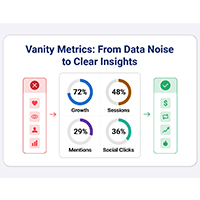
Vanity metrics can mislead teams into tracking numbers that never drive results. Discover what makes a metric truly actionable. Read on!