• Home
  • Tools dropdown img
    • Spreadsheet Charts

      • ChartExpo for Google Sheets
      • ChartExpo for Microsoft Excel
    • Power BI Charts

      • Power BI Custom Visuals by ChartExpo
    • Word Cloud

  • Charts dropdown img
    • Chart Category

      • Bar Charts
      • Circle Graphs
      • Column Charts
      • Combo Charts
      • Comparison Charts
      • Line Graphs
      • PPC Charts
      • Sentiment Analysis Charts
      • Survey Charts
    • Chart Type

      • Box and Whisker Plot
      • Clustered Bar Chart
      • Clustered Column Chart
      • Comparison Bar Chart
      • Control Chart
      • CSAT Survey Bar Chart
      • CSAT Survey Chart
      • Dot Plot Chart
      • Double Bar Graph
      • Funnel Chart
      • Gauge Chart
      • Likert Scale Chart
      • Matrix Chart
      • Multi Axis Line Chart
      • Overlapping Bar Chart
      • Pareto Chart
      • Radar Chart
      • Radial Bar Chart
      • Sankey Diagram
      • Scatter Plot Chart
      • Slope Chart
      • Sunburst Chart
      • Tornado Chart
      • Waterfall Chart
      • Word Cloud
    • Google Sheets
      Microsoft Excel
  • Services
  • Pricing
  • Contact us
  • Blog
  • Support dropdown img
      • Gallery
      • Videos
      • Contact us
      • FAQs
      • Resources
    • Please feel free to contact us

      atsupport@chartexpo.com

Categories
All Data Visualizations Data Analytics Surveys
Add-ons/
  • Google Sheets
  • Microsoft Excel
  • Power BI
All Data Visualizations Data Analytics Surveys
Add-ons
  • Google Sheets
  • Microsoft Excel
  • Power BI

We use cookies

This website uses cookies to provide better user experience and user's session management.
By continuing visiting this website you consent the use of these cookies.

Ok

ChartExpo Survey


Home > Blog > Microsoft Excel

Comparative Analysis: Methods, Tips, and Examples

Evaluating the differences and similarities in your data is one of the most straightforward analyses you can ever conduct.
You only need to compare data points side-by-side.

It gets better.

One of the comparative analysis example strategies we recommend is using charts.

comparative analysis example

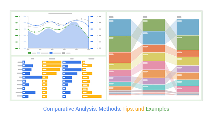
Our brains process visual data 60,000 times faster than texts and figures. This creates a concrete argument for using comparison-oriented graphs, such as Matrix and Radar Graphs.

These charts are amazingly easy to read and interpret.

Excel is one of the freemium tools you can use to visualize your data for insights. However, it lacks ready-to-go graphs for conducting a comparative analysis, such as the Radar Chart.

You don’t have to dump Excel for other expensive data visualization tools.

You can supercharge your Excel by installing a particular add-in to access ready-made graphs for comparative analysis.

You don’t want to miss this.

In this blog, you’ll learn:

Table of Content:

  1. What is Comparative Analysis?
  2. Why is Comparative Analysis Important?
  3. When to use a Comparative Analysis?
  4. Requirements For Comparative Analysis
  5. Comparative vs. Competitive Analysis: Exploring the Differences
  6. Real-Life Comparative Analysis Examples
  7. How to Write a Comparative Analysis?
  8. Key Comparative Analysis Methods
  9. Comparative Analysis Chart
  10. How to Conduct Comparative Analysis: Step-By-Step
  11. Best Practices For a Successful Comparative Analysis
  12. Wrap Up

What is Comparative Analysis?

Definition: Comparison analysis is a methodology that entails comparing data variables to one another for similarities and differences.

Conducting a comparative analysis can help you understand the problem in-depth and form strategies. More so, you can efficiently conduct this analysis to investigate data points with noticeable differences and commonalities.

Car factories can leverage this analysis to examine two production processes to determine cost-effectiveness.

In the education section, policymakers can use comparative analysis examples to compare the efficacy of different curriculums.

Other practical uses of comparative analysis include:

  • Evaluating emerging opportunities versus risks among micro and small
  • Comparing performance relative to the competition.
  • Compare revenue versus costs in your business.

Comparative analysis is critical to your data storytelling. In other words, you can use this methodology, along with Visual Analytics, to create compelling narratives for your audience. Let’s check out the benefits of the analysis.

Why is Comparative Analysis Important?

Comparative analysis is important to better understand the problem and answer related questions. The main goals companies try to achieve by comparing records, documents, or processes are:

  • Keep up with Your Competition’s Every Move

You can quickly evaluate the competition for more insights by conducting a comparative analysis.

  • Establish What’s Working and What’s Not

You need to know what’s working well and what is not working well for you if your goal is to maximize returns and cut costs in the long term. So, flexibility and quickness in adopting changes are vital.

The longer you take, the less valuable these improvements become. Besides, you risk losing your market to the competition.

  • Save Time and Resources

Comparative analysis helps you save time and valuable resources by providing a versatile way of comparing data using easy-to-read charts and graphs.

  • Explore Opportunities using Data

Competitive analysis, along with comparative analysis, helps you explore valuable opportunities in your data that are constantly appearing.

When to use a Comparative Analysis?

Use comparative analysis when evaluating multiple options to choose the best product, service, or strategy. It helps benchmark performance against industry standards or competitors, identify best practices, and make informed decisions in strategic planning.

Additionally, it aids in problem-solving by analyzing potential solutions and determining the most effective one, such as conducting a cost-of-living comparison to find the best location for economic efficiency.

Requirements Comparative Analysis

  • Define criteria: Establish clear metrics for comparison.
  • Gather data: Collect relevant information for each option.
  • Analyze similarities and differences: Evaluate how each set of requirements aligns with the goals.
  • Compare against goals: Assess which option best meets the desired objectives.
  • Consider budget and constraints: Factor in financial and operational limitations.
  • Make informed decisions: Choose the most suitable option based on the analysis.

Comparative vs. Competitive Analysis: Exploring the Differences

Comparative and competitive analyses serve distinct purposes, each offering valuable insights for decision-making.

Comparative Analysis: Involves examining similarities and differences between entities, such as products, services, or companies.

Example: Comparing the features and pricing of two smartphone models to determine which offers better value for money.

Competitive Analysis: Focuses on evaluating competitors within a market to identify strengths, weaknesses, and opportunities.

Example: Assessing the market share and marketing strategies of various fast-food chains to understand their competitive positions.

Real-Life Comparative Analysis Examples

  • Weather

Data analysts in weather stations use comparison-based charts, such as Line Charts and Bar Charts, to compare weather patterns across different periods.

  • Recession Indicators

Federal and central banks worldwide use comparison charts to closely follow the global economy’s performance. Growth is depicted by two consecutive peaks of the line curve.

On the other hand, two consecutive trough quarters in a year are a sign recession is on the corner.

How to Write a Comparative Analysis?

  1. Choose Your Topic: Select two or more entities to compare. Ensure they have relevant similarities and differences that you can analyze effectively.
  2. Define Criteria: Identify specific criteria or factors for comparison. These could include features, pricing, quality, performance, customer satisfaction, or any other relevant aspects.
  3. Research: Gather information about each entity, including data, statistics, customer feedback, and expert opinions. Use credible sources to ensure accuracy and reliability.
  4. Organize Your Analysis: Structure your analysis by presenting each entity side by side, highlighting similarities and differences under each criterion. Use tables, charts such as Pyramid Charts, or bullet points for clarity.
  5. Draw Conclusions: Analyze the data and draw conclusions based on your findings. Assess which entity performs better in each criterion and provide insights into its relative strengths and weaknesses.

Key Comparative Analysis Methods

  1. Benchmarking: Benchmarking involves comparing an organization’s processes, performance metrics, and practices against those of leading companies in the industry. The goal is to identify areas for improvement and adopt best practices to enhance performance.
  2. SWOT Analysis: SWOT analysis examines an entity’s Strengths, Weaknesses, Opportunities, and Threats. This method helps organizations understand their internal capabilities and external environment, facilitating strategic planning and decision-making.
  3. Cost-Benefit Analysis: Cost-benefit analysis evaluates the financial implications of different options by comparing their costs and benefits. This method helps in making informed decisions by quantifying the trade-offs involved.
  4. PEST Analysis: PEST analysis assesses the Political, Economic, Social, and Technological factors that impact an organization. This external analysis method helps understand the broader environment and its influence on the entity’s operations.
  5. Comparative Statistical Analysis: This method involves using statistical tools and techniques to compare datasets. It helps identify patterns, trend analysis, and relationships between variables, providing valuable insights for research and decision-making.

Comparative Analysis Chart

For you to conduct a comparative analysis example, you need different types of comparison charts. Yes, because we interpret visual data faster than text and figures.

We’ve put together a list of comparisons based on graphs you’ve to try.

  • Comparison Bar Chart

A Comparison Bar Chart is one of the best charts you can use to draw comparative analysis examples.

Remember, drawing comparisons is something that humans do naturally. So, by conducting comparative analysis examples using charts, you gain far more insights than relying on intuition or mere observation.

For instance, using a price comparison template in Excel allows you to visualize and analyze differences between products or services effectively. This chart is the go-to if your goal is to compare two or more data sets or items within the same data set.

The key objective of this comparative chart is to help you visually depict data side by side, allowing you to see how data points stack up against one another.

comparison bar char in comparative analysis example
  • Matrix Charts

A Matrix Chart is a Comparison Chart example you can use to display relationships in your dataset, irrespective of the complexity. The chart has a grid-like format to display insights into relationships between two or more variables.

The Matrix Chart is effective at displaying many-to-many relationships in data. In other words, you can draw comparisons and insights into multiple groups or specific components in your data.

matrix chart in comparative analysis example
  • Multi-Axis Comparison Line Graph

A Multi-Axis Line Graph function uses two y-axes. This gives you more flexibility to use one chart to display more insights using limited space.

It gets better.

You can easily visualize data with varying metrics because the chart has two different scales.

multi axis comparison line chart in comparison chart examples

How to Conduct Comparative Analysis: Step-By-Step

Comparative analysis example is a form of analysis that entails comparing a data point against others. This is often a task for a data analyst, who uses various tools to draw insights from data. One of the standard tools for conducting comparative analysis uses charts, graphs, and maps in Excel.

However, the spreadsheet application lacks ready-made Comparative Charts.

We’re not advising you to do away with Excel in favor of other expensive tools.

This is because there’s an amazingly affordable visualization tool that comes as an add-in you can easily install in Excel to access insightful and easy-to-customize Comparison-based charts. The application is called ChartExpo.

What is ChartExpo?

ChartExpo is an add-in you can easily install in your Excel to access ready-made and visually appealing Comparative Charts in Excel, such as Multi Axis Line and Radar Charts.

Features and Benefits

  • You have maximum freedom to customize your charts to your liking.
  • You don’t need sophisticated design or coding skills to generate stunning, insightful charts for data storytelling. Save time with this drag-and-drop application.
  • The tool has many templates to ensure a wider selection of charts. This means you don’t have to waste time moving from one tool to another looking for charts.
  • With just a few clicks, you can turn overwhelming tables and spreadsheets into stunning, insightful graphs.
  • ChartExpo comes with a free 7-day trial. Essentially, if you’re unsatisfied with the tool within a week, you can opt out as easily as signing up for a trial.

In the coming section, we’ll take you through data visualization using a Multi-Axis Chart using the ChartExpo add-in.

You don’t want to miss this!

Example

This section will use a Multi-Axis Line Graph (one of the Comparative Analysis Charts) to display insights into the table below.

Month Laptop TV Mobile Tablet
Jan 45 60 40 35
Feb 60 80 30 70
Mar 55 65 50 55
Apr 35 70 55 80
May 55 55 70 55
Jun 75 85 20 90
Jul 60 50 55 70
Aug 40 30 80 35
Sep 50 55 60 40
Oct 80 75 20 60
Nov 30 50 65 55
Dec 25 30 35 50

To get started with ChartExpo in Excel, follow the steps below:

  • Open your Excel desktop application.
  • Open the worksheet and click the Insert button to access the My Apps option.
insert chartexpo in excel
  • Select ChartExpo add-in and click the Insert button.
open chartexpo in excel
  • In this case, look for the “Multi-Axis Line Chart” in the list of charts as shown below.
search multi axis line chart in excel
  • Highlight your data and click the Create Chart From Selection button, as shown below.
create multi axis line chart in excel
  • To edit the chart, click the Edit Chart button.
edit multi axis line chart in excel
  • Once the Chart Header Properties window shows, click the Line 1 button, and fill in your header.
save multi axis line chart in excel
  • Toggle the small button below Line 2 to the right side.
  • Click the Apply button.
  • Check out the final chart below.
multi axis comparison line chart in comparison chart examples

Best Practices For a Successful Comparative Analysis

  1. Define Your Goals: Start by clarifying what you hope to achieve with your analysis. Think about what you want to compare and why it matters. This will help you stay focused and ensure your analysis is relevant.
  2. Choose Wisely: Select entities that make sense for your goals. Look for ones with noticeable differences and similarities. Make sure you have enough data to work with to make your analysis meaningful.
  3. Keep it Fair: Use consistent criteria for your comparison. This keeps things fair and easy to understand. Everyone should be judged by the same standards.
  4. Get the Full Picture: Gather as much information as you can about each entity. Numbers are important, but so are things like customer feedback and industry trends. The more data you have, the better your analysis will be.
  5. Stay Organized: Organize your data neatly so it’s easy to follow. Tables, charts, and graphs can help you visualize your findings. Don’t forget to label everything clearly so others can understand it too.
  6. Stay Neutral: Try to be impartial when analyzing your data. It’s easy to let personal biases sneak in, so stay objective and focus on the facts.
  7. Consider the Context: Think about the bigger picture. What’s happening in the industry? Are there any external factors that might influence your analysis? Taking these into account will give you a more accurate picture.
  8. Find the Meaning: Dive deep into your data to uncover insights. Look for patterns and trends that can help you understand what’s going on. These insights will be key to making informed decisions.
  9. Keep it Simple: When presenting your findings, keep things clear and concise. Use plain language and visuals to help people understand complex ideas.
  10. Keep Learning: Finally, don’t be afraid to learn from your analysis. Use feedback to improve your approach over time. The more you practice, the better you’ll become at conducting comparative analyses. For instance, incorporating tools like a Mosaic plot can provide a clear visual representation of categorical data, enhancing your understanding and interpretation of complex datasets.

FAQs

What are the 4 types of comparative analysis?

The four types of comparative analysis are:

  1. Qualitative Comparative Analysis (QCA)
  2. Quantitative Comparative Analysis (QCA)
  3. Descriptive Comparative Analysis
  4. Structural Comparative Analysis

What are the three methods of comparative method?

The three methods of the comparative method are:

  1. Controlled Comparison Method
  2. Similarity-Difference Method
  3. Comparative-Historical Method

What are the main objectives of comparative analysis?

The main objectives of comparative analysis are:

  1. To identify similarities and differences between entities.
  2. To evaluate performance, strengths, and weaknesses.
  3. To understand market positioning and competitive advantages.
  4. To inform decision-making and strategic planning.
  5. To gain insights into trends and patterns over time.

Wrap Up

Investigating the differences and similarities in your data is one of the most straightforward analyses you can ever conduct. You only need to compare data points side-by-side.

One of the comparative analysis strategies we recommend is using charts.

Remember, our brains process visual data faster than texts and figures. This creates a concrete argument for using comparison-oriented graphs, such as Matrix and Radar Graphs.

How much did you enjoy this article?

ExcelAd2
Start Free Trial!
121828

Related articles

next previous
Microsoft Excel8 min read

Excel Task Tracker Template for Smarter Task Insights

Task tracker template in Excel organizes tasks, tracks deadlines, and boosts efficiency. Learn its benefits, and explore expert tips to simplify task management.

Microsoft Excel10 min read

Invoice Tracker Template in Excel for Better Insights

An invoice tracker Excel template helps track invoices, due dates, and payments. Learn how to use this template for better financial management.

Microsoft Excel12 min read

Key Performance Indicators in Healthcare for Better Insights

Key Performance Indicators in healthcare track patient care and efficiency. Learn about these KPIs, top examples, and how to use them to improve outcomes.

Microsoft Excel10 min read

BMI Calculation Formula in Excel for Better Fitness Insights

The BMI calculation formula in Excel helps track and analyze body mass index. Explore step-by-step instructions and tips to simplify BMI tracking in Excel.

Microsoft Excel29 min read

How to Create a Tornado Chart in Excel? A Complete Guide

Click to learn how to plot a Tornado Chart in Excel using easy-to-follow steps. Also, we’ll address the following question: what is a Tornado Diagram?

ChartExpo logo

Turn Data into Visual
Stories

CHARTEXPO

  • Home
  • Gallery
  • Videos
  • Services
  • Pricing
  • Contact us
  • FAQs
  • Privacy policy
  • Terms of Service
  • Sitemap

TOOLS

  • ChartExpo for Google Sheets
  • ChartExpo for Microsoft Excel
  • Power BI Custom Visuals by ChartExpo
  • Word Cloud

CATEGORIES

  • Bar Charts
  • Circle Graphs
  • Column Charts
  • Combo Charts
  • Comparison Charts
  • Line Graphs
  • PPC Charts
  • Sentiment Analysis Charts
  • Survey Charts

TOP CHARTS

  • Sankey Diagram
  • Likert Scale Chart
  • Comparison Bar Chart
  • Pareto Chart
  • Funnel Chart
  • Gauge Chart
  • Radar Chart
  • Radial Bar Chart
  • Sunburst Chart
  • see more
  • Scatter Plot Chart
  • CSAT Survey Bar Chart
  • CSAT Survey Chart
  • Dot Plot Chart
  • Double Bar Graph
  • Matrix Chart
  • Multi Axis Line Chart
  • Overlapping Bar Chart
  • Control Chart
  • Slope Chart
  • Clustered Bar Chart
  • Clustered Column Chart
  • Box and Whisker Plot
  • Tornado Chart
  • Waterfall Chart
  • Word Cloud
  • see less

RESOURCES

  • Blog
  • Resources
  • YouTube
SIGN UP FOR UPDATES

We wouldn't dream of spamming you or selling your info.

© 2025 ChartExpo, all rights reserved.