Categories
By ChartExpo Content Team
Performance metrics reveal what’s working, what’s failing, and where to focus next. Businesses that track the right data make smarter decisions, stay competitive, and grow with confidence.
Some metrics help companies grow. Others mislead and waste resources. Choosing the right performance metrics is the difference between success and failure.


Businesses need to track what matters and ignore the rest.
Performance metrics drive decisions in sales, marketing, customer service, and operations. They reveal strengths, expose weaknesses, and highlight opportunities.
The challenge? Avoiding vanity numbers and focusing on data that improves performance.
First…
Performance metrics are quantifiable measures that businesses use to track, monitor, and assess the success or failure of their operations. These metrics can vary widely depending on the industry, from revenue per salesperson in retail to ticket resolution time in customer service.
By analyzing these data points, organizations can make informed decisions to drive improvement and achieve strategic goals.
Businesses don’t guess their way to success. They track, measure, and adjust. Performance metrics reveal how well a company operates, highlighting strengths and exposing weaknesses. Numbers don’t lie, but they need interpretation. Without the right metrics, businesses make decisions in the dark.
Data shows what’s working and what’s failing. Sales figures, production rates, and customer retention rates all tell a story. A business without measurement is like a driver without a dashboard—no speedometer, no fuel gauge, no way to know if a problem exists.
A business that doesn’t measure performance runs on guesswork. Numbers tell a company where it stands, where it’s failing, and where to focus. Business performance metrics track growth, efficiency, and profitability. They reveal strengths, highlight risks, and guide decisions.
Without tracking, businesses waste resources. They chase low-value customers, overspend on weak products, and miss revenue opportunities. Metrics turn assumptions into facts. A company tracking customer acquisition cost knows if marketing is effective. A retailer measuring inventory turnover knows if products are moving or gathering dust.
Data prevents blind spots. A rising return rate signals product issues. A declining repeat purchase rate suggests customer dissatisfaction. Measuring performance isn’t about data collection—it’s about knowing what to fix.
Bad metrics create a false sense of progress. Vanity numbers, like social media likes, often appear valuable but lack real business impact. They inflate performance without reflecting actual growth, leading teams to chase meaningless targets.
Poorly defined metrics encourage wrong decisions. If sales teams focus only on revenue, they may overlook profit margins. High sales figures seem impressive, but without tracking costs, the business might operate at a loss.
Inconsistent data leads to flawed comparisons. If customer retention is measured differently across teams, reports will contradict each other. Misaligned definitions distort insights, making it hard to spot real patterns and trends.
Businesses must scrutinize their metrics. Every number should tie back to a clear goal. If a metric doesn’t guide action, it’s noise. Reliable, well-structured data supports better forecasting, smarter planning, and stronger results.
Key Performance Indicators (KPIs) guide businesses toward their strategic goals. Not all data points are equally important, thus focusing on the essential KPIs is crucial.
For instance, a retail business might prioritize inventory turnover and customer retention rate. These KPIs directly impact profitability and business growth. It’s about finding metrics that give the clearest insight into performance and strategic alignment.
Understanding the difference between KPIs and vanity metrics is crucial for effective management. KPIs offer actionable insights that affect the business’s core functions.
Conversely, vanity metrics, like page views or number of followers, might look good on paper but don’t necessarily translate to business success. Businesses must focus on metrics that drive decisions and improve key outcomes, not just those that are impressive to share.
Selecting the right metrics involves aligning them with your business goals and industry benchmarks. If your goal is to enhance customer satisfaction, metrics like Net Promoter Score (NPS) or customer satisfaction scores (CSAT) are relevant.
Comparing these metrics to industry standards gives businesses a competitive understanding. This alignment ensures that the metrics you track are geared towards real improvements and industry relevance.
A radar chart is ideal for comparing multiple variables. For businesses, it helps in visualizing performance indicators across different departments. The chart’s multi-axis nature allows for an overview of areas like sales, customer service, and production at a glance.
This visualization aids in pinpointing strengths and weaknesses across departments, fostering better decision-making.
Incorporating a radar chart into business analysis benefits decision-making. It visually breaks down complex data, making it easier to identify which departments are performing well and which are not.
This clear visual comparison aids in strategic planning and resource allocation, ensuring efforts are concentrated where they are needed most. Such tools are not just about data presentation; they are vital for strategic insights and informed decision-making.
Revenue growth tracks increases in sales over time. It signals business expansion and market traction. Profit margins measure efficiency, showing earnings after costs. Return on investment (ROI) gauges profitability from spending, guiding smarter financial choices.
Revenue growth reveals demand shifts. A steady rise suggests strong sales. Declines indicate weaknesses. Profit margins expose financial health. High margins mean efficient operations. Low margins hint at pricing or cost issues. ROI measures resource effectiveness. Higher ROI signals better investment returns.
Each metric influences strategy. Revenue growth drives expansion. Margins dictate pricing and cost control. ROI informs spending decisions. Together, they show financial stability, helping businesses plan and adjust effectively.
Cash flow reflects money moving in and out. Positive cash flow ensures bills get paid. Negative cash flow signals trouble. Cost management controls expenses, keeping operations lean. Strong cash flow and tight cost control build financial resilience.
Operating cash flow tracks core business earnings. Free cash flow shows remaining funds after expenses. Tracking these prevents liquidity crises. Cost management reduces waste. Lower expenses boost profit margins. Businesses that manage cash and costs well stay competitive.
Healthy cash flow enables growth. It funds investments, salaries, and new ventures. Controlled costs mean stable profits. Together, they protect against downturns, ensuring long-term survival.
Smart spending maximizes returns. Businesses track spending against outcomes. Metrics like cost-to-revenue ratios and capital efficiency help. These measures show if money is well spent or wasted.
Capital expenditure (CapEx) evaluates investment efficiency. Operating expenses (OpEx) track daily costs. Return on assets (ROA) shows asset profitability. These indicators guide spending choices. Companies that track them avoid wasteful investments and focus on productive areas.
Effective spending fuels growth. Strong metrics prevent financial waste. Data-driven investment decisions improve financial strength, ensuring resources generate real value.
A Waterfall chart shows revenue and cost breakdowns step by step. It highlights gains and losses clearly. This makes financial trends visible, showing how money flows through a business.
Each bar in a waterfall chart represents a financial stage. Positive values push totals higher. Negative values reduce them. This format makes cost drivers and revenue sources easy to spot. Companies use this to pinpoint expense spikes and revenue dips.
Businesses benefit by spotting spending inefficiencies. The waterfall chart clarifies financial movements. It aids in budgeting, cost control, and financial forecasting. Decision-makers see what improves or hurts financial health, leading to better planning.
KPIs are crucial in sales. They guide teams towards achieving business goals. Revenue per sale, lead-to-conversion rate, and pipeline velocity are among the most impactful.
Revenue per sale shows the average income from each transaction. It helps in understanding the value of each customer. Lead-to-conversion rate measures the efficiency of turning leads into buyers. High rates mean your sales tactics are effective.
Pipeline velocity tracks the speed at which deals move through your sales pipeline. Faster velocities suggest a streamlined, efficient sales process.
Optimizing these KPIs boosts overall sales performance. Teams can focus their efforts where they count most, enhancing productivity and profitability.
For sales teams, specific metrics gauge individual and collective success. Productivity, call volume, and closing rates are key indicators.
Productivity measures the output of each team member, often reflecting the quality of work. Call volume tracks the number of sales calls or meetings. It’s a direct indicator of a team’s effort.
Lastly, closing rates show the percentage of deals closed successfully. Higher rates indicate effective sales strategies and strong customer persuasions.
Monitoring these metrics helps managers identify high performers and areas needing improvement. It also motivates the team to push for higher standards.
Conversion Rate Optimization (CRO) is vital in maximizing business potential. It involves using data to improve the rate at which leads become customers.
By analyzing customer interactions, businesses can identify barriers in the sales process. Removing these increases the likelihood of conversion. Strategies involve A/B testing different sales pitches or website layouts. The goal is to find what converts best.
Effective CRO not only boosts sales but also enhances customer experience. It makes the journey from lead to customer smooth and satisfying.
A funnel chart is an effective tool for visualizing lead-to-sale conversions. It shows the number of prospects at each stage of the sales process. The chart’s shape helps in quickly identifying where prospects drop out.
This visualization aids in pinpointing stages needing improvement. For instance, if many leads fail to move from initial contact to interested, strategies can be adjusted. The funnel chart is not just a visual aid but a guide for data-driven decision-making.
Incorporating this chart into sales strategies provides clear, actionable insights. It highlights successes and areas for potential improvement in the sales funnel. This makes it easier for teams to focus their efforts and resources effectively.
The following video will help you to create a Funnel Chart in Microsoft Excel.


The following video will help you to create the Funnel Chart in Google Sheets.
Think about the last time you reached out to customer service. How quickly did they respond? Fast response times can turn frustrated customers into happy ones.
The Resolution Rate also plays a huge role. It measures how many complaints or issues get resolved on the first contact. High resolution rates often lead to higher customer satisfaction.
The Satisfaction Score ties everything together, reflecting how customers feel about their interactions. These metrics are essential for any customer service team aiming to improve their game.
Ever wonder how some businesses seem to know when a customer might leave? They use metrics like churn rate and loyalty indicators.
Churn rate looks at how many customers stop using your service. Loyalty metrics, on the other hand, might include repeat purchase rates or subscription renewals. These numbers help predict customer behavior and strategize on retaining them longer.
Tracking these can alert you early if customers might be thinking of leaving. Then, you can act fast to keep them happy and engaged.
What are people saying about your brand? Reviews, NPS, and word-of-mouth feedback are key indicators of brand reputation. Reviews provide direct customer feedback and influence potential customers. NPS measures customer willingness to recommend your brand to others, a strong indicator of customer loyalty.
Positive word-of-mouth can be gold for a business. It means your customers are happy enough to tell others about their great experiences. Together, these metrics paint a clear picture of your brand’s health and reputation.
A Likert scale chart visualizes customer satisfaction across multiple touchpoints. It displays responses on a scale, often ranging from “Strongly Disagree” to “Strongly Agree.” This structured format helps businesses assess service quality at different interaction stages.
The Likert scale chart provides clear insights into customer opinions. Businesses can compare satisfaction across different departments or service channels. Patterns in responses reveal strengths and weaknesses. This structured approach helps identify service gaps and areas for improvement.
Using this chart, businesses make data-driven decisions to improve customer experience. It helps prioritize changes based on customer feedback. Companies can track changes over time, ensuring service enhancements align with customer expectations.
High absenteeism and turnover rates signal underlying issues. They impact productivity and incur significant costs in hiring and training replacements. Monitoring these rates helps identify problems early, potentially saving the company from substantial losses.
Absenteeism rate measures the frequency of unscheduled absences. Turnover rate calculates how often staff leave and need replacement. Both metrics are crucial for maintaining a stable work environment. High rates may indicate dissatisfaction or poor work conditions, prompting necessary interventions.
Addressing these issues often involves improving workplace conditions and employee support. This can lead to a more motivated workforce, reducing absenteeism and turnover. Ultimately, this enhances company culture and profitability.
KPIs for HR focus on work quality, timeliness, and team collaboration. These indicators help track the effectiveness of HR policies and their impact on company performance. High-quality work, timely completion of tasks, and effective collaboration are all signs of a healthy organizational culture.
Work quality KPIs might include error rates or client satisfaction scores. Timeliness can be measured by deadline adherence rates. Collaboration effectiveness might be evaluated through peer reviews or project outcomes. These metrics provide clear, actionable data that HR can use to improve processes and training programs.
Improving these areas directly benefits overall company performance. Better work quality and efficiency boost customer satisfaction and operational success. Enhanced collaboration leads to innovative solutions and a more cohesive work environment.
Effective objective management aligns employee goals with company objectives. This alignment ensures that everyone is working towards common goals, enhancing overall company performance. Clear, measurable goals motivate employees and provide a clear direction for their efforts.
Setting specific, achievable goals helps employees understand their role in the company’s success. Regular reviews and updates ensure these goals remain relevant and challenging. This ongoing process keeps the workforce focused and driven, directly contributing to the company’s achievements.
The benefits of good objective management are clear. It leads to higher productivity, better job satisfaction, and more robust company performance. By aligning individual achievements with company targets, everyone moves forward together.
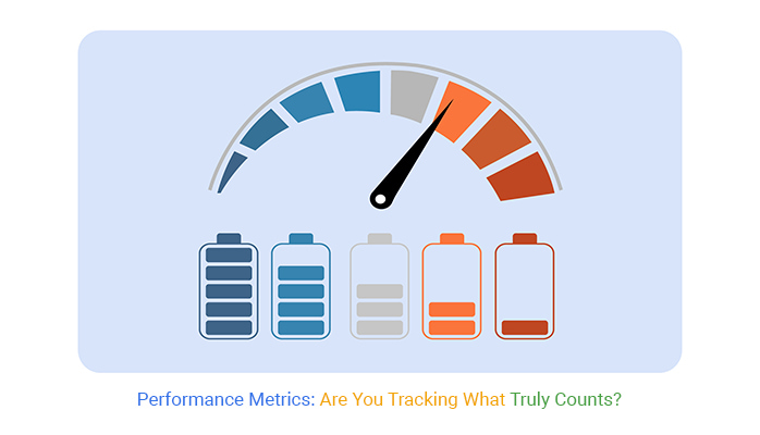
Gauge charts offer a dynamic way to visualize employee engagement and productivity. These charts display data in a dial format, making it easy to see metrics at a glance. This visual format is ideal for displaying levels that fall within a predefined range, such as engagement scores or productivity levels.
The clarity of gauge charts helps in quickly assessing employee performance metrics. They show where improvements are needed and how close individuals or teams are to reaching their targets. This immediate visual feedback is invaluable for managers and employees alike.
Using gauge charts in presentations or dashboards enhances data comprehension. This visual tool helps staff and management understand metrics more intuitively, facilitating better decision-making and planning. It’s a practical way to keep everyone informed and focused on key performance areas.
Inventory turnover is a critical metric for managing stock efficiency. It measures how often inventory is sold and replaced over a specific period. High turnover indicates strong sales and effective inventory management, while low turnover might suggest overstocking or product issues.
Effective management of this metric helps businesses avoid costly overstocks and stockouts, which can disrupt operations and erode customer trust.
Another essential aspect of stock efficiency is the reorder point formula. It determines the right time to reorder stock based on sales velocity and delivery times. Businesses must calculate this point accurately to maintain an optimal inventory level that meets customer demand without tying up too much capital in unsold goods.
By focusing on these aspects, businesses can maintain a balanced inventory that meets market demand while minimizing carrying costs. This not only improves cash flow but also ensures that customers find the products they need when they visit, enhancing satisfaction and loyalty.
Process optimization is crucial for maximizing business performance. By focusing on key performance indicators such as cycle time, businesses can identify delays and inefficiencies within their operations.
Cycle time, the total time from the beginning to the end of a process, serves as a measure of process speed and efficiency. Reducing cycle time can lead to quicker turnaround times and increased customer satisfaction.
Identifying and addressing bottlenecks is another critical aspect of process optimization. Bottlenecks occur when a particular stage in a process slows down the overall operation, creating delays and increasing costs.
By analyzing workflow and throughput at various stages, businesses can pinpoint these bottlenecks and implement targeted improvements.
Waste reduction is also integral to process optimization. This involves identifying areas of waste—whether in materials, time, or effort—and implementing strategies to reduce or eliminate them. Techniques such as Lean Six Sigma can be instrumental in this regard, helping businesses streamline operations and increase efficiency.
In the realm of supply chain and logistics, key metrics such as cost, delivery speed, and vendor performance are instrumental in evaluating efficiency and effectiveness. Cost metrics help businesses track expenses associated with logistics and supply chain operations, aiming to reduce costs without compromising quality or customer satisfaction.
Delivery speed metrics assess the time it takes for products to move from warehouse to customer, a critical factor in customer satisfaction and competitive advantage.
Vendor performance metrics are equally critical as they measure the reliability and quality of suppliers. These metrics can help businesses identify high-performing vendors and those that may pose risks to supply chain stability.
Regular assessment of vendor performance can lead to improved supply chain resilience and better negotiation power for businesses.
By closely monitoring these metrics, companies can make informed decisions that enhance supply chain reliability, reduce costs, and improve overall customer satisfaction.
The Pareto chart is an excellent tool for identifying bottlenecks in business operations. This chart highlights the most significant factors in a dataset, based on the 80-20 rule, i.e. that 80% of problems are often due to 20% of causes. By using a Pareto Chart, businesses can visually identify these key issues or bottlenecks that are hindering performance.
In the context of business operations, the Pareto Chart can be used to pinpoint areas where resources are being wasted or where delays are most common. This enables managers to prioritize problem-solving efforts, focusing on the issues that will have the largest impact on efficiency and productivity.
The visual nature of the chart makes it easy to communicate these insights across the organization, facilitating a collaborative approach to problem-solving.
By integrating the Pareto Chart into regular performance reviews, businesses can maintain a continuous focus on operational efficiency. This ongoing attention to detail helps to prevent small issues from becoming major bottlenecks, ensuring smooth and efficient business operations.
For SaaS businesses, understanding user engagement and retention is key. Tracking how often and how long users engage with the application can show how ‘sticky’ and valuable the service is. Metrics like daily active users (DAUs) and monthly active users (MAUs) provide insights into the app’s daily and monthly usage.
Retention rates give a clear picture of how well the business keeps its users over time. A high retention rate generally indicates that the product meets customer needs effectively.
Identifying drop-off points helps businesses understand where users stop using the application. Addressing these points can improve user experience and increase retention.
In SaaS, how you price products and manage expansion revenue is crucial. Upsell and renewal rates are significant metrics here. Upsell rate measures how effectively a business can sell additional features or products to existing customers. A high upsell rate indicates strong customer relationships and product value.
Renewal rate tracks how many customers renew their subscriptions. It’s a direct indicator of long-term customer satisfaction and product dependability. High renewal rates are often seen in businesses that offer valuable, reliable products that meet ongoing customer needs.
Multi-axis line charts are excellent for visualizing complex data clearly and effectively. This type of chart can show multiple growth metrics, like subscription numbers and revenue trends, over time. The dual axes allow for comparison of two variables, making it easier to see how changes in one affect the other.
Using a multi-axis line chart in this context highlights the relationship between subscription growth and revenue increases. It helps stakeholders understand market trends and make better strategic decisions. The visual representation supports quicker data interpretation and enhances strategic planning.
Now, let’s turn those clicks into customers! Conversion rates will show you exactly how well your site turns visitors into leads or sales. It’s a simple formula: take the number of conversions, divide by the total visitors, and then multiply by 100 to get a percentage. Higher percentages? You’re doing great!
Lead generation metrics also deserve a shoutout. These include tracking how many new leads are coming in and where they’re coming from. By understanding these pathways, businesses can focus efforts on the most fruitful sources.
Finding the sweet spot between what you spend to get customers and what they bring over their lifetime is crucial. Customer Acquisition Cost (CAC) is all about how much you spend to snag each customer.
On the other hand, Customer Lifetime Value (CLV) is the total revenue a business can expect from a single customer. Aim for a CLV that’s at least three times the CAC for a healthy balance.
Brand awareness isn’t just about being known; it’s about being known well. Social engagement metrics, such as likes, shares, and comments, reveal how compelling your content is.
PR efforts can be measured by media mentions, while direct traffic metrics show how many folks come straight to your site without a referral. These insights help in sharpening market positioning strategies.
A mosaic plot breaks down acquisition costs across multiple marketing channels. It uses proportional rectangles to show how each channel contributes to overall spending. The size of each section represents the cost share, making it easy to compare investments across channels.
This data visualization helps marketers see which channels require more budget and which deliver better cost efficiency. If one section dominates, it signals a higher spending concentration. Smaller sections indicate lower costs or underutilized channels. Color coding enhances clarity, distinguishing between high-cost and low-cost sources.
By using a mosaic plot, teams quickly assess cost distribution without digging through spreadsheets. The visual structure makes it easy to identify over-budget channels or those needing optimization. This method simplifies budget allocation decisions, ensuring that funds go where they generate the most value.
Strategic planning isn’t just about setting goals; it’s about laying out a path to achieve them, and business metrics are your milestones. By aligning metrics with business goals, you create a focused strategy. This alignment ensures that every team in your organization pushes toward the same objective.
Metrics such as market share, growth rate, and profitability index act as indicators of your business health. They help you adjust your strategies in real-time, ensuring that your business stays on track. For instance, if your growth rate is slowing down, it might be time to innovate or reevaluate your market strategies.
Moreover, these metrics can predict future trends. By analyzing current and past performance data, you can forecast where your industry is heading. This foresight allows you to adapt your strategies proactively rather than reactively, keeping you one step ahead of the competition.
Benchmarking is your reality check. It measures your business performance against industry standards, providing insights into where you stand in your industry. This comparison is crucial because it sheds light on your competitive edge and areas needing improvement.
For instance, if your customer retention rates are below industry average, you know there’s room for improvement. You can then look into strategies that enhance customer satisfaction and loyalty. Conversely, if you’re leading in operational efficiency, you can capitalize on this strength in your marketing campaigns.
The key here is not just to compare but to understand the factors behind these numbers. Why is your competitor outperforming you in certain areas? What strategies are they using that you aren’t? These insights guide your strategic planning, helping you make informed decisions that boost your competitive stance.
Performance measurement is a powerful tool, but it’s easy to fall into certain traps. One common pitfall is focusing too much on short-term results. While these are important, they can sometimes lead you to make decisions that aren’t beneficial in the long run. It’s like sacrificing long-term health for a short-term gain.
Another trap is relying on flawed metrics. Not all metrics are created equal. Some might not accurately reflect your business performance or align with your strategic goals. It’s like using a faulty compass; you think you’re heading north, but you’re actually going south.
Always ensure your metrics are reliable and relevant to your business objectives.
Lastly, don’t ignore the context. Numbers can be misleading if taken at face value. Understanding the context behind the data is crucial. It’s the difference between reacting blindly and responding strategically.
A comparison bar chart simplifies complex data into a visual format, making it easy to compare your business performance against competitors. This chart type is excellent for displaying multiple data sets side-by-side, highlighting strengths and weaknesses at a glance.
This visualization is particularly useful in meetings and reports where quick, clear understanding is needed. It provides a snapshot of where you stand, helping stakeholders grasp key points without getting lost in numbers.
For instance, seeing a visual gap in market share can be more impactful than hearing the percentage difference.
The chart supports decision-making by making discrepancies and opportunities visible. It’s a straightforward tool that turns abstract numbers into concrete insights. This clarity is crucial for making strategic decisions that are informed by direct market comparisons.
Businesses should update their KPIs when there’s a shift in business strategies or goals. Major market changes or internal growth often warrants a review of existing KPIs to ensure they remain relevant.
Another trigger for updates is the introduction of new technology. Advances can provide more precise data, making it possible to refine KPIs for better accuracy.
Lastly, feedback from stakeholders can indicate the need for change. If KPIs are consistently failing to provide value or insight, they likely need to be reassessed and updated to better serve the company’s needs.
Conducting regular audits of performance metrics is vital. These audits help identify which metrics are performing well and which are not. An audit involves collecting data on each metric and evaluating its effectiveness against set goals.
Realigning metrics with business goals involves ensuring each metric supports overarching objectives. If a goal changes, the associated metrics should change too. This alignment guarantees that all efforts contribute directly to business success.
These audits should occur at least annually, though more frequent checks may benefit fast-changing industries. Regular realignment keeps the company’s strategy sharp and focused.
One major mistake companies make is relying on outdated metrics. Metrics that don’t evolve with business models or market conditions can lead to misguided strategies.
Another error is not involving the right stakeholders in developing metrics. Without input from all departments, selected metrics might not fully capture essential performance aspects.
Finally, ignoring the context in which data is collected can skew results. Companies must consider external factors that might affect data to avoid misinterpretations that could lead to poor decision-making.
A progress bar chart effectively visualizes milestones in performance improvements. This chart type provides a clear, visual representation of where a project or initiative stands in relation to its final goals.
By embedding a progress bar in this discussion, we emphasize its value in project management and strategic planning. It serves as a motivational tool, showing teams exactly how far they have come and how close they are to achieving their targets.
Utilizing this chart can enhance decision-making and planning. It allows managers and teams to quickly assess progress and adjust efforts accordingly. This visual tool keeps everyone aligned and focused on the end goals, ensuring consistent forward movement.
Businesses don’t succeed by tracking everything. They succeed by measuring what drives results. The right data improves sales, marketing, customer experience, and operations. Without clear metrics, decision-making becomes a guessing game.
Bad data leads to wasted time and money.
Tracking vanity numbers won’t fix inefficiencies or improve profits. Every metric should connect to business goals and provide insight that leads to action. Data should guide investments, improve processes, and strengthen competitive advantage.
Metrics should evolve. If business goals shift, the numbers tracked must shift too. Outdated or irrelevant data slows growth. Regular audits help keep reporting accurate and useful.
The businesses that succeed measure, adapt, and improve. They focus on real insights, ignore distractions, and use data to drive every move.
Numbers don’t lie—track the right ones, and they’ll point the way forward.
Net Promoter, NPS, NPS Prism and many other terms related to NPS are registered trademarks of Bain & Company Inc., Satmetrix Systems Inc., and Fred Reichheld.
How much did you enjoy this article?


Calculate accounts receivable turnover ratio to measure credit collection speed, improve cash flow, and strengthen your financial strategy. Read on!

Change Management KPIs are the key to tracking adoption, performance, and ROI during transitions. Find out which metrics matter. Read on!

Data collection methods and techniques determine the quality of every insight you act on. Explore key approaches for gathering reliable data. Read on!


