Categories
Healthcare facilities are among the sectors that produce incredibly immense data. This data is valuable only if it’s leveraged to the fullest. For instance, it could provide insights that help cut costs and improve service delivery.
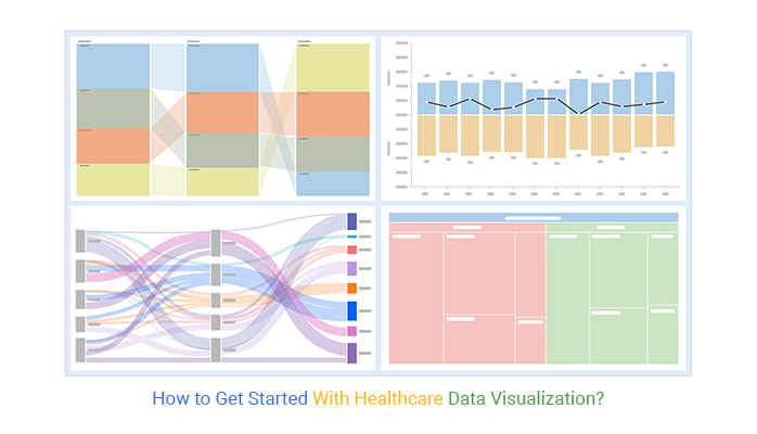


You need tested and proven charts to extract actionable insights into healthcare data. Luckily, we’ve put up together a list of recommended visualization designs you can leverage to extract crucial charts, namely:
Excel is one of the go-to popular data visualization tools among professionals and business owners worldwide.
However, the visualization tool has a very basic Comparison Bar, Treemap, and Sankey Charts. And this implies you’ve got to invest extra effort and time to edit the charts to align with your needs.
You can download and install a specific add-in in Excel to access ready-to-use creative data visualizations for healthcare (highlighted above).
In this blog post, you’ll learn the following:
Before delving into the how-to guide, we’ll address the following question: why is data visualization important in healthcare?
Definition: Data visualization in healthcare refers to the graphical representation of health-related data. It enables healthcare professionals to analyze complex information, identify trends, and make informed decisions quickly.
It utilizes various visual formats, such as charts and graphs, to enhance the understanding and communication of patient outcomes, operational performance, and clinical metrics.
In the following video, you will learn Video Tutorial: How to Create a Sankey chart in Excel to Visualize Healthcare Data.
Data visualization strategies help analysts in the healthcare sector communicate actionable insights and understand what a data analyst does in the process. Using tools like Microsoft Excel and Google Sheets, hospitals can create data streams and visualizations with the potential to optimize service delivery.
Tools for gathering data in most healthcare facilities include:
A survey can reveal opportunities for organizational growth through quantitative (“Please rate your satisfaction with your visit on a scale of 1 to 10”) and qualitative (additional comments section) strategies.
It’s common for healthcare professionals to use scorecards for tracking recovery among patients.
Data visualization in Healthcare plays different roles:
Visualizations help healthcare professionals and stakeholders quickly grasp intricate data relationships and trends, making it easier to identify patterns that may not be evident in raw data.
By presenting data clearly and concisely, visualization aids healthcare providers in making informed decisions about patient care, resource allocation, and operational improvements.
Data visualization can help identify areas for improvement in patient care by tracking key performance indicators (KPIs) and outcomes, ultimately leading to better treatment plans and healthcare strategies.
Effective visual tools can bridge the gap between medical professionals and patients, enabling clearer communication about diagnoses, treatment options, and health status.
Dashboards and visual reports allow for real-time monitoring of various health metrics, enabling timely interventions and adjustments to care plans as needed. This becomes especially powerful in healthcare dashboard examples, where clinicians and administrators can track patient conditions, resource usage, and performance indicators in a single view for faster decision-making.
Visualization simplifies the reporting process, making it easier for healthcare organizations to share findings with stakeholders, regulatory bodies, and the public.
In the coming section, we’ll address data visualization in healthcare examples.
Some of the tested and proven healthcare data visualization charts you can use include:
Let’s discuss these charts in detail.
A Comparison Bar Chart is one of the healthcare data visualization graphs you can use to visualize data.
It uses a bar to represent sections of the same category, and these bars are placed adjacent to each other. The chart is reliable, especially in comparing items between various groups. You can track the changes in key variables.

Sentiment Trend Chart displays patients’ and other clients’ sentiments and opinions towards a healthcare facility. The chart has bars on either side with different colors.

Treemap Graph (one of the healthcare data visualization charts) uses nested rectangles to visualize your data. Each data point is represented by a rectangle, whose area is proportional to its value.
You can use this insightful chart to represent several dimensions of your data, such as groups and subgroups.
Note the difference after using a healthcare data visualization chart.

A Sankey Diagram visualizes “a flow” from one set of values to the next. The two items being connected are referred to as “nodes,” while the connections are labeled as “links.” It’s named after an Irishman, Capt. Matthew Sankey, who first used it in a publication on the energy efficiency of a steam engine in 1898.
Today, tools like a Sankey diagram maker make it easy to build these visuals for various applications. Though Sankey diagrams were initially used to analyze energy flows, they’re now a great way to depict the flow of money, time, and resources.
You can use this visualization design to clearly show complex processes, focusing on a specific aspect or resource you want to highlight. Plus, the chart supports multiple viewing levels, allowing flows to display energy, materials, fluids, revenue, or costs in a visually engaging way.

Healthcare data visualization helps professionals analyze complex data, identify trends, and improve decision-making. Effective visualization enhances patient care, optimizes resource allocation, and improves operational efficiency. Below are some key techniques used in the industry:
These combine multiple charts and metrics to provide an overview of patient care, hospital performance, or disease trends. They help healthcare professionals monitor KPIs like patient satisfaction, readmission rates, and treatment effectiveness in real time.
They highlight variations in patient outcomes, resource utilization, or disease prevalence across different regions. Hospitals use heatmaps to track infection outbreaks, optimize staff deployment, and analyze patient flow.
The Scatter plot is used to show correlations between variables like medication dosage and recovery rates. By identifying patterns, healthcare providers can make data-driven decisions to improve treatment plans and reduce risks.
They help track patient vitals, disease outbreaks, or hospital admissions over time. These charts are crucial for understanding trends in chronic diseases, seasonal illness spikes, and hospital capacity management.
These visualizations display healthcare access, epidemic spread, or regional disparities in medical resources. Public health agencies use geospatial maps to allocate resources effectively and improve healthcare accessibility.
Power BI is a versatile analytics tool that allows healthcare organizations to transform complex data into interactive reports and dashboards. Its integration with Microsoft products makes it user-friendly for healthcare professionals, enabling them to track KPIs and analyze trends effortlessly.
Looker, now part of Google Cloud, provides robust data analytics and visualization capabilities tailored for healthcare organizations. Its focus on embedded analytics allows for seamless integration into healthcare applications, helping users derive actionable insights from data.
ChartExpo is an intuitive data visualization tool that simplifies the process of creating various charts and dashboards without extensive coding knowledge. It’s particularly beneficial for healthcare analytics, allowing users to easily visualize patient data, track trends, and present insights effectively, such as a hemoglobin a1c chart to monitor long-term blood sugar levels and support better clinical decision-making.
Excel generates very basic healthcare data visualization charts, such as Sankey. However, when compared to more advanced data visualization tools, it lacks a significant number of the charts we highlighted earlier, such as Sentiment Trend Charts and more sophisticated Sankey Charts.
So, what’s the solution?
Download and install a particular third-party add-in into your Excel to access ready-made healthcare data visualization graphs.
ChartExpo is an Excel add-in with an ultra-friendly user interface to ensure that any professional can visualize data, irrespective of their coding or programming skills. The add-in comes loaded with all the healthcare data visualization charts highlighted above.
In the coming section, we’ll show you how to visualize healthcare data using Sankey in ChartExpo.
This section will use a Sankey chart in Excel to visualize the data below.
| Source Countries | Channel | Disease | Spending |
| Germany | CEPI | Ebola | 24000 |
| Germany | Development banks | Ebola | 39000 |
| Germany | NGO & Foundations | Ebola | 33000 |
| Canada | Development banks | Ebola | 14000 |
| Canada | NGO & Foundations | Ebola | 1400000 |
| United Kingdom | CEPI | Ebola | 49000 |
| United Kingdom | Development banks | Ebola | 8100 |
| United Kingdom | NGO & Foundations | Ebola | 2200000 |
| United Kingdom | UN agencies | Ebola | 5800000 |
| United States | Development banks | Ebola | 46000 |
| United States | NGO & Foundations | Ebola | 1300000 |
| Gates Foundation | CEPI | Ebola | 84000 |
| Gates Foundation | Development banks | Ebola | 11000 |
| Gates Foundation | NGO & Foundations | Ebola | 1900 |


CEPI got $157k from Germany, Canada, the United Kingdom, & Gates Foundation. Canada, the United Kingdom, the United States, & Gate Foundation donated $4.93M to NGOs & Foundations for fighting against the Ebola virus. UN agencies got the most donations.
The UK donated the biggest chunk of funds for Ebola prevention. In the coming section, we’ll address the following question: how is data visualization transforming the healthcare industry?
Data analysis goes hand in hand with data preparation, modeling, and visualization.
Healthcare analytics is becoming more efficient today through artificial intelligence (AI) and machine learning technologies.
The adoption of visualization tools is a must-have for the healthcare sector to be fully data-driven.
Visualization brings what matters into focus, helping medical staff identify and react faster to threats. By visualizing real-time data on patient health status, doctors can define and group patients according to the treatment and attention they need. Including all patient records in a chart prevents practitioners from missing critical insights.
Doctors can estimate changes in patient health status and make better diagnoses using predictive analytics tools.
Data visualization charts are vital, especially when crafting data stories for the top management in healthcare facilities. Top management can use data presentation charts, such as Sankey, as a backdrop for their decision. Charts and graphs are powerful because they simplify data by making it understandable & readable at the same time.
Unlike manual reporting, real-time data visualization significantly speeds up the analysis and consumption of key insights, which aids in:
The annual cost of fraud and abuse in Medicare alone ranges from $58.5 to $83.9 billion. Fraud schemes are committed by medical providers and patients and include double or phantom billing, service, forged prescriptions, insurance cheating, and more. Healthcare data visualization graphs improve the transparency of connections between patients, practitioners, providers, payers, and claims.
The reason why we visualize data is to create data stories. Remember, poring over numbers in spreadsheets is monotonous, especially if you’re in front of an audience.
So, you need to create a compelling story with insights extracted from the raw data. People love stories. Yes, and this is because they appeal to emotions.
In the coming section, we’ll address the benefits of data visualization in healthcare.
Our brain processes visual information, such as charts, 60,000 times faster than poring over spreadsheets and data reports.
Visualization is a quick and easy way to convey insights to a broader audience. Make data visualization a habit in your organization to enjoy the benefits below:
Healthcare data visualization, combined with AI for data analysis, makes it amazingly easy to extract answers from your data and create compelling stories. Imagine using tables and spreadsheets, enhanced by AI tools, to explain emerging patterns and other significant insights about a hospital to your audience.
How would they respond? Would you get buy-in after presenting the table to them?
Our brains grasp visual content, such as graphs and maps, 60,000 times faster than table reports. This means a compelling data story loaded with easy-to-interpret charts can empower quicker decision-making.
Bulky data provides unlimited opportunities for the healthcare sector to extract actionable insights. Yes, insights that could spell the difference between your brand and the competition.
Visualizing data helps pinpoint relationships and patterns between metrics. Exploring these patterns enables you to save immense resources, such as time, by focusing only on areas that need urgent action.
Health data visualization charts can help you easily spot errors in the data. Working with error-free data validates the accuracy of the insights extracted.
The reason why we visualize data is to create data stories. Customer journey mapping, for instance, can transform raw numbers into compelling narratives. Remember, poring over numbers in spreadsheets is monotonous, especially if you’re in front of an audience.
So, you need to create a compelling story with insights extracted from the raw data. People love stories. Yes, and this is because they appeal to emotions.
To craft a compelling data story, you need an actual story.
It sounds contradictory. Yes, we know.
To create a narrative, start by asking a question or forming a hypothesis. And then, dig into your data to find answers.
Below are some of the questions you need to ask:
Remember, healthcare data visualization comes before you create a story.
Data visualization strategies help analysts in the healthcare sector communicate actionable insights.
Using tools like Microsoft Excel and Google Sheets, hospitals can create data streams and visualizations with the potential to optimize service delivery.
Health data visualization charts can help you spot errors in the data easily.
Analytics are all activities related to investigating data for hidden answers. The primary goal of the data analytics field is to make it easy for other stakeholders to access and understand insights.
There are four types of data analysis, namely:
Healthcare facilities are among the sectors that produce incredibly immense data.
This data is valuable only if it’s leveraged to the fullest. For instance, it could provide insights that help cut costs and improve service delivery. You need tested and proven charts to extract actionable insights into healthcare data.
Luckily, we’ve put together a list of recommended visualization designs you can leverage to extract crucial charts, namely:
Excel is one of the go-to popular data visualization tools among professionals and business owners worldwide.
But the visualization tool has a pretty basic Comparison Bar, Treemap, and Sankey Charts. And this implies you’ve got to invest extra effort and time to edit the charts to align with your needs.
We recommend our readers use the ChartExpo add-in to supercharge their Excel.
ChartExpo has many ready-made, insightful, and visually appealing charts. Besides, it has an intuitive interface, which means you don’t need coding or programming skills to visualize your data.
Sign up for ChartExpo today to access ready-made healthcare data visualization charts.
How much did you enjoy this article?


Calculate accounts receivable turnover ratio to measure credit collection speed, improve cash flow, and strengthen your financial strategy. Read on!

Change Management KPIs are the key to tracking adoption, performance, and ROI during transitions. Find out which metrics matter. Read on!

Data collection methods and techniques determine the quality of every insight you act on. Explore key approaches for gathering reliable data. Read on!


