Categories
Comparing key variables within your data is easier said than done. The situation is further made worse with the increase in data size.
You need a chart that’s primarily designed to help show comparison insights between key data points without clutter. Tables are not recommended, especially if the size of your data is enormous.
In other words, you need a Multicolored Bar Graph in Excel.
The visualization design can help you display how a variable compares to others. Besides, it uses different color shades to bring out comparison insights.
Data visualization tools, such as Excel, come with pretty basic Multicolored Bar Graphs. Essentially, you have to perform multiple customizations, which takes time.
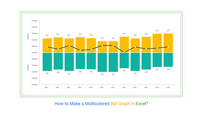
The Multicolored Bar Graph is a chart that uses a combination of contrasting colors and bars to display insights into data. Like a typical Bar Graph, the visualization design is easy to decode.

Just check the variation in the sizes of bars and the distribution of contrasting colors.
You can use a Multicolored Bar Graph to compare key metrics across various categories in data. For instance, the chart above displays insights into the sales performance of different car brands, illustrating how their sales figures relate to the IELTS band scores over current versus previous periods.
If you are fond of unique and beautiful visualization, then the ChartExpo library is best to use in Excel. You can create a chart from a table in Excel and have multiple bar charts with multicolor options. A few are listed below:
Let’s check the aforementioned charts in detail.
A Sentiment Trend Chart uses a combination of lines and bars to display comparison insights into key data points. The green-colored bars depict the current year while the blue ones show the previous year.

The Line on the Chart shows the overall pattern and trend of the key variables under study.
A Stacked Bar Chart, also known as a Segmented Bar Chart, displays insights into data points by showing one another.
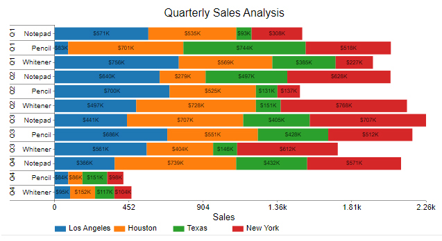
Blue, orange, green, and red, all in one, like a stacked bar diagram or clustered stacked bar chart to present different data. This visualization doesn’t end here with more values and more colors will be added, creating a richer and more detailed representation.

Comparison Bar Chart is a very good example if you are interested in having multicolored visualization for your data set. Your data perfectly shows insights by having side-by-side comparisons.
A Double Bar Graph uses a combination of bars and contrasting colors to display comparison insights into two varying metrics. The visualization design is divided into two, each side representing a different metric.
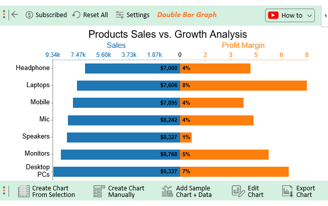
For instance, the chart above displays the performance of two key metrics (sales and profit margin) relative to key categories in data (different products in inventory).

The Progress Bar Chart is another example of perfect multicolored used in a single visualization. This visualization is helpful if you compare data and also look for the differences as well. If the difference is positive it will show in green color, if the difference is negative it will show in red. Although you can use any color of your choice to present your data.
If you are from the field of survey analysis then you should not ignore the Likert Scale Chart.

In a single presentation, you can have an overall idea about the feedback received along with the questionnaires, and each rating is uniquely presented with different colors. Red, of course, represents a negative or bad rating, whereas gray is neutral, and green is positive. If you look into the details of this visualization by exploring a chart or graph maker add-in, you can change the colors according to your needs.
How to make a Multicolored Bar Graph in Excel should never consume a significant amount of your time. Keep reading to discover more.
Excel does not natively support some of the multicolored bar graph variants, including advanced styles like a Segmented bar graph. In other words, one of the options available to you is plotting the graph manually, which is incredibly time-intensive.
You don’t have to undergo all this.
Download and install a particular third-party add-in for Excel Mac to access ready-made Multicolored Bar Graphs.
There are thousands of add-ins purposely designed for Excel. To simplify things, we tested over 30 data visualization-based add-ins, including those that feature a side-by-side bar graph.
We narrowed down our results based on the following factors:
The Excel add-in that met all our conditions for creating powerful Excel charts is ChartExpo.
The tool comes with ready-made charts that need minimal editing.
Let’s take a closer look at ChartExpo.
ChartExpo is an Excel add-in with an ultra-friendly user interface that lets any professional visualize data, including a tornado chart in Excel, regardless of their coding or programming skills.


This section will use a Double Bar Chart (a variant of Multicolored Bar Graphs) in ChartExpo to display insights into the table below.
| Products | Sales | Growth |
| Headphone | 7000 | 4.2 |
| Laptops | 7606 | 7.6 |
| Mobile | 7895 | 3.8 |
| Mic | 8242 | 4.4 |
| Speakers | 8327 | 0.7 |
| Monitors | 8768 | 5.3 |
| Desktop PCs | 9337 | 6.5 |
Install the ChartExpo into your Excel by clicking this link to get started.


How to make a Multicolored Bar Graph in Excel should never be a complex and time-intensive task.
The Multicolored Bar Graph is a chart that uses a combination of contrasting colors and bars to display insights into data. Like a typical Bar Graph, the visualization design is amazingly easy to decode.
You can use the chart to compare the performance of varying metrics in your data.
A Stacked Bar uses contrasting color shades to bring out comparison insights into varying data points. The colors should be contrasted to emphasize the differences.
In other words, the chart uses varying colors to display insights into variables across totals.
Comparing key variables within your data is easier said than done. The situation is further made worse with the increase in data size.
You need a chart that’s primarily designed to help show comparison insights between key data points without clutter. Tables are not recommended, especially if the size of your data is enormous.
We recommend installing third-party apps, such as ChartExpo, in Excel to access ready-to-use Multicolored Bar Charts.
Sign up for a 7-day free trial today to access ready-made Multicolored Bar Graphs that are easy to interpret and visually appealing to your target audience.
How much did you enjoy this article?


Learn how to use sparklines in Excel to quickly visualize trends inside cells. Discover types, creation steps, customization, use cases, benefits, and best practices.

Learn what a confidence interval graph is, how to create it in Excel, and how to interpret results to make more reliable, data-driven decisions.

A correlation matrix in Excel helps identify relationships between variables. Learn how to create, read, and use it for effective data analysis.


