Categories
Comparing two metrics using one graph is not as straightforward as it seems. The situation mentioned above worsens with the increase in data sets. We recommend you use a Double Bar Graph Maker in Excel & Google Sheets that is designed to display insights into two metrics.

A Double Bar Graph can help you highlight how a variable compares to others. It uses different colors to bring out the differences between critical variables.
In this blog, you’ll discover the following:
Before delving into the how-to guide, we’ll address the following question: what is a Double Bar Graph?
Definition: A Double Bar Graph is a data visualization that is used for presenting two sets of data concurrently within a single graph using bars of different colors and heights. This type of chart is similar to a bar chart but features pairs of bars for each item in your data set.
Another related visualization is the Butterfly Chart, which displays two sets of data on opposite sides of a central axis, allowing for an easy comparison between the two data sets.
While both charts serve to compare multiple data points, the Butterfly Chart provides a mirrored perspective that can be particularly useful for analyzing demographic or distributional data.
The improved design over traditional bar charts, including the Tornado chart, allows you to compare two variables or sets of data with one visualization. Thus, Tornado charts and double bar charts make for powerful comparative analysis tools.
Definition: A Double Bar Graph in Excel is a chart you can use to represent two varying metrics with different measures.
One of the key uses of a Double Bar Chart is to compare two varying variables in data. The visualization design uses two axes to illustrate the relationships between two data points with varying measurement scales.
We recommend you use a Double Bar Graph in Excel to generate visualizations showing plenty of insights using limited space. Also, you can make comparisons between categories using a highly contrasting color scheme. To effectively illustrate your data, you can make a graph from a table, enhancing your ability to analyze and present your findings.
Your go-to visualization design should be a Double Bar Graph in Excel if your goal is to use limited space in your dashboard.
The history of the double bar graph is really the background story of bar charts in general.
To tell this story, we need to talk about William Playfair, the inventor of many chart types, including the bar graph.
In 1786, Playfair published The Commercial and Political Atlas; Representing, by Means of Stained Copper-Plate Charts, the Exports, Imports, and General Trade of England, at a Single View. To which are Added Charts of the Revenue and Debts of Ireland, Done in the Same Manner by James Correy.
This exhaustive and monotonous title wouldn’t interest most. However, within this publication, Playfair introduced the first bar charts and line graphs. (He would publish another piece a couple of years later that offered the first look at pie and circle charts).
At the time for statistics, this was like a prehistoric human returning to his tribe with fire and the wheel.
It wouldn’t take long for these visualizations to become commonplace in statistics. Soon, people began introducing variations to Playfair’s original bar chart, including the double bar graph.
History is a little murky on when exactly the first dual bar chart appeared or who invented it. Some forms of comparison visualizations appeared even before Playfair’s published bar chart in 1786.
So, we know that people were already conducting visual comparative analyses. It wouldn’t take long for people to recognize the power of comparison charts, such as a percentage bar graph and a double bar graph. At best guess, multi-bar charts started appearing sometime in the 1800s.
Keep reading because, in the coming section, we’ll take you through practical examples of a Double Bar Graph in Excel.
Use a double bar graph to compare two sets of data visually, especially when they belong to different categories or groups. Here are some scenarios when you might consider using a Double Bar Graph:
Use a Double Bar Graph in Google Sheets when you want to compare the values of two different variables for each category or group.
A double bar graph in Google Sheets offers a clear visual comparison when you have two sets of related data and want to highlight their differences.
If you have data for two different periods or conditions (before and after), a Double Bar Graph in Google Sheets can effectively show the changes in each category.
Double Bar Graphs in Google Sheets are useful when dealing with both positive and negative values for each category, providing a quick way to compare magnitudes.
When you have subcategories within each main category, and you want to compare values for both subcategories, a Double Bar Graph in Google Sheets can be beneficial.
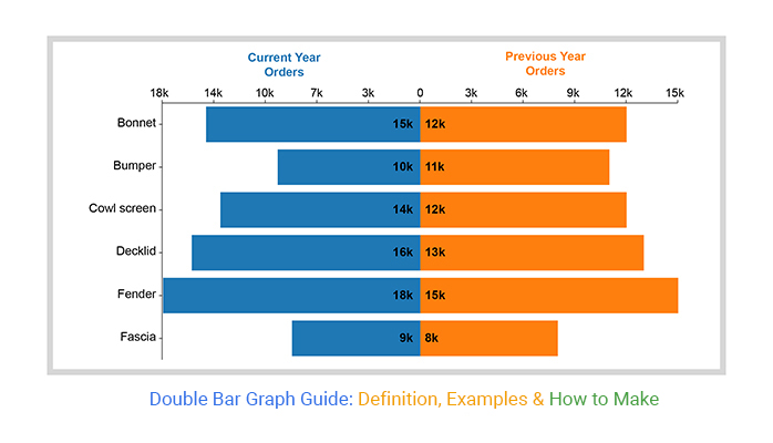
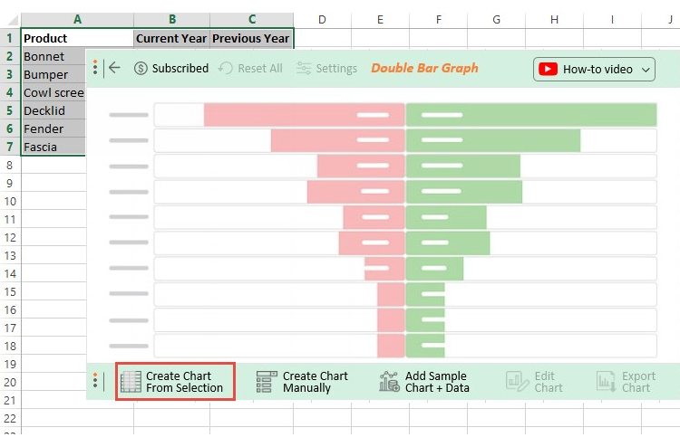
Let’s imagine your goal is to compare the sales performance of various products in previous versus current years.
Let’s assume the data below represents the scenario above.
Can you provide key takeaways of the data below?
| Product | Current Year Orders | Previous Year Orders |
| Bonnet | 15000 | 12000 |
| Bumper | 10000 | 11000 |
| Cowl screen | 14000 | 12000 |
| Decklid | 16000 | 13000 |
| Fender | 18000 | 15000 |
| Fascia | 9000 | 8000 |
Notice the difference after visualizing the table above for insights.
Let’s imagine your goal is to compare the orders of food items processed in the previous versus the current year.
Let’s assume the data below represents our scenario.
Can you provide key takeaways from the data below?
| Food Items | Current Year Orders | Previous Year Orders |
| The Hamburger | 500 | 400 |
| Clam Chowder | 800 | 900 |
| Bagel and Lox | 700 | 600 |
| Deep-Dish Pizza | 600 | 500 |
| Drop Biscuits | 300 | 400 |
Notice the difference after visualizing the data.

So, what is the difference between a Bar Graph and a Double Bar Graph?

Excel is one of the standard tools that business owners use to store and analyze data. This is because it has a library of charts, graphs, and maps, including the Side-By-Side Bar Chart in Excel.
We’re not advising you to do away with Excel in favor of other expensive tools.
This is because there’s an amazingly affordable visualization tool that comes as an add-in you can easily install in Excel to access insightful and easy-to-customize Double Bar graphs in Excel. The application is called ChartExpo.
What is ChartExpo?
ChartExpo is an add-in you can easily install in your Excel to access ready-made and visually appealing Double Bar graphs in Excel.
Keep reading because we’ll be showing you how to create a Double Bar Graph in Excel.
You don’t want to skip this.
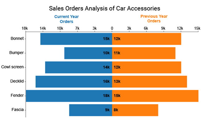
This section will use a Double Bar Graph in Excel to visualize the data below.
Let’s dive in.
| Product | Current Year Orders | Previous Year Orders |
| Bonnet | 15000 | 12000 |
| Bumper | 10000 | 11000 |
| Cowl screen | 14000 | 12000 |
| Decklid | 16000 | 13000 |
| Fender | 18000 | 15000 |
| Fascia | 9000 | 8000 |
To get started with ChartExpo in Excel, follow the steps below:


Google Sheets is a trusted data visualization tool. However, the spreadsheet application lacks ready-made Double Bar Charts in Google Sheets. In other words, it’s not a reliable Double Bar Graph maker.
We’re not advocating you ditch Google Sheets in favor of other expensive data visualization tools.
There’s an easy-to-use and amazingly affordable visualization tool that comes as an add-on you can easily install in your Google Sheets to access ready-made Double Bar Charts in Google Sheets. The tool is called ChartExpo.
So, what is ChartExpo?
ChartExpo is an incredibly intuitive add-on for Google Sheets you can easily install in your Google Sheets.
With many ready-to-go visualizations, the Graph maker turns your complex, raw data into compelling, easy-to-digest visual renderings that tell the data stories in real time.
In the coming section, we’ll take you through how to install and use ChartExpo in your Google Sheets to create double graphs.
You don’t want to miss this!
This section will use a Double Bar Graph in Google Sheets to visualize the tabular data below.
| Marketing Channels | Previous | Current |
| 7500 | 9000 | |
| 15000 | 12000 | |
| Google Ads | 10000 | 8000 |
| 8000 | 10000 | |
| SMS | 20000 | 18000 |
| SEO | 7000 | 8000 |
| Influencer | 12000 | 8000 |
| Affiliate | 10000 | 9000 |
To install the Double Bar Graph Maker (ChartExpo) add-in for Google Sheets click this link.


Insights:
You can use the chart to compare different items or changes in the same item over time.
Below are the steps for decoding a Double Bar Graph in Google Sheets.
So, what are the applications of a Double Bar Graph in Excel?
Data holds an immense value that could help you unlock success in your business.
The problem comes in presenting this data to the stakeholders in your business. This is because some of these individuals may not have the same familiarity with your data.
To alleviate this problem, we recommend you use a Double Bar Graph in Excel.
The visualization design offers an effective and engaging way of presenting insights into your data to others. Furthermore, it has a minimalist design to ensure everyone in your team can easily decode insights without struggle.
Data in its raw form is difficult to work with, especially if it’s complex and bulky. If you opt for the tables, how much time will you take?
While tables are super helpful for organizing your information, they don’t provide a conducive ecosystem for in-depth analysis.
This is where a Double Bar Graph in Excel comes in.
It offers a more convenient medium for interacting with raw data and analyzing the resulting insights.
Here’s an interesting fact. Our brains process visual content over 60,000 times faster than text and numbers. Besides, we can easily recall visual information longer and more efficiently.
Take time and reflect on this.
We’re always constantly processing visual data as our eyes are open.
Remember, the speed and effectiveness of visual analysis are significant. And this is because data changes rapidly. So, timely decision-making is the key to getting maximum value from your data.
You can quickly evaluate the competition for more insights, especially if you’re a business owner.
Remember, competition plays a significant role in your overall performance. But it can easily detract from your key objectives. On the other hand, if you lack insights into what your rivals are doing, it will be challenging to measure their effect on your revenues.
Therefore, we recommend a Double Bar Graph in Excel.
You can leverage visualization design to conduct a competitive comparison analysis, revealing new intelligence.
A Double Bar Graph in Excel provides a versatile way of comparing data using easy-to-read diagrams.
You can easily leverage the visualization to compare key points for actionable intelligence.
One of the biggest strengths of a Double Bar Graph in Excel is its ability to depict many insights in a limited space.
And this is because each dot takes up very little space. You can easily pack lots of points with the X and Y-axes. A Double Bar Graph in Excel is among a few visualization designs that display a lot of insights in a straightforward format.
Most businesses are still relying on intuition rather than facts and data.
One of the key reasons for this could be a lack of access to quality data to back up decision-making processes.
A Double Bar Graph maker can help you distill signals from noise in your raw data. This can save massive amounts of time. Just imagine the competitive advantage you would enjoy by relying on data to make strategic decisions.
A Double Bar Graph in Google Sheets can improve the productivity and efficiency of staff in your business. In other words, you can leverage data to predict risks, such as declining productivity.
In today’s world, customers have a broader range of choices.
If your business is aligned with the customer’s desires and expectations, you can easily find yourself in a downward spiral. Customers change their minds as they are continuously exposed to new information in their purchasing journey.
With the vast amount of data, it’s practically impossible for you to make sense of all the changes in the market.
One of the benefits of a Double Bar Graph maker is that it provides you with answers about the changing behavior of the market. You can easily point out significant shifts in tastes and preferences by using charts.
Timely awareness of the change in customer behavior can be the decisive factor in the current competitive landscape.
Gone are the days when you could easily sell a standard set of products and services to customers.
Today’s market craves products and services that can meet their individual needs.
One of the benefits of a Double Bar Graph maker is that it can help you keep track of your target market’s tastes, preferences, and needs. You can leverage data from various attributions, such as social media and websites, to create a reliable persona for the market.
A Bar Graph is one of the simplest forms of visual representation of data. It uses single bars of various heights to depict the value of critical metrics in your data.
The length of each bar is proportional to the corresponding data point. You can leverage this chart to display insights in a form understandable to many.
A Double Bar Graph has multiple bars representing the critical metrics in your data.
For instance, you can compare sales revenue and net profit in previous versus current financial years.
Definition: A Double Bar Graph is a data visualization that is used for presenting two sets of data concurrently within a single graph using bars of different colors and heights.
A Double Bar Graph closely resembles a bar chart. The primary difference is that a Double Bar Graph uses a pair of bars for each item in your data set.
To create a Double Bar Graph in Excel in a few clicks without any coding, follow the simple steps below.
To better learn with the help of images you can read our blog above.
A Double Bar Graph in Excel is a chart you can use to represent two varying metrics with different measures.
One of the key uses of a Double Bar Chart is to compare two varying variables in data. The visualization design uses two axes to illustrate the relationships between two metrics with varying measurement scales.
A bar graph is a chart or graph that presents categorical data with rectangular bars with heights or lengths proportional to the values that they represent. The bars can be plotted vertically or horizontally.
On the other hand, a Double Bar Graph uses two axes to illustrate the relationships between two variables with different magnitudes and scales of measurement.
A Double Bar Graph is a visualization design that uses corresponding bars with varying colors to display insights into two key data points.
The chart is amazingly easy to read and interpret, even for non-technical audiences. Besides, it’s easy to plot if you have a reliable Double Bar Graph maker.
Comparing two metrics using one graph is not as straightforward as it seems.
The situation mentioned above worsens with the increase in data sets.
We recommend you use a chart primarily designed to display insights into two different metrics.
This is where a Double Bar Graph in Excel comes in. The chart can help you highlight how a variable compares to others.
Besides, it uses different colors to highlight the differences between key variables.
How much did you enjoy this article?


Calculate accounts receivable turnover ratio to measure credit collection speed, improve cash flow, and strengthen your financial strategy. Read on!

Change Management KPIs are the key to tracking adoption, performance, and ROI during transitions. Find out which metrics matter. Read on!

Data collection methods and techniques determine the quality of every insight you act on. Explore key approaches for gathering reliable data. Read on!


