Categories
Data has become the foundation for the most significant decisions made in recent years. Due to its demand, different methods of representing and understanding data have been developed.


Data profiling is an important data management process that examines and analyzes data. It provides a comprehensive understanding of the data’s content, structure, quality, and properties.
The quality of Power BI data is crucial for effective analysis and report creation. Garbage in equals garbage out, as the adage goes.
In this blog post, we’ll answer the question: What is data profiling? We’ll explore why we use data profiling and types of data profiling.
We’ll then discuss the benefits of profiling data. We’ll learn what the data profiling process looks like and some of the tools you can use.
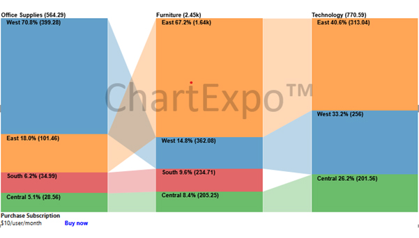
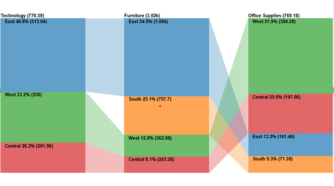
Eventually, we’ll learn how to use data profiling in Power BI. We’ll use a comparison bar chart as an example.
Definition: Data profiling is the process of data integration and analysis whose core purpose is to draw insights and analyze the ideas, design, and accuracy of the Dataset.
Data profiling has the following characteristics
Data profiling involves examining and analyzing data to understand its structure, quality, and content. It starts by collecting data from various sources and then using profiling tools to assess its completeness, accuracy, and consistency.
The process includes identifying and correcting issues like missing values or duplicates, generating reports to highlight these issues, and ensuring the data meets business standards. This helps in improving data quality and making informed decisions based on reliable data.
The profiling of data provides critical insights that improve all downstream analytics and reporting.
Here are some of the key reasons you should incorporate data profiling into your Power BI workflows:
Data profiling gives you an overview of your data types, patterns, completeness, and more. You can identify issues like bias, outliers, or mislabeled records.
Data profiling helps catch problems like typos, missing fields, duplicates, and inconsistent formats early. This helps you address them, avoiding misleading reports and dashboard metrics.
By analyzing the shape and distribution of your data, you can better understand appropriate relationships and data transformations. The need for normalization or application of business rules becomes clearer through profiling.
You can record baseline data quality metrics. This way, you can track the improvement or deterioration of the system over time. This prevents “data drift” issues from creeping in without your knowledge.
Let’s explore some of the different types of profiling analysis you can perform as well as understand “What is data profiling”.
Examining individual columns in a dataset to determine data types, formats, and distributions. For instance, checking if a “Date of Birth” column contains valid dates and consistent formats.
Analyzing datasets to identify missing values or incomplete records. For example, profiling a customer database to find records with missing email addresses.
Ensuring that data across different sources or tables aligns correctly. For example, comparing customer IDs in sales and support databases to ensure consistency.
Identifying duplicate records within a dataset. For instance, profiling a product inventory to detect and remove duplicate product entries.
Checking if data values fall within expected ranges or conform to predefined rules. For example, validating that order quantities are positive integers and within acceptable limits.
There are numerous data profiling tools, such as
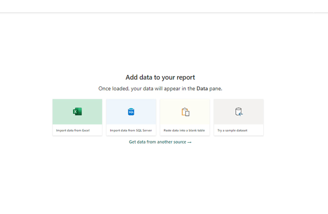
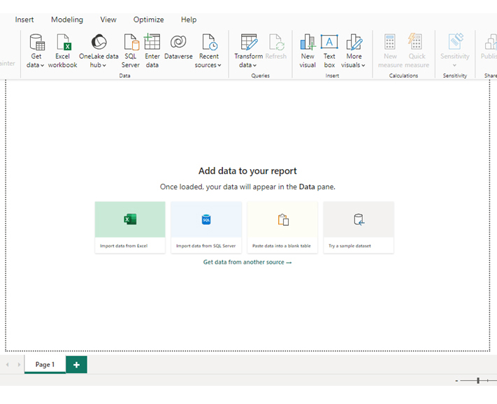
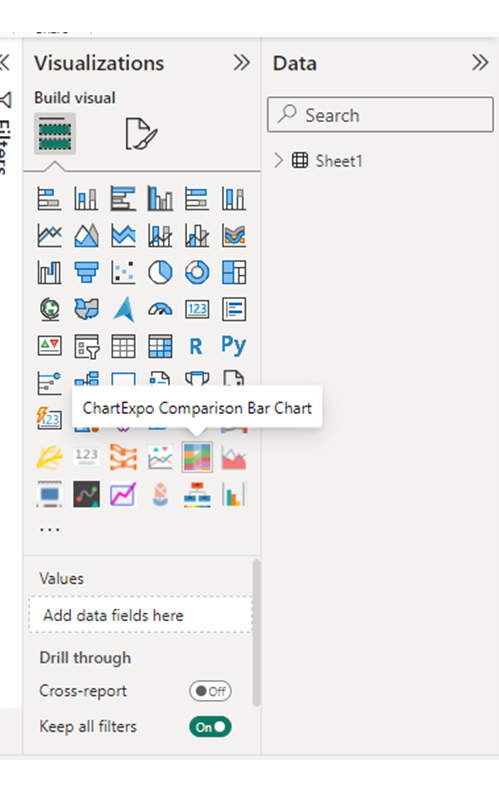
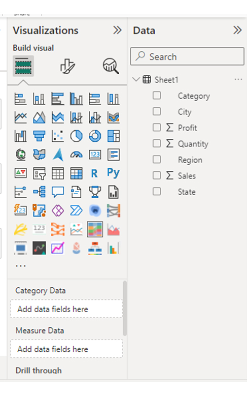
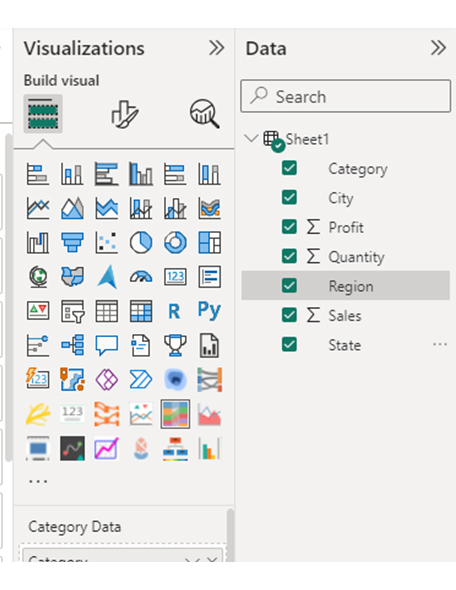
In this section, we learn how to use data profiling in Power BI. We’ll use a comparison bar chart as our visualization in Power BI. We are using Power BI Desktop.


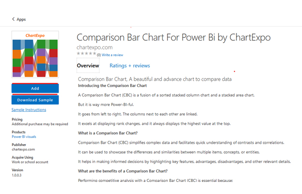
Comparison Bar Chart
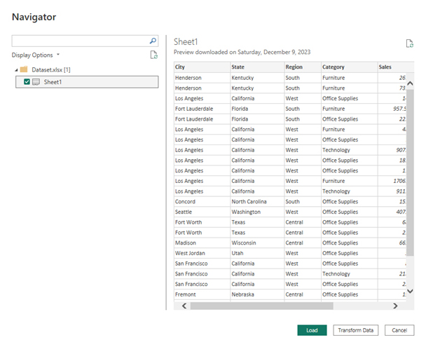
| City | State | Region | Category | Sales | Quantity | Profit |
| Henderson | Kentucky | South | Furniture | 261.96 | 2 | 41.9136 |
| Henderson | Kentucky | South | Furniture | 731.94 | 3 | 219.582 |
| Los Angeles | California | West | Office Supplies | 14.62 | 2 | 6.8714 |
| Fort Lauderdale | Florida | South | Furniture | 957.5775 | 5 | -383.031 |
| Fort Lauderdale | Florida | South | Office Supplies | 22.368 | 2 | 2.5164 |
| Los Angeles | California | West | Furniture | 48.86 | 7 | 14.1694 |
| Los Angeles | California | West | Office Supplies | 7.28 | 4 | 1.9656 |
| Los Angeles | California | West | Technology | 907.152 | 6 | 90.7152 |
| Los Angeles | California | West | Office Supplies | 18.504 | 3 | 5.7825 |
| Los Angeles | California | West | Office Supplies | 114.9 | 5 | 34.47 |
| Los Angeles | California | West | Furniture | 1706.184 | 9 | 85.3092 |
| Los Angeles | California | West | Technology | 911.424 | 4 | 68.3568 |
| Concord | North Carolina | South | Office Supplies | 15.552 | 3 | 5.4432 |
| Seattle | Washington | West | Office Supplies | 407.976 | 3 | 132.5922 |
| Fort Worth | Texas | Central | Office Supplies | 68.81 | 5 | -123.858 |
| Fort Worth | Texas | Central | Office Supplies | 2.544 | 3 | -3.816 |
| Madison | Wisconsin | Central | Office Supplies | 665.88 | 6 | 13.3176 |
| West Jordan | Utah | West | Office Supplies | 55.5 | 2 | 9.99 |
| San Francisco | California | West | Office Supplies | 8.56 | 2 | 2.4824 |
| San Francisco | California | West | Technology | 213.48 | 3 | 16.011 |
| San Francisco | California | West | Office Supplies | 22.72 | 4 | 7.384 |
| Fremont | Nebraska | Central | Office Supplies | 19.46 | 7 | 5.0596 |
| Fremont | Nebraska | Central | Office Supplies | 60.34 | 7 | 15.6884 |
| Philadelphia | Pennsylvania | East | Furniture | 71.372 | 2 | -1.0196 |
| Orem | Utah | West | Furniture | 1044.63 | 3 | 240.2649 |
| Los Angeles | California | West | Office Supplies | 11.648 | 2 | 4.2224 |
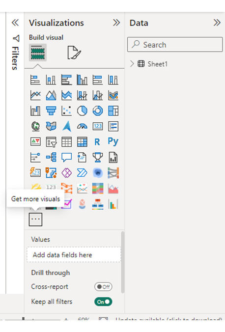
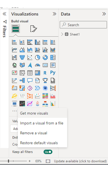
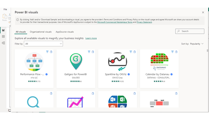
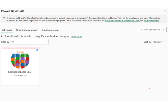
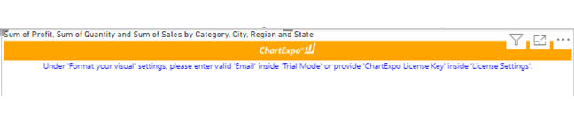
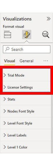
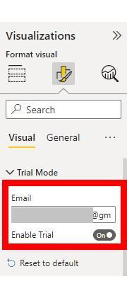
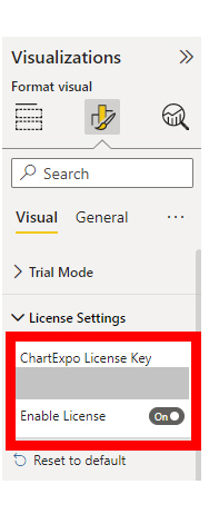
To finish creating our comparison bar chart, we’ll use an add-in or Power BI visual from AppSource.
The following video will help you create a Comparison Bar Chart in Microsoft Power BI.
Handling large volumes of data and complex structures can make profiling challenging. Large datasets may require substantial processing power and time, while complex relationships between data fields can be difficult to analyze comprehensively.
Data often comes in varied formats, which can complicate the profiling process. Inconsistent formats across different sources or fields make it hard to standardize and validate data effectively.
Lack of sufficient metadata or documentation about data sources and structures can hinder effective profiling. Without clear metadata, understanding and interpreting the data accurately becomes more difficult.
Integrating data from multiple sources for profiling can be complex, especially when sources have different formats, structures, or quality levels. Ensuring seamless integration and consistency across sources is a significant challenge.
Here are some best practices for understanding what is data profiling:
Clearly define the objectives and goals of your data profiling efforts. Know what insights or improvements you aim to achieve through the process.
Uncover its structure, content, and quality. The better you know it, the more powerful your profiles become.
Data evolves. Regularly update your data profiles to ensure they reflect the current state of your dataset. This helps in identifying and addressing any changes or issues promptly.
Data owners guide the data source, analysts interpret the details, and business users bridge the gap to practical use. This collaboration fuels a deeper understanding of your data’s potential.
Leverage automation tools for data profiling tasks. Automation streamlines tasks, maximizing both speed and accuracy.
Maintain detailed documentation of your data profiling results. This documentation should include the methods used, assumptions made, and any patterns or anomalies detected.
If your dataset contains sensitive information, handle it with the utmost care. Implement necessary security measures to protect confidential data during the profiling process.
Data profiling helps you pinpoint and solve missing values, inconsistencies, and duplicates. This transformation leads to trustworthy data you can confidently use.
Understand the relationships between different data elements. Profiling should extend beyond individual columns to explore how various columns and tables relate to each other.
Better understanding, better decision-making. Invest in training for insightful results and confident choices.
There are several benefits to the profiling of data. These include:
No, data profiling and data cleaning are separate steps in the data preparation process. They are, however, closely related.
Data profiling consists of the following steps:
Data analysis focuses on extracting meaningful information, patterns, and trends from the data. This helps make informed decisions, predictions, or recommendations.
Data profiling, on the other hand, focuses on understanding the structure, content, and quality of your data. This helps identify potential problems and prepare for analysis.
In conclusion, we’ve explored the fundamental question of “What is Data Profiling?” We’ve also discussed the various types, benefits, and the step-by-step process involved.
We’ve also delved into the different types of data profiling analyses. For example, column profiling, structure analysis, and pattern profiling.
Moreover, the benefits of data profiling extend beyond accuracy and quality improvement. They include more accurate reporting, improved data literacy, and enhanced governance.
Eventually, we’ve walked you through the process of using data profiling in Power BI. We used a comparison bar chart as an example.
We’ve equipped you with the knowledge to leverage data profiling for enhanced analytics.
We hope you are ready to incorporate data profiling into your Power BI workflows. This way, you’ll gain critical insights into your data’s composition, quality, and structure.
How much did you enjoy this article?


Discover diverse and high-quality Power BI report examples for inspiration and insights. Elevate your reporting with strategic visualization techniques.

A Customer Relationship Management Dashboard centralizes data, tracks key metrics, and drives smarter business decisions. Discover now!

Explore Healthcare Dashboard Examples and learn how to turn complex healthcare data into clear, actionable insights for better decision-making.


