Categories
What is a Confidence Interval Graph, and Why Does It Matter?
A confidence interval graph shows not just a result, but how reliable that result actually is.
Most data points look clear on the surface, but a single value often hides the uncertainty behind it.
That’s where confidence interval graphs become important.
Instead of presenting one fixed number, they display a range where the true value is likely to fall.
This helps you understand both the estimate and the level of variation around it.
For example, a study might report 85% effectiveness, or a survey might show 52% support.
While these numbers look precise, confidence intervals reveal how much those results could realistically vary depending on the sample.
This changes how decisions are made, especially in business reporting, forecasting, and performance analysis.
Two results that look different at first glance may actually overlap when uncertainty is considered.
That’s why confidence interval graphs in Excel are widely used in research and analytics.
They help you evaluate reliability, compare results more fairly, and avoid overconfidence in single-point estimates.
In simple terms, a confidence interval graph in Excel doesn’t just show what the data says. It shows how much you can trust it when making decisions.
First…
Definition: A confidence interval is a statistical range used to estimate where a true population value is likely to fall based on sample data.
It consists of:
A 95% confidence level means that if the same sampling process were repeated many times, about 95% of the calculated intervals would contain the true population value.
It does not guarantee that the true value is inside a single calculated interval.
A confidence interval graph visually represents this range alongside the estimated value, making uncertainty easier to interpret.
It typically includes:
Instead of interpreting statistical output, you can quickly see how stable or uncertain the results are.
A team compares conversion rates:
Even though Campaign B has a higher number, its wider interval shows more uncertainty. That changes how confidently you can call it “better.”
Confidence interval charts matter because they add context to raw numbers by showing how reliable those numbers actually are.
A confidence interval chart is most useful when you need to understand not just a result, but how reliable that result is.
Calculating confidence intervals in Excel is a structured process that converts raw data into a reliable range estimate, helping you understand both the result and its uncertainty.
Start by finding the central value of your dataset using:
=AVERAGE(range)
This represents the main estimate around which the confidence interval is built.
Measure how spread out the data is using:
=STDEV.S(range)
This captures variability in the dataset, which directly affects the width of the confidence interval.
Count the number of observations using:
=COUNT(range)
A larger sample size usually leads to more precise (narrower) confidence intervals.
Choose the appropriate critical value based on your data:
This step ensures the confidence level is statistically valid.
Standard error measures how much the sample mean is expected to vary:
=STDEV.S(range)/SQRT(COUNT(range))
A smaller standard error indicates higher precision in your estimate.
Once you have SE and the critical value, calculate:
This final range is what is used in the confidence interval plot in Excel.
Confidence intervals in Excel help you understand what your data means, not just what it shows.
Instead of focusing on a single value, you interpret the range to judge reliability, precision, and decision impact.
Look closely at the upper and lower bounds.
The width of the interval is often more important than the central value itself.
Evaluate whether the interval includes a key reference point such as zero, a baseline, or a business target.
This is especially important in A/B testing and performance comparison.
Confidence interval width gives direct insight into data quality.
This helps you judge how much trust to place in the estimate.
The final step is interpretation in context.
Ask:
This is where confidence intervals move from statistical output to business insight.
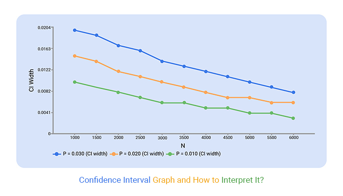
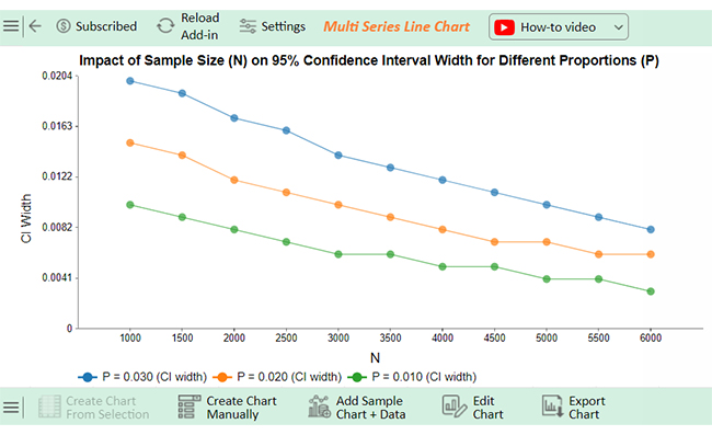
A confidence interval graph in Excel helps visualize how values change along with their level of uncertainty.
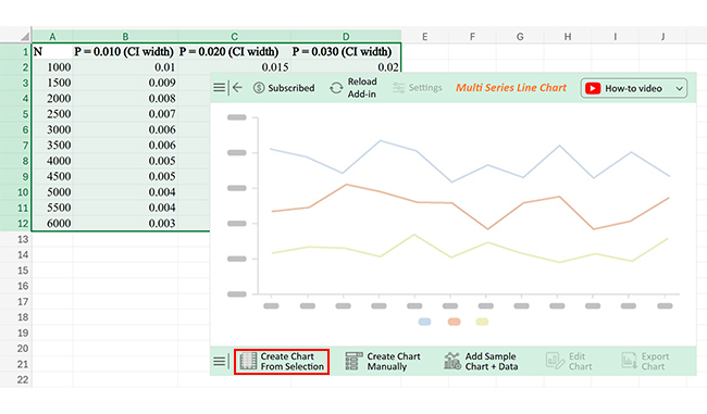
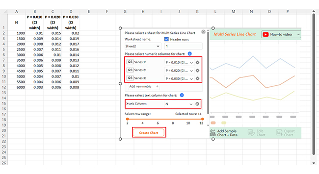
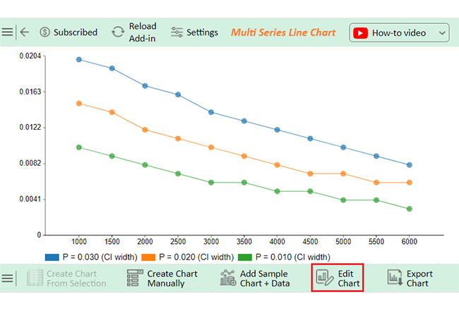
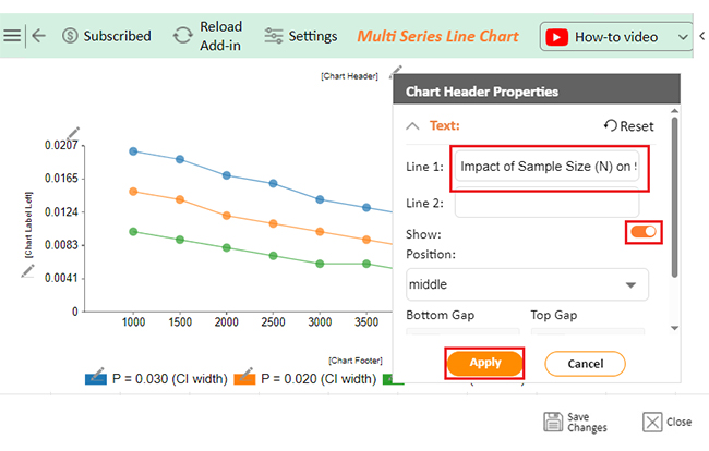
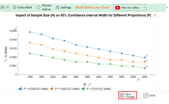
In Excel, it is often created using multi-series Excel charts that show how the confidence interval width varies across different conditions, such as sample size or proportions.
Follow these steps to recreate it accurately:
Example:
This step is critical for accurate interpretation.
This is the core insight your visualization must highlight.
Confidence interval charts are useful, but they are often misunderstood, especially when interpreting what the range actually represents.
A common mistake is assuming:
Misinterpretation: “The true value is definitely within the range.”
This is incorrect.
Confidence intervals do not guarantee that the true value lies inside the range. Instead, they describe how a method behaves over repeated sampling and how likely it is to capture the true value.
For example, a 95% confidence interval means that if the same process were repeated many times, about 95% of the calculated intervals would contain the true population value.
It reflects the reliability of the method, not the certainty of a single result.
Confidence intervals on a graph show the range of likely values for a parameter.
Narrow intervals indicate higher precision, while wider intervals suggest more uncertainty.
If intervals overlap, differences may not be significant – interpret them alongside the mean or trend.
A confidence interval graph goes beyond a single data point. It shows both the estimate and the uncertainty around it, helping you understand how reliable the result actually is.
Instead of presenting one fixed value, it displays a range where the true value is likely to fall, giving proper context to variability in the data.
These graphs are widely used in research, analytics, and business reporting because they make uncertainty visible and improve the quality of decision-making.
They also help reduce overconfidence in results and support a more balanced interpretation of data.
You can create a confidence interval chart in Excel, but tools like ChartExpo make them easier to read and compare, especially when dealing with multiple groups or complex datasets.
In short, a confidence interval plot helps turn raw numbers into meaningful insights by showing not just the result, but how much confidence you can place in it.
How much did you enjoy this article?


Learn how to use sparklines in Excel to quickly visualize trends inside cells. Discover types, creation steps, customization, use cases, benefits, and best practices.

A correlation matrix in Excel helps identify relationships between variables. Learn how to create, read, and use it for effective data analysis.

Learn how to create a clustered column chart in Excel with real use cases, step-by-step guide, tips, and common mistakes.