• Home
  • Tools dropdown img
    • Spreadsheet Charts

      • ChartExpo for Google Sheets
      • ChartExpo for Microsoft Excel
    • Power BI Charts

      • Power BI Custom Visuals by ChartExpo
    • Word Cloud

  • Charts dropdown img
    • Chart Category

      • Bar Charts
      • Circle Graphs
      • Column Charts
      • Combo Charts
      • Comparison Charts
      • Line Graphs
      • PPC Charts
      • Sentiment Analysis Charts
      • Survey Charts
    • Chart Type

      • Box and Whisker Plot
      • Clustered Bar Chart
      • Clustered Column Chart
      • Comparison Bar Chart
      • Control Chart
      • CSAT Survey Bar Chart
      • CSAT Survey Chart
      • Dot Plot Chart
      • Double Bar Graph
      • Funnel Chart
      • Gauge Chart
      • Likert Scale Chart
      • Matrix Chart
      • Multi Axis Line Chart
      • Overlapping Bar Chart
      • Pareto Chart
      • Radar Chart
      • Radial Bar Chart
      • Sankey Diagram
      • Scatter Plot Chart
      • Slope Chart
      • Sunburst Chart
      • Tornado Chart
      • Waterfall Chart
      • Word Cloud
    • Google Sheets
      Microsoft Excel
  • Services
  • Pricing
  • Contact us
  • Blog
  • Support dropdown img
      • Gallery
      • Videos
      • Contact us
      • FAQs
      • Resources
    • Please feel free to contact us

      atsupport@chartexpo.com

Categories
All Data Visualizations Data Analytics Surveys
Add-ons/
  • Google Sheets
  • Microsoft Excel
  • Power BI
All Data Visualizations Data Analytics Surveys
Add-ons
  • Google Sheets
  • Microsoft Excel
  • Power BI

We use cookies

This website uses cookies to provide better user experience and user's session management.
By continuing visiting this website you consent the use of these cookies.

Ok

ChartExpo Survey


Home > Blog > Data Analytics

Measuring the Central Tendency Through Effective Visuals

What does measuring central tendency mean? It refers to identifying patterns in data and summarizing them with a single representative value.

Whether in education, business, or research, central tendency aids in interpreting data effectively. It helps answer questions like “What is the average score?”

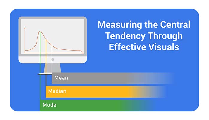
The mean, median, and mode are key measures of the central tendency. They simplify and summarize data. The mean adds up values and divides by their count. The median finds the middle value, while the mode identifies the most frequent one. Each tells a different story about your data.

Measuring of Central Tendency

In schools, teachers use a central tendency to analyze student performance. In business, it guides decisions like pricing or inventory. For instance, knowing the average income of a target audience can shape marketing strategies.

Statistics reveal the importance of data interpretation, and central tendency is often the starting point. Without it, data can seem overwhelming and directionless.

This blog dives into central tendency’s meaning, methods, and real-life applications. Measuring central tendency will equip you with essential tools for analyzing trends. It will help you draw meaningful insights quickly and accurately.

Let’s transform how you handle information.

Table of Contents:

  1. What is a Central Tendency?
  2. What is the Meaning of Measures of Central Tendency (Mean, Median, and Mode)?
  3. How to Calculate Measures of Central Tendency in Statistics?
  4. What is a Central Tendency Formula?
  5. When Should You Use the Mean, Median or Mode?
  6. How to Analyze Measure of Central Tendency?
  7. Wrap Up

First…

What is a Central Tendency?

Definition: Central tendency is a statistical concept that identifies the center point of a dataset. The goal is to summarize data with a single value.

The three main measures are mean, median, and mode:

  • The mean is the average of all values.
  • The median is the middle value when data is aligned.
  • The mode is the most frequently occurring value.

Central tendency helps simplify data analysis by providing insights into typical or common patterns within a dataset.

What is the Meaning of Measures of Central Tendency (Mean, Median, and Mode)?

Have you ever wondered how to find the “average” or the most common value in a set of numbers? That’s where measures of central tendency come in. These tools summarize data with a single, representative value.

  • Mean: Often called the average, it’s calculated by adding all numbers and dividing by the total count. It is widely used but can be influenced or skewed by extreme values.
  • Median: This is the middle value in a sorted list. It’s ideal for avoiding the influence of outliers and gives a balanced central point.
  • Mode: The most frequent number in a dataset. It helps identify shared preferences or trends.

How to Calculate Measures of Central Tendency in Statistics?

Understanding how to calculate central tendency measures is essential for analyzing and interpreting data effectively. These calculations summarize information into a single, meaningful value. Whether it’s the mean, median, or mode, each measure provides a unique perspective for interpreting data. Let’s break it down:

  • Mean (arithmetic average): Add all the numbers in your dataset, then divide the sum by the total count of values. For example, in {10, 20, 30}, the mean is: (10 + 20 + 30) ÷ 3 = 20.
  • Median (middle value): Arrange the numbers in order. Find the middle one. If there’s an even count, average the two middle numbers. In {10, 20, 30, 40}, the median is (20 + 30) ÷ 2 = 25.
  • Mode (most frequent value): Identify the repeated number that appears most often. In {10, 20, 20, 30}, the mode is 20. If no value repeats, the dataset has no mode.

What is a Central Tendency Formula?

It’s all about finding the “middle ground” or the most typical value in a data set. It helps you to understand it. Think of it as a quick snapshot of the data.

  1. Mean (Arithmetic Average): It’s like sharing equally. Add up all the numbers, then divide by how many there are.

Formula: Mean=∑x/n

  • ∑x: Sum of all data values
  • n: Number of data values
  • Example: For 5, 10, and 15, the mean is:
  • (5+10+15)/3=10
  1. Median: The median is the middle value when numbers are in order. If there’s an even count, take the average of the two middle numbers.

Formula: Median=Middle value 1+Middle value 2/2

Steps:

  • Arrange the numbers.
  • Find the middle
  • Example: For 3, 7, 9, 11, and 15, the median is 9.
  1. Mode: The mode is the most frequent value. It’s like the star player that shows up the most in the game!
  • Example: 2, 4, 4, 5, and 7, the mode is 4 because it appears twice.

When Should You Use the Mean, Median or Mode?

The choice between using the mean, median, or mode depends on the characteristics of your data and the type of data analysis you’re conducting. Here’s a breakdown:

Mean (Arithmetic Average)

When to Use:

  • Data is numerical and symmetrically distributed.
  • There are no extreme outliers or skewness in the data.

Why:

  • The mean provides a balanced central value, accounting for all data points.
  • It’s useful for further statistical analysis (e.g., calculating standard deviation).

Example:

  • Average test scores of a class when scores are evenly distributed.

Median (Middle Value)

When to Use:

  • Data is numerical or ordinal but is skewed or contains outliers.
  • You want to identify the midpoint, avoiding distortion from extreme values.

Why:

  • To find out the median, a measure robust against outliers, it provides a true central point even in skewed data distributions.

Example:

  • Median income in a city where a few individuals earn significantly more than most.

Mode (Most Frequent Value)

When to Use:

  • Data can be categorical data, ordinal, or numerical, and identifying the most common value within these types is crucial for meaningful data analysis.
  • The dataset has a clear peak or is multimodal (has multiple modes).

Why:

  • The mode highlights the most frequent occurrence, which is valuable in understanding preferences or commonalities.

Example:

  • Determining the most popular shoe size or the most chosen color in surveys.

How to Analyze Measure of Central Tendency?

Have you ever wondered what makes data speak louder? That’s where Measures of Central Tendency step in. They summarize your data by spotlighting the “average” or most typical values.

But here’s the catch—understanding numbers alone isn’t always enough. Visualizing data is key to seeing trends and patterns. Excel is a trusty sidekick but often stumbles regarding advanced, eye-catching visuals.

Enter ChartExpo, the ultimate game-changer in data visualization. It transforms your data into stunning, insightful visuals, seamlessly bridging the gap where Excel falls short.

Ready to make your data shine? Install ChartExpo.

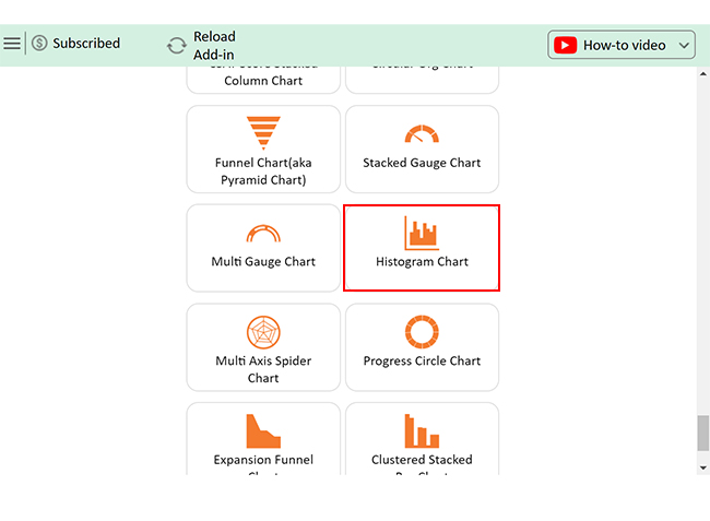
Let’s learn how to install ChartExpo in Excel.

  1. Open your Excel application.
  2. Open the worksheet and click the “Insert” menu.
  3. You’ll see the “My Apps” option.
  4. In the Office Add-ins window, click “Store” and search for ChartExpo on my Apps Store.
  5. Click the “Add” button to install ChartExpo in your Excel.

ChartExpo charts are available both in Google Sheets and Microsoft Excel. Please use the following CTAs to install the tool of your choice and create beautiful visualizations with a few clicks in your favorite tool.

Example

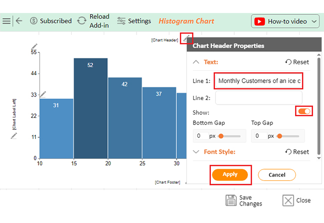
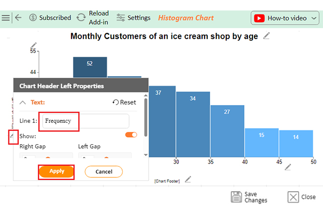
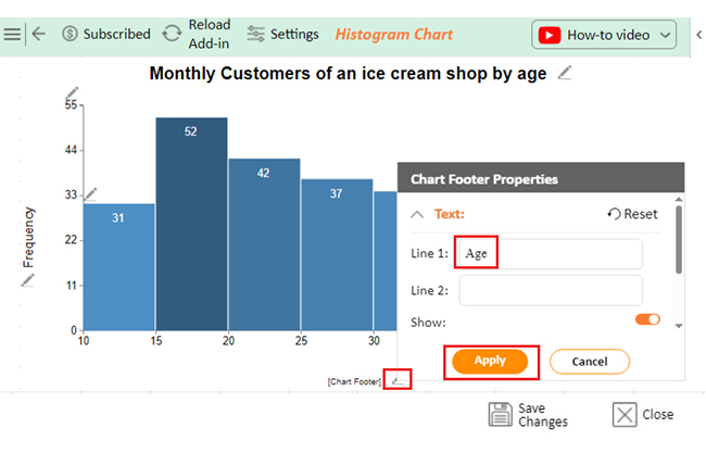
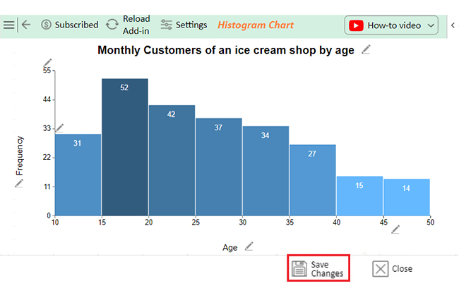
Let’s analyze this data in Excel using ChartExpo.

Age
11
15
12
12
12
14
14
10
14
11
13
13
15
13
12
11
11
15
11
10
14
12
14
11
11
13
14
10
10
13
12
15
14
15
12
11
15
16
18
16
20
17
18
15
19
15
17
15
17
19
18
16
15
15
20
19
20
20
19
19
20
16
15
16
18
15
15
17
20
16
16
15
17
15
20
18
20
19
19
20
17
18
17
17
20
16
15
19
15
18
18
17
15
20
25
22
22
25
25
25
24
21
21
25
24
25
21
22
21
22
24
23
24
25
25
21
24
22
24
25
24
25
21
24
22
23
25
23
23
25
22
23
22
22
23
22
21
30
27
28
28
29
27
26
28
27
27
29
30
26
26
26
27
30
28
30
28
26
28
26
27
30
27
30
27
27
30
30
28
29
34
32
31
33
32
31
33
33
34
32
34
34
33
31
32
32
31
31
33
34
34
32
34
31
33
34
38
38
38
38
37
36
37
36
40
37
38
39
40
38
38
39
36
38
37
36
38
39
36
37
36
36
39
37
39
44
44
44
43
44
44
44
45
44
44
43
43
42
42
50
45
47
46
46
49
47
46
47
47
48
47
46
  • To get started with ChartExpo, install ChartExpo in Excel.
  • Now Click on My Apps from the INSERT menu.
insert chartexpo in excel
  • Choose ChartExpo from My Apps, then click Insert.
open chartexpo in excel
  • Once it loads, choose the “Histogram Chart” from the charts list.
search histogram chart in excel
  • Click the “Create Chart From Selection” button after selecting the data from the sheet, as shown.
Click Create Chart From Selection for Doing Measuring of Central Tendency
  • ChartExpo will generate the visualization below for you.
Initial Visual for Doing Measuring of Central Tendency
  • If you want to have the chart’s title, click Edit Chart, as shown in the above image.
  • Click the pencil icon next to the Chart Header to change the title.
  • It will open the properties dialog. Under the Text section, you can add a heading in Line 1 and enable Show.
  • Give the appropriate title of your chart and click the Apply button.
Add Chart Header for Doing Measuring of Central Tendency
  • Add the chart label text on the Y-axis by clicking on the small pencil icon as follows:
Add Chart Label Text on Y-Axis for Doing Measuring of Central Tendency
  • Add the chart label text on the X-axis by clicking on the small pencil icon as follows:
Add Chart Label Text on X-Axis for Doing Measuring of Central Tendency
  • Click the “Save Changes” button to persist the changes.
Click Save Changes for Doing Measuring of Central Tendency
  • Your final Histogram Chart will appear as below.
Final Measuring of Central Tendency

Insights

  • Ages range from 10 to 50.
  • The 15-20 age group shows the highest peak.
  • Most ages cluster in the younger and middle brackets.
  • This data indicates a diverse range with stronger youth representation.

Steps to make a Histogram in Microsoft Excel:

  1. Open your Excel Application.
  2. Install ChartExpo Add-in for Excel from Microsoft AppSource to create interactive visualizations.
  3. Select Histogram from the list of charts.
  4. Select your data
  5. Click on the “Create Chart from Selection” button.
  6. Customize your chart properties to add header, axis, legends, and other required information.
  7. Export your chart and share it with your audience.

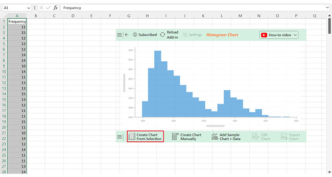
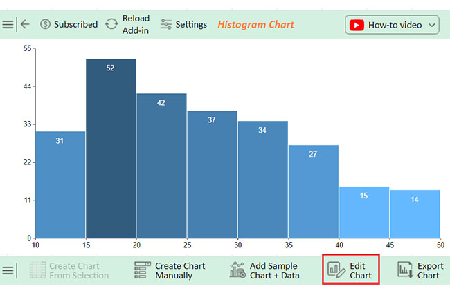
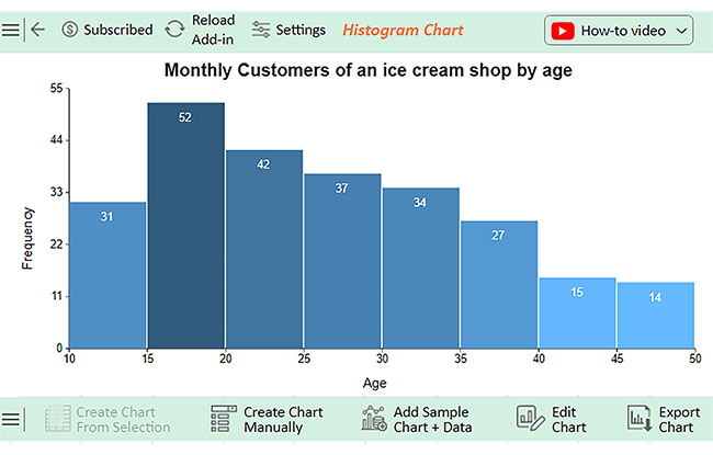
The following video will help you to create a Histogram in Microsoft Excel.

FAQs

What are the 7 measures of central tendency?’

The 7 measures of central tendency are:

  1. Mean (average of all values).
  2. Median (middle value).
  3. Mode (most frequent value).
  4. Geometric Mean.
  5. Harmonic Mean.
  6. Midrange.
  7. Trimmed Mean.

What is the correct order of the measures of central tendency?

The correct order depends on the data type:

  1. Mean: For quantitative data.
  2. Median: For ordinal or skewed data.
  3. Mode: For categorical or bimodal data.

How do I get the range in measure of central tendency?

The range measures data spread, not central tendency. To calculate it:

  1. Identify the highest value in the dataset.
  2. Find the lowest value.
  3. Subtract: Range=Highest−Lowest

Wrap Up

Measures of central tendency simplify complex data. They summarize information into a single value. It makes analysis more manageable and more meaningful.

The mean, median, and mode each have unique purposes. The mean provides an average. The median provides a middle value, whereas the mode shows the most frequent one.

These measures help identify patterns, uncover trends, and highlight typical values, making them essential in business, education, and research. They also enhance communication by summarizing data, enabling others to understand it quickly and fostering a shared understanding of the information.

Central tendency is not one-size-fits-all. Therefore, choosing the right measure depends on the data. Skewed data might favor the median, while categorical data suits the mode.

Understanding measures of central tendency is crucial. They are foundational in statistics and decision-making. Start using them today with ChartExpo to work more effectively with data.

How much did you enjoy this article?

GSAd1
Start Free Trial!
145955

Related articles

next previous
Data Analytics10 min read

Analytics in Telecom Industry for Better Insights

Analytics in the telecom industry optimizes networks, enhances customer experience, and detect fraud. Learn its key benefits, challenges, and use cases.

Data Analytics7 min read

Financial Forecasting for Startups: A Complete Guide

This guide dives deep into financial forecasting for startups. You'll also discover elements of a financial projection for a startup, and tips for creating one.

Data Analytics32 min read

Data Reporting: Making Your Reports Irresistible

Data reporting turns numbers into insights that guide decisions. Learn how to simplify complex data and make confident choices. Read on for key strategies!

Data Analytics10 min read

Employee Performance KPIs: Insights That Drive Action

Employee performance KPIs track productivity and success. Learn the key metrics, measurement methods, and analysis techniques to boost performance.

Data Analytics27 min read

Prescriptive Analytics: From Forecasts to Fixes

Prescriptive analytics helps you turn data into action. Learn how it improves decision-making, drives results, and supports smarter strategies. Get started!

ChartExpo logo

Turn Data into Visual
Stories

CHARTEXPO

  • Home
  • Gallery
  • Videos
  • Services
  • Pricing
  • Contact us
  • FAQs
  • Privacy policy
  • Terms of Service
  • Sitemap

TOOLS

  • ChartExpo for Google Sheets
  • ChartExpo for Microsoft Excel
  • Power BI Custom Visuals by ChartExpo
  • Word Cloud

CATEGORIES

  • Bar Charts
  • Circle Graphs
  • Column Charts
  • Combo Charts
  • Comparison Charts
  • Line Graphs
  • PPC Charts
  • Sentiment Analysis Charts
  • Survey Charts

TOP CHARTS

  • Sankey Diagram
  • Likert Scale Chart
  • Comparison Bar Chart
  • Pareto Chart
  • Funnel Chart
  • Gauge Chart
  • Radar Chart
  • Radial Bar Chart
  • Sunburst Chart
  • see more
  • Scatter Plot Chart
  • CSAT Survey Bar Chart
  • CSAT Survey Chart
  • Dot Plot Chart
  • Double Bar Graph
  • Matrix Chart
  • Multi Axis Line Chart
  • Overlapping Bar Chart
  • Control Chart
  • Slope Chart
  • Clustered Bar Chart
  • Clustered Column Chart
  • Box and Whisker Plot
  • Tornado Chart
  • Waterfall Chart
  • Word Cloud
  • see less

RESOURCES

  • Blog
  • Resources
  • YouTube
SIGN UP FOR UPDATES

We wouldn't dream of spamming you or selling your info.

© 2025 ChartExpo, all rights reserved.