Categories
Tracking progress toward business goals is crucial for achieving results and keeping teams accountable. One of the most effective ways to visualize progress is with a clear, minimalist chart that instantly shows completion levels.
A Google Sheets Progress Bar is a popular choice among professionals because it makes complex data easy to understand at a glance. However, Google Sheets does not include a native progress bar chart by default, which means creating one from scratch can be time-consuming and error-prone.
Fortunately, with the right add-on, you can quickly generate ready-made, visually appealing Progress Bar charts that simplify reporting and improve team collaboration.
Before we delve into the blog’s core, let’s define the chart of the moment.
So let’s get to it.
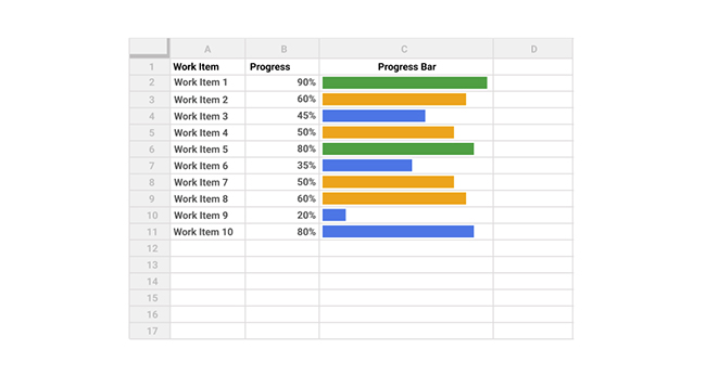
Definition: A Progress Bar in Google Sheets is a chart that visually shows how much of a task, project, or goal has been completed. Each bar fills proportionally to the progress made, making it easy to see at a glance which tasks are on track and which need attention.
This type of chart is useful for tracking project milestones, monitoring team performance, and prioritizing tasks, all without having to analyze raw numbers. By turning percentages into a simple visual, progress bars make decision-making faster and more intuitive.
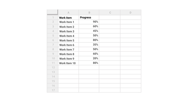
Then, in cell C2, enter the following formula to generate a progress bar for the initial task.
=SPARKLINE(B2,{“charttype”,”bar”;”max”,1;”min”,0;”color1″,”green”})
Duplicate this formula across all the remaining cells in column C by copying and pasting it.
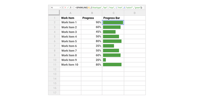
Each progress bar in column C visually represents the percentage listed in column B.
You can customize the progress bars to show different colors depending on the completion percentage. For instance, use the formula below to display a green bar for values above 70%, a yellow bar for those above 50%, and a blue bar for anything lower.
=SPARKLINE(B2,{“charttype”,”bar”;”max”,1;”min”,0;”color1″,IF(B2>0.7,”green”,IF(B2>0.5,”yellow”,”blue”))})
The screenshot below demonstrates how this formula is applied in a real example:
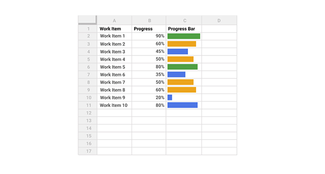
Now, the color of the progress bar is determined by the value in column B.
You can also add borders around the cells and adjust the cell size to make the progress bars more visible and easier to read.
We can use Sparkline for a progress bar in Google Sheets through the following method:
=SPARKLINE(B2, {“chart type”,”bar”; “max”, 100})
In Google Sheets, you can use conditional formatting to color your progress bars based on their value.
We need to follow these steps for the Progress Bar Google Sheets with percentage:
Google Spreadsheet progress bars are important because they provide a clear visual representation of task completion, making data easier to interpret at a glance. They help users track progress efficiently without needing to analyze numbers manually. This boosts productivity, especially in collaborative projects where quick updates are essential.
Use a progress bar when you need a quick visual view of completion without analyzing raw numbers.
It works best for:
Progress bars are ideal for percentage-based goals but not for complex trend or multi-variable analysis.
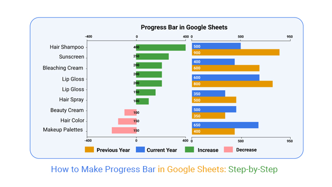
Order analysis of beauty products using a Google Sheets progress bar. Easily spot top-selling and underperforming items at a glance.
Now, look at the following.
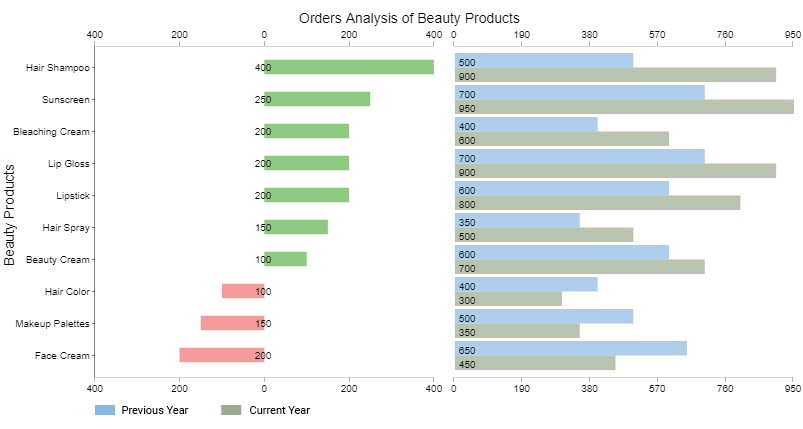
You can easily point out the best and worst-performing products in the inventory.
For instance, the worst-performing products are hair color, make-up palettes, and face cream. The red bars represent a decline, while the green ones depict positive growth.
Creating effective progress bars in Google Sheets requires more than just inserting formulas. Following these best practices can improve readability, accuracy, and overall usability.
Apply conditional formatting to highlight different levels of progress. For example, use green for completed tasks, yellow for tasks in progress, and red for delayed activities. This makes it easier to interpret progress instantly.
Avoid using too many colors or complex formatting. A clean and minimalist progress bar makes the data easier to understand and prevents visual clutter in your spreadsheet.
Adding percentage values next to the progress bar provides precise information, while the visual bar offers a quick overview. This combination improves clarity in reports and dashboards.
Ensure all progress bars use the same maximum value or percentage scale. Consistent scaling helps viewers accurately compare different tasks or performance metrics.
Widen the column containing the progress bar so the visual representation is clear and easy to interpret. Narrow cells can make progress bars difficult to read.
Clearly label each progress bar with the related task, project milestone, or KPI. This provides context and ensures viewers understand what each bar represents.
Progress bars work best when integrated into dashboards that track project milestones, sales targets, or KPI performance. Combining them with other charts provides a more complete view of progress.
Progress bars are widely used in Google Sheets because they transform raw numbers into clear visual indicators of completion. This makes progress easier to monitor and interpret across projects, tasks, and performance metrics.
Progress bars convert percentages into visual indicators that instantly show how much of a task or goal has been completed. This allows users to monitor project progress without analyzing detailed numerical data.
Google Sheets allows users to customize progress bars using formulas, conditional formatting, and cell adjustments. Colors, thresholds, and bar lengths can be modified to match different tracking needs.
Progress bars make spreadsheets easier to interpret by summarizing performance visually. They are commonly used in dashboards to track KPIs, project milestones, and sales targets.
Because Google Sheets is cloud-based, multiple team members can update and monitor progress bars in real time. This helps teams stay aligned on project status and performance goals.
Users can create progress bars using built-in functions such as SPARKLINE, REPT, or conditional formatting. This makes them accessible even for users with basic spreadsheet knowledge.
While progress bars provide a quick way to visualize completion percentages, they also have several limitations when working with larger or more complex datasets.
Progress bars only display percentage completion. They do not reveal deeper insights such as trends, patterns, or the reasons behind performance changes.
When many progress bars are displayed in the same sheet, the layout can become cluttered. This makes it harder to compare multiple tasks, teams, or performance metrics clearly.
Creating progress bars often requires formulas like SPARKLINE or REPT, along with additional formatting. For large datasets, maintaining these formulas can become time-consuming.
Google Sheets offers only basic formatting options for progress bars. Advanced styling, interactive elements, or detailed visual controls are not available without external tools.
Progress bars work best for simple percentage-based metrics. They are not suitable for analyzing multi-variable data, time-series trends, or detailed performance comparisons.
Yes. You can create visual progress indicators using conditional formatting color scales, though formulas offer more control and flexibility.
There are two major types of Progress Bar Charts, namely:
After defining your project goals and milestones, you can use both chart variants to visualize and keep track of your team’s work.
More so, the two charts are straightforward to decode.
To make a progress bar in Google Sheets based on a checkbox, use conditional formatting with a formula that checks if the Google Sheets progress bar checkbox is ticked, then fills a cell or range accordingly to visually represent progress.
Tracking progress toward business goals is essential for making informed decisions and keeping teams aligned. A Progress Bar provides a simple, visual way to monitor completion, compare performance, and prioritize tasks without analyzing raw numbers.
While Google Sheets does not offer a native progress bar chart, you can create one using formulas or with add-ons like ChartExpo to save time and simplify customization.
Key Takeaways:
How much did you enjoy this article?


SUMPRODUCT in Google Sheets handles multi-condition calculations without extra columns. Master its syntax, uses, and errors. Read on!

An annual budget template in Google Sheets organizes your yearly finances, tracks every dollar, and reveals spending patterns. Read on!

Learn the best graph to show profit and loss with practical examples and use cases. Discover how to visualize your business data, track trends, and make smarter financial decisions.


