Categories
Making sense of employee engagement survey data is one of the most complex and time-consuming tasks.
Why?
Survey data is complex and may involve both textual and numerical information. And this calls for a change in strategy, especially during the analysis phase.


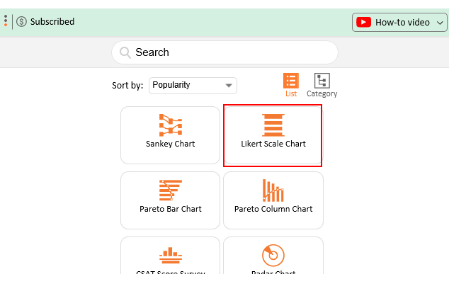
This is where specialized survey tools, such as the Likert Scale, come in.
Likert Scale is one of the many charts, tailor-made specifically to help your business extract actionable insights from employee engagement survey data without consuming much time.
Yes, you read that right.
Data visualization tools, such as Excel, lack ready-made and visually stunning employee engagement survey visualization charts.
It turns out you don’t have to ditch your Excel in favor of other costly tools on the market.
You can improve your Excel by installing third-party apps (add-ons). This will enable you to access ready-to-go and specialized charts for employee engagement survey data visualization.
In this blog, you’ll learn:
Definition: An Employee Engagement Survey Result measures the degree to which staff feels valued at your company.
Tracking the level of engagement is vital in determining the commitment of your workforce to achieving your strategic business goals. An employee engagement survey results presentation can help you communicate the following:
Analyzing employee engagement data is crucial because it provides actionable insights into the overall health of an organization. Here’s why it’s so important:
So, what are the benefits of employee engagement surveys? This is what we’ll address in the coming section.
You can use the employee engagement survey results presentation to display insights into staff’s commitment to your company in the long term.
Measuring the engagement level entails gathering opinions using Surveys, which provide employees with a platform to air their grievances.
You can use an engagement survey results presentation to lobby the top management to focus on boosting employees’ satisfaction levels.
Keep reading to discover more.
An Employee Engagement Survey Results Presentation using a Likert Chart visually showcases employee feedback on a 5-Point Performance Rating Scale, highlighting trends, strengths, and areas for improvement to support better decision-making.
A CSAT Score Bar Chart visually represents customer satisfaction levels, making it easy to identify trends, strengths, and areas for improvement at a glance.

A Customer Satisfaction Chart visually displays customer feedback, helping identify satisfaction trends, strengths, and areas for improvement.
An NPS Chart visually represents Net Promoter Score data, helping identify customer loyalty trends, promoters, passives, and detractors.
A Rating Bar Chart visually displays rating data, making it easy to compare scores and identify trends at a glance.
Putting an employee engagement survey results presentation together is not a walk in the park, especially if you don’t have the right tool. While Excel is a trusted data visualization tool because it’s familiar and has been there for decades, relying solely on it can be limiting.
For instance, utilizing techniques like cross-tabulation in Excel can help you analyze the data more effectively. However, the spreadsheet application should not be your go-to employee engagement survey generator, especially if you want to harness high-level insights.
This freemium spreadsheet tool lacks a ready-made and visually stunning employee engagement survey chart, such as Likert.
We understand switching tools is not an easy task.
This is why we’re not advocating you ditch Excel in favor of other expensive data visualization tools.
There’s an amazingly affordable visualization tool that comes as an add-in. You can easily install it in Excel to access ready-made employee engagement survey results charts. The tool is called ChartExpo.
So, what is ChartExpo?
ChartExpo is an incredibly intuitive add-in you can easily install in your Excel without watching hours of YouTube tutorials.
With a large number of ready-to-go visualizations, the employee engagement survey generator turns your complex, raw data into compelling, easy-to-digest, visualization designs.
In the coming section, we’ll take you through how to use ChartExpo in your Excel to create an employee engagement survey results presentation.
You don’t want to miss this!
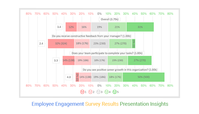
This section will use a Likert Chart to display insights into the table below.
| Questions | Scale | Responses |
| Do you receive constructive feedback from your manager? | 1 | 324 |
| Do you receive constructive feedback from your manager? | 2 | 176 |
| Do you receive constructive feedback from your manager? | 3 | 230 |
| Do you receive constructive feedback from your manager? | 4 | 270 |
| Do you receive constructive feedback from your manager? | 5 | 0 |
| Does your team participate in completing your tasks? | 1 | 138 |
| Does your team participate in completing your tasks? | 2 | 186 |
| Does your team participate in completing your tasks? | 3 | 176 |
| Does your team participate in completing your tasks? | 4 | 230 |
| Does your team participate in completing your tasks? | 5 | 270 |
| Do you see positive career growth in this organization? | 1 | 0 |
| Do you see positive career growth in this organization? | 2 | 138 |
| Do you see positive career growth in this organization? | 3 | 186 |
| Do you see positive career growth in this organization? | 4 | 176 |
| Do you see positive career growth in this organization? | 5 | 500 |
| Do you feel favoritism isn’t an issue in the organization? | 1 | 5 |
| Do you feel favoritism isn’t an issue in the organization? | 2 | 100 |
| Do you feel favoritism isn’t an issue in the organization? | 3 | 146 |
| Do you feel favoritism isn’t an issue in the organization? | 4 | 116 |
| Do you feel favoritism isn’t an issue in the organization? | 5 | 420 |
To install ChartExpo into your Excel, click this link.


Most employee engagement surveys protect the identity of the individual employee and aggregate data for a full, company-wide view.
Confidentiality clauses can help your employees respond openly and honestly, thus increasing response rates.
It’s not always easy to uncover issues within your organization, let alone solve them.
An employee engagement survey results presentation gives reliable insights into what is engaging (and disengaging) in the workforce.
Employee engagement surveys should accurately measure all elements of commitment at department, team, and organizational levels.
Giving your staff a voice is an important part of boosting engagement at the workplace.
Surveys provide employees with the opportunity to share their opinions and be heard by the top management.
Surveys are much easier to distribute, complete, collect, and analyze feedback. Add in user-friendly survey technology and your feedback efforts will skyrocket further.
In the coming section, we’ll address the pros of conducting employee engagement surveys.
Employees may skip surveys due to a lack of interest, time, or belief that their input won’t lead to change.
Solution: Keep surveys concise, ensure anonymity, and communicate their importance.
Employees may hesitate to provide honest feedback, fearing it might negatively impact their roles.
Solution: Emphasize confidentiality and create a culture of trust.
Without proper analysis, results can be misunderstood, leading to ineffective actions.
Solution: Use experienced analysts and validate findings with employees.
Failure to act on survey insights can disengage employees further and reduce trust in leadership.
Solution: Develop an action plan, implement changes, and share progress regularly.
One-size-fits-all surveys may not address specific organizational or team challenges.
Solution: Customize surveys to fit the organization’s goals and employee needs.
Check out the best practices to follow when creating an employee engagement survey:
To create a compelling employee engagement survey results presentation, you’ve got to ask for more.
The point of surveys is to listen and learn from your employees. Yes, you read that right.
Some questions require more contextual information. So, asking more closed-ended questions gives you more feedback. Besides, polling your employees more frequently can help you stay up-to-date on changes in perceptions.
If a question appears to be too long or complicated, break it into multiple units to get clearer responses. This can help you in getting more segregated analytics reports.
While designing an employee engagement survey results presentation, keep a systematic balance between using open-ended and closed-ended questions.
Closed-ended questions can help you get quantitative feedback. On the other hand, open-ended questions can lead to qualitative feedback.
Incorporate both question types to get a well-rounded picture of your employees’ engagement.
Once you’ve designed your employee engagement survey results presentation, send it to your colleagues or friends for feedback. How to craft an employee engagement survey results presentation chart in Excel should never be an Achilles’ heel for you.
An Employee Engagement Survey measures the degree to which staff feels valued at your company.
Tracking the level of engagement is vital in determining the commitment of your workforce to achieving your strategic business goals.
A ‘good’ engagement survey result is anything above 50%.
Yes, the employee engagement survey results presentation should be shared with everyone in the organization. And this is because it makes everyone feel valued and part of the family.
Employees should not be denied access to their sentiments and opinions towards the company.
Analyzing employee engagement survey data is one of the most complex and time-consuming tasks.
Why?
Survey data is complex and may involve both textual and numerical information. And this calls for a change in strategy, especially during the analysis phase.
This is where specialized survey tools, such as the Likert Scale, come in.
Likert Scale Chart is one of the many charts, tailor-made specifically to help your business extract actionable insights from employee engagement survey data without consuming much time.
Yes, you read that right.
Data visualization tools, such as Excel, lack ready-made and visually stunning employee engagement survey visualization charts.
It turns out you don’t have to ditch your Excel in favor of other costly tools in the market.
So, what’s the solution?
We recommend you install third-party apps, such as ChartExpo, to access ready-to-use employee engagement survey results presentation charts, such as the Likert Scale.
ChartExpo is an add-in for Excel that’s loaded with insightful and ready-to-go employee engagement survey results presentation charts. You don’t need programming or coding skills to use ChartExpo.
Sign up for a 7-day free trial today to access ready-made employee engagement survey charts that are easy to interpret and visually appealing to your target audience.
How much did you enjoy this article?


Google Forms to Google Sheets keeps your data organized and current with every submission. Learn the steps, methods, and tips now!

Product survey questions reveal what customers truly think. Learn how to ask the right ones and act on the survey results. Read on!

Learn how the 5-Point Performance Rating Scale improves employee evaluations with clear, consistent, and fair performance reviews across teams.


