Bar Charts
Uncover Powerful Insights
in Less Time
Bar charts are one of the most familiar and versatile graph types available. You can compare results, measure frequency, see the distribution of data and more.
Save time with ChartExpo’s simple, easy bar graph creator. You can turn complex datasets into stacked, grouped, horizontal and other types of bar charts. It only takes 3 quick steps and a couple of minutes to create high-quality bar charts.
Google Sheets
Microsoft Excel
Free 7-day trial (no purchase necessary). Pricing starts at $10 per month.
 ChartExpo for Google Sheets is
 used by 695,000+ users worldwide!
Click this link to watch a ChartExpo for
Google Sheets single-user installation video.
Click this link to watch a ChartExpo for
Google Sheets admin installation video.
Click this link to watch a ChartExpo
for Excel single-user installation video.
Click this link to watch a ChartExpo
for Excel admin installation video.


What Is a Bar Graph?
Bar graphs are one of the most common and popular graph types. You’ve seen and probably used this chart type before.
Understanding every minor and major detail regarding bar charts allows you to use these visualizations more effectively. This means getting even more valuable and actionable insight from your charts!
Learn everything that bar charts have to offer for your data and team.
Bar Graph Definition
Bar graphs (also known as bar charts and sometimes column charts) are pictorial visualizations that use vertical or horizontal rectangles to display data. The features of a bar chart help you identify valuable insights within your data.
Typically, bar charts display categorical data. Each bar represents a category or “bin” reflective of an item in the dataset.
For example, if you measured how many people entered your business for each day of the week, you’d have 7 total bars. Each bar would represent one of the 7 days of the week.
The height of each bar reflects the value of that particular bin. In the above example bar chart, the day with the most traffic in your business would create the tallest bar in the chart.
To make it easy to measure the value or magnitude of each column, the bar chart uses an X-Y plot. The opposite bar chart Y-axis from the bins acts as a scale to quantify the size of each bar.
If you’re using a horizontal bar graph maker, the X-axis acts as the scale of your measurements. Conversely, bar chart vertical columns rely on the Y-axis for this purpose.
To include more variables in the visualization, you can create a multi-axis bar chart. Alternatively, you can add extra bins under the same category, as is the case with group or cluster bar charts.
The bar chart definition is relatively straightforward. However, there are many variations and types of bar graphs that we’ll explain in a later section.
Bar Graph Examples with Explanations
You’re likely already familiar with bar charts. Maybe you’ve even used a bar chart in data visualization before. However, given the many different types, it’s a good idea to review some bar chart examples.
These sample scenarios will show when to use a bar chart. You’ll also learn how to use bar charts when you have multiple variables, different data ranges or other obstacles.
Bar Chart Example 1: Mrs. Apple’s kindergarten class takes a poll on everyone’s favorite color. Mrs. Apple displays the results using a bar chart. Each bar represents a possible color. The heights of the bar reflect how frequently classmates selected this as their favorite.
With this example of bar chart visualization, the class can quickly tell which colors are the most and least popular!
Bar Chart Example 2: Sarah is an online advertiser who wants to find new keywords to target in ads. They grab a handful of relevant search terms and compare their search volumes using a bar plot.
This graph allows them to understand which terms are most popular among users.
Next, Sarah takes the top keywords by volume and uses a grouped bar chart to see the popularity relative to the cost of these terms.
So, for each keyword, she has two bars — one for the search volume and the other for the cost. Ideally, she’s looking for terms with high volume and low costs. The double bars make this comparison easy.
Bar Chart Example 3: A global sales company wants to measure sales by region over the past 5 years. For this analysis, they use a clustered column bar chart.
Each “bin” represents a year, resulting in 5 whole clusters. Within each group are 3 bars to depict the individual regions that this company sells in: Europe, North America and Asia.
With this chart, the sales executives can compare how each region performs against one another and how sales have grown year-over-year.
For added clarity, the company divides each bar into four sections to showcase the sales for each quarter.
Essentially, they create a clustered stacked chart. This demonstrates how versatile examples of bar graphs can be!
How to Read Bar Graphs
Reading bar charts is very straightforward, which is one of the reasons it is such a popular visualization option.
Even with no axes or labels, you could identify the most and least significant parts of the bar chart data. You simply compare the sizes of each bar. The taller the bar, the more value or frequency that particular item has.
That said, to truly understand what these bars show, you need to know how to label a bar graph. You often need one label per bin and bar. So, in a clustered bar chart, you’d have a title for each cluster and bar chart labels for the bars within that container.
Labels are one of the most crucial elements of how to read bar charts. It gives identity to the different categories or items in your frequency bar graph.
You also need a bar graph label on the opposite axis. This will declare the metric or variable used to measure each bar’s height. It’s accompanied by a range, like 0-100, or $0 - $1,000,000, or 0-25.
Once you understand these individual components, reading a bar graph is very easy. You identify what the bar means (what category the bar represents) and then evaluate the frequency or value of that category by using the adjacent axis and range.
You can repeat this for each item or draw cross-comparisons between the different categories based on the heights of their respective bars.
What Is a Bar Graph Used for?
One of the most significant advantages of the bar chart is its versatility. Charting your data with bars isn’t always the best option, but it is rarely the wrong one.
The most popular answer to why we use bar graphs is simply to put large volumes of data into a visual format. As you move into different types of bar charts, like the stacked or clustered bar graphs, you can include even more data.
Visualizing data makes analysis more manageable and efficient. The human brain just works better when analyzing visuals than raw numbers.
More specifically, people use bar charts primarily for two reasons. The more common route is to use these visualizations to compare categorical items. A bar chart compares values and frequencies by measuring the height or length of each column.
For instance, you might ask an audience to choose their favorite color. Each time a color is selected, the bar for that item increases in size. At the end of the poll, the bar graph explains the most and least popular colors to the audience.
In this case, the height of the bars show the value of how many people chose each color as their favorite. You can also think of this as the frequency that each color is picked.
The second use of frequency bar charts is to look at the distribution of data over time or another variable.
You could use a bar chart to see how you spend your income by distributing it over major sources of spending (bills, rent, leisure, groceries, etc.).
Alternatively, you could distribute the data by time. A business might use a bar chart to see its annual earnings distributed across each month.

Types of Bar Graphs
Bar charts are versatile because of the many variations and types that exist. You can have vertical or horizontal bars. Similarly, you can test one variable or several, a few categories or many.
Valuable insights become immediately apparent by aligning your data with the proper bar chart design. The hardest part about making a bar graph is understanding these different types and when to use each.
Find the best bar chart for your data today.
Horizontal Bar Graphs
Most bar charts use vertical columns to represent each data item. This is why bar graphs are often referred to as column charts. However, bar graphs can also use horizontal rectangles.
A horizontal bar chart operates exactly like its vertical counterpart. The only difference is that your two axes switch.
In a column chart, the X-axis represents the categorical data (your bars) and the Y-axis shows your dependent variable. The dependent variable is the numerical value or frequency that you’re measuring.
With a horizontal bar graph, the opposite is true. Your categorical data is on the Y-axis and the corresponding metric used to evaluate each item appears on the X-axis.
Why choose a horizontal bar graph over a vertical one?
One benefit is it makes labeling easier. In a vertical bar chart, there may be enough room to name each bar along the X-axis, especially if the category titles are very long.
Sometimes, you’ll see the text displayed vertically or at an angle, but this isn’t as easy to read as horizontal labels. Horizontal bar charts don’t have this issue and display text properly.
Labeling may seem like a small benefit, but it’s a significant problem when you’re charting lots of different categories. The labels quickly become cluttered and impossible to discern when shown vertically.
This issue doesn’t happen in horizontal bar graphs, even when you have stacked or clustered bars.
Clustered Column Charts
A clustered column chart is also known as a grouped bar chart or multiple bar graph. In this visualization, several bars appear closely together (hence the name “clustered”).
The grouped bar graph displays multiple items. It’s useful when you want to add extra data to your bar graph designs.
You use grouped bar charts when you have subcategories within each main container that you want to visualize.
For instance, let’s say a landscaping company offers 3 services: grass cutting, snow plowing and tree removal. The business is deciding on new equipment to buy and wants to see which of these 3 services generates the most revenue.
So, they pull their sales data from the last five years and look at how each service performed. The data is divided into bins for each year. It’s then sub-divided by these three services.
The resulting chart has 5 clusters representing the years in question. Each cluster consists of 3 bars to depict the revenue from each unique service.
Thanks to the cluster design, the landscaping company can quickly and easily assess which service to buy equipment for to help the business grow.
Cluster column charts are excellent comparative tools because you can compare results within each cluster and between different groups.
It’s important before you insert clustered column charts to check for consistency. The subcategory bars should be in the same order and utilize the same color across all clusters. This consistency will make the chart easier to read.
Double Bar Graphs
Double bar graphs function like clusters but with one difference. You use clusters to show multiple subcategories, thereby comparing several items in one chart.
The double bar graph definition states that it only visualizes two items for each bin. This may seem like a disadvantage. Why draw a bar graph with only two bars when you can have many, right?
However, there are several cases when a double bar chart is a significantly better option than the clustered column chart.
The most obvious case is when you only have two subcategories to chart. You simply don’t need extra bars in this scenario.
Even when you have extra data you could include, you may purposely omit this information in some cases. Why? Because it’s easier (and often more meaningful) to draw comparisons between two items instead of more.
If you create double bar graphs to include in a report or other bar graph presentation, you may leave out less critical subcategories. This encourages the audience to focus on the most significant parts of the data.
A concise double bar graph example limits potential distractions or irrelevant findings.
Another practical use for a double bar graph template is creating a before and after comparison. For instance, a company may change its website design and test the performance of each page before and after the update.
In short, clustered column charts are great, but sometimes all you need is a double bar graph maker!
Stacked Bar Charts
A stacked bar chart is similar to a cluster because you’re visualizing multiple things within each primary category. The difference with a stacked bar chart is each subcategory appears on top of one another as parts of the same bar.
Let’s revisit the landscaping company charting revenue for each of its 3 services. With a cluster bar chart, you have 15 individual bars in the visualization (3 per cluster for each service offered multiplied by 5 years of sales data).
If you put this data into a stacked bar chart, you’d have only 5 bars — one for each year. Those bars would be divided into 3 sections and each one would represent one of the services.
One of the advantages of the stacked bar chart over clusters or double bar charts is what’s known as a parts of the whole comparison.
Since the subcategory sections stack on top of one another instead of sitting side by side, you get a better feel for each part’s contribution to the whole.
Let’s look at an example of an ecommerce company creating a bar chart to understand the origin of their site traffic.
They look at their monthly website visitors for the quarter and divide each month’s total into subcategories for each possible source of traffic, like social media sites, PPC ads, email newsletters, etc.
While a clustered column chart would work, they create stacked bar chart visuals instead. By placing traffic results from each source on top of one another, you can better compare each one’s contribution to the sum.
By creating a stacked bar chart, you can make vertical comparisons within each column and horizontal ones between each month.

How to Make Bar Graphs
Bar charts are highly effective data visualization tools. They help you access critical information in your data. Bar chart insights can help you make better organizational decisions and improve performance.
However, you need to know how to create bar charts in Excel, Google Sheets and other platforms. Otherwise, you can’t experience any of these powerful benefits.
ChartExpo enables you to generate bar charts almost instantly. This saves you time and headaches compared to other bar graph makers.
Pick Which Type of Bar Chart to Use
With so many chart types under the umbrella of bar graphs, it isn’t always obvious which one you should use. Is a simple bar chart enough? Or, do you need a grouped or stacked bar chart to display your data?
Answering these questions requires you to assess a few qualities of your dataset.
What’s the objective of your chart? You should have a goal for each visualization you make. What do you want to find out, or what question do you want to answer? This objective will dictate what data you need and which bar chart to use for your data.
Do you have subcategories in your data? Stacked and clustered bar charts work wonderfully at depicting data in subcategories. If you want to visualize more complex datasets with more parts, these bar chart types are the answer.
Do you want to chart multiple dependent variables? Similar to including subcategories, bar charts can also include multiple numerical variables. For instance, you might want to chart sales data versus the total number of transactions. In this case, you need a multi-axis bar chart.
Do you want to display the data horizontally or vertically? If you have lots of data categories, or ones with long labels, you may want to opt for a horizontal bar chart. This will make these labels easier to read and avoid jumbled text from appearing.
Once you’ve chosen a bar chart type, take some time to review your choice and analysis goal. Did you select the right chart type, or is there a better option for achieving your analysis goal?
How to Make a Bar Graph in Excel
Bar charts are exceedingly popular, meaning you can easily create bar charts and column charts in Excel. It’s just a matter of inserting the data into your spreadsheet page.
However, the Excel bar chart maker does have limitations. It’s an easy program to use when collecting and organizing data, but building advanced customer charts is more challenging.
For instance, creating clustered columns charts in Excel requires you to navigate several confusing settings. The more steps you take, the longer the process and the more time needed to reach valuable insights.
This time-consuming process is why ChartExpo exists. You can create a bar graph in Excel with professional quality in only 3 easy steps. If you want to move beyond simple bar charts, it’s good to use a chart making add-in like ChartExpo.
To download and use ChartExpo to start creating bar chart visualizations, visit the Microsoft App Store and search the tool by name. After downloading, you’ll need to restart the Excel program for ChartExpo to appear as an option.
When you open ChartExpo to begin creating a bar chart in Excel, you’ll see the complete library of graphs and visualizations. You can look for the bar chart type you want by searching it by name.
With step 1 complete, the next objective is to tell ChartExpo what data you want to visualize for your Excel chart type. You can click and drag to select the columns and rows you want to use from your dataset. Alternatively, you can input the cell IDs manually.
Be sure to select the labels in your Excel bar graph sheet. ChartExpo will use these when creating your bar chart for Excel.
Once you’re satisfied with your selections, you can click the “Create Chart” button and your new Excel chart bar diagram appears instantly next to the data.
You can save the image as an image or PDF file, making it easy to use in emails, reports, presentations and other formats.
How to Make a Bar Graph in Google Sheets
Google Sheets faces many of the same limitations as Excel. Mainly, there is a lack of advanced Google Sheets bar chart options.
So, while you can make a basic bar chart in Google Sheets with no problems, it’s not as successful at creating more advanced visualizations.
The ChartExpo add-on is necessary to create a bar graph in Google Sheets that’s more powerful and meaningful. You have more chart types available and an overall more effective bar chart generator.
Downloading ChartExpo for Google Sheets is easy. After opening a Google Sheets spreadsheet (even a fresh, blank one), click on “Extensions” from the top toolbar.
You’ll notice an “Add-ons” option. When you mouse over it, a right dropdown menu appears with the plugins and other tools for Google Sheets you’ve downloaded.
There’s also an option to “Get add-ons.” Clicking this will open the Google Workspace Marketplace. You can search and download ChartExpo from this app store.
The next time you use Google Sheets and click the “Add-ons” option under “Extensions,” you’ll see the ChartExpo icon.
The process to create a bar graph in Google Sheets with ChartExpo is very similar to using the tool in Excel.
Your first objective is to select the bar chart type you want to use. Next, select the data you want to visualize. After reviewing your data selections, click “Create Chart.”
You’ll now see your new bar chart visualization next to your data. You can make minor edits to the labels, colors, etc. Then, save the chart as an image or PDF file to use it elsewhere.
How to Make a Bar Graph with Multiple Data Series
To reiterate: when you need to make more advanced bar charts with multiple data variables, you need to move beyond stock charting options in Excel or Google Sheets.
Creating a bar chart with multiple series of data can be an incredibly valuable analysis project.
Sometimes, you simply need a more advanced chart to answer the critical questions to improve your business and strategies.
In other cases, adding more variables to your charts allows you to pack more insight into a single chart. You can deliver the value and information of multiple graphs with just one visualization.
However, when you create bar charts with more data, you face new obstacles that you wouldn’t normally run into
First, you need a bar chart creator like ChartExpo that can construct more advanced charts.
You also need to think about the data you’re using. You may need to create bar chart visualizations using data from different sources. Certain issues may arise when combining these datasets into one to use for your bar chart.
Each source may have its own metric labels or use different units. You may need to make small changes to the datasets to ensure they can “talk” to one another when combined to create a compound bar chart.
Once your data is adequately prepared for visualization, you can choose one of the multi-series bar chart options in ChartExpo and begin creating your chart.

Advantages of Bar Charts
The versatility of bar charts means they have many advantages and benefits. Bar charts work for comparison analysis, data distribution tracking, checking frequency and more. You can use bar charts anytime you need to understand the story behind your datasets.
Bar graphs are also effective data communication tools. Since everyone is familiar with how to draw a bar graph, you need little explanation when using this visualization in your reports.
Experience everything bar charts have to offer.
One of the Most Universal and Familiar Chart Types
Some chart types are more recognizable than others. This familiarity comes with several advantages and there is no chart more common than the bar chart.
In the history of data visualization, bar graphs have existed from nearly the beginning. Even students in grade school know how to create a bar graph and read them correctly. This universal nature makes it an exceedingly popular chart choice.
So, what’s the benefit of using such a popular chart type?
To answer this, it’s easier to look at what happens when you present an unfamiliar chart type. For audiences to understand the alien chart, you need to supply some kind of explanation. Otherwise, you can’t guarantee that viewers read the visualization correctly.
While these explanations are helpful, they take time to read and write. They may even distract from the visualization itself.
The most effective data communication occurs when charts speak for themselves — no explanation is necessary. Bar charts have this advantage because it is something that all audiences are familiar with and comfortable analyzing.
Even when you present cluster or stacked bar charts depicting multiple dimensions of data, audiences can navigate the visualization without the assistance of an explanation.
Plus, there’s something engaging about a familiar chart design. Your eyes naturally will gravitate to what’s easiest to read and understand. So, bar charts may be the first thing viewers look at in your reports and presentations.
Bar Charts Make Comparison Easy
Comparison analysis explores two (or more) sets of data, variables or categories. If you know how to make a bar graph comparing two sets of data, you can easily perform this analysis.
For example, you might use comparison analysis to evaluate competitor strategies to identify strengths and weaknesses.
A simpler comparison analysis may be to look at the sales numbers between a handful of employees to determine the top salesperson.
In either case, bar charts shine when making comparisons. The shape of each bar makes it easy for the eyes to recognize which items hold the most value. Even if two bars are nearly identical, you can still notice when one is slightly larger than the other.
Other chart types, like a pie chart, have problems with this. It can be challenging to tell which slice in a pie is bigger if the values are very close. This issue doesn’t happen with bars.
The other benefit of bar charts is they allow you to draw comparisons across multiple categories and/or variables. By using a grouped bar graph, you can measure several variables within each category.
You could take the same bar graph example with data and use a grouped bar chart to show each employee’s numbers for each of the last 3 months.
With this added detail, you can test whether the top salesperson this month is consistently good or just had a lucky month.
Identify the Most and Least Significant Parts in Your Data
A wise approach to data analysis is to start with the most and least significant parts. Bar charts help you identify these areas of your datasets. You simply look for the tallest and shortest bars.
It’s that easy.
The tallest bars in your chart reflect the highest value or greatest frequency in your data. This enables you to spot the most prominent categories or items easily.
If you don’t already know what these critical categories are, bar charts deliver immediate insight. You can start looking at what causes these categories to perform so well. Then, apply those findings to your weaker items.
The weaker performers demonstrate the other side of the spectrum in your data: your least significant values.
It’s easy to ignore weak performers. The bar depictions of these values may be barely noticeable! However, neglecting these categories is a dangerous mistake.
It’s great to know what’s working, but it’s more actionable to recognize what isn’t working. Shorter bars represent the areas that require immediate attention and offer the biggest potential room for improvement.
Again, the bar plot helps draw your eyes to these least and most significant parts. With this visual depiction, you can effortlessly detect emerging trends, resolve weak performers and continuously optimize your results.
An Extremely Versatile Chart Type for All Your Needs
Aside from being a universally familiar chart type, bar charts graphs are also immensely versatile. This lends a hand to why these charts are so common. They are effective tools to depict frequency, magnitude, distribution and more.
It is a powerful multi-purpose chart! The versatility of the bar chart graph grows tremendously when you consider all of the different types of visualizations that fall under this category.
Stacked or grouped variations, for instance, allow users to include multiple sets or variables in the same visualization.
One of the reasons that bar charts are so versatile is because they can act as a traditional bar chart and histogram.
What is the difference between a bar graph and a histogram?
The bar graph vs. histogram conversation can get confusing because both look like bar charts. The only discernible way to explain the difference between a bar graph and a histogram is to look at the appearances of both.
A bar graph histogram places its bars directly next to one another, leaving no space in between. Traditional bar charts will have gaps between individual bars outside the group or cluster.
What makes bar charts and histograms different comes down to function. Bar chart histograms specifically analyze frequency distribution while bar charts depict categorical data.
The bottom line: there are very few restrictions or limitations when using bar plots. While it may not always be the best chart for your data, it’s always a useful option to better understand your data.

Why Use ChartExpo for Making Bar Graphs
ChartExpo provides several valuable benefits to chart making, whether you’re creating bar graphs or another type of visualization.
With zero coding, everyone can participate in the chart-making process and begin using bar charts in their analysis.
Plus, you can choose from a vast library of options, including all different types of bar charts. Even complicated cluster bar graphs or stacked bar charts require only 3 clicks to make.
Start making better charts in less time.
A 100% Codeless Way to Creating Bar Graphs
There are plenty of bar graph generators on the market. You can even make bar charts in Excel or Google Sheets directly.
So, what makes ChartExpo the clear choice for how to create a bar chart and other visualizations?
One of the primary advantages of ChartExpo is a codeless charting environment. Other bar chart templates require you to edit coding scripts. This approach requires that you (or someone on your team) have prior knowledge of the coding language used (usually JavaScript).
Without this unique set of skills, you could struggle to make truly effective custom charts and graphs.
Having a script-free bar graph maker offers several key benefits:
- No more accidental errors or mistypes from manual inputs.
- Saves significant time in the chart-making process, meaning you can reach valuable insights sooner.
- Fewer headaches or wasted time trying to troubleshoot problems in your scripts.
- Gives more people access to charts, allowing each team to answer analysis questions independently.
- Largely removes the need to have a trained data scientist on the team, which can be an expensive hire to make.
Scripts have long been the go-to approach to adding new bar graph templates to tools like Excel and Google Sheets. However, it’s an unnecessary obstacle that many teams needlessly tolerate daily.
ChartExpo eliminates this headache and allows you to create a bar chart without the hindrance of complicated scripts.
The Simplest Bar Graph Maker Available
Data moves quickly and constantly. One of the chief challenges of managing your analytics is staying on top of these continuous changes.
Charting agility is critical to solving this problem. After all, charts help you understand what’s happening behind all the numbers. The sooner you see the “big picture,” the faster you can act and make appropriate decisions.
ChartExpo offers one of the most agile visualization tools available. You can transform raw data into beautiful bar graphs in three easy steps:
- Choose the type of bar chart you want to use (or any other visualization in ChartExpo’s library).
- Highlight the data you want to chart or manually input the cells and ranges.
- Click the “Create Chart” button.
ChartExpo allows you to chart results and reach those valuable insights in less time by removing time-consuming, unnecessary steps in the process.
This speed can be a decisive advantage, especially in competitive spaces. There’s more value to your actions if you can react to changes in the data faster than competitors.
For example, a PPC advertiser uses a double bar graph to compare keyword search volumes over two weeks. The goal is to identify new keywords with growing popularity.
Thanks to ChartExpo’s agile charting tool, the advertiser is able to capitalize on these emerging keyword trends ahead of the competition.
This charting speed is equally valuable when monitoring for risks. You want to visualize your results and detect problems before they cause serious loss of performance.
More Chart Types than ever Before
You can create simple bar graphs within the Excel or Google Sheets interface. As you begin developing more advanced types of bar charts, you may find that the stock options available to you no longer work.
These platforms work wonders when collecting, organizing and arranging data. However, they often fall short in regard to charting.
Not only do these tools have a distinct lack of charting options, but the limited customization settings may prevent you from designing visualizations the way you intend.
ChartExpo solves both of these problems. First, the tool has a far more complete charting gallery. It includes several times more visualizations than standard data tools.
This library contains many types of bar charts, including:
- Bar chart
- Column chart
- Comparison bar chart
- CSAT score bar chart
- CSAT score survey chart
- Double axis line and bar chart
- Double bar graph
- Double axis grouped bar chart
- Double axis grouped column chart
- Grouped bar chart
- Grouped column chart
- Stacked bar chart
- Stacked column chart
- Overlapping bar chart
And these are just the options under the bar chart category! ChartExpo also offers many other chart types.
These new options mean you can always match your data to a proper visualization. You’ll even be able to chart the same data using multiple options.
Looking at the same data from the lens of different charts often reveals new insights. It’s kind of like looking at a problem from a fresh perspective!
What an Easy Bar Graph Maker Brings to Your Team
One of the challenges facing organizations during the “big data revolution” is establishing a solid internal data culture.
In particular, organizations often struggle with normalizing the use of data across all departments.
With ChartExpo’s easy bar chart creator, there is no skill gap. Anyone on your team can participate in the visualization process. This means you have more parties interpreting bar graphs and collaborating on data projects.
Since you can make bar charts in Excel or Google Sheets, there’s no need to learn an entirely different platform. ChartExpo seamlessly integrates into the platform you’re already using and familiar with.
Not only does ChartExpo give more people access to charts, but it also enhances your team’s ability to share and communicate key findings.
Reporting is the final stage of analysis. You have to properly explain your findings to others; otherwise your analysis loses its significance.
A bar chart in Excel or Google Sheets makes an excellent reporting tool because it is popular and familiar as a visualization option.
Audiences instantly recognize the bar chart design and know how to read it correctly. This makes the communication of critical, actionable insights fast and effective.
Even if the audience is unfamiliar with your data, you can still create bar graphs to communicate findings effectively.
ChartExpo Pricing
ChartExpo for
Google Sheets
$10*
per month
(no purchase necessary)
*pricing starts at $10
per user per month.
Only in-app purchase available
ChartExpo for Google Sheets
single-user purchase video.
ChartExpo for Google Sheets
admin purchase video.
ChartExpo for Google Sheets
single-user installation video.
ChartExpo for Google Sheets
admin installation video.
ChartExpo for
Microsoft Excel
$10*
per month
(no purchase necessary)
*pricing starts at $10
per user per month.
Only in-app purchase available
ChartExpo for Excel single-user
purchase video.
ChartExpo for Excel admin purchase video.
ChartExpo for Excel single-user
installation video.
ChartExpo for Excel admin
installation video.
Custom Pricing
Blogs
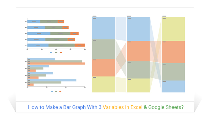
How to Make a Bar Graph With 3 Variables in Excel & Google Sheets?
Bar Charts are best-suited for displaying comparison insights into data. Click to learn…
How to Make a Stacked Bar Chart in Google Sheets?
Click to learn how to make a Stacked Bar Chart in Google Sheets using easy-to-follow steps.
How to Create Google Sheets Progress Bar Chart? (Easy Steps)
Creating Google Sheets Progress Bar is time extensive task. Click to learn…

How to Create a Clustered Bar Chart in Google Sheets?
Click to learn how to visualize your data using Clustered Bar Chart in Google Sheets.
How to Make a Stacked Bar Chart in Excel With Multiple Data?
Click to learn how to make a Stacked Bar Chart in Excel With Multiple Data? You’ll learn...