Categories
By ChartExpo Content Team
Why do customers choose you over the competition? Or leave halfway through checkout?
Customer Journey Analytics answers these questions by connecting the dots in your customers’ experiences. It’s the process of tracking and analyzing interactions across all touchpoints—websites, emails, or even in-store visits. Each data point tells a story, showing what works and what doesn’t.


Think of it as your guide to understanding behaviors and decisions. When you know why customers click, call, or walk away, you’re better equipped to fix problems and improve their experience. That’s the value of Customer Journey Analytics.
This approach doesn’t just track steps—it reveals patterns. Are certain pages driving users away? Are checkout processes too complicated? By digging into this data, you can make informed decisions that build loyalty, increase conversions, and improve satisfaction.
Customer Journey Analytics isn’t about guessing; it’s about knowing. Let’s make every customer interaction count.
First…
Customer Journey Analytics (CJA) is an analytical approach. It focuses on understanding customer interactions. This analysis spans across multiple touchpoints and channels. By collecting data from various sources, it provides a holistic view of the customer’s experience.
The goal is to optimize interactions from the customer’s perspective. It improves customer satisfaction and loyalty. It also enhances overall business performance by providing actionable insights.
Unraveling customer interactions is crucial. It reveals patterns, behaviors, and preferences. These insights help businesses tailor their offerings. They provide targeted responses to customer needs. By analyzing interactions, businesses identify key areas of improvement. They also spot opportunities to delight customers.
This detailed data analysis supports strategic decisions. It aligns products and services with customer expectations.
Transitioning from guesswork to data-driven decisions is vital. Customer Journey Analytics replaces assumptions with hard facts. It helps businesses understand the ‘why’ behind customer behaviors. This shift to data-driven insights leads to more effective marketing strategies.
It also enhances customer service approaches and product development. This reliance on data reduces risks. It ensures that resources are invested in areas that directly improve customer satisfaction and business performance.
Identifying key touchpoints in the customer journey is like setting markers on a trail. Each marker represents a point of interaction that is significant to both the customer and the business.
But how do you determine which touchpoints are key? The answer lies in data. By analyzing customer interactions through data, you can see not just where customers engage but how these engagements influence their behavior.
Touchpoints vary widely, from digital ads and email campaigns to customer service calls and checkout processes. Each of these interactions holds value, offering insights into customer preferences, pain points, and potential drop-off points.
However, the trick isn’t just to identify these touchpoints but to understand their impact. Which interactions lead to sales? Which ones see the highest engagement? Answers to these questions help refine the customer journey, enhancing those touchpoints that drive positive outcomes.
Moreover, it’s crucial to look at touchpoints not just individually but as interconnected steps in a larger journey. This interconnected view helps in creating a seamless customer experience, smoothing out any bumps along the customer’s path and ensuring they feel supported and valued at every step.
Traditional mapping often scratches just the surface of customer interactions. It shows where customers go but not why they take those paths or how they feel about the journey. This surface-level view misses critical emotional and psychological triggers that drive customer behaviors.
To truly understand the customer journey, you need to dig deeper. This means looking beyond mere numbers and stats. You must delve into sentiment analysis to gauge emotions and social listening to capture unspoken feedback. These deeper insights reveal not just patterns of behavior but the motivations behind them.
Moreover, traditional maps often view each interaction in isolation, failing to see the journey as an evolving, fluid experience. Today’s analytics tools, however, can capture this dynamism. They track changes over time, revealing how customer behaviors evolve. This not only provides a fuller picture but also helps predict future trends, giving businesses a proactive edge.
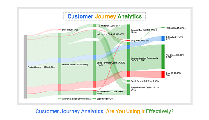
Visual tools are pivotal in translating complex data into understandable insights. Among these tools, the Sankey diagram stands out for its ability to display customer flows through various stages of the journey. This diagram isn’t just a static image; it’s a vibrant, flowing representation of real customer data.
The Sankey diagram shows how customers move from one touchpoint to another, highlighting major paths as well as less traveled routes. Thicker lines indicate heavier traffic, making it easy to spot popular routes. This data visualization helps businesses identify which paths lead to successful conversions and which may require reevaluation.
By integrating real data, the Sankey diagram provides a dynamic view of customer interactions. This isn’t just helpful for spotting trends; it’s crucial for testing the impact of changes.
For instance, if a business modifies its checkout process, the Sankey can show how this change affects customer flow, providing clear, visual feedback on the impact of strategic decisions.
This makes the Sankey diagram an indispensable tool for any data-driven approach to understanding and optimizing the customer journey.
Identifying where customers leave can highlight problems in the journey. Track exit pages and drop-off points in the conversion funnel. This data helps identify where customers lose interest or encounter issues. Addressing these roadblocks can smooth the customer path and increase conversions.
A Pareto Chart is vital for prioritizing issues in customer journey analytics. This tool helps identify which 20% of problems cause 80% – also known as 80-20 rule – of customer drop-offs. Focus on resolving these key issues to significantly improve the customer experience.
This targeted approach makes problem-solving more efficient and effective.
The following video will help you create a Sankey Chart in Microsoft Excel.
The following video will help you to create a Sankey Chart in Google Sheets.
The following video will help you create a Sankey Chart in Microsoft Power BI.
Relying on a single platform to track customer interactions is no longer viable. Customers use various channels to interact with businesses. Each channel can influence their decision-making process in different ways. To truly understand this multi-touch journey, businesses need a holistic approach.
Using multiple platforms helps capture data from each customer touchpoint. This method provides a comprehensive view of the customer journey. It allows companies to see how different channels work together to influence customer behavior.
For instance, a customer might see an ad on social media, visit the website, then buy in a store. Tracking these touchpoints across platforms helps in understanding the effectiveness of each channel. This insight is critical for optimizing marketing strategies and improving customer engagement.
Bridging online and offline data is crucial for a cohesive view of customer behavior. Many customers interact with brands both digitally and physically. Connecting these data points can offer insights into their preferences and behaviors.
How can businesses bridge these data sources? By using tools that track and integrate both online and offline interactions. For example, a customer loyalty rewards program can link in-store purchases to online profiles, creating a continuous data stream across customer touchpoints.
Integrating online and offline data helps businesses understand how different channels influence each other. It also allows for more personalized marketing efforts. By knowing a customer’s online and offline behaviors, companies can tailor their interactions to better meet individual needs.
A crosstab chart is effective for comparing customer behavior across different channels. This type of chart displays how variables are related to each other. It’s useful for analyzing the interactions between different modes of customer engagement.
For instance, a crosstab chart can show how many customers visited a website after receiving an email campaign. It can also compare the number of in-store purchases against online ads clicks. This comparison helps in understanding which channels are most effective at driving specific actions.
Using a crosstab chart, businesses can visually analyze data from multiple channels. This analysis aids in identifying trends and patterns in customer behavior. It also supports strategic decisions about where to allocate resources for maximum impact.
Spotting trends is like being a detective in the world of data. You look for clues (patterns) that tell you how customers behave. These patterns are gold mines. They reveal what customers love and what frustrates them.
Here’s how it works. You gather data across various customer interactions. Then, sift through this data to find recurring behaviors or feedback. Perhaps many customers abandon their carts on mobile devices. This trend suggests a need for a smoother mobile checkout process.
Recognizing these patterns early helps preempt issues and tailor experiences that resonate with customer preferences. It’s about staying one step ahead.
Real-time adjustments are about agility. It’s the ability to use data to make swift decisions that enhance the customer journey as it happens. Imagine a live dashboard that shows customer behavior and customer feedback in real time. You notice a sudden drop in satisfaction at a certain point.
With real-time data, you don’t just sit back. You act immediately. Perhaps you dispatch a customer service rep to address the concern, or you tweak a service feature to better meet customer needs. This prompt response can turn a potential negative experience into a positive one.
The key here is speed backed by data. It turns potential pitfalls into opportunities for delight.
A multi-axis line chart is not just a fancy graph; it’s a storytelling tool. It allows you to visualize relationships between different metrics at a glance. Think of it as a map that shows you how different aspects of the customer journey interact with each other.
For instance, one axis might represent time, and another could represent customer satisfaction levels. Add a third metric like the number of support tickets issued, and suddenly, you see how changes in service affect satisfaction over time.
This chart helps identify which areas of the customer journey deserve more attention and resource allocation. It’s a strategic tool that helps in making informed decisions that are crucial for improving customer experience.
Historical data provides a goldmine of insights for forecasting customer behavior. By examining previous customer interactions, businesses can identify trends and patterns that are likely to repeat. This data serves as the foundation for predictive models that forecast future customer actions.
For instance, if data shows a significant number of customers upgrade their services after a specific period, businesses can proactively offer upgrades to enhance customer satisfaction and retention.
Segmenting customers allows for more targeted and effective marketing strategies. By grouping customers based on similar behaviors and preferences, businesses can craft personalized experiences that resonate well with each segment.
This approach not only increases the relevance of marketing efforts but also enhances customer engagement by ensuring that each customer feels uniquely understood and valued.
A clustered column chart is an excellent tool for visualizing how different customer segments behave over time. This type of chart displays grouped data columns for each segment across a timeline, providing clear insights into trends and changes among different groups.
Businesses can use this visual tool to compare and contrast the effectiveness of targeted strategies across various segments, making it easier to tailor future approaches and optimize customer interactions.
Identifying early signs of churn rate is crucial for timely intervention. Customer journey analytics play a crucial role here, offering markers such as decreased engagement, reduced transaction frequency, or poor service interactions. Recognizing these signs allows businesses to act swiftly to address customer concerns and improve their experience.
Proactive communication is a strategy here. Reaching out to customers showing signs of disengagement with personalized messages can reinvigorate their interest. Offering special deals or asking for feedback demonstrates that the company values their business and is attentive to their needs.
Regularly updating customer data also helps in keeping the interventions relevant. As customer preferences evolve, so should the strategies to retain them. This dynamic approach prevents churn and enhances customer satisfaction.
Customer journey analytics not only identifies problem areas but also highlights what works well in the customer experience. By analyzing paths that lead to high satisfaction and repeat purchases, companies can replicate successful tactics across other segments.
Predictive analytics is a tool here. It uses data from customer interactions to forecast future behaviors. This foresight enables businesses to craft preemptive strategies that meet customer needs before they turn into demands, thus fostering loyalty.
Moreover, integrating feedback mechanisms throughout the customer journey helps in maintaining a pulse on customer sentiment. This ongoing data stream enriches customer profiles, making retention efforts more accurate and timely.
A waterfall chart is an effective visual tool for identifying where customers drop off during their journey. This chart clearly shows the flow of customer retention or loss through each stage of engagement. Businesses can pinpoint critical stages where interventions are necessary to improve retention rates.
The chart’s step-by-step reduction allows businesses to focus their efforts on problematic areas. For example, if a significant drop occurs after the onboarding process, enhancements in this stage could have a substantial impact on overall retention.
Training staff to interpret and act on insights from waterfall charts is also important. They can use this knowledge to optimize interactions at every customer touchpoint, preventing drop-offs and building a stronger relationship with the customer.
In customer journey analytics, roadblocks are critical areas where customers often get stuck. These could be confusing navigation, long wait times, or unclear instructions. Each of these can make a customer pause, hesitate, and eventually leave without completing their journey.
By using data analytics, businesses can spot these common barriers. Analyzing patterns and feedback, firms can identify which steps in the journey aren’t user-friendly.
Once the barriers are identified, the next step is solving these issues. This process involves streamlining interactions and simplifying processes.
For example, if data shows that customers abandon their carts due to a complex checkout process, simplifying this process can retain them. Implementing clearer forms, fewer steps, or more visible help options can guide the customers smoothly towards completion.
A dot plot chart is an effective tool in visualizing where customers face the most problems. By plotting data points where customers drop off, businesses can visually assess the critical areas needing improvement.
This chart helps in pinpointing exactly where the friction points are, allowing for targeted improvements in the customer journey. Each dot represents data about customer interactions, providing a clear map of roadblocks and attrition points.
Customer complaints are often viewed negatively, but they are gold mines for actionable insights. Each complaint holds the key to understanding what might not be working in your customer journey. Addressing these issues can significantly improve your service.
First, categorize complaints to identify common themes. This categorization helps in prioritizing which areas need immediate attention. For instance, if timing issues are a frequent complaint, focusing on improving process efficiency might be beneficial.
Next, develop a responsive plan to address these complaints. This might involve adjusting your service blueprint or providing additional training to your staff. Actively responding to complaints not only solves problems but also shows your customers that their opinions are valued.
Feedback loops are essential for continuous improvement in customer journey analytics. They allow businesses to remain agile and responsive to customer needs. Establishing a systematic feedback loop involves collecting, analyzing, and acting on feedback continuously.
Start by setting up mechanisms to collect feedback across various touchpoints. Surveys, direct customer interactions, and social media are effective channels. Make sure the feedback collection is as unintrusive as possible.
Once collected, the feedback should be analyzed quickly to identify actionable insights. Rapid analysis ensures that any necessary changes can be implemented swiftly, keeping your service fresh and relevant. Regularly updating your strategies based on customer feedback keeps your business aligned with customer expectations.
A Likert scale chart is an effective tool for measuring customer sentiment over time. It uses a scale, typically from one to five, to gauge customer feelings about various aspects of your service. This method provides a clear, quantitative measure of customer satisfaction.
Implement regular surveys using the Likert scale to track changes in customer sentiment. This tracking can highlight improvements or declines in satisfaction levels. It acts as a barometer for the health of your customer relationships.
Analyzing data from a Likert scale helps pinpoint specific areas needing improvement. For example, if scores consistently dip in one area, it may indicate an underlying issue that needs addressing. Regularly reviewing these scores helps maintain a consistently high level of customer satisfaction over time.
Identifying the right data points in customer journey analytics is akin to finding a needle in a haystack. The key is to know which data points are impactful. Businesses should focus on data that directly correlates to customer behavior and satisfaction.
Metrics such as customer engagement rates, conversion rates, and service interaction times are vital. They provide insights into what customers value most. By focusing on these metrics, businesses can tailor their strategies to meet customer needs more effectively.
Moreover, tracking changes in these key metrics over time can reveal trends. These trends help predict future customer behaviors. This predictive insight allows businesses to proactively adjust their strategies to enhance customer satisfaction.
Analysis paralysis occurs when there is too much data to make a clear decision. It’s a common pitfall in customer journey analytics. The solution lies in setting clear objectives and key performance indicators (KPIs).
Objectives should align with business goals and customer expectations. They guide the data analysis process, ensuring it remains focused. KPIs help measure the effectiveness of the customer journey strategies. They act as benchmarks for success.
Regular reviews of these objectives and KPIs are important. They ensure that the analytics process stays relevant and aligned with business goals. This approach helps companies stay agile and responsive to changes in customer behavior.
A Mosaic plot is a powerful visual tool in customer journey analytics. It helps in organizing complex customer data effectively. This plot displays categorical data in a mosaic-like layout. It allows analysts to see patterns and relationships in customer behavior quickly.
Each tile in the Mosaic plot represents a combination of categorical variables. The size and color of the tiles can indicate the frequency or importance of these variables. This visual arrangement helps businesses easily identify which factors most influence customer behavior.
Using Mosaic plots, companies can quickly discern which areas of the customer journey need attention. This visual tool simplifies complex data sets. It helps businesses make informed decisions swiftly to enhance customer experiences.
Personalization shines when it makes shopping smoother. For instance, online stores remembering your size or suggesting items based on past purchases can save time and enhance satisfaction. However, if personalization gets too invasive, or eerily accurate, it can backfire.
Customers might feel their privacy is compromised if they perceive their data is used without clear consent. The key is balance; offering personalized options without making customers uneasy about how their data is being used.
The trick to real personalization isn’t just about bombarding customers with automated recommendations. It’s about crafting experiences that feel thoughtful and human.
This might mean adjusting communication styles based on customer preferences or recognizing significant events like birthdays or anniversaries with special offers. Real personalization feels like a human interaction, not a robot analyzing data points.
Visual tools like radar charts can brilliantly map out customer preferences and behaviors, offering a clear view of multiple variables at once.
For example, a radar chart can display how a customer values price, product features, brand reputation, and service quality. Marketers can then use this information to target communications more effectively, ensuring that messages resonate with the intended audience.
This method not only streamlines targeting but also enhances the chance of delivering truly personal customer experiences.
In every dataset, there lies potential that might be overlooked. For instance, time-stamp data in customer logs can offer insights into peak interaction times, influencing when to launch marketing campaigns for maximum effect.
Similarly, exit pages in website analytics might indicate where customers are losing interest, signaling where improvements are necessary to enhance user experience and retention.
Small tweaks based on data can lead to significant impacts on business outcomes. A/B testing different aspects of a webpage can show slight variations in color or layout that might increase user engagement or conversion rates.
For example, altering the call-to-action button’s placement could lead to higher clicks, subtly steering business growth. These optimizations, driven by data insights, ensure resources are used where they have the most substantial effect.
A Horizontal Waterfall Chart is an excellent tool for visualizing incremental growth in customer journey analytics. This chart type illustrates how successive positive and negative values contribute to a final data point.
For example, it can show the step-by-step increase or decrease in customer satisfaction levels across different touchpoints. Each bar in the chart represents a change introduced, such as a new feature or service improvement, helping stakeholders see which changes had the most impact on the overall growth trajectory.
Data plays a pivotal role in staying ahead of customer expectations. By leveraging detailed analytics, businesses gain insights into customer preferences and behaviors. This allows them to anticipate needs and tailor services accordingly.
Companies that excel in this area use real-time data to adjust their strategies. This agility helps them not only meet but exceed customer expectations, setting a new standard in customer service.
The most successful companies focus intently on customer feedback loops. These loops provide continual input from customers, which is then analyzed to drive improvements.
By prioritizing this feedback, these companies ensure that their services evolve in line with customer needs.
Additionally, they invest in advanced analytics tools to decode vast amounts of data effectively. This commitment to understanding and acting on customer data distinguishes them in the marketplace.
The sunburst chart is an effective visual tool for displaying the evolution of customer engagement. This chart illustrates the complexity of customer interactions across various channels and touchpoints. By presenting data in concentric circles, it offers a hierarchical view of how customer engagement develops over time.
Businesses use this chart to quickly identify patterns and trends, making it easier to adapt strategies that align with customer behaviors. This visualization aids in comprehending the multi-layered nature of customer relationships, essential for strategic planning.
Customer journey analysis starts with gathering data on how customers interact with your business across different touchpoints. This includes website visits, email engagement, social media interactions, customer support calls, and in-store visits.
The goal is to map out each step a customer takes, from initial awareness to purchase and beyond.
The next step is identifying key touchpoints that influence decisions. Analyzing these interactions helps reveal what drives engagement, where customers drop off, and what obstacles prevent conversions. Patterns begin to emerge, showing which steps lead to successful outcomes and which create friction.
Once the data is mapped, look for trends that highlight customer pain points and areas for improvement. Common drop-off points, long response times, or confusing navigation can signal issues that need fixing. Using visual tools like Sankey diagrams can make these insights clearer.
The final step is acting on the findings. Small changes, such as streamlining checkout processes, improving onboarding, or refining messaging, can make a big impact. Continuously tracking results ensures that improvements lead to better retention, increased conversions, and a smoother experience.
Customer Journey Analytics helps businesses understand the “why” behind customer actions. It replaces assumptions with data-driven insights, allowing companies to identify areas that need improvement and those that drive success.
By analyzing patterns, businesses can improve customer satisfaction, increase loyalty, and reduce churn. It also ensures that resources are focused on areas that have the greatest impact on business performance.
Customer Journey Analytics connects the dots between your business and your customers. By analyzing interactions across all touchpoints, it reveals what works and what doesn’t. This clarity helps you make decisions that lead to better experiences and stronger relationships.
The process isn’t just about collecting data—it’s about turning it into meaningful insights.
Whether it’s spotting drop-off points or understanding why a campaign succeeds, Customer Journey Analytics keeps your focus where it matters most: your customers.
Start small by tracking key touchpoints and gradually expand as you see results. Use the insights to act quickly and improve your approach. Customer Journey Analytics isn’t just about finding problems—it’s your opportunity to create solutions.
Every customer journey tells a story. Make sure yours ends with satisfaction and loyalty.
How much did you enjoy this article?


Vanity metrics can mislead teams into tracking numbers that never drive results. Discover what makes a metric truly actionable. Read on!
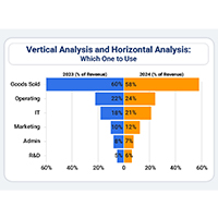
Vertical analysis and horizontal analysis reveal how financial statements shift over time and within a period. Learn both methods now!
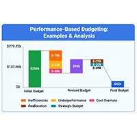
Performance-based budgeting links spending to measurable results. Explore how it works, see examples, benefits, challenges, and analyze PBB in Excel.