Categories
Comparing multiple data points across categories can quickly become confusing when the data grows.
A Clustered Column chart in Excel solves this by organizing related values into grouped vertical columns, making side-by-side comparisons clear and easy to interpret.
Each category is displayed along a shared axis, while multiple metrics are presented as separate columns within the same group.
This structure helps you quickly identify differences, patterns, and performance gaps without scanning raw data.
While Excel supports basic column charts, creating a well-structured Excel Clustered Column chart that clearly highlights insights often requires careful setup and formatting.
In many cases, users rely on additional tools to improve clarity and build more advanced, comparison-focused visuals.
In this guide, you’ll learn when to use this chart, how to create it correctly, and how to turn it into a clear decision-making tool rather than just a visual.
Definition: A Clustered Column chart in Excel is a visual used to compare multiple data series across categories by displaying vertical bars grouped side by side.
Each cluster represents a category (such as time periods, products, or regions), while each column within the cluster represents a different data series.
This structure makes it easy to compare values across multiple variables within the same category.
For example, if you want to compare product sales across different quarters, each quarter appears as a cluster, and each column within that cluster represents a product’s performance.
The vertical (Y) axis shows the value scale, while the horizontal (X) axis displays categories. Since all series share the same axis, comparisons are clear and consistent.
Each category is represented as a cluster of vertical bars placed next to each other.
This grouping allows you to quickly compare multiple values within a single category.
All clusters are aligned along a common horizontal axis.
This ensures consistency and makes it easy to scan across categories without confusion.
All data series use the same vertical axis for values.
This feature prevents misinterpretation that can occur with multiple axes.
A Clustered Column chart supports multiple data series within the same visualization.
This makes it useful for analyzing relationships between variables without switching charts.
Each data series is visually separated using spacing and color.
It helps users focus on differences rather than totals.
A Clustered Column chart in Excel is ideal when you need to compare how multiple products perform across the same time periods.
Real-life use case:
A retail business tracks monthly sales for Product A, Product B, and Product C. Each month appears as a cluster, and each product is shown as a separate column within that cluster.
What your image should show:
Months on the X-axis and grouped columns for each product within every month.
Key Insight:
You can instantly identify which product is consistently leading, which one is declining, and where performance gaps exist without reviewing detailed reports.
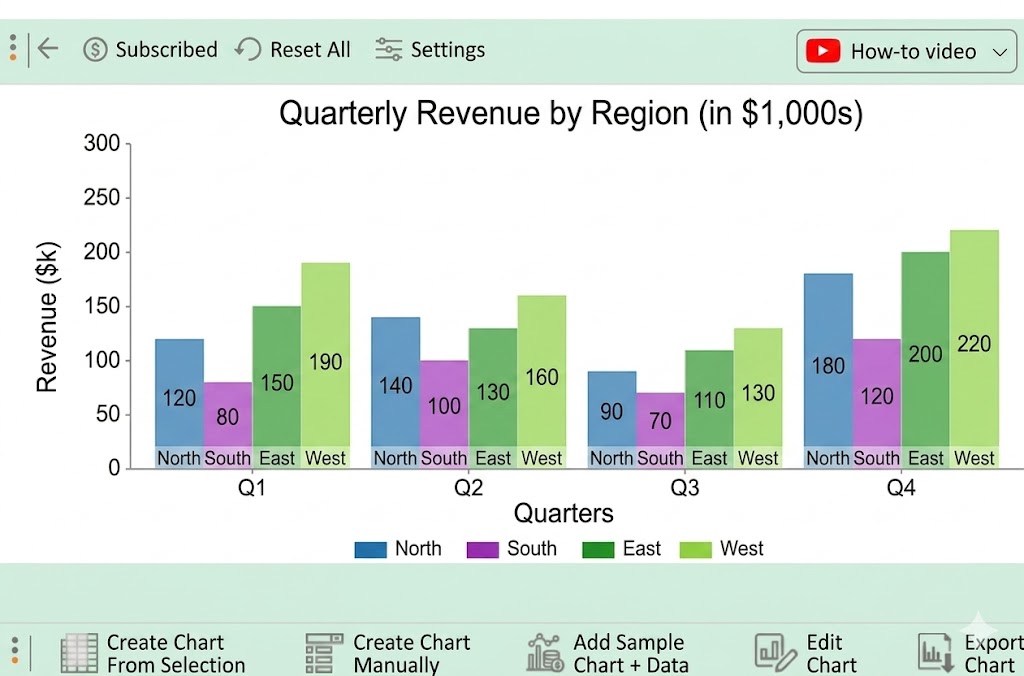
This chart is highly effective for comparing performance across regions within the same timeframe.
Real-life use case:
A company analyzes quarterly revenue from North, South, East, and West regions to evaluate which region contributes the most in each quarter.
What your image should show:
Quarters are clusters and regions as grouped columns within each quarter.
Key Insight:
It helps decision-makers quickly spot strong and weak regions, making it easier to adjust sales strategies or reallocate budgets.
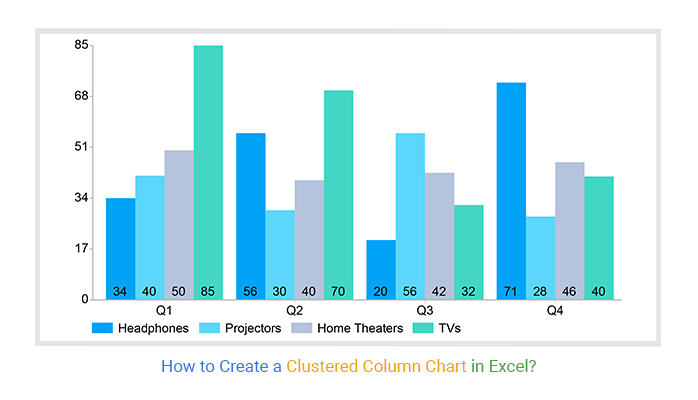
An Excel Clustered Column chart is highly effective for comparing product performance across multiple time periods, especially when multiple categories are involved.
Real-life use case:
A business tracks quarterly orders for different product categories such as Headphones, Projectors, Home Theaters, and TVs.
Each quarter (Q1–Q4) forms a cluster, and each product category is represented as a separate column within that cluster.
Key Insight:
This type of chart makes it easy to compare product demand across quarters and quickly identify:
It helps businesses make decisions like inventory planning, marketing focus, and product prioritization without analyzing raw tables.

Organize your dataset in a tabular format:
Make sure:
This ensures Excel correctly identifies:

Go to:
Check if the chart is correctly plotted:
If needed, use “Switch Row/Column” to fix orientation.
Enhance readability by adding:
This makes the chart easier to understand without extra explanation.
Improve visual clarity:
For more complex comparisons or large datasets, you can use tools like ChartExpo to create a more structured and visually refined Excel Clustered Column chart.
Before using the chart:

Use an Excel Clustered Column chart when your goal is to compare multiple data series across the same categories in a clear and structured way.
Use it when each category contains more than one variable that needs side-by-side comparison.
Example: Sales of multiple products across the same months.
Clustered columns make it easy to spot which value is higher or lower within each group.
These Excel charts work best when all categories are compared equally rather than combined into a total.
It provides a quick visual comparison without requiring deep analysis, making it ideal for reports and dashboards.
Avoid using an Excel Clustered Column chart when the data requires a different type of interpretation.
If your goal is to show how values contribute to a total, use a stacked chart instead.
Too many clusters make the chart crowded and difficult to read.
Line charts are better for showing continuous trends and patterns.
If you need to analyze correlations or interactions between variables, use Scatter plots or other analytical visuals.
Useful when comparing products, regions, or time periods.
Works well for reports shared with non-technical stakeholders.
Ensures fair and consistent comparison across all values.
Commonly used in sales, marketing, and performance dashboards.
Helps reduce the need for multiple charts.
Best suited for small to medium datasets.
Better alternatives exist for time-based analysis.
Stacked charts are more suitable for this purpose.
Needs manual adjustments for better readability.
Should be used selectively in dashboard design in Excel.
Avoid overcrowding your chart with too many series or groups. When you add too many categories, the visual comparison becomes harder instead of easier.
A good rule is to stick to 3–5 data series per chart. This keeps bars readable and ensures users can quickly compare values without visual fatigue.
A clean data structure is often overlooked but makes a big difference in chart quality. Arrange your data in a clear table format with:
Well-structured data ensures Excel automatically generates a clean clustered layout without manual fixes later.
Avoid random or overly bright color choices. Assign consistent colors to each data series so users can easily recognize patterns across the chart.
For example:
Consistency across reports also improves dashboard readability and reduces cognitive load for users.
The order of categories affects how quickly users understand the chart. Instead of leaving data unsorted, arrange it in a meaningful way, such as:
This small step often improves clarity more than any formatting change.
Too many visual elements can distract from the actual comparison. Keep the chart clean by:
A cleaner chart helps users focus on comparisons instead of design noise.
A Clustered Column chart in Excel is a simple and effective way to compare multiple data points within a limited space.
It lets you display more than one metric side by side using vertical bars, where each group shares the same category axis.
This structure makes comparisons between values quick and easy to understand.
The chart is especially useful when you want to compare performance across categories, such as sales, regions, or products.
Its straightforward layout makes it easy for users to interpret without requiring advanced analytical skills.
How much did you enjoy this article?


Learn how to use sparklines in Excel to quickly visualize trends inside cells. Discover types, creation steps, customization, use cases, benefits, and best practices.

Learn what a confidence interval graph is, how to create it in Excel, and how to interpret results to make more reliable, data-driven decisions.

A correlation matrix in Excel helps identify relationships between variables. Learn how to create, read, and use it for effective data analysis.