Categories
By ChartExpo Content Team
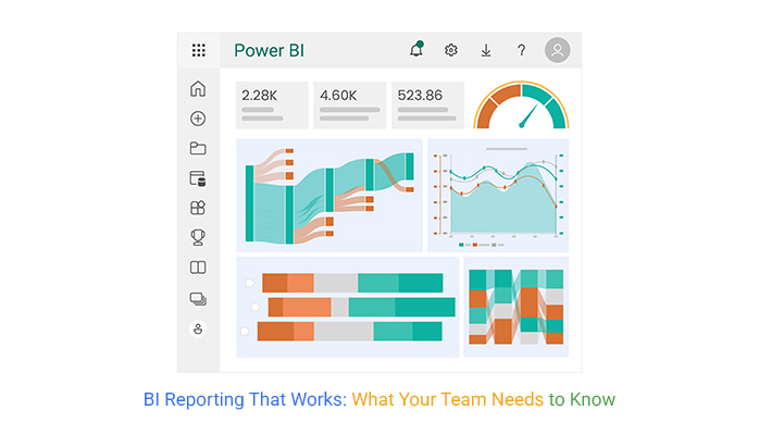
Data is everywhere, but without structure, it’s noise. BI reporting turns that noise into clear, actionable insights. Businesses rely on it to track trends, measure performance, and make informed choices.
BI reporting pulls data from multiple sources, organizes it, and presents it in a digestible format. Whether it’s sales numbers, customer behavior, or operational efficiency, these reports highlight what matters most. Without them, companies make decisions in the dark.


BI reporting isn’t just about numbers—it’s about knowing when to act. A spike in sales? Understand why. A sudden drop in customer retention? Find the cause.
BI reporting provides the clarity needed to move forward with confidence.
First…
BI (Business Intelligence) reporting is creating and managing reports from data to aid in business decision-making. These reports summarize current and historical data, identifying patterns for operational and strategic insights. BI reporting tools gather data from various sources, process it, and present it in digestible formats.
BI reports offer a snapshot of business performance. They provide insights into trends, helping companies anticipate market changes and adapt strategies. With BI reports, businesses can identify areas for cost reduction, improvement, and opportunities for growth, leading to smarter business moves.
BI reporting tools start by collecting raw data from diverse business systems. They then clean and integrate this data to ensure accuracy and relevancy. The processed data is displayed in reports and dashboards, offering actionable insights through visual representations like graphs and charts.
BI reporting and dashboards offer several advantages. They provide real-time data access, enabling quick response to business conditions. Best-designed dashboards allow users to interact with data, drilling down into metrics for deeper analysis. This leads to data-driven decision-making capabilities across all levels of an organization.
Data sources are the backbone of BI reporting. Warehouses store historical data efficiently. Data marts, a subset, focus on specific business areas. Live feeds offer real-time data, vital for timely decisions. These sources feed into BI tools, setting the stage for impactful data analytics.
Effective report design is crucial. It ensures data is understandable at a glance. Tables offer detailed views, while graphs show trends and patterns swiftly. Dashboards combine these elements, providing a comprehensive snapshot. This design strategy aids stakeholders in making informed decisions quickly.
A Clustered Column Chart presents multiple data series side by side. Each category appears along the horizontal axis, while vertical bars show values for different groups. This layout makes it easy to compare numbers across multiple time periods or categories. The uniform spacing ensures clarity, and color coding keeps comparisons distinct.
This chart works best for tracking monthly sales, customer retention rates, or regional performance. Each group stands next to another, letting viewers spot patterns, gaps, and trends without effort. A well-structured clustered column chart avoids clutter and keeps comparisons straightforward.
For BI reporting, this chart delivers quick insights without confusion. It helps decision-makers compare revenue growth, customer engagement, or operational efficiency over time. With clear labels and logical grouping, it removes guesswork, allowing teams to act with confidence.
Static reports provide a snapshot in time. They are detailed documents, ideal for historical data analysis. Interactive views, or dashboards, allow users to explore data in real-time. They offer flexibility and immediate insights.
For businesses needing detailed records, static reports are valuable. They provide a historical benchmark and comprehensive data. For dynamic environments, dashboards are better. They allow real-time decision-making and data exploration.
Deciding between static reports and interactive views depends on business needs. Static reports are great for depth, while interactive views offer flexibility. Choose based on the specific requirements of your business environment.
Different stakeholders need different data presentations. Executives might prefer dashboards for quick health checks of the company. Data analysts might need detailed reports to conduct thorough analyses. Matching the tool to the user is key for effective data use.
Executives benefit from dashboards that provide a quick overview. Analysts and other data-heavy roles benefit from the detailed insights found in BI reports. Understanding who needs what information ensures that each stakeholder has the right tool.
It’s about the right information to the right user at the right time. Dashboards for quick insights, reports for detailed analysis. This ensures that all levels of the organization are effectively informed and can act on data.
Self-service BI tools empower users to create reports on demand without IT help. IT-managed reports, however, are controlled by IT departments. They ensure data consistency and accuracy but might be slower to distribute.
Self-service tools are great for empowering users. They allow quick, personalized report generation. IT-managed reports are necessary when data governance and security are priorities. They provide standardized, accurate reports company-wide.
Choosing between these depends on the need for speed versus control. Self-service offers flexibility; IT-managed offers consistency. Balance these based on your organizational needs and data policies.
A Sankey Diagram visualizes how data moves from one point to another. Thick and thin flows represent the volume of movement, making it easy to spot major trends. The layout follows a left-to-right structure, showing inputs, pathways, and final outcomes.
This chart works well for tracking financial transactions, customer journeys, or data processing pipelines. The width of each flow represents the size of movement, making it clear where resources are concentrated. This removes confusion, keeping the focus on key decision points.
In BI reporting, a Sankey Diagram clarifies how data travels. It shows which sources contribute most to results and where losses occur. Decision-makers can pinpoint inefficiencies, allocate resources, and fine-tune data strategies without digging through raw numbers.
Faced with heaps of data? Start by setting clear objectives. What decision needs support from this data? Identify key metrics that influence these decisions. Link these metrics to data sources. Filter out unrelated data to avoid confusion. Use BI tools to automate data processing for consistency.
By keeping your focus sharp, you ensure that your BI report remains a vital tool for informed decision-making.
A great BI report does more than show numbers; it tells a story. Start with your end goal—what should the reader take away? Organize your data to build towards this conclusion. Use chronological data sequences to show trends over time. Highlight causal relationships with correlational data.
Summarize key points at the start of each section to guide the reader through your narrative. This method keeps your report compelling and insightful.
The right chart can make or break your BI report’s clarity. Bar charts work well for comparing quantities across different categories. Line charts are ideal for showing trends over time. Scatter plots can help illustrate the relationships between variables. Always ask yourself: “What’s the simplest way to present this data?” Simplicity is key to delivering clear insights.
A Pareto Chart ranks key business factors from most to least significant. It combines bars and a line graph to show how a few elements contribute to the majority of results. The largest bars appear first, emphasizing the biggest drivers of change.
This chart works for identifying top sales channels, frequent customer complaints, or major cost factors. The 80-20 rule applies—a small set of factors often cause most of the impact. By focusing on the largest contributors, teams allocate resources where they matter most.
In BI reporting, a Pareto Chart helps prioritize efforts efficiently. It points to key metrics affecting revenue, productivity, or service quality. Decision-makers can focus on fixing what moves the needle, rather than spreading efforts too thin.
The following video will help you create a Sankey Chart in Microsoft Excel.
The following video will help you to create a Sankey Chart in Google Sheets.
The following video will help you create a Sankey Chart in Microsoft Power BI.
BI report developers play a pivotal role in an organization. They begin by designing tools that help in decision-making processes. Their work involves various stages, starting with the design of reports and dashboards. They move from a conceptual blueprint, through rigorous testing phases, to a functional tool that impacts business decisions directly.
Developers work with raw data, which they transform into insightful data visualizations. The development process demands a deep understanding of both the data and the business needs. This ensures that the reports generated are relevant and actionable. They examine each data point to confirm its accuracy, thus maintaining the data integrity of the information.
Testing is a critical stage in this development. It ensures the data’s accuracy and reliability. By carefully validating every element of the report, developers prevent the risk of “garbage in, garbage out.” This term refers to inaccurate input data leading to unreliable outputs. Accurate testing safeguards the organization from making misguided decisions based on incorrect data.
Developers use data warehouses, data marts, and data stores to manage vast amounts of information. Data warehouses store current and historical data from different sources. This extensive storage system allows developers to pull comprehensive reports covering various time frames and topics.
Data marts, however, are more focused. They cater to specific business segments, providing more targeted insights. They are smaller and draw data from fewer sources compared to data warehouses. This makes them quicker and more efficient for specific departmental needs.
Data stores are often used for real-time data processing. They support the high-speed retrieval of data, which is crucial for time-sensitive decisions. This setup helps developers provide the most current insights into the organization’s operations, enabling swift and effective decision-making.
The Waterfall Chart is an effective tool for visualizing how business metrics evolve over time. It shows the cumulative effect of sequentially introduced positive or negative values. This data visualization helps in understanding the step-by-step progression of a value, making it easier to identify trends and patterns.
In BI reporting, the Waterfall Chart is invaluable. It breaks down the journey of a metric, adding clarity to its rises and drops. This chart helps stakeholders see how individual elements contribute to the overall performance. It’s particularly helpful in financial reporting, where it can show how initial figures lead to final totals.
The value of the Waterfall Chart in BI reporting lies in its ability to highlight the consequences of each action. By understanding how various factors affect business outcomes, decision-makers can better strategize for future actions. This chart not only enhances the visual presentation of data but also deepens the understanding of the factors influencing business metrics.
Choosing between scheduled reports and on-demand insights depends on your business needs. Scheduled reports are automated to run at set times. Ideal for regular updates, they ensure everyone receives the same information at the same time. This consistency helps in monitoring ongoing projects and long-term trends.
On-demand insights offer flexibility. Users can pull data as needed, allowing for spontaneous data queries and deeper dives into specific areas. This is particularly useful in dynamic environments where conditions change rapidly.
Both methods offer advantages, but the right choice varies. Consider factors such as the need for real-time data, the frequency of data updates, and the specific demands of stakeholders.
AI revolutionizes BI tools by introducing advanced data analysis capabilities. Machine learning algorithms predict trends and patterns, offering insights beyond traditional analysis. This proactive approach identifies opportunities and risks early, giving companies a competitive edge.
AI also personalizes reports by learning user preferences and behaviors. It tailors data presentations to individual needs, making reports more relevant and easier to understand. This customization improves user engagement with the data.
Moreover, natural language processing (NLP) allows users to interact with BI tools via voice or text. Ask questions and receive answers in natural language, making BI more accessible to all, regardless of technical expertise.
Full automation of the BI pipeline eliminates repetitive manual work, from data collection to report generation. Data is collected and processed automatically, ensuring it is always ready for analysis. This seamless flow improves accuracy and speed.
Automated data cleansing and preparation save hours of manual labor. Algorithms detect and correct errors, standardize formats, and consolidate data from multiple sources. With clean and organized data, the analysis is more accurate and meaningful.
Automation also facilitates more frequent updates. Data is refreshed automatically, providing the latest insights. This constant data flow helps businesses stay agile and informed.
Gauge charts offer a clear visualization of performance metrics, ideal for measuring the efficiency of automated BI reports. They display data in a dial-like format, showing where a metric stands between predefined ranges. This makes it easy to see if performance is on target, underperforming, or exceeding expectations.
In the context of BI reporting, gauge charts can display real-time efficiency gains from automation. Track how much time and resources are saved since implementing automated reports. This visual tool helps stakeholders understand the tangible benefits of automation.
Further, gauge charts can guide decision-making. They highlight areas needing improvement, driving continuous enhancement of reporting processes. Their straightforward visual representation ensures that all team members, regardless of their data expertise, can understand and act on the information presented.
Aligning BI reports with business strategy begins with determining what to measure. It is crucial to select metrics that reflect the company’s key objectives.
For example, if a business aims to increase market share, metrics related to customer acquisition and customer retention rates are appropriate. By focusing on relevant metrics, businesses ensure that their strategic goals directly influence their operational activities.
This alignment is not just about tracking; it’s about enabling informed decision-making that supports long-term success.
BI dashboards play a pivotal role in decision-making by providing a visual representation of critical data. These dashboards consolidate information from various sources, presenting it in an accessible format that decision-makers can quickly interpret.
This immediacy is invaluable as it allows for swift responses to emerging trends or issues, ensuring that decisions are data-driven and aligned with strategic objectives. The visual nature of dashboards makes complex data sets understandable at a glance, which is essential for maintaining competitive advantage.
A Mosaic Plot offers a powerful way to identify patterns and trends in business performance. This chart’s visual clarity allows viewers to see variations across different categories at once.
For instance, a Mosaic Plot can highlight sales performance across various regions and product categories, revealing underperforming areas or unexpected successes. The advantage of using this type of chart lies in its ability to display complex information in a straightforward manner, facilitating quicker and more accurate analysis.
By integrating a Mosaic Plot into BI reporting, businesses enhance their ability to comprehend vast amounts of data quickly. This understanding aids in recognizing key trends that may not be apparent from raw data alone. As a result, decision-makers can take timely actions that are informed by a clear analysis of business performance, driving strategic initiatives forward effectively.
To gauge the impact of BI, start by setting clear goals. What do you want to achieve with your BI tools? Is it increased sales, better customer satisfaction, or something else? Once you have your goals set, BI reporting can track the progress.
Next, consider employee productivity. BI tools automate many routine data analysis tasks. This automation frees up your team to focus on more strategic tasks. Measuring the time saved, and the increase in productivity can show the benefits of BI reporting.
Lastly, customer interactions provide a goldmine of insights. BI tools analyze customer data and reveal patterns in behavior. These insights can lead to improved customer experiences and increased loyalty, which are key metrics for assessing the impact of BI.
Data accuracy is non-negotiable in BI reporting. Incorrect data can lead to misguided strategies and, ultimately, financial loss. For example, if a financial report is inaccurate, it might lead to overspending in areas that aren’t profitable.
Timeliness is equally crucial. Data that’s old or not updated quickly loses its value. In fast-paced industries like technology or retail, outdated information can result in missed opportunities and decreased competitive edge.
By investing in high-quality BI tools, companies can avoid the pitfalls of bad reporting. These tools ensure that data is not only accurate but also delivered in real-time, aiding in making swift, informed decisions.
BI reports do more than just compile data—they provide strategic insights that lead to increased profitability. By analyzing sales trends, for instance, businesses can identify the most profitable products and focus their marketing efforts accordingly.
Cost reduction is another area where BI reports shine. They identify inefficiencies in processes, allowing businesses to streamline operations. This streamlining can significantly reduce costs, thereby boosting the bottom line.
Moreover, BI tools predict future trends. This predictive power means businesses can make proactive changes that enhance profitability. Whether it’s adjusting supply chains or setting prices, these data-driven decisions keep companies competitive.
A progress bar tracks growth, adoption, and milestones in BI reporting. It visually represents how much progress has been made toward goals. The clear layout allows teams to see movement at a glance, making it easier to stay on track.
This chart is ideal for measuring BI adoption across departments, tracking report usage, or assessing benefits over time. It presents completion percentages, helping businesses gauge whether BI efforts are meeting expectations. Leaders can spot slow adoption early and take action.
For BI reporting, a progress bar keeps teams accountable. It shows if data-driven decisions are gaining traction or if teams need more support. By making adoption visible, organizations push toward better data usage and stronger business impact.
The first common mistake in data visualization is neglecting the audience. Who are the viewers? What’s their expertise? Tailor the complexity of your visualizations to their understanding. A common pitfall is assuming too much knowledge, which can lead to confusion.
Another mistake is using inappropriate chart types. The wrong chart can distort what the data means. This misrepresentation can lead to poor business decisions. Always match the chart type to the nature of the data and the story it needs to tell.
Overcomplicating the design is another frequent error. Too many colors or complex designs detract from the data’s message. Keep design elements minimal and functional. This approach highlights the data itself, not the decoration.
Selecting the correct chart is vital for effective communication. Bar charts work best for comparing quantities of different categories. Line charts are ideal for showing trends over time. Let’s keep those pies in the kitchen!
For relationships among data points, scatter plots are perfect. They show how variables interact with each other. When dealing with parts of a whole, consider stacked bar charts. They layer data, allowing for a comparison of total and individual categories.
Always ask, “What is the best way to present this particular set of data?” This question guides the choice of charts, ensuring that the visualization is both appropriate and effective.
Colors and shapes are not just decoration—they guide understanding. Use color to differentiate data sets clearly. But remember, color has meaning. Red might indicate danger or a decline, while green often suggests growth or safety.
Shapes can help differentiate data points when colors are limited. Different shapes can represent different categories or groups within the data. This use of shapes is particularly useful in scatter plots.
Layout matters, too. Place the most important data in the most visible spots. Western readers will naturally look to the top-left corner first. Use this area for key insights. A well-thought-out layout makes your BI report not just visually appealing but also more effective.
Tree maps are fantastic for showing hierarchies. They make large amounts of data comprehensible at a glance. Tree maps use nested rectangles to represent different levels of the hierarchy. The size of each rectangle is proportional to the value it represents.
In BI dashboards, tree maps can show how individual regions contribute to total sales. They can also display product categories and subcategories to identify revenue contributors. This visualization is not only clear but also space-efficient. It makes complex hierarchies readable and accessible.
Using a tree map enhances decision-making. It highlights areas that need attention or are performing well. This clarity supports faster and more accurate business decisions, proving that a well-chosen chart type greatly enriches the data story.
Business Intelligence (BI) is shifting towards AI-driven, self-service models. These systems allow users to perform complex data analysis without deep technical knowledge. AI enhances these platforms by automating data insights and predictive analytics. This means quicker, smarter decisions without relying heavily on IT staff.
Interactive and predictive reporting is reshaping how organizations use data. These reports adjust in real-time, providing deeper insights with each user interaction. Predictive elements apply machine learning to forecast future trends. This dynamic duo of features makes reports not just informative but anticipatory, giving a sneak peek into future possibilities.
The Multi-Axis Spider Chart offers a unique visualization by displaying data points on multiple axes radiating from a central point. This layout is ideal for comparing multiple variables simultaneously, providing a clear snapshot of data contrasts and convergences. It’s especially useful in BI for juxtaposing different data metrics in a single, comprehensible format.
Incorporating the Multi-Axis Spider Chart in BI reporting empowers decision-makers. By presenting complex data sets intuitively, it aids in identifying patterns and discrepancies quickly. This chart type is pivotal for strategic planning, as it highlights relationships between diverse business metrics, facilitating informed, robust decision-making processes.
Building a BI reporting strategy starts with understanding your data’s story. What do your data points say about your operations, customers, and market trends? Start by setting clear objectives for what you wish to achieve with your BI reports. Do these goals align with your broader business strategy?
Next, identify the key metrics that matter most to your business. These metrics should directly tie into your strategic goals. For instance, if increasing customer satisfaction is a goal, tracking customer support interactions and satisfaction rates becomes essential.
Finally, ensure that your BI tools and platforms can handle and process your data needs. They should offer flexibility and scalability to grow with your business. Choose tools that not only gather data but also analyze and report it in ways that are useful to your team. Integration capabilities with other systems can streamline the data flow and provide more coherent insights.
A BI report should do more than present numbers—it should lead to action. Many reports fail because they dump raw data without highlighting insights. A well-designed report guides decision-making, uncovers trends, and reveals gaps.
This checklist ensures your reports stay clear, relevant, and actionable. Each item keeps the focus on insights, helping teams make informed choices without wasting time.
Every report should answer a business question. If a report doesn’t solve a problem, it’s just a collection of numbers. Define who will use it and why it matters.
Reports for executives focus on high-level KPIs, while operational teams need detailed performance data. A sales manager needs conversion rates, while finance teams track revenue trends. Make sure each report serves a specific audience.
Too much data distracts from the main message. Show only critical numbers that affect business outcomes. If a metric doesn’t impact strategy or execution, remove it.
Context matters. A 5% revenue dip means nothing without previous period comparisons. Include benchmarks, trends, and targets to show whether numbers are good or bad.
A report packed with tables and raw data is difficult to read. Charts help users absorb insights faster. Use bar charts, line graphs, and heatmaps to highlight key patterns.
Every visual should have a purpose. Avoid cluttered layouts or unnecessary colors. A simple, well-labeled chart communicates trends faster than paragraphs of numbers.
A great report follows a clear structure. Place key insights at the top, detailed data below, and breakdowns at the end. Users should grasp the key message without scrolling.
Break content into sections with headings. Use bullet points for summaries. Avoid long text blocks that slow down comprehension.
Static reports limit insights. Give users options to filter by department, region, or date. Allow drill-down features so teams can analyze data at different levels.
An interactive report lets a manager compare store performance, while a sales rep filters by product line. More control means better decisions.
Bad data leads to bad decisions. Before publishing, validate data sources, remove duplicates, and check for missing values. A single incorrect number can mislead an entire strategy.
Schedule regular data audits. If teams notice errors, they’ll lose trust in reports. Reliable data keeps BI reporting valuable.
A report should stay current. Set up automated refreshes so teams see real-time trends. If decision-makers use outdated numbers, their actions may be too late.
Static reports quickly lose relevance. Automating updates keeps teams ahead of shifts in revenue, performance, or market trends.
If a report isn’t used, it’s failing. Ask teams what they need, what’s missing, and what’s unclear. Adjust reports based on real-world use.
A report built for one team might not work for another. Keeping reports relevant ensures engagement and impact.
The Sunburst Chart is an effective visual tool in BI reporting. It shows how various data segments relate to a whole. This chart is excellent for displaying hierarchical data and revealing patterns that might be missed in other types of charts.
In the context of BI reporting, a Sunburst Chart can display the entire process from data collection to action. It starts from the innermost layer, showing data gathering methods, moving outwards to data processing techniques, and ending with decision-making layers.
This visualization supports the BI reporting strategy by offering a clear view of how each step of the process impacts the next. It aids in identifying where bottlenecks might occur and highlights areas for improvement. By integrating the Sunburst Chart in BI reports, businesses can enhance their understanding of the reporting process and streamline their operations accordingly.
BI reporting isn’t just about collecting data—it’s about using it to make better decisions.
Clear, accurate reports help businesses track performance, spot trends, and adjust strategies. When done right, BI reporting becomes a competitive advantage, not just another tool.
To get the most value, focus on what matters. Use the right charts, highlight key metrics, and keep reports easy to read. Avoid data overload and ensure accuracy. The best reports don’t just inform—they drive action.
Automation makes BI reporting even more effective. Real-time updates, AI-driven insights, and self-service tools empower teams to move faster. Businesses that embrace these advances stay ahead, while those stuck with outdated methods risk falling behind.
In the end, data is only as valuable as the decisions it drives. BI reports should guide strategy, improve efficiency, and increase profitability. If they don’t, it’s time to rethink the approach.
The smartest companies don’t just report data—they use it to grow.
How much did you enjoy this article?


A supplier comparison template streamlines vendor evaluation by comparing cost and quality. Click here to learn its benefits and how to analyze them.
Ecommerce analytics often lead to mixed signals and costly misreads. Fix attribution gaps, align teams, and act on the right data. Get started now!
Is your sales funnel hiding costly gaps? Learn how pipeline stalls, false metrics, and handoff chaos could be draining revenue. Get started now!