Categories
Making cool Excel charts and graphs is not just about visual appeal. It is about transforming raw data into meaningful insights that are easy to understand and act on.
Today, businesses rely heavily on data, but data alone has no value unless it supports clear decision-making. That is where visualization becomes essential.
Well-designed charts simplify complex datasets, highlight patterns, and improve the speed and accuracy of analysis.
If you’ve ever struggled to understand large datasets, the issue is not the data itself, but how it is presented.
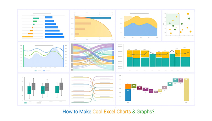
Definition: Cool Excel charts and graphs are fancy and visually engaging data visualizations designed to present information clearly and effectively beyond basic charts.
They focus on simplifying complex data, highlighting key patterns, and improving understanding through better structure, clean design, and purposeful use of visuals.
These charts make it easier to identify trends, compare values, and uncover insights at a glance.
Making a beautiful chart or graph contributes to a more informed and effective decision-making process. Here are some of the reasons why:
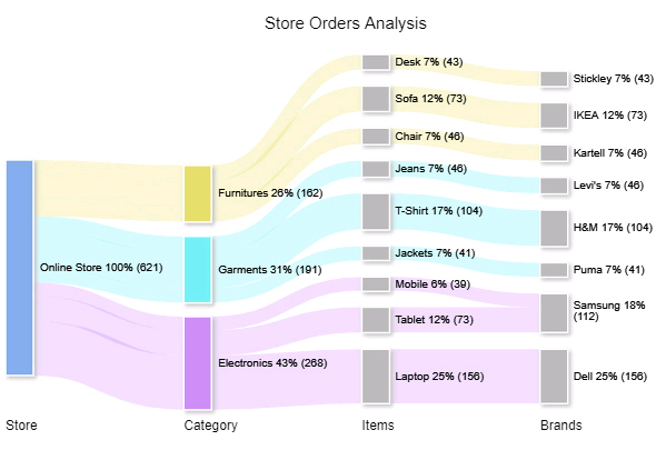
1. Sankey Diagram
A Sankey Diagram is a powerful visualization used to represent the flow of data between different stages or categories, such as customer journeys, energy usage, or revenue distribution.
Each flow is shown by width, making it easy to identify where the highest movement or loss occurs in a process.
When used in business dashboards, it highlights how users, revenue, or resources move across stages, making complex flows easy to interpret.
2. Likert Scale Chart
A Likert Scale Chart is used to visualize survey responses based on agreement levels, such as strongly agree to strongly disagree.
It simplifies large volumes of feedback into structured sentiment categories.
This helps businesses quickly understand user perception without analyzing raw survey data.

3. Multi-Axis Line Chart
A Multi-Axis Line Chart compares two different metrics with different scales using dual axes on the same chart.
It helps uncover relationships between metrics that influence each other but are not directly comparable.
This makes it useful for performance tracking across multiple business indicators.

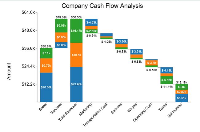
4. Waterfall Chart
A Waterfall Chart shows how a starting value changes through a sequence of increases and decreases until it reaches a final value.
Each step explains how the total is built or reduced over time.
It is commonly used in financial analysis to explain performance shifts.

5. Stacked Waterfall Chart
A Stacked Waterfall Chart expands the standard waterfall by breaking each change into multiple contributing categories.
This allows deeper insight into how different segments impact overall performance.
It is especially useful when multiple departments or products contribute to one result.
6. Pareto Chart
A Pareto Chart combines bars and a cumulative line to highlight the most impactful factors in a dataset.
It follows the 80/20 rule, where a small number of causes create most outcomes.
This helps prioritize business problems effectively.

7. Progress Bar Chart
A Progress Bar Chart shows how much of a task or goal has been completed compared to the target.
It provides a simple visual status of progress without requiring detailed analysis.
It is widely used in dashboards for real-time tracking.

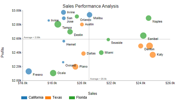
8. Scatter Plot
A Scatter Plot displays individual data points using X and Y axes to show relationships between two variables.
It is one of the most effective ways to identify correlations and outliers, often supported by a correlation matrix in Excel for deeper analysis.
It is commonly used in performance and trend analysis.
9. Slope Chart
A Slope Chart compares two points in time using a simple line connection between values.
It focuses only on the direction and magnitude of change.
It is useful for showing ranking or KPI shifts.

10. Sentiment Trend Chart
A Sentiment Trend Chart tracks changes in positive, neutral, and negative responses over time.
It helps businesses understand how perception evolves after events or changes.
It is widely used in customer experience tracking.

11. Box & Whisker Plot
A Box & Whisker Plot summarizes data distribution using median, quartiles, and outliers.
It helps compare variation across multiple datasets in a compact view.
It is commonly used in statistical and performance analysis.

Turning raw data into meaningful visuals in Excel is about more than inserting a chart. It’s about structuring data, choosing the right chart, and presenting insights clearly.
Start with a clean and structured dataset:
Choose a chart based on what you want to show:
Improve readability by:
Make important data stand out:
For more engaging and insightful visuals, use tools like ChartExpo to create fancy charts (e.g., Sankey, Pareto, or funnel charts) that are not easily available in default Excel.

Avoid clutter:
Before sharing:

Fancy Excel graphs and charts are used when simple visuals are not enough to explain what the data is really saying. The goal is to turn raw numbers into clear insights that support faster decisions.
Each chart type serves a different purpose, so selection is the first step.
Excel is mainly used for organizing, storing, and visualizing data in a structured way.
It works best for:
However, it becomes limited when data needs a deeper visual explanation or multi-layer analysis.
When standard charts are not enough, fancy visuals help uncover hidden insights.
These may include:
Fancy charts should simplify decision-making, not complicate it.
They help you:
The effectiveness of a chart starts with selecting the correct type. A mismatch between data and visualization can confuse users instead of guiding them.
Use:
Color should support understanding, not distract from it. Stick to a simple and consistent color palette across your visuals.
Too many visual elements reduce clarity and distract from the message.
Every chart should explain itself without needing extra context.
Creating attractive charts is about making your data easy to understand at a glance, not just about making it visually appealing.
There is no single “best” chart in Excel. The right choice depends on your goal:
The best chart is the one that presents your data clearly and accurately for decision-making.
Data today is one of the most valuable assets for any business, but its real value comes only when it is transformed into clear and actionable insights.
That’s where data visualization plays a critical role by turning complex datasets into simple, understandable visuals.
Throughout this guide, we explored how cool Excel charts and graphs help present data more effectively.
Each chart type serves a specific purpose, whether it’s showing trends, comparisons, relationships, or distributions.
We also looked at how best visualization tools can enhance Excel’s native capabilities and make insights easier to interpret, especially when working with large or complex datasets.
One helpful option for building more advanced and insightful visuals in Excel is ChartExpo, which allows you to create more structured and visually clear charts without unnecessary complexity.
By applying the right chart types and keeping visuals clean and focused, you can improve how data is understood and shared across teams.
Now it’s your turn to apply these techniques and turn your data into meaningful insights that support better decisions.
How much did you enjoy this article?


Learn how to use sparklines in Excel to quickly visualize trends inside cells. Discover types, creation steps, customization, use cases, benefits, and best practices.

Learn what a confidence interval graph is, how to create it in Excel, and how to interpret results to make more reliable, data-driven decisions.

A correlation matrix in Excel helps identify relationships between variables. Learn how to create, read, and use it for effective data analysis.